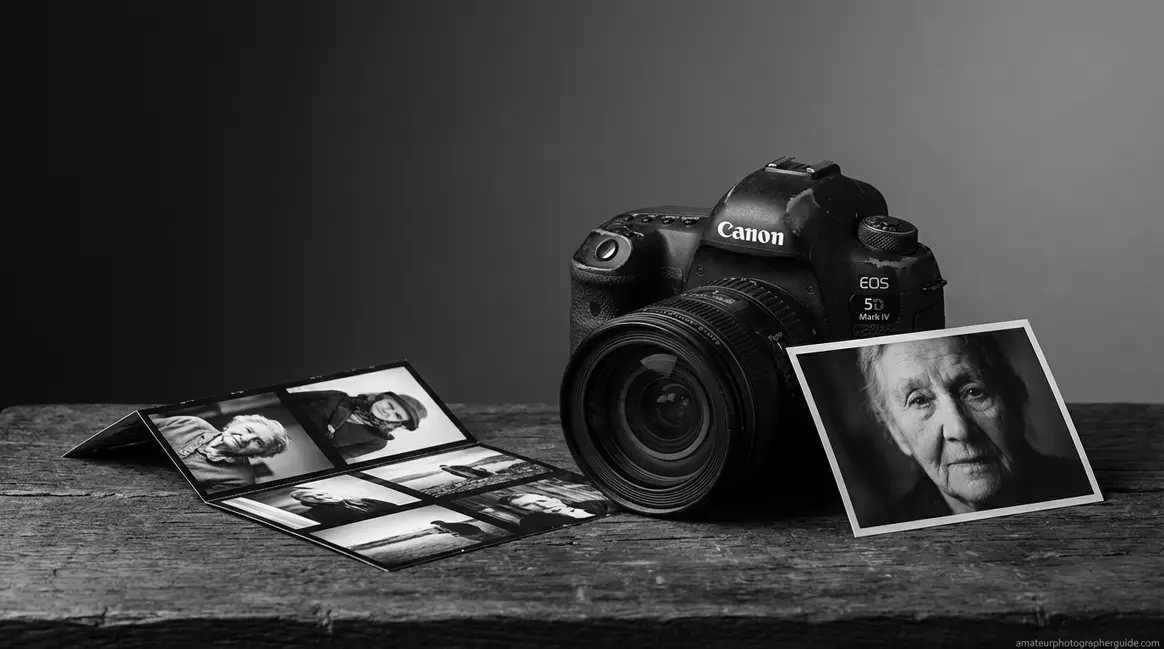
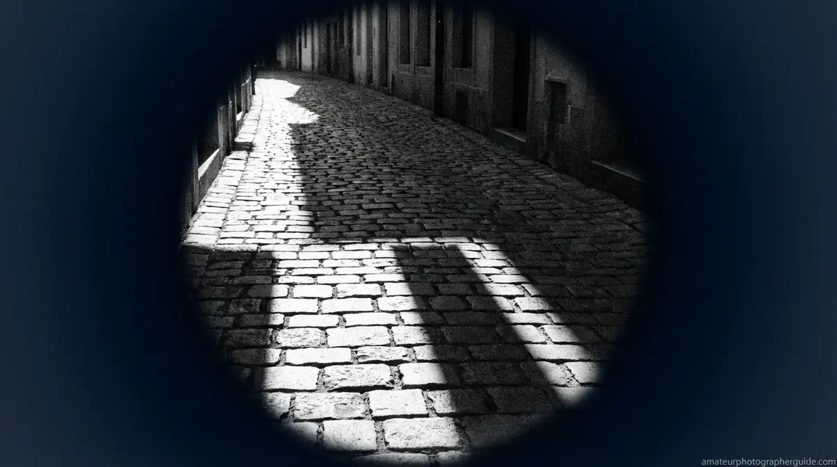
Table of Contents
This blog post may contain affiliate links. As an Amazon Associate I earn from qualifying purchases.
You converted your photo to grayscale and it looked exactly like what it was — a color photo with the color removed. Flat. Muddy. Nothing like the dramatic B&W images you were aiming for.
That happens because converting color to B&W is not B&W photography. Most beginners miss this distinction entirely, and it costs them every shot.
“Black & white photography isn’t about removing color, it’s about seeing light differently.”
In this guide, you’ll learn the exact black and white photography tips for beginners that move you from accidental grayscale to intentional, impactful monochrome. We’ll cover how to train your eye, configure camera settings, avoid common mistakes, and process your images in Lightroom.
Great black and white photography starts with seeing light, contrast, and texture — not just removing color from a scene.
- See differently: Train your eye to read tonal contrast, not hue
- Shoot RAW: Preserve maximum tonal data for editing flexibility
- Chase directional light: Side lighting reveals texture and depth
- Use “The Monochrome Perception Shift”: Plan your shot as B&W before you press the shutter
- Fix mistakes in editing: The B&W Mix panel in Lightroom separates tones competitors ignore
Learning to See in Monochrome
The difference between a desaturated snapshot and a great B&W photo begins before you lift the camera—it starts with seeing tonal contrast where others see color. Experienced photographers don’t just convert color images; they perceive the world in terms of light, shadow, texture, and shape from the start. Canon Ambassadors consistently recommend mentally switching to monochrome visualization before composing a shot (Canon, 2026). If your results look flat, this is why.
- What makes a great black and white photo? Look for these elements:
- Strong tonal contrast between light and shadow
- Interesting textures—rough stone, skin, bark, fabric
- Clear shapes and geometric lines
- Directional or dramatic lighting (not flat, even light)
- A subject with emotion or strong form
- Minimal reliance on color as the story
The Perception Shift: Stop Seeing Color
The Monochrome Perception Shift is the act of mentally asking: “If I removed every color from this scene, what would remain?” The answer—light, shadow, texture, shape—becomes your new compositional vocabulary. This is the core skill separating flat B&W work from images with genuine depth. As Digital Photography School notes, the foundational skill is learning to see beyond color and focus on contrast and form (Digital Photography School, n.d.).
A practical way to trigger this shift is to squint when looking at a potential scene. Colors become muted, leaving you with tones—light and dark areas. Your camera can reinforce this. Setting your LCD to a B&W preview (via Monochrome Picture Style) lets you compose in monochrome while your RAW file still stores full color data for editing.
Caption: Watch this short tutorial to see The Monochrome Perception Shift in action — from scene selection to final frame.
A Strong B&W Image: The Four Elements
Before shooting, run through four questions. Photography Life identifies tonal contrast, texture, and strong shapes as essential building blocks. Great B&W photos consistently contain at least three of these four elements:
- Light: Is there a clear light source creating distinct highlights and shadows? Side lighting is ideal.
- Contrast: Are there bright whites and deep blacks naturally present, not just a range of mid-greys?
- Texture: Is there a surface the absence of color will reveal, not hide? Bark, brick, skin, and fabric all gain interest.
- Shape: Does the subject have a strong silhouette or geometric form? Without color, shape guides the viewer’s eye.
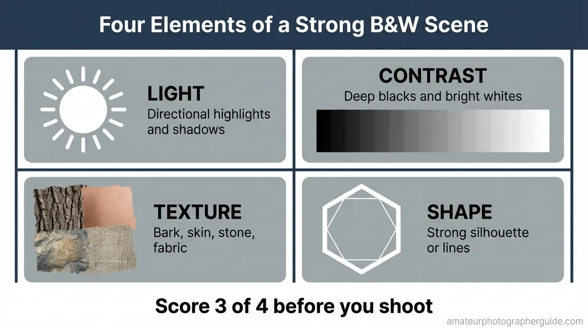
Caption: Use this four-element framework as a pre-shoot checklist. If a scene passes three of four, it’s worth shooting in monochrome.
Before you press the shutter, mentally score the scene. If it doesn’t have at least three elements, change your angle, find a new subject, or wait for better light. These black and white photography tips for beginners apply at the moment of perception, not just in editing.
Best Subjects and Scenes for Beginners
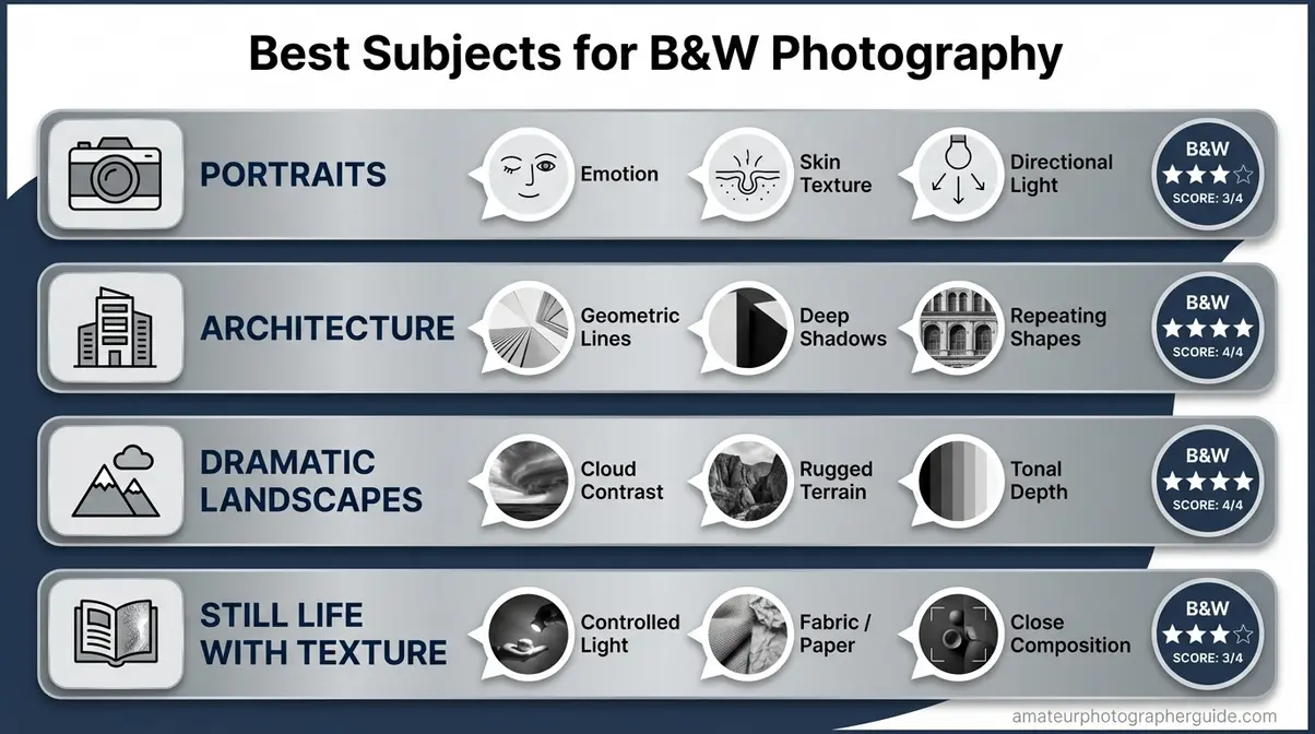
Caption: Each subject category naturally delivers a different combination of the Four Elements — portraits bring texture, while architecture brings shape and contrast.
Four subject categories consistently reward beginners:
Portraits offer emotion, expression, and skin texture. Under directional window light, the contours of a face become architectural, and the absence of color pushes focus to character.
Architecture and urban environments deliver geometric lines, deep shadows, and repeating shapes. A plain building becomes a study in form and contrast.
Dramatic landscapes work when cloud formations create tonal contrast and terrain creates texture. Note that flat, uniform green fields are a poor choice, as the tones compress into an undifferentiated mid-grey.
Still life with texture—old books, wrinkled fabric—gives you controlled light and composition. As PetaPixel notes, subjects with strong textures, shapes, and tonal contrast translate most successfully (PetaPixel, 2026).
Essential Camera Settings and Shooting Techniques
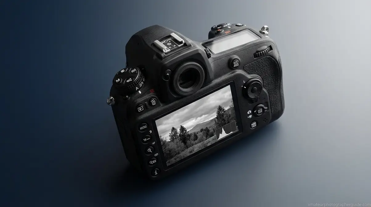
Setting your camera correctly for B&W takes three adjustments that most beginners miss, and each multiplies your editing options. The key is to preview in monochrome while preserving full color data in the RAW file. Shooting in RAW while using Monochrome mode gives you the best of both worlds: a B&W preview on your LCD and full color data for editing in Lightroom (Adobe, 2026). This is one of the most crucial black and white photography tips for beginners.
Your B&W Camera Setup Checklist
This checklist covers the essential setup for a reliable workflow.
- Set file format to RAW (not JPEG). RAW preserves all tonal data across every color channel; JPEG bakes in the B&W conversion and discards the information you need for editing. Location: Camera Menu → Quality → RAW.
- Enable Monochrome Picture Style / Creative Style. (Canon: Picture Style → Monochrome. Nikon: Picture Control → Monochrome. Sony: Creative Style → B&W). Your LCD will show a B&W preview, but your RAW file still stores full color data. Canon Ambassadors recommend this approach to train your eye to compose for tonal contrast.
- Start at base ISO. ISO 100 or 200 produces clean images. ISO 1600 or higher introduces grain that can look intentional and cinematic in B&W, unlike in color photography where high-ISO noise is almost always a defect.
- Check your histogram. A strong B&W histogram has peaks in the shadows and highlights. A single compressed lump in the middle means a flat image.
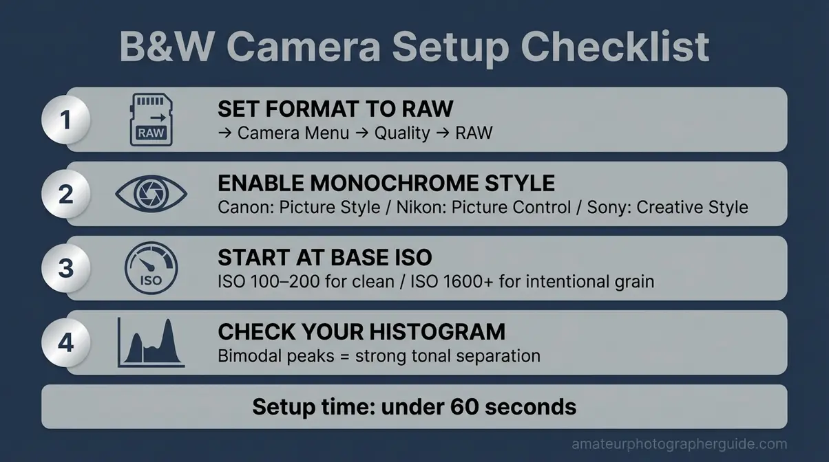
Caption: Keep this cheat sheet in your camera bag. The four-step setup takes less than 60 seconds and prevents common mistakes.
Shooting for Contrast, Texture & Light
B&W images rely on light and shadow for separation, making light direction the most critical variable (Adobe, 2026). Understanding why certain light conditions work is key.
The three most useful lighting conditions for B&W:
- Golden hour (sunrise/sunset): Directional, raking light creates long shadows and reveals surface texture. Ideal for landscapes and architecture.
- Overcast midday: Diffused, even light is useful for portraits, creating soft, even skin tones without distracting shadows.
- Harsh noon light: Deep shadows and intense highlights are effective for dramatic street photography with strong graphic contrast.
Directional light—light hitting a subject from the side—is key. A flat-lit wall looks dull. The same wall with side light reveals texture in every imperfection. Your histogram is a real-time contrast meter. A bimodal histogram—peaks at both ends—confirms the scene has tonal separation.
[ORIGINAL PHOTO: Side-lit texture example — brick wall or bark showing directional light creating shadow detail. Alt: Directional lighting technique for black and white photography showing texture in brick surface]
Caption: The same brick wall photographed with flat frontal light vs. directional side light — the difference in perceived texture is dramatic.
Using Color Filters (Film & Digital)
A colored filter lightens its own color and darkens its complementary color, giving you control over tonal separation. Ilford Photo confirms this core principle for B&W photography (Ilford Photo, 2026). Digital shooters get the same effect in Lightroom’s B&W Mix panel.
The three essential filters:
Red filter: Dramatically darkens blue skies, making white clouds pop. It also darkens skin tones, so use it carefully in portraits. Best for landscapes.
Yellow filter: Moderately darkens blue skies while producing natural-looking skin tones. It’s the most versatile and forgiving filter for beginners. As The Darkroom Lab notes, a red filter creates dramatic contrast, while a green filter lightens foliage (The Darkroom Lab, 2026).
Green filter: Lightens foliage and darkens red/orange tones. Ideal for nature photography, preventing greens from compressing into muddy mid-tones.
Caption: Each filter produces a distinct tonal response. The yellow filter (center) is the recommended starting point for beginners.
Getting Started with B&W Film Photography
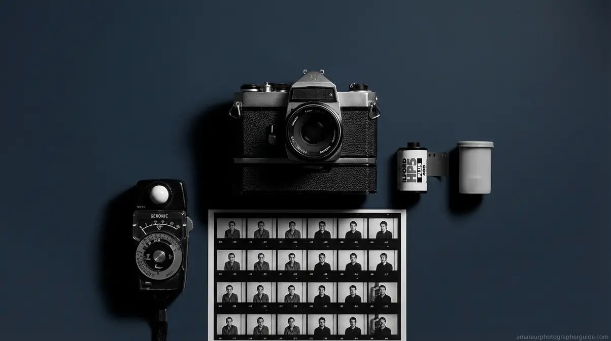
B&W film photography forces a deliberate approach that many photographers say improves their digital habits. Unlike digital, you can’t check your LCD or change ISO mid-roll. For beginners exploring these black and white film photography tips, this discipline is the reward.
How B&W Film Differs from Digital
The first thing to know is there’s no instant review. This reinforces The Monochrome Perception Shift, as you must pre-visualize every shot.
Grain versus noise is another key difference. Film grain is organic and often adds a tactile, cinematic quality. Digital noise is electronic and tends to look harsher.
Development adds a step: Post-processing begins at a lab. The workflow is: shoot → send to lab → receive scans → edit. Ilford Photo documents that dense negatives indicate overexposure, while thin negatives indicate underexposure (Ilford Photo, 2026).
Choosing Your First Film Stock
Three ISO 400 stocks dominate for beginners, offering versatility for various lighting conditions.
Kodak T-MAX 400: Fine grain for its speed, this is a cleaner, polished option with an excellent tonal range.
Ilford HP5 Plus: Offering approximately 12 stops of usable dynamic range (Ilford Photo, 2026), this stock is exceptionally forgiving. It has slightly more grain than T-MAX, with a classic quality photographers love. Shoot It With Film identifies HP5 Plus as the most forgiving beginner stock (Shoot It With Film, 2026).
Kodak Tri-X 400: More pronounced grain and a distinctive photojournalistic aesthetic. It’s slightly more demanding but iconic.
Recommendation: Start with Ilford HP5 Plus. Its exposure latitude is forgiving, recovering gracefully from minor exposure mistakes.
Essential Film Exposure Tips
- Expose for the shadows. Unlike digital, B&W film has more latitude in the highlights. Meter your shadows to ensure detail isn’t lost. Underexposed negatives lose shadow detail permanently.
- Use a light meter or the Sunny 16 rule. On a sunny day, set your aperture to f/16 and your shutter speed to the reciprocal of your ISO (e.g., ISO 400 = 1/500s).
- Bracket your exposures. Shoot at the metered exposure, then one stop over and one stop under. This is essential when learning to read light without an instant histogram.
8 Common B&W Photography Mistakes (and Fixes)
Most B&W photography problems are caused by the same eight mistakes, and every one is fixable. The most common error is treating monochrome as a post-shot filter, not a photographic intention, resulting in flat images. This section provides key black and white photography tips for beginners to avoid these pitfalls.
Mistakes #1-4: Planning & Shooting
Mistake #1 — Converting color to B&W without planning. This is the most damaging mistake. Fix: Apply The Monochrome Perception Shift before you shoot. If the scene doesn’t pass the Four Elements test in your mind, it won’t work on screen.
[ORIGINAL PHOTO: Rushed color-to-B&W conversion vs. planned B&W composition of the same scene. Alt: Black and white photography mistake showing unplanned color conversion compared to intentional monochrome composition]
Caption: One scene converted without planning, the other pre-visualized as B&W. The difference in impact is immediate.
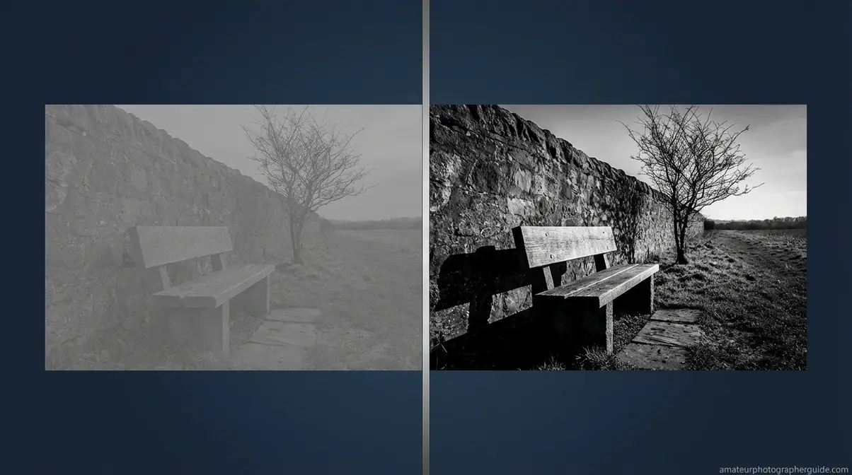
Mistake #2 — Not enough contrast (the flat/muddy result). Fix: Use your histogram. Look for tonal energy at both ends, not a compressed peak in the middle.
Caption: Left: a flat histogram, flat image. Right: bimodal histogram with tonal separation — same subject, different light.
Mistake #3 — Ignoring texture. Fix: If your subject is smooth and textureless, change your angle or find a new subject. Use the Four Elements framework as a pre-shoot filter.
[ORIGINAL PHOTO: Textureless flat subject vs. textured subject in same light. Alt: Black and white photography texture comparison showing flat subject versus textured bark with directional light]
Caption: Without texture, the absence of color leaves nothing to explore. With texture, the image gains dimensionality.
Mistake #4 — Not shooting RAW. Fix: Change your file format to RAW. JPEGs discard the color channel data that Lightroom’s B&W Mix panel needs. As Mastering Lightroom notes, a common mistake is adding too much global contrast, which crushes details (Mastering Lightroom, 2026).
[ORIGINAL PHOTO: RAW vs. JPEG editing flexibility example. Alt: Comparing RAW versus JPEG black and white editing flexibility in Lightroom B&W mix panel]
Caption: A RAW file retains full tonal adjustability in Lightroom; the JPEG is fixed at the in-camera conversion.
Mistakes #5-8: Composition & Editing
Mistake #5 — Poor composition. Color is a compositional tool that B&W removes. Fix: Rely on the rule of thirds, leading lines (fences, roads, shadows), or a strong silhouette. Photography Mad confirms that composition principles become more critical in B&W (Photography Mad, 2026).
[ORIGINAL PHOTO: Composition with no clear subject vs. image with strong leading line. Alt: Black and white photography composition showing poor subject placement versus effective leading line technique]
Caption: Without a leading line, the eye wanders. A single shadow-line transforms the scene into a directed experience.
Mistake #6 — Ignoring the histogram. Fix: Review the histogram after every important shot. A bi-modal spread indicates strong tonal separation; a far-right spike means clipped highlights.
[ORIGINAL PHOTO: Histogram comparison — compressed midtones vs. bi-modal distribution. Alt: Black and white photography histogram showing flat compressed midtones versus ideal bi-modal tonal distribution]
Caption: A compressed midtone peak in the histogram predicts a flat image every time.
Mistake #7 — Over-editing. Pushing the Contrast or Blacks sliders too far creates “crushed blacks” with no detail. Fix: Use the Tone Curve for precise control. Hold Alt/Option while dragging the Whites or Blacks slider to see where clipping begins.
Caption: Crushed blacks eliminate shadow detail permanently. The Tone Curve approach preserves it while adding drama.
Mistake #8 — Wrong subject choice. A red apple on green grass looks vivid in color but compresses to identical mid-grey tones in B&W. Fix: Squint before you shoot. If it looks flat, choose another subject.
[ORIGINAL PHOTO: Red apple on green grass — color vs. B&W comparison. Alt: Black and white photography subject choice mistake showing red apple on green grass converting to identical grey tones]
Caption: What looks vibrant in color can disappear in monochrome when tonal values are nearly identical.
Post-Processing Your B&W Images in Lightroom
The B&W Mix panel in Adobe Lightroom is the most powerful—and most overlooked—tool for beginner monochrome photographers. It gives precise tonal control that simple desaturation can never achieve. Mastering the B&W conversion panel and the Tone Curve permanently changes your results.
Converting to B&W in Lightroom
This Lightroom workflow is one of the most useful black and white photography tips. Adobe recommends using the dedicated B&W panel rather than desaturation, as it preserves tonal separation.
- Open the Develop module and click the B&W tab in the HSL/Color panel. Do NOT just drag the Saturation slider to -100 in the Basic panel; this is a crude desaturation that discards tonal nuance.
- Set your Black and White Points in the Basic panel. Hold Alt (Mac: Option) while dragging the sliders to see where clipping begins, ensuring you retain detail.
- Apply a gentle S-curve to the Tone Curve. Pull the highlights node up and the shadows node down. This adds precise contrast without crushing tones.
- Adjust Clarity (+10 to +25) to enhance mid-tone contrast and reveal texture, especially on portraits and architecture.
- Export as a full-resolution JPEG or TIFF.
Caption: Follow this five-step sequence. Setting Black/White points before the Tone Curve prevents double-adjustment.
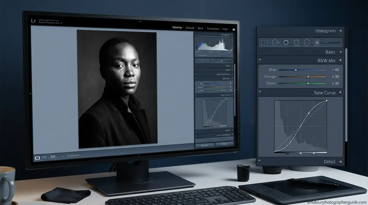
The B&W Mix Panel: Your Secret Weapon
The B&W Mix panel is where you decide how each color in the original scene translates to grey. Each slider controls a specific color channel, replicating what physical filters do in-camera. This is one of the best black and white photography tips for beginners in Lightroom.
Three slider combinations to know:
- Blue slider to -40: Sky darkens dramatically, making clouds pop. This is the digital equivalent of a red filter.
- Orange slider to +30: Skin tones lighten, making portraits look softer and more luminous.
- Green slider to +30: Foliage separates from shadows, giving landscapes dimensionality.
[ORIGINAL PHOTO: Screenshot of Lightroom B&W Mix panel with sliders adjusted. Alt: Lightroom B&W mix panel tutorial for black and white photography editing beginners]
Caption: Small slider movements produce significant tonal shifts. Start with small adjustments to avoid overcorrection.
When B&W Photography Works Against You
B&W is a creative choice, not a cure-all. Knowing when not to convert is part of developing technical judgment.
When B&W Makes Things Worse
Three scenarios produce poor B&W results:
Scenes with uniform tonal value, like a red apple on green grass, produce flat images because both colors compress to a similar grey.
Completely flat, overcast light with no strong subject leaves you without shadows or texture. There is no tonal contrast to work with.
Scenes where color tells the story—like food photography or product shots with branded colors—lose their meaning in B&W.
When to Look at Alternatives
If post-processing is overwhelming, start with JPEG + Monochrome mode. You lose editing flexibility but gain a simpler workflow to focus on composition and light.
If you like the film aesthetic but lab costs are a barrier, Fujifilm’s Acros film simulation delivers a convincing film-like look directly in-camera.
Frequently Asked Questions
What’s the Secret to B&W Photography?
The secret is learning to see tonal contrast, texture, and shape instead of relying on color. Strong B&W images use the interplay of light and shadow to create depth. Photographers who pre-visualize a scene in monochrome before shooting produce more dramatic and intentional results. This mental shift from color to tone is the skill that separates flat snapshots from compelling photographs.
What are common B&W photography mistakes?
The most common mistake is converting a color photo without planning the shot for monochrome. Other errors include insufficient contrast, ignoring texture, and not shooting in RAW, which limits editing control. Many beginners also over-edit in Lightroom, crushing shadow detail. Each mistake is avoidable by understanding that great B&W is planned, not accidental.
What subjects work best in B&W?
Subjects with strong textures, shapes, and tonal contrast translate best. Portraits work well because the absence of skin-tone color emphasizes expression. Architecture offers strong geometric lines and shadows. Dramatic landscapes—especially with heavy clouds or rugged terrain—also photograph powerfully. In general, look for scenes where light and form are the main story, not color.
How to take the perfect black and white photo?
To take a great B&W photo, set your camera to shoot RAW and enable Monochrome picture style. This lets you compose in B&W while preserving color data for editing. Focus on finding strong directional light that creates distinct shadows and reveals texture. Compose around shapes and lines, not color. Finally, always check your histogram after shooting to ensure a good tonal spread.
What is the 20-60-20 rule in photography?
The 20-60-20 rule describes the ideal tonal distribution for a compelling B&W image: 20% pure blacks, 60% mid-tones, and 20% pure whites. This creates a full tonal range that gives the image visual impact. Images skewed toward mid-tones appear flat. You can check this balance on your histogram and apply it during editing by adjusting your Blacks, Whites, and Tone Curve.
Best Time of Day for B&W Photos?
Golden hour—the first hour after sunrise and the last before sunset—is best for landscapes and architecture. The directional light creates long shadows and reveals surface texture. Overcast midday light works well for portraits, producing soft, diffused tones. Harsh noon light, while challenging, can create high-contrast street photography with deep, graphic shadows.
Conclusion
For amateur photographers, these black and white photography tips for beginners offer a path from accidental grayscale to intentional monochrome. The most important shift is cognitive: pre-visualizing a scene in terms of light, contrast, and shape—what we call The Monochrome Perception Shift—separates great B&W images from simple desaturated photos. Combine that mindset with the right camera settings and Lightroom’s B&W Mix panel, and the results will follow.
The frustration of a flat, muddy image comes from shooting in color and converting later. The Four Elements framework—Light, Contrast, Texture, Shape—gives you a concrete pre-shoot checklist. Run that checklist before every frame, and the gap between what you see and what you capture will close.
Take your camera out today with one goal: find a scene that passes the Four Elements checklist. Plan the frame in B&W before you press the shutter. One deliberate frame, processed with intention, teaches more than a hundred converted snapshots ever will.