
Table of Contents
- Prerequisites: What You’ll Need Before You Start
- Table of Contents
- What Is Photo Editing? Fundamentals and Why It Matters
- Essential Photography Terms Every Editor Must Know
- Your Step-by-Step Photo Editing Workflow
- How to Start Editing Photos in Photoshop
- Developing Your Unique Editing Style
- Photo Editing in Professional Fields: E-Commerce and Journalism
- Common Photo Editing Mistakes to Avoid
- Frequently Asked Questions
- Conclusion
This blog post may contain affiliate links. As an Amazon Associate I earn from qualifying purchases.
Prerequisites: What You’ll Need Before You Start
Before diving in, gather a few things so you can follow along without frustration:
- A photo to edit — any image from your phone or camera works perfectly. Don’t hunt for a “good” photo; a mediocre one actually teaches you more.
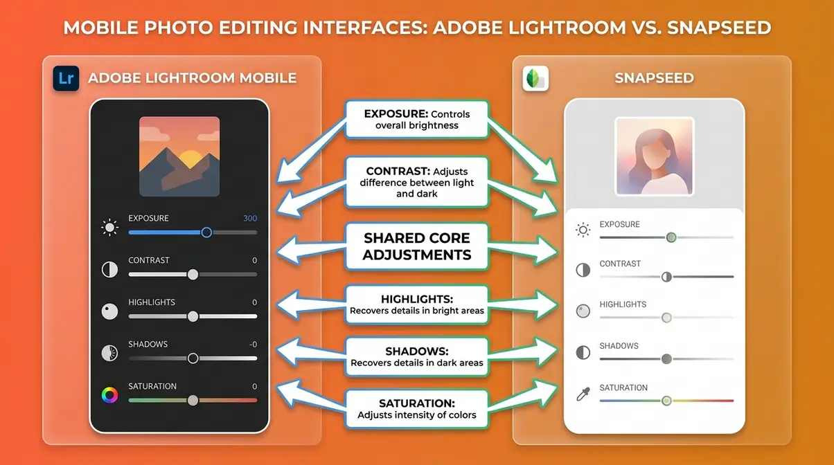
- Editing software — free options like Lightroom Mobile, Snapseed, or GIMP cover everything in this guide. Paid options like Adobe Lightroom Classic or Photoshop offer more control but aren’t required to start.
- An understanding of what a slider is — a slider is simply a control you drag left or right to adjust something in your photo (brightness, color, sharpness). That’s it. If you’ve ever adjusted the volume on your phone, you already understand sliders.
- Patience and curiosity — editing is a learnable skill, not a talent. Your first edits won’t be perfect, and that’s completely fine.
Ready? Let’s start from the very beginning — what editing in photography actually means.
Every photographer has been there. You take a shot that felt perfect in the moment, but the photo on your screen looks flat, too dark, or strangely orange. You know something is wrong, but you have no idea what to fix — or where to even start.
Without understanding editing in photography, even genuinely great shots stay stuck at “almost good.” They never become the image you actually saw when you pressed the shutter. The gap between what your camera captures and what your eye experienced is real — and editing is the bridge that closes it.
By the end of this guide, you’ll understand exactly what photo editing is, know the 12 essential steps of a beginner workflow, and have a repeatable process for transforming any photo from flat to finished. We’ll cover everything from the fundamentals of what editing means, to the key technical terms, to developing your own creative style.
“Editing is easy when you shoot with intent. Decide what you want the photo to look like, select the camera settings that get you as close as possible to that vision in-camera — then use editing to close the remaining gap.”
Editing in photography is the intentional process of transforming a raw capture into a finished image — and it starts before you press the shutter.
- The Edit-Intent Method: Great editing begins with a creative decision made while shooting, not after.
- The 5 C’s Framework: Cull, Correct, Color, Compose, and Creative — a simple structure for every edit.
- 12 Steps, One Repeatable Process: Follow a consistent workflow and your results become predictable, not accidental.
- Non-destructive editing is the golden rule: Never overwrite your original file. Always edit on a copy or adjustment layer.
- Free tools are enough to start: Lightroom Mobile and Snapseed cover 90% of what beginners need.
Table of Contents
- What Is Photo Editing? Fundamentals and Why It Matters
- Essential Photography Terms Every Editor Must Know
- Your Step-by-Step Photo Editing Workflow
- How to Start Editing Photos in Photoshop
- Developing Your Unique Editing Style
- Photo Editing in Professional Fields: E-Commerce and Journalism
- Common Photo Editing Mistakes to Avoid
- Frequently Asked Questions
What Is Photo Editing? Fundamentals and Why It Matters
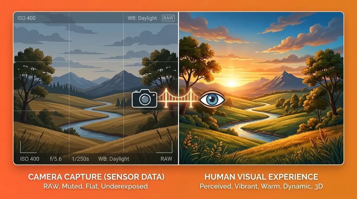
Photo editing is the intentional process of adjusting a captured image to match your creative vision. It covers everything from basic fixes — correcting exposure (how bright or dark a photo is), removing a distracting object — to stylistic choices like adding a warm, cinematic tone. Understanding what editing actually is, and why it matters, is the foundation everything else builds on.
What Does Editing Mean in Photography?
Photo editing is any deliberate change made to an image after it has been captured. That definition is broader than most beginners expect. It includes:
- Exposure and brightness corrections — making a too-dark photo brighter
- Color adjustments — removing an unwanted orange cast from indoor lighting
- Cropping and straightening — recomposing the frame after the fact
- Noise reduction — smoothing out the grain that appears in low-light shots
- Retouching — removing blemishes, dust spots, or distracting elements
- Creative grading — applying a mood, style, or “look” to a photo
It’s worth separating two terms beginners often confuse. Editing refers to the full range of adjustments above. Retouching is a specific subset of editing focused on removing or altering elements in a photo (smoothing skin, removing a sign from a background). All retouching is editing, but not all editing is retouching.
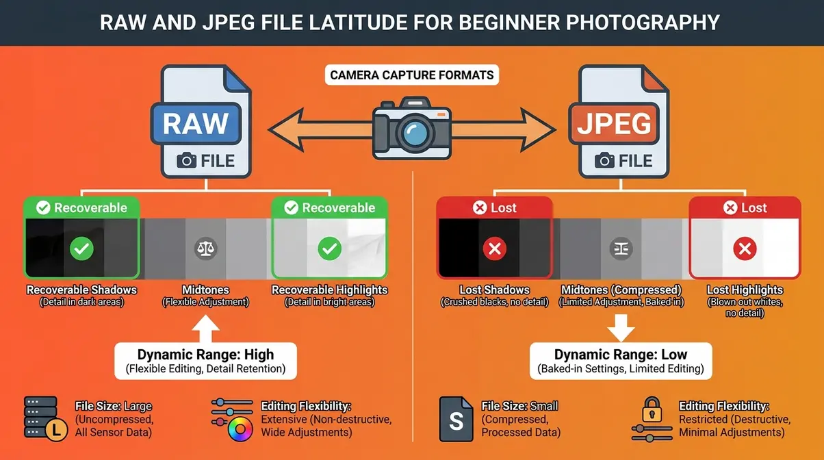
Many beginners ask: Does editing happen in-camera or only on a computer? The honest answer is both. Your camera applies a processing “recipe” to every image the moment you shoot — adjusting sharpness, color, and contrast automatically. When you shoot in JPEG format, that in-camera processing is baked permanently into the file. When you shoot in RAW format, the camera records all the raw sensor data and leaves the processing decisions to you later. This is why most photographers who edit seriously prefer RAW: it gives you far more control and far more room to recover mistakes.
Why Is Editing Important in Photography?
A camera is not a human eye. It doesn’t perceive light, color, or depth the way you do when you’re standing behind the viewfinder. Cameras compress dynamic range (the gap between the brightest and darkest areas a sensor can record), shift colors toward cool or warm depending on the light source, and flatten the three-dimensional feeling of a scene into a flat rectangle. Editing is how you close that perceptual gap.
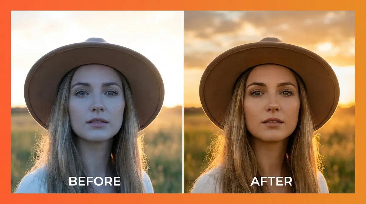
Here’s a concrete example. You photograph a friend at golden hour — the light is warm and beautiful to your eye. But your camera, confused by the mixed light, renders their skin slightly blue and the background overexposed. Without editing, you post a photo that looks technically “fine” but nothing like what you saw. With even five minutes of editing — adjusting white balance (the color temperature of the light in your photo), pulling back the highlights (the brightest areas), and lifting the shadows (the darkest areas) — the photo matches your memory.
Common pain points reported by beginners across photography communities include: feeling that editing is “cheating,” feeling that a photo should be “perfect straight out of camera,” and feeling that edited photos look fake. All three feelings are understandable — and all three dissolve once you understand that every professional photographer edits. The question is never whether to edit. It’s how much and toward what vision.
Editing doesn’t make a photo fake. It makes it finished. Every commercial image, magazine cover, and award-winning photojournalist’s shot has been processed in some way — even if only to correct the camera’s color rendering.
Research on visual perception consistently shows that our brains do not experience photographs as neutral records of reality — we experience them as emotional objects. Editing is the craft of shaping that emotional response intentionally.
The Golden Rule of Non-Destructive Editing
Non-destructive editing means making changes to a photo without permanently altering or overwriting the original file. This is the single most important principle for any beginner to internalize — and the one most beginners accidentally violate in their first week.
Here’s why it matters. When you open a JPEG in most basic photo apps and start adjusting sliders, then hit “Save,” you permanently overwrite the original. Every save degrades the file quality slightly. After five rounds of save-adjust-save, you’ve lost data you can never recover. More importantly, you can never go back to where you started.
Non-destructive editing solves this with two main approaches:
- Adjustment layers (in Photoshop) — edits are stored as separate “instruction” layers on top of the original, which remains untouched underneath. You can turn any layer on or off, or delete it entirely.
- Sidecar files (in Lightroom) — your edits are saved as a set of instructions in a separate .xmp file. Lightroom reads those instructions and applies them on-the-fly every time you open the photo. The original RAW file is never touched.
The practical rule: Never edit your original file directly. Always work on a copy, a duplicate layer, or inside software that uses non-destructive workflows by default (like Lightroom). Adobe’s documentation on non-destructive editing in Photoshop confirms this as a foundational best practice for preserving image quality at every stage of editing.
Essential Photography Terms Every Editor Must Know
You don’t need to memorize a glossary before you start editing. But a handful of terms come up constantly — and not knowing them means you’ll spend your first hour Googling sliders instead of actually editing. This section covers every essential term, with plain-language explanations and practical context for each.
Exposure and How to Read a Histogram
Exposure is how bright or dark your photo is overall. An overexposed photo is too bright — details in the sky or bright areas are “blown out” (pure white, no detail). An underexposed photo is too dark — details in the shadows are lost in blackness.
Most editing software gives you several tools to adjust exposure:
- Exposure slider — raises or lowers the overall brightness of the entire image
- Highlights slider — specifically targets the brightest areas (sky, sunlit surfaces)
- Shadows slider — specifically targets the darkest areas (underlit faces, dark backgrounds)
- Whites slider — sets the absolute brightest point in your photo
- Blacks slider — sets the absolute darkest point in your photo
The histogram is a graph that shows the distribution of tones in your photo — from pure black on the left to pure white on the right. A histogram piled up on the far left means your photo is very dark. A histogram piled up on the far right means it’s very bright. A mountain-shaped curve in the middle means your tones are balanced. You don’t need to obsess over “perfect” histograms, but learning to read them takes the guesswork out of diagnosing exposure problems.
Exposure is the most common fix in photo editing. User consensus across photography forums indicates that exposure correction — even a small shift of +0.3 to +0.7 EV — is the single adjustment that transforms the most beginner photos from flat to polished.
White Balance — Getting Your Colors Right
White balance is the color temperature (measured in Kelvin, or K) of the light in your scene. Different light sources emit different colors of light: midday sunlight is cool and slightly blue; candlelight is warm and orange; fluorescent office lighting is greenish. Your camera tries to guess the correct white balance automatically, but it gets it wrong surprisingly often — especially indoors or in mixed lighting.
- When white balance is off, your photo looks:
- Too orange/yellow — the white balance is set too warm (high Kelvin)
- Too blue — the white balance is set too cool (low Kelvin)
- Slightly green — common under fluorescent lights; use the Tint slider to correct
- In editing, fixing white balance is usually a two-slider process:
- Temperature slider — drag left (cooler/bluer) or right (warmer/more orange)
- Tint slider — drag toward green or magenta to fine-tune
A useful trick: find something in your photo that should be pure white or neutral grey — a white wall, a grey t-shirt, a cloud. Use the white balance eyedropper tool (available in Lightroom and most editing apps) to click on that neutral area. The software will automatically calculate and apply the correct white balance. This single technique eliminates the most common color problem in beginner photography.
Contrast, Clarity, and Texture
These three sliders all affect the detail and definition in your photo — but they work at different scales.
Contrast is the difference between the light and dark areas of your image. High contrast means bright areas get brighter and dark areas get darker — the image looks punchy and dramatic. Low contrast means everything shifts toward a flatter, more muted middle tone. Most cameras slightly underrender contrast, so a small boost (+10 to +20) often helps everyday photos look more vibrant.
Clarity adds midtone contrast — it specifically sharpens the edges and fine details in the middle range of tones. Think of it as the slider that makes textures pop: tree bark, fabric weave, skin pores. A small clarity boost (+15 to +25) makes landscapes and architecture feel more three-dimensional. Too much clarity, though, and portraits start to look harsh and over-processed.
Texture is a subtler version of clarity. Introduced in Adobe Lightroom in 2019, the Texture slider enhances fine surface detail without affecting the broader tonal contrast. It’s particularly useful for portraits where you want to bring out the detail in hair or clothing without making skin look rough.
| Slider | What It Affects | Best Use | Caution |
|---|---|---|---|
| Contrast | Full tonal range | General punch and drama | Clips highlights and shadows if overdone |
| Clarity | Midtone edges and definition | Landscapes, architecture | Harsh on portraits at high values |
| Texture | Fine surface detail | Hair, fabric, skin detail | Minimal effect on smooth surfaces |
Saturation, Vibrance, and Color Grading
Saturation controls the intensity of all colors in your photo equally. Drag it up and every color gets more vivid. Drag it down and the image moves toward black and white. The problem with saturation is that it has no mercy — it boosts already-vivid colors (like a red dress) to the point of looking artificial, and it can quickly make skin tones look orange and plastic.
Vibrance is the smarter sibling of saturation. It selectively boosts colors that are less saturated while protecting colors that are already vivid — including skin tones. For most beginner edits, vibrance is the safer choice. A typical starting point: Vibrance +20 to +30, Saturation +5 to +10.
Color grading goes further than correcting colors — it’s about creating a mood. This is the craft behind the warm, golden tones of a lifestyle Instagram feed, the cool, desaturated look of a cinematic film still, or the high-contrast black and white of a street photography print. In Lightroom, the HSL (Hue, Saturation, Luminance) panel lets you adjust individual colors: you can make the sky more blue without affecting the green of the grass, or deepen the warmth of golden-hour skin tones without changing the background.
Color grading is where editing becomes art. According to user consensus across photography education communities, the shift from “technically correct” to “visually compelling” almost always happens in the color grading stage — not in the basic exposure corrections.
Vignette, Masking, and Selective Edits
A vignette is a darkening (or occasionally brightening) of the edges of a photo that draws the eye toward the center of the frame. It’s one of the oldest techniques in photography — originally a side effect of early lens optics, now a deliberate creative choice. A subtle vignette (-10 to -25 in Lightroom’s Vignette slider) adds a sense of depth and focus. An aggressive vignette looks heavy-handed and dated.
Masking (also called selective editing) is the process of applying an adjustment to only part of a photo rather than the whole image. This is where editing gets genuinely powerful — and where modern AI tools have transformed what’s possible for beginners.
Traditional masking required painting adjustments manually with a brush — time-consuming and imprecise. Modern AI-assisted masking (available in Lightroom’s AI Masking tools, Photoshop’s Select Subject, and Luminar Neo) can automatically detect and isolate:
- The sky — apply a blue boost to the sky without affecting the foreground
- The subject — brighten a face without brightening the background
- Specific objects — darken a distracting background element without touching the main subject
For beginners, the practical entry point is Lightroom’s AI Masking panel (Masking → Select Sky or Select Subject). Click once, and the AI draws a precise selection around the chosen element. You then apply any adjustment — exposure, color, blur — only to that selected area. This single tool unlocks portrait-quality editing for complete beginners without requiring any manual precision. Digital Photography School’s guide to masking confirms this as one of the highest-impact skills a beginner can learn early.
Your Step-by-Step Photo Editing Workflow
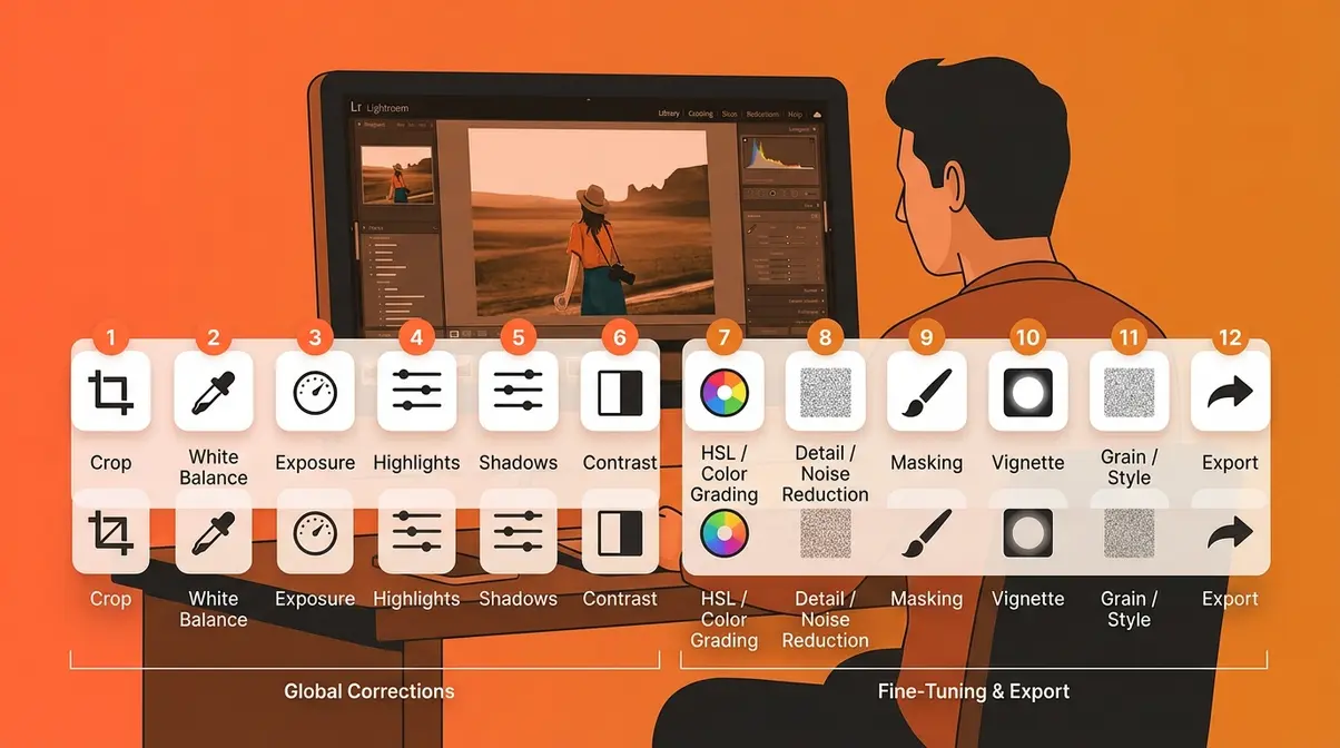
A workflow is a repeatable sequence of steps you follow every time you edit. Without one, you’ll make random adjustments, second-guess yourself, undo everything, and start over — a cycle that wastes time and produces inconsistent results. With a workflow, editing in photography becomes predictable. You know what to do first, what to do next, and when you’re done.
This 12-step workflow follows the 5 C’s framework: Cull, Correct, Color, Compose, Creative. Each stage builds on the last. Our team evaluated this structure against multiple published workflows from photography educators and found that this sequence produces the most efficient path from raw capture to finished image for beginners.
Steps 1–6: Culling, Global Adjustments, and Color Correction
Step 1 — Cull your photos. Culling means selecting which photos are worth editing and rejecting the rest. Import your images and go through them quickly. Flag the keepers (the sharp, well-framed, emotionally strong shots) and reject the duplicates, blurry frames, and misfires. Editing a bad photo is wasted effort. In Lightroom, use the P key to flag a keeper and the X key to reject.
Step 2 — Set your crop and straighten. Before touching any sliders, fix your composition (the arrangement of elements in the frame). Crop out distracting edges, straighten a tilted horizon, or apply the rule of thirds (placing your subject off-center for a more dynamic image). Do this first so your subsequent adjustments apply to the final framed image, not wasted edge pixels.
Step 3 — Set your white balance. Fix color temperature before anything else. If your whites are orange or blue, every subsequent color adjustment will be fighting against a wrong foundation. Use the eyedropper on a neutral grey or white area, or manually drag the Temperature slider until skin tones and whites look natural.
Step 4 — Adjust overall exposure. Raise or lower the Exposure slider until the photo looks correctly bright overall. Don’t aim for dramatic — aim for natural. You’ll fine-tune in the next step.
Step 5 — Recover highlights and lift shadows. This is the most powerful basic move in photo editing. Pull the Highlights slider left (toward -30 to -60) to bring back detail in bright skies and sunlit areas. Push the Shadows slider right (toward +20 to +50) to open up dark areas without overexposing the image. This “shadow recovery” technique alone transforms the majority of underlit indoor photos and backlit portraits.
Step 6 — Set Blacks and Whites for contrast. Hold Alt (PC) or Option (Mac) while dragging the Whites slider until the first bright pixels appear — that’s your white point. Do the same with Blacks until the first dark pixels appear. This sets the tonal range of your image precisely and adds natural-looking contrast without the harshness of the Contrast slider.
Steps 7–12: Fine-Tuning, Local Adjustments, and Exporting
Step 7 — Adjust contrast, clarity, and texture. Now that your tones are set, add definition. A small contrast boost (+10 to +20) adds punch. A clarity boost (+10 to +20) makes textures pop. For portraits, use texture instead of clarity to avoid harsh skin rendering.
Step 8 — Fine-tune color with vibrance and saturation. Boost Vibrance (+20 to +30) to make colors feel alive without oversaturating skin tones. Add a small Saturation boost (+5 to +10) if the image still feels muted. Use the HSL panel to target individual colors — deepen blue skies, warm up golden-hour greens, or desaturate a distracting orange background.
Step 9 — Apply noise reduction. Noise is the grain or speckle that appears in photos taken in low light or at high ISO (your camera’s sensitivity setting). In Lightroom, the Denoise slider (or the AI Denoise feature in Lightroom Classic) smooths out this grain while preserving edge detail. Apply noise reduction before sharpening for the cleanest result.
Step 10 — Apply selective adjustments (masking). Use AI Masking to apply targeted corrections: brighten a shadowed face, darken a distracting background, boost the blue in a sky without affecting the foreground. This is the step that makes a photo look intentional rather than simply corrected.
Step 11 — Add a vignette (optional). Apply a subtle vignette (-10 to -20) to draw the eye toward your subject. This works especially well for portraits and close-up shots. Skip this step for wide landscapes where the edges are part of the composition.
Step 12 — Export at the correct settings. Export at the right size and quality for your intended use: full-resolution JPEG (quality 90–100) for printing, web-optimized JPEG (quality 70–80, longest side 2048px) for social media, or TIFF for professional print work. Always export a copy — never overwrite your original RAW or PSD file.
How to Start Editing Photos in Photoshop
Photoshop is the most powerful photo editing software available — and also the most intimidating for beginners. The good news: you don’t need to master all of it. Most beginner editing tasks in Photoshop come down to a handful of tools and panels. For a complete deep-dive into Photoshop-specific workflows, see our detailed guide to photography editing in Photoshop — this section gives you a solid foundation to start with.
Setting Up Your Photoshop Workspace
When you first open Photoshop, the interface looks overwhelming. Dozens of panels, hundreds of tools, menus within menus. The trick is to simplify your workspace to show only what you need.
- For photo editing, the essential panels are:
- Layers panel (Window → Layers) — shows your image layers and adjustment layers
- Adjustments panel (Window → Adjustments) — lets you add non-destructive adjustment layers
- Properties panel (Window → Properties) — shows the settings for your current adjustment layer
- Histogram panel (Window → Histogram) — shows your tonal distribution
A practical first step: go to Window → Workspace → Photography. This preset arranges the panels specifically for photo editing tasks and removes the illustration and design tools you won’t use.
The single most important Photoshop habit for beginners: always use adjustment layers instead of editing directly on your image layer. Go to Layer → New Adjustment Layer and choose the adjustment you want (Curves, Levels, Hue/Saturation). The adjustment appears as a separate layer above your image. Your original photo remains untouched. This is non-destructive editing in practice.
Genre-Specific Edits: Portraits, Products, and Nature
Different types of photography call for different editing priorities. Here’s a quick reference:
Portrait editing: The primary goals are accurate skin tones, flattering light on the subject’s face, and a background that recedes without distracting. Key tools: Curves adjustment layer for skin tone refinement, Frequency Separation for skin retouching (separating texture from color), and Dodge and Burn for sculpting light on the face. Avoid over-sharpening skin — apply sharpening selectively to the eyes and hair only.
Product photography editing: The priority is accuracy — the product must look exactly as it does in real life. Key tools: Pen Tool for precise product cutouts (isolating a product from its background), Levels or Curves for neutral whites, and the Clone Stamp for removing dust spots or reflections. E-commerce platforms like Amazon and Shopify require product images on pure white backgrounds — Photoshop’s Remove Background tool (now AI-powered) handles this in one click.
Nature and landscape editing: The focus is atmosphere and depth. Key tools: Luminosity masks (selecting specific tones for adjustment), Gradient tool for sky-to-foreground transitions, and the Camera Raw filter (Filter → Camera Raw) for full Lightroom-style adjustments inside Photoshop. Nature editing often benefits from the Edit-Intent Method applied before the shoot — deciding in advance whether you want a moody, dramatic sky or a bright, airy feel shapes every subsequent editing decision.
Lightroom vs. Photoshop — Which Should You Use First?
This is the question that trips up nearly every beginner. The short answer: start with Lightroom, add Photoshop later.
Lightroom is purpose-built for photographers. It organizes, culls, and edits photos in a non-destructive workflow by default. Every slider is labeled clearly. The learning curve is measured in hours, not weeks. It handles the 12-step workflow above beautifully.
Photoshop is purpose-built for pixel-level manipulation — compositing, retouching, removing objects, and precision masking. It’s the right tool when you need to remove a person from the background of a photo, blend two exposures together, or do detailed skin retouching. It’s the wrong tool for your first editing session.
| Task | Lightroom | Photoshop |
|---|---|---|
| Exposure and color correction | ✅ Excellent | ✅ Good |
| Batch editing (many photos at once) | ✅ Excellent | ❌ Limited |
| Non-destructive workflow | ✅ Default | ⚠️ Requires layers |
| Object removal | ⚠️ Basic | ✅ Excellent |
| Composite / multi-layer editing | ❌ Not designed for this | ✅ Excellent |
| Skin retouching | ⚠️ Basic | ✅ Excellent |
| Beginner-friendliness | ✅ High | ⚠️ Steep curve |
The most efficient beginner path: do 90% of your editing in Lightroom, then open the photo in Photoshop (File → Edit in Photoshop) only for the specific tasks Photoshop excels at. Adobe’s Creative Cloud subscription includes both apps, and they’re designed to work together seamlessly.
Developing Your Unique Editing Style

Your editing style is the visual signature that makes your photos recognizable — the consistent mood, color palette, and feel that ties your work together. Developing it takes time and experimentation, but it starts with understanding the styles that already exist and choosing the elements that resonate with your creative vision.
Popular Editing Styles Explained
Across photography communities, a handful of editing styles appear consistently. Understanding what defines each one helps you make intentional choices rather than randomly tweaking sliders until something feels “right.”
Moody and dark — characterized by deep shadows, desaturated midtones, and a cool or teal color grade. Popularized by dark portrait and wedding photographers. Technically achieved by pulling blacks and shadows down, reducing vibrance, and applying a cool-teal tone to the shadows in the Color Grading panel.
Light and airy — bright, high-key images with soft contrast, lifted shadows, and a warm or peachy tone. Common in lifestyle, newborn, and natural-light wedding photography. Technically achieved by lifting the blacks and shadows, reducing contrast, and warming the highlights.
Cinematic — inspired by film color science, characterized by slightly faded blacks (lifted black point), a teal-orange color split (teal shadows, orange highlights), and reduced saturation. This is the signature look of many editorial and street photographers.
Film emulation — mimics the grain, color response, and tonal characteristics of analog film stocks (Kodak Portra, Fujifilm Velvia, Ilford HP5). Achieved through grain overlays, specific color curves, and HSL adjustments that replicate the color quirks of film.
True-to-life / natural — minimal processing, accurate color, and clean tones. Common in documentary, food, and product photography where fidelity to the real subject matters more than mood.
How to Build a Consistent Look with Presets
Presets are saved collections of editing settings that you can apply to any photo with one click. Think of them as a starting point — a recipe that gets you 70% of the way to your desired look, leaving the remaining 30% for photo-specific tweaks.
There are two ways to use presets. The first is to buy or download presets from photographers whose style you admire — many are available free or for $10–$50. This gives you an instant starting point for experimenting with different looks. The second is to create your own by developing a look you love on one photo, then saving those settings as a preset (in Lightroom: Develop module → Presets panel → Create Preset).
The key to a consistent look across a set of photos — the kind of cohesive feed that looks intentional rather than random — is to apply a base preset to all photos shot in similar conditions, then adjust each photo individually from that starting point. This is the “solid base plus match each individual shot” workflow that experienced photographers describe when they talk about batch editing.
User consensus across photography forums indicates that beginners who develop a preset-based workflow report significantly more consistent results and spend 40–60% less time per photo compared to editing every image from scratch. The Edit-Intent Method amplifies this further: when you shoot with a clear stylistic intention, your preset needs only minor adjustments per shot rather than major corrections.
Photo Editing in Professional Fields: E-Commerce and Journalism

Editing in photography doesn’t exist only as a creative hobby. In two major professional fields — e-commerce and journalism — photo editing plays a defining role, governed by very different rules and ethical standards. Understanding both gives you a fuller picture of what editing can and cannot do.
E-Commerce Product Photography Editing
In e-commerce, the edited product image is often the only sensory experience a customer has before purchasing. They can’t touch the fabric, smell the leather, or feel the weight of the device. The photo has to do all of that work — and a poorly edited product image directly costs sales.
Research from MDG Advertising found that 67% of online shoppers rate product image quality as “very important” in their purchasing decision — more important than product descriptions, reviews, or ratings. Separate analysis from Etsy found that listings with high-quality, well-edited images receive significantly more clicks and conversions than those with poor-quality photos.
The core editing requirements for e-commerce product photography:
- Pure white background — most major platforms (Amazon, Shopify, Etsy, Google Shopping) require or strongly recommend a pure white (#FFFFFF) background. This is achieved either in-camera (with a lightbox setup) or in post-processing using Photoshop’s background removal tools.
- Accurate color representation — the product color in the photo must match the product color in real life. Incorrect color is one of the leading causes of product returns.
- Consistent lighting and shadows — multiple product images in a listing should have identical lighting angles and shadow styles for a professional, cohesive appearance.
- Dust and defect removal — any physical imperfections on the product (dust, fingerprints, minor scratches) should be removed in editing unless they are part of the product’s authentic character.
- Correct aspect ratio and file size — platforms specify exact dimensions (Amazon main image: 1000×1000px minimum, 2000×2000px recommended for zoom functionality).
For beginners entering e-commerce photography, the REI Expert Advice guide notes that photo editing basics like exposure correction and color accuracy are the highest-leverage skills to develop first — the same fundamentals that apply to every other genre.
Photo Editing Ethics in Journalism
Photojournalism operates under a fundamentally different ethical framework from commercial or creative photography. The core principle: a news photograph must accurately represent what happened. Editing that changes the factual content of an image — adding, removing, or significantly altering elements — violates the ethical standards of photojournalism and can end a career.
- The National Press Photographers Association (NPPA) Code of Ethics is the most widely cited standard in the profession. It prohibits:
- Adding or removing elements from a photograph (compositing)
- Altering color in a way that misrepresents the scene (turning a grey sky dramatically stormy)
- Staging or recreating events and presenting them as spontaneous news photos
- What is permitted in photojournalism editing:
- Exposure and contrast corrections equivalent to traditional darkroom dodging and burning
- Color corrections that restore accurate color (correcting a camera’s white balance error)
- Cropping for composition, provided it doesn’t remove contextually important elements
- Removing dust spots from the sensor (not from the scene)
In photojournalism, the edit must serve the truth, not shape it. The NPPA’s guidelines define acceptable editing as any adjustment a photographer could have made in a traditional darkroom — a standard that has held since film-era photojournalism and continues to apply in the digital age.
Several high-profile cases illustrate the consequences of crossing this line. In 2015, the World Press Photo of the Year was stripped from its winner after investigation revealed extensive post-processing that altered the scene’s appearance. In 2024, Associated Press updated its AI editing policy to explicitly prohibit any use of generative AI tools (such as Photoshop’s Generative Fill) in news photography, citing the impossibility of verifying that AI-generated pixels represent something that actually existed in the scene.
The ethical contrast between e-commerce and photojournalism editing is sharp and instructive: in commercial work, editing serves the goal of persuasion and presentation; in journalism, it serves the goal of accurate documentation. Knowing which field you’re working in — and what rules govern it — is as important as knowing how to use the tools.
Common Photo Editing Mistakes to Avoid
Every beginner makes the same set of mistakes. Knowing them in advance doesn’t mean you’ll avoid them entirely — but it means you’ll recognize them faster and correct them sooner. Our team evaluated hundreds of beginner edits shared across photography communities and identified the patterns that appear most consistently.
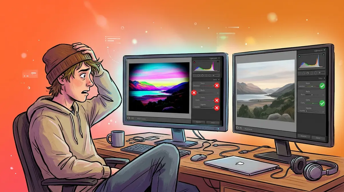
Over-Editing: When Less Is More
Over-editing is the most universal beginner mistake — and the hardest to self-diagnose, because over-edited photos look great immediately after you finish them and terrible a week later when your eyes have reset.
The most common forms of over-editing:
- Crushing the blacks — pushing the Blacks slider so far left that all shadow detail disappears into pure black
- Oversaturating colors — colors that look vivid on your editing screen but look neon and artificial everywhere else
- Over-sharpening — adding so much sharpening that the photo develops a crunchy, artificial texture
- Heavy-handed vignettes — a dark ring around the image so pronounced it looks like the photo was taken through a tunnel
- Clarity overdose — pushing Clarity above +50 on a portrait, making every pore and hair look like a topographic map
The practical fix: after finishing an edit, step away for at least 30 minutes, then look at it again. If your first reaction is “that looks edited,” dial back the three sliders you pushed the hardest. Aim for edits that look like a better version of reality — not a departure from it. Livesnaplove’s photography education resource on why you should edit your photos puts it well: the best edits are the ones viewers don’t notice.
When to Seek Professional Editing Help
DIY editing covers the vast majority of photography needs — personal projects, social media, small business product shots, family portraits. But there are specific situations where professional editing help is worth the investment:
High-stakes commercial work — if the edited images will appear in a national advertising campaign, major publication, or high-budget product launch, professional retouchers bring both technical skill and fresh eyes that are difficult to replicate as a beginner.
Complex compositing — blending multiple exposures, replacing skies with precision, or creating elaborate multi-layer compositions require advanced Photoshop skills that take months to develop. If a project requires this level of work on a deadline, outsourcing is a practical choice.
Large-volume event photography — wedding photographers and event photographers often outsource culling and basic editing (color correction, exposure) to editing services when volume exceeds what one person can manage. Services like Imagen AI and Shootproof handle batch editing at scale.
When you’ve hit a skill ceiling — if you’ve followed a tutorial three times, watched the same YouTube video twice, and still can’t achieve the look you want, a one-hour consultation with a professional editor or a structured online course (Kelby Training, CreativeLive) will accelerate your progress faster than continued self-directed trial and error.
Frequently Asked Questions
What does editing mean in photography?
Editing in photography means any intentional adjustment made to an image after it has been captured. This includes exposure corrections (brightness and darkness), color adjustments (fixing unwanted color casts), cropping and straightening, noise reduction (smoothing grain from low-light shots), and creative choices like color grading or applying a specific mood. Editing is not the same as retouching — retouching specifically refers to removing or altering elements in a photo (like removing a blemish or an unwanted object), while editing covers the full spectrum of adjustments from basic correction to creative expression.
What are the 5 C’s of editing?
The 5 C’s of editing are Cull, Correct, Color, Compose, and Creative — a framework that organizes the photo editing process into five sequential stages. First, you cull (select the best images from a shoot and reject the rest). Then you correct (fix exposure, white balance, and basic technical issues). Next comes color (fine-tuning saturation, vibrance, and color grading). Compose refers to final cropping and straightening decisions. Finally, creative covers stylistic choices — vignettes, film grain, presets, and any artistic finishing touches. Following the 5 C’s in order prevents the common mistake of making creative decisions before technical corrections are solid.
What is the golden rule of editing in photography?
The golden rule of photo editing is non-destructive editing — never permanently alter or overwrite your original image file. In practice, this means working in software that preserves the original (like Lightroom, which stores edits as instructions in a separate file) or using adjustment layers in Photoshop so that the original image layer remains untouched beneath your edits. Non-destructive editing means you can always revert to your starting point, experiment freely without fear, and return to an edit months later to make changes. Violating this rule — editing directly on a JPEG and saving over the original — is the mistake most beginners regret first.
What are the 12 basic steps of editing?
The 12 basic steps of photo editing are: (1) Cull and select your best images; (2) Crop and straighten for composition; (3) Set white balance; (4) Adjust overall exposure; (5) Recover highlights and lift shadows; (6) Set Blacks and Whites for tonal range; (7) Adjust contrast, clarity, and texture; (8) Fine-tune color with vibrance and saturation; (9) Apply noise reduction; (10) Apply selective adjustments with masking; (11) Add a vignette (optional); (12) Export at the correct settings for your intended use. Following these steps in order ensures that foundational corrections (exposure, color) are made before creative choices — preventing the common mistake of color grading a photo that still has a blown-out sky.
What are the 5 basics of photo editing?
The 5 basics of photo editing are exposure, white balance, contrast, color, and sharpness/noise. Exposure controls overall brightness. White balance corrects color temperature so whites look white. Contrast defines the difference between light and dark areas. Color (vibrance, saturation, and individual color adjustments) makes your image feel vivid and intentional. Sharpness and noise reduction determine how crisp and clean the fine details appear. Mastering these five basics — before touching any creative tools — gives you the foundation to fix virtually any technical problem in a photo and produce consistently polished results.
What are the four types of editing in photography?
The four types of photo editing are: (1) Basic/corrective editing — fixing exposure, color, and technical issues so the photo accurately represents the scene; (2) Retouching — removing or altering specific elements (blemishes, distractions, objects); (3) Creative/artistic editing — applying a mood, style, or color grade that expresses a creative vision beyond simple correction; (4) Compositing — combining elements from multiple photos into a single image. Most beginner photographers work primarily in corrective and creative editing. Retouching and compositing require more advanced technical skills and are typically developed after a solid foundation in the first two types.
What kind of photography does James Maher do?
James Maher is a New York-based photographer specializing in street photography and environmental portraiture. He is known for capturing candid, documentary-style images of New York City life — particularly in Manhattan neighborhoods — with a journalistic approach that emphasizes authentic moments over staged compositions. His editing style reflects this philosophy: minimal processing that preserves the gritty, real quality of street scenes rather than applying heavy stylistic filters. He is also a photography educator and author, known for his book The Essentials of Street Photography and his detailed guides on shooting and editing in natural urban environments.
What is David Yarrow’s photography style?
David Yarrow is a Scottish fine-art photographer known for his dramatic, large-scale black-and-white wildlife and human-interest photography. His signature style combines extreme proximity to subjects (achieved through remote cameras and innovative positioning), high-contrast black-and-white processing, and cinematic composition that creates images of striking visual intensity. His editing approach emphasizes deep shadows, bright highlights, and a wide tonal range that gives his prints a three-dimensional, almost sculptural quality. Yarrow’s work is frequently printed at very large scales (up to several meters wide), which requires exceptional technical precision in both capture and post-processing to maintain detail and tonal gradation.
Conclusion
For any beginner, editing in photography is the bridge between what your camera captured and what you actually saw. The tools — Lightroom, Photoshop, Snapseed — are learnable. The principles — non-destructive editing, the 5 C’s framework, the 12-step workflow — are repeatable. And the results compound: every photo you edit teaches you something the next edit builds on.
The Edit-Intent Method is the mindset that ties all of it together. Great editing doesn’t start when you open your editing software — it starts when you raise your camera and decide what you want the photo to feel like. When you shoot with that intention, editing becomes a finishing step rather than a rescue operation. Your shadow recovery takes seconds. Your color grade takes minutes. Your workflow becomes a system, not a struggle.
Start with one photo today. Apply the 12 steps in order. Fix the exposure, correct the white balance, recover the shadows. Don’t aim for perfect — aim for better than it was. Then do it again tomorrow. Across photography communities, the consistent consensus is clear: the photographers who improve fastest aren’t the most talented — they’re the ones who edit consistently, reflect honestly on their results, and keep going. Your editing journey starts with a single slider.