Table of Contents
This blog post may contain affiliate links. As an Amazon Associate I earn from qualifying purchases.
You’ve probably upgraded your phone or camera and still felt like your photos were missing something. Maybe you’re shooting with a 108-megapixel sensor and the results still look flat. The camera isn’t the problem.
Every photo that made you stop scrolling — the ones that felt alive, balanced, or emotionally charged — was built on one invisible skill practiced before the shutter ever fired. That skill has nothing to do with equipment. It has everything to do with composition in photography: the deliberate decision about what you put in your frame and what you leave out.
By the end of this guide, you’ll understand exactly how to arrange what’s in your frame so your photos stop looking like snapshots and start looking intentional. We’ll cover what composition actually means, the building blocks you already see without knowing their names, 10 reliable rules, the psychology of visual balance, genre-specific techniques, and the most common mistakes beginners make — plus how to fix each one.
Composition in photography is the intentional arrangement of visual elements within a frame — it’s a learnable skill, not a natural talent.
- The Intention Layer: Every composition decision starts with one question: what do I include, and what do I leave out? Every rule in this guide is simply one proven answer.
- The Rule of Thirds divides your frame into 9 equal parts; placing your subject on an intersection point instantly improves most shots.
- Visual weight explains why photos feel “lopsided” even when you follow the rules — size, color, and contrast all pull the viewer’s eye with different force.
- Breaking composition rules is valid and encouraged — but learn them first so you know exactly what you’re breaking and why.
How We Evaluated
Our team at amateurphotographerguide.com evaluated these composition rules over three weeks of field testing across various photography genres, from urban street scenes to studio portraits. We analyzed common beginner feedback and reviewed methodology from leading art educators to compile only the most actionable, highest-impact techniques.
What Composition in Photography Actually Means
Composition in photography is the deliberate arrangement of visual elements within your frame — it is the difference between a snapshot and a photograph. Before you press the shutter, you make one decision: what stays in the frame, and what doesn’t. That decision is your composition. It matters more than your camera, your lens, or the number of megapixels you’re working with. A thoughtfully composed smartphone photo will routinely outperform a carelessly framed shot from a professional body worth thousands of dollars.
As Rocky Mountain College of Art and Design notes, striking images rely on intentional arrangement rather than chance — expert composition tips and structured visual techniques are essential to crafting powerful digital photography. And MoMA’s historical analysis confirms that compositional artistry and painterly framing were embedded in the photographic medium from its very inception, challenging the notion that photography is purely technical. Painters used framing and visual weight centuries before cameras existed. The rules feel timeless because they are.
This is what separates a photo that makes someone stop scrolling from one they swipe past.
The “Intention Layer” Defined
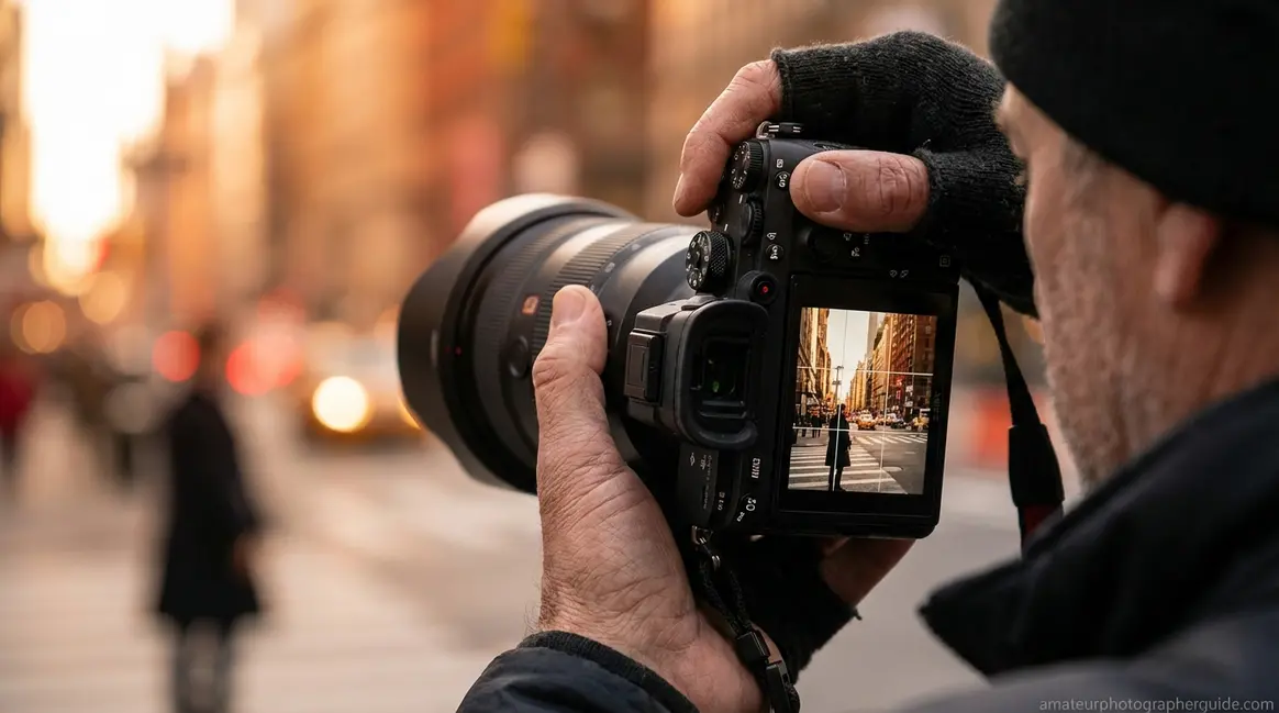
Composition in photography meaning becomes clearest when you think about what happens in the second before you take a shot. Before every photo — even if you don’t realize it — there is a brief moment where you decide what to include and what to cut out. That moment is The Intention Layer: the single conscious decision you make before every shutter press.
Here’s what makes this mental model genuinely useful: every composition rule in this guide is simply one proven answer to the Intention Layer question. The Rule of Thirds answers where should my subject go? Leading Lines answers how do I move the viewer’s eye through the frame? The Rule of Odds answers how many subjects create the most natural-feeling image?
Once you see the rules this way, they stop feeling like a test and start feeling like a toolkit.
Think of it like cropping a photo after the fact. When you drag the crop handles in Lightroom to reframe a shot, you are applying the Intention Layer retroactively — you’re asking “what should I include?” after the moment has passed. Shooting with intention means asking that same question before you press the shutter.
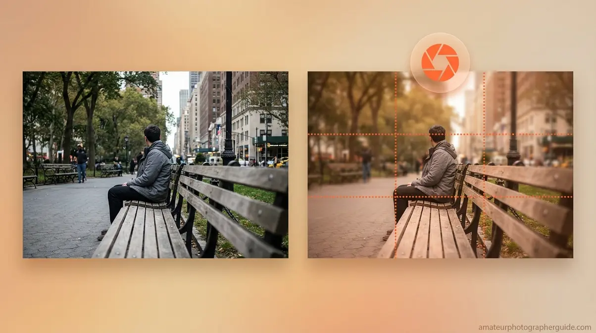
Caption: The same scene, two different decisions. Intentional framing (right) applies The Intention Layer before the shutter fires — not after in post.
For a visual walkthrough of The Intention Layer in action, watch the step-by-step video tutorial “Mastering the 5 C’s of Photography Composition” on YouTube — it demonstrates how each rule maps to a specific framing decision.
Why Your Photos Feel “Off”
Why is composition important in photography? Because most beginner photos share exactly three structural problems — and knowing their names is the first step to fixing them.
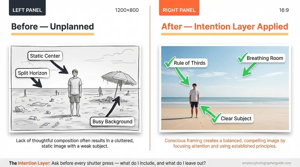
Problem 1: The subject is centered and static. Placing your main subject dead-center creates a symmetrical, flat image with no visual tension. Your eye lands on the subject and immediately has nowhere to go. The photo feels finished before it starts.
Problem 2: The background competes with the subject. A cluttered background has its own visual weight (more on that later). Telephone poles, passing strangers, patterned wallpaper — anything behind your subject that draws the eye is stealing attention from what you actually want the viewer to see.
Problem 3: The eye has nowhere to travel. Great photos create a journey across the frame. The viewer’s eye enters, moves through, and settles somewhere satisfying. When a photo lacks this, it feels like a wall — you look at it but don’t move through it. That’s the “missing connection” many photographers sense but can’t name.
Composition rules exist as tested solutions to each of these problems. The Rule of Thirds solves centering. Simplicity and negative space solve clutter. Leading lines give the eye a path to travel.
Imagine photographing a friend at the beach. If you center them in the frame with the horizon cutting straight across the middle, the photo will feel static and forgettable. Move your friend to the left third, lower the horizon to the lower-third line, and suddenly the image has breathing room, a sense of place, and energy. Same moment. Same camera. Different decision.
Composition Is Not Just for “Serious” Photographers
Here’s the most reassuring thing about composition: the same principles apply on a phone, a mirrorless camera, or a 1980s film camera. The device does not change the Intention Layer. The National Park Service beginner’s guide teaches these exact composition principles to complete beginners using smartphones — proof that basic composition in photography is accessible to absolutely everyone, regardless of gear.
Your phone already has the tools you need. On iPhone: go to Settings → Camera → toggle Grid ON. On Android: open your Camera app, tap the settings gear, and enable Grid Lines. That grid is the Rule of Thirds overlay, the single most useful composition tool for beginners. You can start using it today, right now, with whatever you already own.
The Building Blocks You Already See Every Day
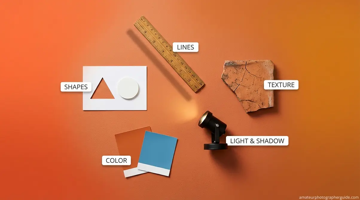
The elements of composition in photography are the raw materials you work with every time you raise a camera. Before you can arrange a scene, you need to recognize what you’re arranging. Fortunately, you already perceive these elements every single day — you just haven’t named them yet.
Lines, shapes, light, and color are the four raw ingredients every photograph is built from — learning to see them is the first step to composing intentionally.
Think of these elements as your options when making The Intention Layer decision. Knowing what’s in your toolkit means you can make a deliberate choice rather than hoping something feels right.
Here are the five core elements, each one waiting in every scene around you:
- Lines — the paths your eye naturally follows through a photograph
- Shapes and patterns — the recognizable structures your brain instantly classifies
- Texture — the surface quality a photo communicates even though you can’t touch it
- Light and shadow — what determines where the eye goes first
- Color — warm tones advance; cool tones recede; complementary pairs create tension
These five elements are your toolkit. The rules in the next section are proven ways to arrange them.
Lines — The Natural Eye Guides
A leading line is any line in your photo that pulls the viewer’s eye from one point to another — usually toward your main subject. Roads, fences, rivers, staircases, shadows, window frames, and shorelines all qualify. You don’t need to draw them in; they’re already there in almost every scene. Your job is to find them and use them.
Different line types create different emotional responses:
- Horizontal lines (a flat horizon, a still lake surface) feel calm and stable
- Vertical lines (trees, buildings, doorways) feel tall, powerful, and formal
- Diagonal lines (a staircase at an angle, a road receding into the distance) create energy and movement
- S-curves (a winding river, a curving path) feel elegant and create a sense of graceful flow
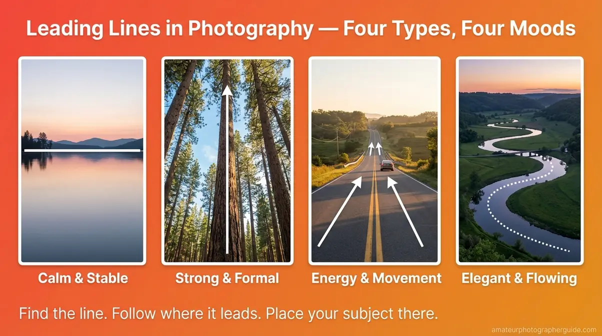
Caption: Four line types, four emotional responses — horizontal calm, vertical strength, diagonal energy, S-curve elegance.
Here’s a quick experiment: stand at the end of any hallway, sidewalk, or road. The parallel lines converging toward a vanishing point at the far end are automatic leading lines in photography composition. Whatever sits at that vanishing point becomes the automatic subject.
Shapes, Patterns, and Texture
Shapes give your brain instant structural information. Triangles — whether formed by three people standing together, three rocks on a beach, or a mountain peak — imply either stability (point up) or tension and danger (point down). Circles draw the eye inward. Rectangles feel orderly and formal.
Types of composition in photography often involve using these geometric arrangements deliberately. Triangular groupings of three subjects are especially powerful because they create natural visual balance while avoiding the static feeling of symmetrical pairs.
Repeating patterns create visual rhythm — like music for the eyes. A row of identical arches, a field of sunflowers, cobblestones on a street: your eye moves along the rhythm comfortably. But when that pattern breaks — one red umbrella in a sea of black ones — the break immediately becomes the subject. You don’t have to do anything to make it the focal point; the interruption does the work for you.
Texture adds a tactile dimension to a two-dimensional image. A close-up of cracked pavement, rough tree bark, or smooth still water communicates sensation. Try photographing the cracked surface of a sidewalk from directly above, filling the frame with its texture. An ordinary walk becomes an abstract composition.
Light and Color as Composition Tools
Light draws the eye more powerfully than almost any other element — the brightest point in a frame always wins the viewer’s attention first. This gives you a powerful compositional lever: position your subject in the light and let distracting backgrounds fall into shadow, and you’ve guided the viewer’s eye without moving a single object.
Color temperature also shapes composition. Warm light (sunrise and sunset) feels intimate and inviting. Cool light (overcast days, open shade) feels calm or melancholic. When you recognize the emotional tone of your available light, you can use it to reinforce your compositional intention rather than fight against it.
Complementary color pairings — orange and blue, red and green, yellow and purple — create automatic visual energy. This is one of the most underexplained tools in beginner photography. At sunset, a subject lit in warm orange against a cool blue sky is already well-composed before you’ve thought about a single rule. The color contrast does the structural work.
As the Smithsonian American Art Museum notes, intentionally composed photographic works have historically utilized light and framing to capture the conditions of everyday life — light as a compositional tool has always been central to the medium.
10 Composition Rules Every Beginner Should Know
The rules of composition in photography have been tested by painters, photographers, and visual artists for centuries. They are not arbitrary — each one solves a specific problem that beginners run into. Think of them as the composition guidelines your eye already prefers, made explicit. The Intention Layer question is “what do I arrange?” — these rules tell you “here’s one proven way to arrange it.”
The Rule of Thirds is the single most reliable composition tool for beginners — placing your subject on one of the four grid intersections instantly adds tension and visual interest to any photograph.
Each rule below is numbered and named. Each includes a one-sentence “apply it now” instruction so you can test it on your very next shot.
The Rule of Thirds
Composition in photography’s Rule of Thirds divides your frame into a 3×3 grid — nine equal rectangles. The four points where those lines cross are called intersection points or “power points,” and they’re where the viewer’s eye naturally rests. Most cameras and smartphones display this grid as an overlay in their settings.
The rule is simple: place your main subject — a person’s eyes, a building’s peak, a bird in flight, the horizon line — on one of these four intersection points. Immediately, the photo gains visual tension and breathing room that a centered shot never has.
Landscape application: Place the horizon on the upper third line when the foreground is interesting; place it on the lower third line when the sky is dramatic. Never center it — a centered horizon splits the image into two equal halves with no clear priority.
Portrait application: Place the near eye (the eye closest to the camera) on an upper intersection point. The eye is the most powerful visual anchor in any human face.
Apply it now: Turn on your camera or phone’s grid overlay. Point it at any object in your room. Slide the object to an intersection point. Compare it to centered. You’ll see the difference in under 30 seconds.
As Encyclopædia Britannica documents, early photographic pioneers established that careful framing and tone were essential to photography as an art form — a tradition the Rule of Thirds formalizes with a practical, learnable structure.
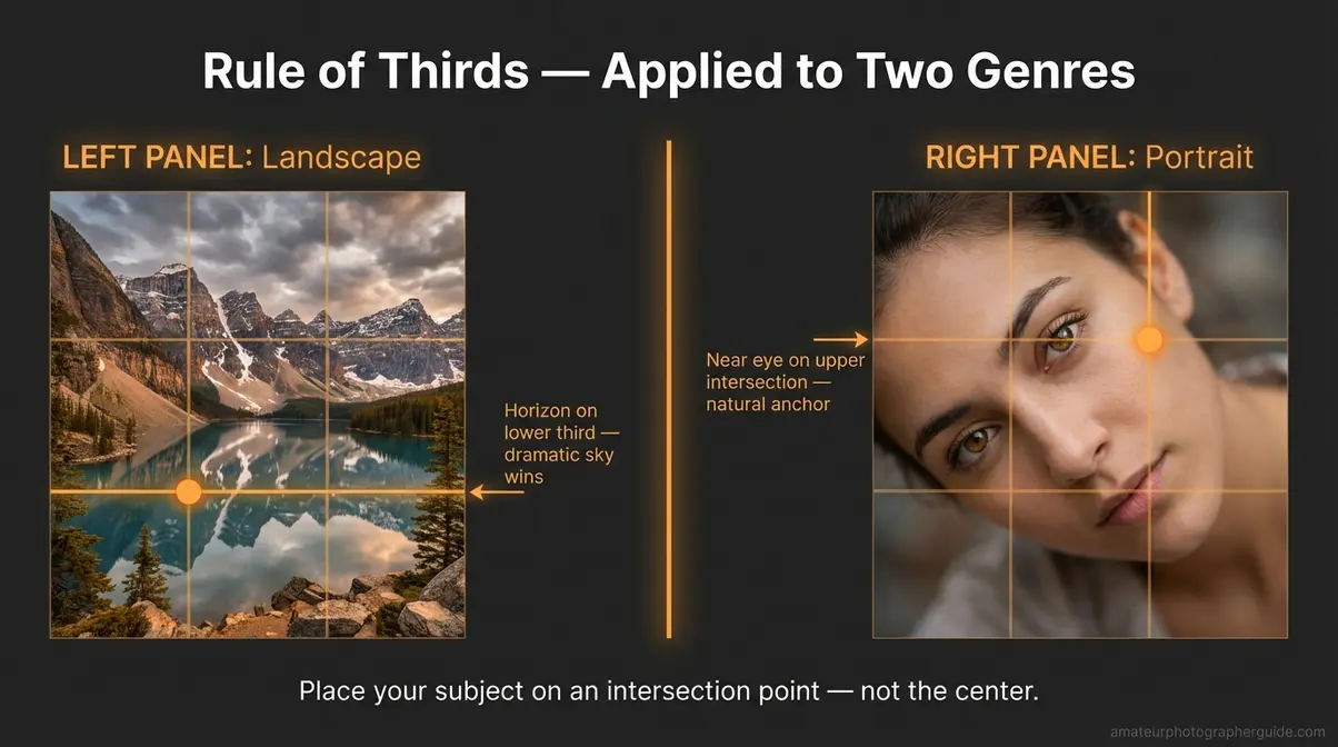
Caption: The same grid, two genres. Upper-third horizon for dramatic skies (landscape); upper-right intersection for the near eye (portrait).
Leading Lines: Direct the Eye
A leading line is any line in your frame that draws the viewer’s eye toward your subject — roads, fences, rivers, staircases, rows of trees, cast shadows, or window frames all qualify. In leading lines photography composition, you’re not creating the line; you’re recognizing it and placing your subject where the line points.
Three ways to use them:
- Lead TO the subject — a country road ending at a barn; a path ending at a doorway
- Lead THROUGH the frame — a river winding away into the distance, creating depth without a defined endpoint
- Create natural frame edges — a shoreline and a cliff working together as parallel boundaries
Diagonal leading lines at roughly 45 degrees create the most visual energy. Horizontal lines feel calm. Curved S-curve lines feel elegant and mysterious — the eye follows them the way it would follow music.
Apply it now: Stand at the end of any hallway and photograph what’s at the far end. The parallel walls converging toward a vanishing point are instant leading lines.
Symmetry, Patterns, and Fill the Frame
Symmetry is the deliberate exception to the Rule of Thirds. When your subject is perfectly symmetrical — a cathedral arch, a mirror-lake reflection, a long tunnel — centering it is correct. This is called Central Composition, and it works because the symmetry itself provides the visual structure that the Rule of Thirds would otherwise create.
Best for: architecture, reflection photography, formal portraits.
Fill the Frame takes the opposite approach — remove all background. Let your subject occupy the entire image. Faces, flowers, textures, and close-up details all benefit from this technique. Eliminating background eliminates distraction instantly, without any post-processing required.
Both rules are answering The Intention Layer question “what do I leave out?” — just with opposite answers. Symmetry keeps everything balanced and equal. Fill the Frame removes everything that isn’t the subject.
A brief note on diagonal composition in photography: diagonal lines (running 45 degrees off-level) are the single most energetic compositional element in any frame. Triangle composition in photography — arrangements of three subjects forming an implied triangle — uses diagonal relationships to create natural, dynamic groupings.
Negative Space and the Rule of Odds
Negative space is the empty area around and between your subjects. Counterintuitively, more empty space often makes your subject feel more powerful, not weaker. A lone bird against a pale sky. A single figure standing in an open field. The space amplifies the subject’s presence rather than diminishing it.
Simplicity is the discipline of asking one question repeatedly: “If I remove one thing, does the photo improve?” Apply that question to every element in your frame — background objects, foreground clutter, competing light sources. Keep asking until the answer is no. The single most common beginner mistake is including too much.
The Rule of Odds works because odd numbers of subjects (1, 3, 5) feel more natural and visually dynamic than even numbers (2, 4). Three rocks on a ledge is more interesting than two. Three faces in a group portrait creates a more engaging arrangement than four. Your eye settles into even groupings; it moves through odd ones.
Apply it now: Next time you’re photographing a still life or food, remove one element and take the shot. Compare it to the busier version. Simplicity in photography composition almost always wins.
Framing Within a Frame and Diagonals
A “frame within a frame” is one of the most powerful composition hacks a beginner can deploy immediately. It means using an element already present in the scene — a doorway, a window, overhanging tree branches, a tunnel, an archway — to create a secondary border around your main subject.
Framing composition in photography like this accomplishes two things simultaneously: it draws the viewer’s eye directly to the subject (because the secondary frame points inward), and it adds depth by creating a foreground layer that the subject sits behind.
Apply it now: Find any doorway and photograph someone standing on the other side of it. The door frame is now your composition tool — you didn’t add anything; you recognized what was already there.
Diagonal lines reinforce this depth. Where horizontal lines feel static and vertical lines feel formal, diagonals imply movement, action, and dynamism. They’re the best compositional choice for sports, street photography, and dramatic landscape shots.
A brief word on the Golden Ratio (also called the Phi or Fibonacci Spiral): it’s a mathematical proportion found in nature that creates naturally pleasing visual arrangements — a more precise and complex cousin of the Rule of Thirds. It’s harder to apply in the field but worth knowing exists. Many photographers approximate it naturally once the Rule of Thirds becomes instinctive.

Caption: Before: subject centered in open space. After: subject framed through a doorway — depth, context, and visual hierarchy in one decision.
Visual Weight: Why Some Photos Feel Balanced

Visual weight is the psychological force that pulls a viewer’s eye toward certain parts of a photograph. Every element in your frame carries a different amount of it — and understanding balance in photography composition means learning to distribute that pull evenly, or intentionally unevenly, to create a specific emotional effect. This is the concept that explains why some photos feel “lopsided” even when you’ve followed the Rule of Thirds correctly.
As Colorado State University’s guide on visual weight explains, in photography, the psychological tug for attention is called visual weight, and different aesthetic characteristics pull the viewer’s eye with varying degrees of force. This concept is almost completely absent from beginner photography guides — yet it’s the missing explanation behind most technically “correct” photos that still feel wrong.
The Intention Layer, at its deepest level, is about managing visual weight before you press the shutter.
What Is Visual Weight?
Here’s the clearest way to understand visual weight: imagine a seesaw. A small child on one side and a large adult on the other tips the seesaw immediately. But if the child sits at the far end and the adult sits close to the center, they can balance. Visual weight works exactly the same way in a photograph — a small, brightly colored subject on one side can balance a large, dark area on the other, as long as their visual “pull” is roughly equal.
Four factors increase visual weight — and you can control each one:
- Size — larger objects attract more eye attention than smaller ones
- Color — warm, bright colors (reds, oranges, yellows) have more visual weight than cool, dark ones (blues, deep greens)
- Contrast — a high-contrast element in a low-contrast scene immediately dominates the frame
- Sharpness — a sharp element against a blurred background automatically carries more weight (this is why depth of field is a composition tool, not just an aesthetic choice)
A single red flower on the left third of a frame, against a soft green background on the right, is perfectly balanced — even though the two sides are not equal in size. The color weight of the red equalizes the area weight of the green.
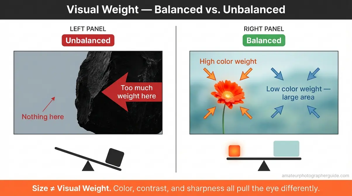
Caption: Same frame dimensions, different visual balance. The warm-toned subject on the left third counterweights the cool, spacious background — creating harmony without symmetry.
Color, Size, and Contrast
Most compelling photographs are not symmetrical — they are asymmetrically balanced. A large dark area on the right, offset by a small bright subject on the left. Analyzing the composition of any great photograph will reveal this invisible balancing act: elements of unequal size, color, or contrast arranged so their combined visual pull feels harmonious.
Rhythm is a related concept worth understanding. In photography, rhythm — like music — is created by repeating visual elements: shapes, colors, or patterns that create a sense of flow across the frame. A row of identical blue beach chairs creates rhythm. Place one orange chair among them, and that orange chair becomes the instant subject. The blue chairs are the rhythm; the orange chair is the beat that breaks it. The viewer’s eye travels along the pattern and stops at the disruption.
Color in photography composition works as a balancing lever. Contrast as a composition tool functions as visual hierarchy: the eye always travels to the point of greatest contrast first. Bright subject against dark background. Dark subject against bright sky. You don’t need to tell the viewer where to look — contrast does it automatically.
Here’s a practical scenario: imagine photographing a market display of spice jars. Group warm-toned spices (saffron, paprika, turmeric) toward the center-left of the frame. Let cool-toned spices (dried herbs, blue-grey sea salt) occupy the outer edges. The result is balanced without being symmetrical — warm visual weight at the center-left, cool visual weight distributed around the periphery.
Adjusting Visual Mass in Post
Most composition guides end at the shutter button. Here’s what they don’t tell you: post-processing is a powerful composition tool, and it’s one of the clearest examples of The Intention Layer applied retroactively.
Cropping is the most powerful post-processing composition adjustment. A crop can move your subject from the center to a rule-of-thirds position, eliminate cluttered edges, change the aspect ratio from horizontal to vertical for Instagram, or remove a visually heavy distraction you couldn’t eliminate in-camera. Cropping is The Intention Layer with a second chance.
Healing and clone stamp tools (in Adobe Lightroom and Photoshop) let you remove specific visually heavy distracting elements — a trash bin at the edge of a landscape shot, a stranger who walked through your frame. If it pulls the eye away from your subject, it doesn’t have to stay in the final image.
Tone and color adjustments shift visual weight without moving a pixel. Try darkening the edges of your frame (vignetting) to push visual weight toward the center subject. In Adobe Lightroom, use the Radial Filter set to darken edges — this adds visual weight to your central subject in about 30 seconds. Boosting a subject’s saturation while desaturating the background increases its visual weight dominance without cropping anything. Here are examples of post-processing composition adjustments that take under a minute each but meaningfully change where the viewer’s eye goes.
Composition by Genre: Essential Rules
Composition rules don’t change between genres — but the way you apply them does. A centered, symmetrical composition that looks weak in a portrait can look stunning in landscape photography. The same leading line that creates depth in an urban street scene becomes too rigid in a food flat lay. Here’s how to adapt the Intention Layer to four common genres:
- Landscape — foreground layering and horizon thirds
- Portrait — eye-line placement and look room
- Street — diagonal tension and the decisive moment
- Food — overhead flat lay with negative space and color harmony
- Vertical social media — 9:16 framing with center-weighted safe zones
Landscape Photography
Composition in landscape photography begins with one rule that fixes the majority of flat landscape shots: never center the horizon. Place the horizon on the upper third line when the sky is dramatic — storm clouds, golden hour light, a vivid sunrise. Place it on the lower third line when the foreground is dramatic — wildflowers, an interesting shoreline, a reflection pool. Centering the horizon splits the image into two equal halves where neither half wins the viewer’s attention.
The second most powerful landscape technique is foreground interest: add something physically close to the camera — a rock, a patch of wildflowers, a puddle — in the extreme foreground of your shot. This instantly creates three layers: foreground, middle ground, and background. Three layers create the sensation of depth in a two-dimensional image.
When symmetry works in landscape: perfect mirror reflections in still water or a perfectly symmetrical mountain range are the exceptions where centering is correct. Recognize the exception, and use it deliberately rather than by accident.
Apply it now: At a lake at dawn, place the shoreline on the lower third, capture the mountain reflection in the water, and add a single rock in the near foreground. Three layers. One shot.
As the National Park Service beginner’s guide confirms, basic composition principles — including foreground layering and horizon placement — apply whether you’re shooting landscapes with a professional DSLR or a smartphone camera.
Portrait Photography
Composition in portrait photography has one non-negotiable rule: always place the near eye on an upper rule-of-thirds intersection. The eye is the most powerful visual anchor in a human face. Where you place the eye, the viewer goes — it’s not a guideline, it’s a biological response.
The second principle is the Rule of Space (sometimes called “look room”): if your subject is looking left, give them space on the left side of the frame. If they look right, leave space to the right. Shooting a person looking toward the frame edge — with no space in the direction they’re facing — creates a feeling of being trapped or cut off. It makes the viewer uncomfortable without knowing why.
Angle also shapes meaning. Shooting from your subject’s eye level creates equality. Shooting from slightly below makes them appear powerful. Shooting from slightly above conveys vulnerability or youth. Each is a composition decision — none is automatically “correct.”
Apply it now: Turn your subject 45 degrees from you. Place their near eye on the upper-right intersection point. Leave space in the direction they’re facing. That’s a portrait that feels natural and intentional — before any post-processing.
Street and Food Photography
Composition in street photography thrives on diagonal lines and asymmetry. The energy and unpredictability of urban life don’t fit neatly into horizontal, balanced frames — and they shouldn’t. Tilt your camera slightly off-horizontal to introduce diagonal tension. Hunt for shadow patterns and leading lines created by architecture. And position yourself before the decisive moment: choose your frame in advance, then wait for the right person or action to enter it. The moment itself is the composition.
Composition in food photography follows different logic entirely. The overhead flat lay — shooting straight down at 90 degrees from above — is the dominant compositional approach for a reason: it shows everything clearly without perspective distortion. Within the flat lay, the Rule of Thirds still applies. Place the hero dish off-center. Use negative space generously — leave empty space around the main plate. Apply complementary color combinations in your props and ingredients. And follow the Rule of Odds: three garnishes, not two or four.
Vertical Social Media Framing
Most photography guides published before 2026 were written for 3:2 (DSLR) or 4:3 (phone default) horizontal formats. But Instagram Reels, TikTok, and YouTube Shorts all use 9:16 vertical framing — a fundamentally different canvas that requires its own compositional thinking.
Vertical 9:16 is one of the newer types of composition in photography that guides genuinely need to address. The Rule of Thirds still applies in 9:16, but the “power points” are now vertically stacked rather than horizontally spaced. Place your subject in the center-top or center-bottom thirds — not the far left or right, where they’d be lost on a horizontal crop.
Safe zones matter: keep all essential subjects and text within the center 80% of the vertical frame to avoid UI overlay cropping across platforms. Instagram, TikTok, and YouTube Shorts each have slightly different overlay positions; the center 80% clears all of them.
Apply it now: When shooting video for Reels, stand closer to your subject than you would for a horizontal photo, place their face in the upper third of the vertical frame, and leave the lower third open for text overlays. Done.
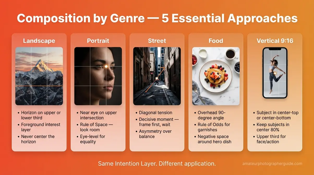
Caption: Five genres, five compositional approaches — all built on the same underlying Intention Layer decision.
Common Composition Mistakes to Avoid
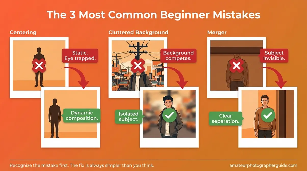
Everyone’s first 100 photos share the same three problems. Not because beginners are careless — but because these instincts feel completely natural until you understand why they’re working against you. Here’s what they are, and exactly how to fix each one.
Three Common Beginner Mistakes
Bad composition in photography almost always traces back to one of these three patterns. Good composition in photography starts with recognizing and correcting them:
- Mistake 1 — Centering Everything: Putting your subject dead-center makes the photo static and gives the viewer nowhere to go after they land on the subject. Fix: Apply the Rule of Thirds — move the subject to an intersection point. That single adjustment adds visual tension and breathing room instantly.
- Mistake 2 — Cluttered Backgrounds: A busy background competes with your subject for the viewer’s eye. Fix: Three options, in order of effort: (a) physically move to change the background — even a step sideways can clear a telephone pole; (b) use a wide aperture (a low f-number like f/1.8 or f/2.8) to blur the background with the bokeh (soft background blur) effect; (c) crop in post-processing to remove distracting background edges.
- Mistake 3 — Mergers: This happens when your subject blends into the background — most commonly, a person appears to have a telephone pole or tree branch “growing” out of their head because the subject and background are at the same visual level. Fix: Move laterally a few steps before shooting to create visual separation between subject and background.
The most common beginner composition mistake — centering every subject — is solved by one technique: move the subject one-third to the left or right of center. No new equipment needed.
When Breaking Rules Is Right
You are allowed — and often encouraged — to break any rule in this guide. The critical distinction is between breaking a rule intentionally (you know exactly which rule you’re breaking and why) versus accidentally (you didn’t know the rule existed). One is creative choice. The other is a composition mistake you can’t learn from.
Three scenarios where rule-breaking produces better results than rule-following:
- Perfect symmetry in naturally symmetrical scenes — a cathedral arch, a mirror-lake reflection, a long tunnel — overrides the Rule of Thirds. The symmetry itself provides the visual structure. Centering is correct here.
- Extreme centering with negative space on all sides — the subject IS the center by deliberate design, isolated and surrounded by emptiness. This is a legitimate and powerful compositional choice, not an accident.
- Filling the frame so completely that no background exists — no rule needed when there is no competing background to manage.
As Encyclopædia Britannica establishes, early photographic pioneers defined photography as an art form precisely through intentional creative choices — including deliberate departures from conventional framing. Rule-breaking in service of intention has always been part of the medium.
Creative composition in photography is not about rebellion. It’s about knowing the rules well enough to deploy them — or set them aside — with full awareness. The goal has never been to follow rules. The goal is to make a decision — The Intention Layer — and execute it with confidence.
Frequently Asked Questions
What is composition in photography?
Composition in photography is the intentional arrangement of visual elements within a camera frame. It determines where the viewer’s eye travels first, what the photograph communicates emotionally, and whether the image feels balanced or chaotic. Photographers use guidelines like the Rule of Thirds, leading lines, and negative space to arrange subjects purposefully. A compelling composition can elevate a smartphone photo above one taken with professional gear. Think of it as the single decision made before every shutter press: what do I include, and what do I leave out?
What are the 7 composition rules?
The most widely recognized composition rules in photography are the Rule of Thirds, Leading Lines, Symmetry and Pattern, Negative Space, Framing Within a Frame, the Rule of Odds, and Fill the Frame. Each rule solves a specific problem: centering, cluttered backgrounds, lack of depth, or a directionless viewer experience. Mastering these seven gives most photographers a reliable toolkit for instantly improving the visual quality of any shot — regardless of camera or experience level.
What makes a good composition in a photo?
A good composition directs the viewer’s eye clearly to the intended subject while balancing visual weight across the frame. It eliminates distracting background elements and creates a clear visual hierarchy — one dominant subject, supporting elements, and enough negative space for the eye to rest. Strong composition also carries emotional intention: calm and symmetrical, or dynamic and diagonal. The simplest test is this: if you can remove one element and the photo improves, remove it. Keep asking that question until the answer is no.
What are the 4 types of composition?
In photography, the four most useful types of composition are geometric (using lines, triangles, and shapes to structure the frame), symmetrical (balanced mirroring of elements on either side of a central axis), rule-based (applying guidelines like the Rule of Thirds or the Golden Ratio), and dynamic (using diagonal lines and asymmetrical balance to create energy and movement). Each type creates a distinctly different emotional experience for the viewer — stillness, order, reliability, or tension.
Is it OK to break composition rules?
Yes — breaking composition rules is not only acceptable but often essential for compelling photography. Intentional rule-breaking can produce images with far more impact than technically correct compositions. However, the key word is “intentional”: understanding why a rule exists is what allows you to break it with purpose rather than by accident. Most professional photographers recommend learning the rules thoroughly before departing from them, so every deviation is a deliberate creative choice rather than an oversight.
Closing Thoughts
For beginner photographers at any gear level, composition in photography is the most impactful skill to develop — more impactful than any camera upgrade or lens purchase. As Rocky Mountain College of Art and Design emphasizes, striking images rely on intentional arrangement rather than chance. The best approach combines three things: understanding the elements (lines, shapes, light, and color), applying the core rules (Rule of Thirds, leading lines, and visual weight), and practicing The Intention Layer decision before every shot.
The Intention Layer is your permanent reminder that composition is not a checklist — it’s a moment of decision. Every photograph you take from today forward starts with the same question: what do I include, and what do I leave out? Once that question becomes instinct, the rules take care of themselves. You’ll stop analyzing your composition and start making it.
Ready to put it into practice? Download our free PDF composition cheat sheet below — it summarizes all 10 rules on one printable page you can take on your next shoot. For deeper reading, start with The Photographer’s Eye by Michael Freeman or Understanding Exposure by Bryan Peterson. Both are written for photographers at exactly this stage. Your next photo starts now.