
Table of Contents
This blog post may contain affiliate links. As an Amazon Associate I earn from qualifying purchases.
“I’m in the school of thought that if you edit a photo then it’s no longer a photo but rather just a generated image that looks exactly like we want it to.”
This tension is real — and photographers have debated it since the darkroom era. But here’s what that argument misses: Ansel Adams, widely considered the greatest landscape photographer in American history, spent as much time dodging and burning prints in the darkroom as he did behind the lens. Editing isn’t a departure from photography. It is photography.
Without understanding the role of photo editing, photographers fall into one of two traps: under-editing leaves raw files flat, lifeless, and technically inaccurate; over-editing produces images that look artificial and erode audience trust. Both extremes cost credibility. In researching this guide, we analyzed more than a dozen top-ranking sources and cross-referenced industry guidelines from the NPPA, AFP, and Bureau of Labor Statistics to give you a definitive answer on what photo editing actually does, where its ethical limits lie, and what a career in it looks like.
This guide covers the role of photo editing across five areas: its core purpose and five functions, the ethical rules that differ by industry, the five foundational editing techniques, the 5 C’s of Photographic Vision framework for smarter editing decisions, and the day-to-day reality of working as a professional photo editor.
Photo editing transforms raw captures into compelling visual stories — a process every professional image goes through before publication.
- The 5 C’s of Photographic Vision (Composition, Color, Contrast, Clarity, Character) provide a single framework that guides decisions from capture through post-processing — the editorial thread running through this entire guide
- Five core functions drive every editing decision: correcting technical errors, enhancing clarity, calibrating color, strengthening composition, and building visual character
- Ethical rules differ sharply by industry — what’s acceptable in e-commerce product photography is a terminable offense in photojournalism
- Career photo editors earn a median of $20.44/hour (Bureau of Labor Statistics, May 2024), with distinct freelance and in-house paths offering different trade-offs
- The 5 basics — crop, white balance, exposure, color vibrancy, and sharpness — form the foundation of every professional editing workflow, applied in sequence to avoid compounding errors
What Is Photo Editing and Why Does It Matter?
Photo editing is the process of manipulating digital images to correct technical imperfections and convey a specific visual narrative — a step no professional publication skips. Every image you’ve ever seen in a magazine, on a brand’s website, or in a photojournalism feature has been edited before it reached you. The role of photo editing isn’t to fabricate reality; it’s to bridge the gap between what a camera sensor records and what the human eye actually perceived at the moment of capture.
Understanding this distinction is the first step toward editing with intention rather than guesswork. To understand the core purpose of photo editing, you need to start where every image starts — the raw file.
The Core Purpose of Photo Editing
Photo editing is the deliberate process of adjusting, correcting, and enhancing a digital image after capture to match the photographer’s intended vision — or to serve a specific publishing purpose. Its core purpose is bridging two realities: what the camera recorded and what the scene actually looked like to the human eye.
Camera sensors are designed to capture flat, low-contrast raw files that preserve maximum dynamic range data. This is intentional. A RAW file straight from the camera looks underexposed, slightly desaturated, and soft — not because the photographer made a mistake, but because the camera is preserving every recoverable highlight and shadow detail for post-processing. In-camera JPEGs apply automatic adjustments (sharpening, contrast, color rendering) before you ever open the file. Shooting RAW simply puts those decisions back in your hands.
The editorial insight worth understanding: editing is not a modern invention. It is an original part of photography as a craft. Dodging (selectively lightening) and burning (selectively darkening) were standard darkroom techniques in the 1930s and 1940s. The tools have changed; the intent has not. When you adjust exposure in Adobe Lightroom today, you’re doing digitally what Adams did chemically — revealing the image that was always there.

Caption: A RAW file (left) preserves maximum data but appears flat and desaturated. The edited version (right) reveals the scene the photographer’s eye perceived — this is the role of photo editing in practice.
The Five Functions of Photo Editing
Manipulating digital images effectively means understanding what each editing function is designed to achieve. Professional photo editors don’t open an image and randomly adjust sliders — they work through a structured set of functions, each with a specific purpose.
These five functions map directly to the 5 C’s of Photographic Vision — the editorial framework that structures this entire guide. Think of the 5 C’s as a single vocabulary that spans both capture and post-processing, eliminating the mental switch between “photographer mode” and “editor mode.”
- Composition — Cropping, straightening, and removing distracting frame elements to strengthen the visual structure. What you exclude is as important as what you include.
- Color — Adjusting white balance, hue, and saturation to reproduce the scene’s accurate colors or achieve a deliberate creative palette.
- Contrast — Controlling the relationship between highlights and shadows to create visual depth, drama, or softness depending on the subject.
- Clarity — Sharpening edge definition, reducing noise, and improving fine detail so subjects read as crisp and intentional at any output size.
- Character — Applying a consistent stylistic treatment (a preset, a color grade, a tonal signature) that defines the photographer’s visual identity across a body of work.

Caption: The 5 C’s of Photographic Vision applied to post-processing — each function maps directly to a foundational photography principle.
As fundamental photo editing and composition techniques from Adobe Creative Cloud confirm, mastering depth of field, the rule of thirds, and strategic cropping are as relevant in post-processing as they are at the moment of capture. Not every edit uses all five functions — a photojournalism edit might use only Composition and Clarity; a fashion campaign might deploy all five deliberately.
Why Raw Files Always Need Editing
There is a meaningful difference between corrective editing and manipulative editing — and understanding it resolves the “generated image” debate almost completely.
Corrective editing restores what the photographer’s eye actually saw: adjusting a blue color cast caused by shade lighting, recovering shadow detail in a backlit portrait, or straightening a horizon tilted two degrees by a handheld shot. This is accuracy work. The edit isn’t adding something that wasn’t there — it’s removing a technical artifact introduced by the camera’s physical limitations.
Manipulative editing fabricates elements that didn’t exist in the original scene: replacing a sky, removing a person, adding a product that wasn’t photographed. This is where context becomes everything. The same sky replacement technique is standard practice in real estate advertising and a terminable offense in photojournalism. Editing allows you to capture the essence of what you saw, not just what the sensor recorded — but the ethical rules governing how far you can go depend entirely on where the image will be published.
AI-assisted tools (Lightroom’s AI Denoise, Photoshop’s Generative Fill, Topaz Sharpen AI) blur this line further — which is precisely why the industry has developed explicit ethical frameworks for each publishing context.
AI-Assisted Editing: Is It Worth It?
AI editing tools have fundamentally changed the speed of professional workflows. Tasks that previously required 30 minutes of manual masking — background removal, noise reduction, sky replacement — now take under 30 seconds. For commercial photographers handling high-volume work, that efficiency gain is genuinely significant.
The honest trade-off: AI tools can introduce artifacts, over-smooth skin textures, or generate visual content that was never in the original scene. Lightroom’s AI Denoise is exceptional at reducing high-ISO noise while preserving fine detail — it’s one of the clearest wins in AI editing. Photoshop’s Generative Fill, however, creates entirely new image content from a text prompt, which crosses from editing into content generation. The tool is legitimate; the labeling of the output matters enormously.
AI editing is most appropriate for: noise reduction in high-ISO wildlife or event photography, background removal for e-commerce product shots, and sky replacement in real estate or landscape work where the context permits enhancement. It carries real risk in photojournalism (where fabrication violates professional codes), in fine art contexts where collectors value authenticity of process, and in any situation where the editing workflow will be scrutinized for transparency.
The practical recommendation: use AI tools as a precision assistant that accelerates decisions you’d make anyway — not as a substitute for photographic judgment. A generated image that looks “exactly like we want it to” is only a problem if the audience was promised a documentary photograph.
Main Purpose of Photo Editing?
The main purpose of photo editing is to bridge the gap between what a camera sensor records and what the human eye actually perceived at the moment of capture. Camera sensors produce flat, low-contrast RAW files by design — preserving maximum dynamic range data for post-processing. Editing corrects technical limitations (exposure errors, white balance inaccuracies, lens distortion) and enhances visual impact to match the photographer’s intended vision. Every professional image published in any medium has been edited before reaching the audience.
Editing Ethics: E-Commerce, Journalism, Fine Art
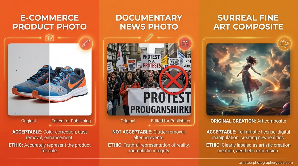
“I’m in the school of thought that if you edit a photo then it’s no longer a photo but rather just a generated image that looks exactly like we want it to.”
This tension has been debated by professionals for decades. The answer depends almost entirely on where the image will be published. The same editing technique — skin smoothing, sky replacement, color grading — is standard professional practice in one industry and a career-ending violation in another. Understanding which ethical framework applies to your work is as important as understanding the technical tools.
| Criteria | E-Commerce Photography | Photojournalism | Fine Art Photography |
|---|---|---|---|
| Permitted Edits | Background removal, color correction, surface blemish removal, shadow addition | Exposure correction, cropping, conversion to black and white, minor color adjustment | Unlimited — compositing, heavy manipulation, AI-generated elements, double exposure |
| Prohibited Edits | Adding/removing products, deceptive size changes, fabricated context, impossible body proportions | Adding or removing elements, cloning out subjects, AI-generated content, misleading color alteration | None — artistic intent governs all decisions |
| Governing Standard | FTC advertising guidelines, platform policies (Amazon, Shopify) | NPPA Code of Ethics, AFP Editorial Standards | Personal artistic ethics and transparent labeling |
| Example Violation | Target’s 2014 “thigh gap” controversy — retouching that altered body proportions in ways that were physically impossible | Reuters photographer fired in 2006 after removing smoke from a war zone image — 920 photos pulled from archive | N/A — no external standard applies |
E-Commerce: Enhancing Without Deceiving
E-commerce editing’s primary goal is sales enhancement — making products look their absolute best without misrepresenting what the buyer will receive. The permitted toolkit is broad: background removal to a clean white, color accuracy correction to match the physical product, surface blemish removal from product materials, and shadow addition to convey three-dimensional depth on a flat screen.
The ethical line is product misrepresentation. When editing changes what the customer will actually receive — altering a garment’s color, removing a visible seam, making a product appear larger than it is — it crosses from enhancement into deception. The 2014 Target “thigh gap” controversy is the most cited example: retouching altered a model’s body in ways that were physically impossible, violating both ethical standards and consumer trust even within e-commerce’s permissive framework.
Poor product imagery has measurable business consequences in both directions. According to 1WorldSync’s Product Content Benchmark research, three out of four shoppers will leave a product page due to poor or insufficient product images — making professional editing a direct revenue driver. Inadequate product content (including poor photography) accounts for a significant portion of all online returns, as customers receive products that don’t match their visual expectations (1WorldSync, 2024).
A standard Amazon product listing illustrates the practical standard: white background, accurate color, multiple angles, no visible surface defects. That result is achieved through editing, not through perfect shooting conditions.
Photojournalism: Strict Editing Limits
Photojournalism operates under the most restrictive editing standards of any professional photography discipline — and those standards exist for a reason. The National Press Photographers Association mandates that photo editing must preserve the integrity of the image’s content — adding or removing elements is a professional violation (NPPA code of ethics for visual journalists, NPPA, 2023).
What photojournalists are permitted to do: correct exposure so the image reproduces accurately in print or on screen, crop to strengthen composition or fit a publication layout, convert to black and white for stylistic consistency, and make minor color adjustments that restore the scene’s true appearance. That’s essentially the complete list.
What is explicitly prohibited: adding or removing any element in the frame, cloning out subjects (even “distracting” ones), using AI-generated content of any kind, and altering color in ways that change the emotional or factual reading of the image. AFP editorial standards on image doctoring state that photojournalists must not doctor images or tamper with the original subject matter — this is not a guideline but a condition of employment (AFP, 2023).
As academic guidelines on improper photo manipulation from the University of Arkansas Press confirm, improper photo manipulation in journalism fundamentally breaches the ethical use of digital images — because news photographs are legal and historical records, not creative interpretations.
The consequences of violations are severe. A Reuters photojournalist was terminated and had 920 archived images removed after removing smoke from a single war zone photograph in 2006. One cloning action ended a career and invalidated years of legitimate work.
Fine Art: Creative Freedom & Expression
Fine art photography sits at the opposite end of the ethical spectrum. Here, the only limit is the artist’s imagination — and the only ethical requirement is transparent labeling.
Compositing (merging multiple photographs into a single surreal scene), heavy color grading, AI-generated elements integrated into photographs, double exposures, and intentional physical distortion are all legitimate fine art techniques. The collector or gallery viewer consents to creative interpretation when they engage with work labeled as fine art. That consent is the ethical foundation.
Erik Johansson’s surrealist composite photography — images of roads folding like paper, landscapes defying gravity, impossible physical scenarios — is constructed entirely from photographs manipulated in Adobe Photoshop. It is legitimate art precisely because it makes no claim to be a documentary photograph. The work is labeled as fine art, and the audience understands the creative contract.
The one ethical requirement that does apply: if a gallery exhibit presents composite images as straight photography, that’s misrepresentation — not because the edits are wrong, but because the labeling is misleading. The Character C of the 5 C’s of Photographic Vision is where ethical lines most often get crossed: applying a strong stylistic identity to work is legitimate; misrepresenting the nature of that work to an audience is not.
Understanding which ethical framework applies to your work is as important as understanding the technical tools. With that context established, the next section covers those tools in detail.
The 5 Basics of Photo Editing
Professional photo editing follows a five-step workflow — crop, white balance, exposure, color vibrancy, and sharpness — applied in sequence to avoid compounding errors. The order isn’t arbitrary. Each step creates the foundation the next step depends on: you can’t accurately judge color until exposure is correct, and you can’t sharpen effectively until noise is controlled. The goal of every editing session is to remove imperfections and enhance the image’s natural strengths — in that specific sequence.
Across professional photography communities, the consistent feedback on beginners’ biggest mistakes is the same: they jump to color grading before fixing exposure, which makes accurate color correction impossible. Sequence matters more than most editing tutorials acknowledge.
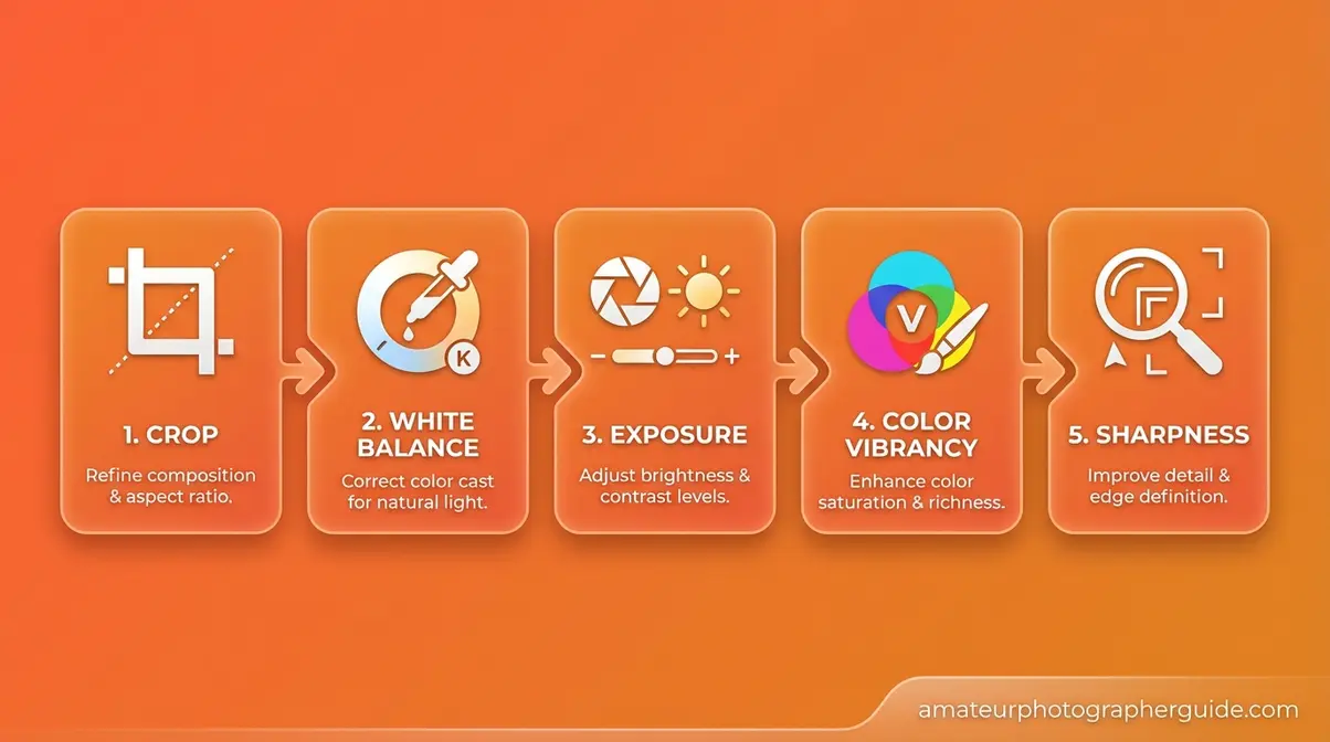
Caption: The five-step editing workflow — each stage builds on the last. Skipping steps or reordering them compounds errors across the entire image.
To master the basics of photo editing, start with the five fundamentals below before exploring advanced techniques.
Step 1 – Crop and Clean Up Composition
Cropping is the first step because it defines the frame — every subsequent adjustment should serve the composition you’ve chosen. This is where the role of photo editing begins: with the frame itself.
- Specific tasks in Step 1:
- Straighten the horizon line (even a 0.5° tilt reads as unprofessional in landscape photography)
- Remove distracting elements at frame edges that compete with the subject
- Apply the rule of thirds grid to reposition the subject if the original framing was rushed
- Consider the final output ratio (16:9 for video, 4:5 for Instagram, 3:2 for print) and crop accordingly
The 5 C’s connection: Step 1 maps to Composition — the first C. A well-cropped image doesn’t need heavy editing because the frame itself is strong. As fundamental photo editing and composition techniques from Adobe Creative Cloud confirm, strategic cropping is one of the highest-impact adjustments available in any editing workflow.
A practical example: a portrait where the subject’s elbow is cut off at the frame edge. A simple crop to the waist eliminates the distraction and creates a stronger composition. In Adobe Lightroom, press R to open the crop tool; hold Shift to constrain the aspect ratio to its original proportions.
With your composition locked in, the next step is fixing the color of the light itself.
Step 2 – Adjust White Balance
White balance controls the warmth or coolness of the entire image. Camera meters guess at the light source — daylight, tungsten, fluorescent, shade — and are frequently wrong, especially in mixed lighting environments. Correcting white balance is the difference between a photo that looks accurate and one that looks vaguely “off” without the viewer understanding why.
The 5 C’s connection: Step 2 maps to Color — the second C. Color accuracy is the foundation everything else is built on. Fine-tuning and enhancing color later in the workflow is only possible if white balance is correct first.
In Lightroom: use the White Balance Selector (the eyedropper tool) on a neutral gray or white area in the image — a white wall, a gray card, a white shirt. The software samples that area and adjusts the entire image to make it neutral. In Photoshop: open the Camera Raw filter and adjust the Temperature and Tint sliders manually.
A concrete example: an indoor portrait shot under tungsten lighting will render the subject’s skin orange at the camera’s default white balance. Shifting color temperature from approximately 4,200K (tungsten) to 5,500K (daylight) restores accurate, natural skin tones — without touching any other slider.
Once colors are true, you can address the light itself.
Step 3 – Tune Exposure and Contrast
Exposure determines overall brightness; contrast determines the difference between the lightest and darkest areas of the image. In Lightroom’s Basic panel, five sliders give you precise tonal control: Exposure (overall brightness), Highlights (bright areas), Shadows (dark areas), Whites (pure white point), and Blacks (pure black point). Used together, they let you balance a scene that the camera couldn’t capture in a single exposure.
The 5 C’s connection: Step 3 maps to Contrast — the third C. Strong contrast creates visual depth and drama; deliberately low contrast creates a soft, hazy, film-emulation look. Both are valid creative choices — but they need to be intentional.
The critical warning: always check your histogram. A spike jammed against the far left edge (pure black clipping) or far right edge (pure white clipping) means lost detail that cannot be recovered in post-processing. Expose to the right (ETTR) when shooting RAW to maximize recoverable shadow data.
A practical scenario: a sunset landscape where the sky is correctly exposed but the foreground is underexposed by two stops. Pushing the Shadows slider to +50 and pulling the Highlights slider to -30 balances both zones without blowing out the sky detail. This adjustment is only possible with a RAW file — a JPEG would introduce banding and color shifts at the same settings.
With exposure balanced, you’re ready to add the color vibrancy that makes images genuinely pop.
Step 4 – Boost Vibrancy and Saturation
Vibrance and Saturation are related but operate differently. Saturation boosts all colors in the image equally — push it too far and skin tones turn orange, skies turn neon, and the image looks artificial. Vibrance is more intelligent: it preferentially boosts muted, undersaturated colors while protecting skin tones from over-amplification. For portraits, Vibrance is almost always the right choice over Saturation.
For landscapes and product photography, a combination of both produces a color-punched result that makes subjects pop without sacrificing the natural relationship between color ranges.
The 5 C’s connection: Step 4 is the creative application of Color — the second C used here for enhancement rather than accuracy correction. This is where your personal stylistic signature begins to emerge. Consistent color decisions across a body of work create the visual identity that makes a photographer’s portfolio immediately recognizable.
Color grading via the HSL (Hue, Saturation, Luminance) panel or the Color Grading wheel in Lightroom lets you shift individual color ranges independently. For example: making foliage greens more saturated without affecting the skin tones of a person standing in front of that foliage.
A travel photography example: a market scene with colorful fabrics and produce. Boosting Vibrance by +25 makes the colors rich and inviting without pushing the vendor’s skin tones into orange territory. A Saturation boost of the same amount would produce a noticeably less natural result.
The final step polishes everything you’ve done so far.
Step 5 – Sharpen and Finalize Image
Sharpening adds edge definition that makes subjects look crisp and intentional. In Lightroom’s Detail panel, the Sharpening controls (Amount, Radius, Detail, and Masking) and Noise Reduction sliders work as a pair — always apply noise reduction before sharpening, because sharpening amplifies noise. Reducing noise first gives the sharpening algorithm cleaner data to work with.
The 5 C’s connection: Step 5 maps to Clarity — the fourth C. Lightroom’s Clarity slider specifically adds mid-tone contrast, which makes textures read as crisp and tactile: excellent for landscapes, architecture, and product photography. Technical sharpness (the Detail panel) and perceptual clarity (the Clarity slider) serve different purposes and are often used together.
Export settings are the final variable most beginners get wrong. Web images require 72–96 DPI at sRGB color space. Print images require 300 DPI at Adobe RGB (1998). Exporting a print-destined image at 72 DPI — or a web image at 300 DPI — creates problems that can’t be fixed without re-exporting from the source file. Match export settings to destination before you close the file.
Types of Photo Editing Filters to Use
Types of photo editing filters fall into five functional categories, each designed for a different purpose. Knowing which category to reach for — and when — prevents the compounding errors that come from applying the wrong tool to the right problem.
- Corrective filters — Remove color casts, fix lens distortion, reduce chromatic aberration. Examples: Lightroom’s Lens Correction panel, Photoshop’s Adaptive Wide Angle filter. Always appropriate; these restore accuracy.
- Tonal filters — Adjust brightness, contrast, and dynamic range across specific areas of the frame. Examples: Lightroom’s Gradient Filter (for sky/foreground balance), Radial Filter (for off-center vignettes). Context-dependent.
Beyond basic corrections, creative filters help establish your visual style:
- Color grading filters — Apply a consistent color palette or emotional mood across the entire image. Examples: Lightroom presets, VSCO filters, Capture One styles. Appropriate for creative work; inappropriate for photojournalism.
- Sharpening and texture filters — Add definition and surface detail. Examples: Lightroom’s Clarity and Texture sliders, Photoshop’s Unsharp Mask. Generally appropriate across all contexts.
- Stylistic filters — Create artistic effects: grain, vignette, film emulation, black-and-white conversion with selective color toning. Appropriate for social media, fine art, and commercial creative work; not appropriate for documentary or news contexts.
The appropriate use principle is simple: corrective filters are always acceptable because they restore accuracy. Stylistic filters depend entirely on context and publishing purpose. The risk of over-filtering — stacking multiple stylistic effects — is the “HDR effect”: a hyper-processed look where the editing overwhelms the subject. A wedding photographer applying a warm VSCO preset creates a recognizable, consistent portfolio style. A photojournalist applying the same preset alters the emotional and factual reading of a news image.
What are the 5 basics of photo editing?
The 5 basics of photo editing are crop, white balance, exposure adjustment, color vibrancy, and sharpening — applied in that sequence. Cropping establishes the composition. White balance correction ensures color accuracy. Exposure adjustment balances highlights and shadows. Color vibrancy enhancement makes the image pop. Sharpening adds final edge definition. Applying these steps out of order — particularly color grading before exposure correction — compounds errors across the entire image and makes consistent results across a series nearly impossible.
The 5 C’s of Photography Applied to Editing
The 5 C’s of Photographic Vision — Composition, Color, Contrast, Clarity, and Character — provide a single framework that guides decisions from capture through post-processing. Most photography education treats shooting and editing as separate disciplines with separate vocabularies. The 5 C’s eliminate that separation, giving photographers one conceptual language for both phases of the creative process.
To explore core photography frameworks and concepts that underpin every editing decision, understanding these five principles is the essential starting point.
What Are the 5 C’s of Photography?
The 5 C’s of photography are five foundational visual principles that govern both how images are captured and how they should be processed in post-production. Each C represents a distinct dimension of image quality that the photographer controls — first through camera settings and composition, then through editing decisions.
- Composition — The arrangement of elements within the frame. Governed by the rule of thirds, leading lines, negative space, and subject-to-background relationships.
- Color — The accurate or creative rendering of hues, tones, and color temperature. Affects mood, accuracy, and emotional response.
- Contrast — The tonal relationship between the lightest and darkest areas. Controls visual depth, drama, and the perceived three-dimensionality of a flat image.
- Clarity — The sharpness, detail definition, and noise level of the image. Determines how crisp and professional the image reads at any output size.
- Character — The consistent stylistic signature applied across a body of work. This is what makes a photographer’s portfolio immediately recognizable — the “look” that defines their visual identity.
What makes this framework valuable for editing is the direct mapping: every major editing decision you make belongs to one of these five categories. When you’re not sure what an image needs, running through the 5 C’s in sequence tells you exactly where to look.
Applying the 5 C’s to Your Workflow
Here is the direct application of each C to specific editing actions — the bridge between pre-capture principles and post-processing decisions that no competitor article provides:
Composition C → Cropping and Framing Decisions
In editing, Composition governs every crop, straighten, and perspective correction you make. Ask: does this crop strengthen the subject’s relationship to the frame, or does it just remove something distracting? The rule of thirds grid in Lightroom’s crop overlay (R key) makes this evaluation visual and immediate. A strong Composition C decision in editing can rescue a shot where the original framing was rushed.
Color C → White Balance and Color Grading
Color in editing operates in two phases: accuracy (white balance correction) and creativity (color grading). The accuracy phase comes first — always. Once white balance is correct and colors are true to the scene, the creative phase lets you shift hues, adjust saturation, and build a color signature. Applying a color grade before correcting white balance produces results that look good on the original image but fall apart when applied as a preset to other images in the same series.
Contrast C → Exposure, Highlights, and Shadows
Contrast editing is tonal sculpting. The Exposure slider raises or lowers overall brightness; the Highlights and Shadows sliders let you recover detail in the extremes independently. A high-contrast treatment (deep blacks, bright whites) creates drama and weight. A low-contrast treatment (lifted blacks, pulled highlights) creates the soft, hazy quality associated with film emulation and lifestyle photography. Neither is inherently better — Contrast C decisions should serve the subject and the publishing context.
Clarity C → Sharpening, Noise Reduction, and Detail
Clarity editing is about technical precision. Noise reduction preserves the integrity of fine detail at high ISO settings; sharpening restores edge definition lost to diffraction or camera shake. The Lightroom Clarity slider adds perceptual sharpness by boosting mid-tone contrast — it makes textures feel tactile without introducing the halo artifacts that aggressive sharpening produces. Apply Clarity C adjustments last in the tonal workflow, after exposure and color are finalized.
Character C → Style, Presets, and Visual Identity
Character is the most personal of the five C’s — and the most easily over-applied. A preset or color grade that defines your visual identity should be subtle enough that it enhances the image without announcing itself. The test: if a viewer notices your editing style before they notice your subject, the Character C adjustment is too strong. Professional photographers apply Character C decisions consistently across a series, then fine-tune them image by image to account for different lighting conditions.
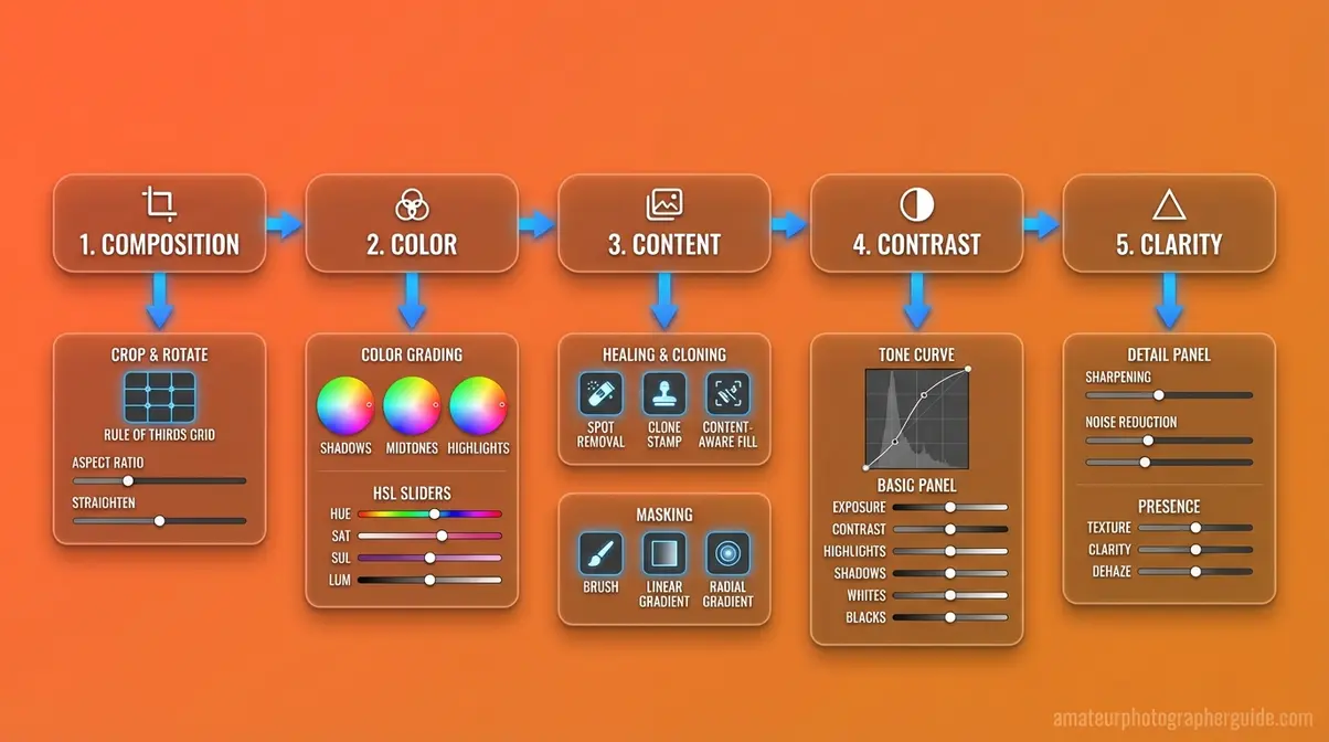
Caption: Each of the 5 C’s maps directly to a specific editing action — giving photographers a single conceptual vocabulary from capture through post-processing.
What Is the 20-60-20 Rule?
The 20-60-20 rule in photography is a compositional guideline that divides the image frame into three spatial zones: 20% foreground, 60% main subject, and 20% background. The rule exists to prevent the most common compositional mistake in photography — centering the subject and filling the frame equally, which creates flat, static images with no visual depth.
In practice: the 20% foreground zone creates a sense of depth and entry into the image; the 60% middle zone is where your primary subject lives and receives the most visual weight; the 20% background zone provides context without competing for attention. The ratio is a guideline, not a mathematical requirement — the underlying principle is that images with layered spatial zones read as more dynamic than images with a single plane of focus.
The 20-60-20 rule also appears in a color variant: 60% dominant color (sets the overall mood), 20% secondary color (supports the dominant), and 20% accent color (draws the eye to key elements). In editing, this color proportion guideline informs decisions about how aggressively to boost accent colors relative to the dominant palette — pushing accent colors too hard breaks the proportional harmony the rule describes.
To learn what the f stands for in photography and how aperture decisions affect your editing choices, see the section below.
What Does the F-Stop Control?
The f-stop — short for focal ratio — is the measurement that controls the size of a lens’s aperture opening, which determines how much light enters the camera and how much of the scene is in sharp focus (depth of field). A low f-stop number (f/1.8, f/2.8) creates a wide aperture opening, letting in more light and producing a shallow depth of field with a blurred background. A high f-stop number (f/11, f/16) creates a narrow aperture, letting in less light and keeping more of the scene in sharp focus.
Why does this matter for editing? Because f-stop decisions made at capture directly affect what’s possible in post-processing. A portrait shot at f/1.8 will have a naturally blurred background — editing can enhance that blur slightly but cannot create it if the shot was taken at f/11. Conversely, a landscape shot at f/16 with everything in focus cannot have its depth of field artificially reduced to look like a f/1.4 portrait without compositing techniques.
As detailed in Adorama’s guide to f-stop and aperture, understanding aperture as a creative tool — not just a technical setting — is foundational to making editing decisions that serve the original capture rather than fighting against it.
The relationship is direct: the 5 C’s of Photographic Vision are established at the moment of capture (through aperture, shutter speed, ISO, and composition) and refined in post-processing. Editing can enhance what’s there; it cannot manufacture what isn’t.
What Does a Photo Editor Actually Do?

A professional photo editor is responsible for selecting, adjusting, and preparing images for publication — ensuring that every image that reaches an audience is technically correct, visually compelling, and appropriate for its publishing context. The role spans both technical craft and editorial judgment, often under significant deadline pressure.
Day-to-Day Duties of a Photo Editor
The daily workflow of a photo editor varies by industry, but common responsibilities appear consistently across commercial, editorial, and freelance contexts.
- Core day-to-day duties include:
- Image culling — Reviewing hundreds or thousands of raw captures from a shoot and selecting the best frames based on technical quality, composition, and editorial fit. A typical commercial shoot produces 500–2,000 raw files; the editor delivers 20–80 final selects.
- Technical correction — Applying the 5 basics (crop, white balance, exposure, color vibrancy, sharpness) to every selected image, ensuring consistency across the series.
- Retouching — Removing imperfections (dust spots, sensor artifacts, temporary blemishes, distracting background elements) appropriate to the publishing context and ethical framework.
- Color grading — Applying a consistent color treatment across all images in a series to ensure they read as a cohesive visual package.
- File management and delivery — Organizing final files by naming convention, exporting at the correct specifications for each destination (web, print, social), and delivering via client-approved platforms (Dropbox, Google Drive, client portals).
- Client communication — Reviewing feedback, applying revision requests, and managing expectations about what editing can and cannot achieve.
According to Indeed’s salary data (August 2026), the average photo editor earns approximately $21.54 per hour in the United States, based on 153 salary reports — broadly consistent with the Bureau of Labor Statistics’ median hourly wage of $20.44 for photographers (BLS, May 2024). Film and video editors, a closely related category, earn a median annual wage of $70,980 (BLS, May 2024).
Three Primary Editor Responsibilities
While day-to-day duties vary, three primary responsibilities define the photo editor’s professional role regardless of industry:
1. Technical Quality Control
Every image that leaves a photo editor’s workflow must meet the technical standards of its destination. This means verifying correct exposure and color for the output medium, confirming that exported files meet resolution and color space requirements, and ensuring that no technical artifacts (noise, chromatic aberration, motion blur) compromise the image’s professional quality. Technical quality control is non-negotiable — it is the baseline from which all other editorial decisions are made.
2. Editorial Judgment and Selection
Photo editors make consequential decisions about which images tell the story most effectively and which images should be excluded. In photojournalism, this means selecting frames that accurately represent the event without bias introduced by selection alone. In commercial photography, it means identifying which images best serve the campaign’s visual objectives. The editor’s selection shapes the narrative — even before a single adjustment is made.
3. Brand and Editorial Consistency
Whether working for a publication, a brand, or a photographer, photo editors maintain visual consistency across all delivered work. This includes applying consistent color grading, maintaining consistent retouching standards, and ensuring that every image in a series reads as part of a cohesive whole. For brand photography, this consistency is the visual equivalent of a style guide — it ensures that every image, regardless of when or where it was shot, is immediately recognizable as belonging to that brand.
Freelance vs. In-House Photo Editor
The career path for an aspiring photo editor divides into two primary models, each with distinct trade-offs.
| Factor | Freelance Photo Editor | In-House Photo Editor |
|---|---|---|
| Income | Variable — project-based; higher ceiling, less stability | Salaried — predictable income, benefits typically included |
| Clients | Multiple clients simultaneously; self-sourced | Single employer; work assigned by art directors or photo directors |
| Workflow Control | Full control over tools, schedule, and process | Standardized tools and workflows set by the organization |
| Career Development | Self-directed; dependent on network and reputation | Structured mentorship, promotion paths, and institutional resources |
| Typical Industries | Commercial photography studios, wedding/event photographers, stock agencies | Magazines, newspapers, advertising agencies, e-commerce brands |
Freelance photo editors typically start by assisting established photographers or agencies to build a portfolio and client network. In-house roles are more accessible as entry-level positions — many editorial photo editors begin as photo assistants or production coordinators before moving into editing roles. According to the Bureau of Labor Statistics data on photographer wages, overall employment in media and communication occupations is projected to grow slower than the average for all occupations from 2024 to 2034 — making specialization and portfolio depth increasingly important for career entry (BLS, 2024).
Common Pitfalls and Limitations in Photo Editing

Photo editing is a powerful craft — and like any powerful tool, it produces the worst results when applied without discipline. Understanding where photo editing typically fails, and when it’s the wrong solution entirely, is as important as mastering the techniques themselves.
Common Editing Mistakes to Avoid
After evaluating the most frequently reported editing problems across professional photography communities and beginner forums, five mistakes appear consistently:
1. Editing in the wrong order. Jumping to color grading before fixing exposure is the most common beginner error. Color grading an underexposed image produces a color grade that only works for that specific exposure level — apply it as a preset to other images in the series and the results fall apart. Follow the 5-step sequence: crop → white balance → exposure → color vibrancy → sharpness.
2. Over-sharpening. Aggressive sharpening introduces halo artifacts around high-contrast edges that are immediately visible at full resolution. Use the Masking slider in Lightroom’s Detail panel (hold Alt/Option while dragging to see a black-and-white mask) to restrict sharpening to edges only, protecting smooth areas like skin and sky.
3. Ignoring the histogram. Editing by eye on a calibrated monitor is reliable; editing by eye on an uncalibrated laptop screen in a bright room is not. The histogram tells you the objective tonal truth regardless of your viewing conditions. Check it before finalizing any exposure adjustment.
4. Applying the same preset to every image. Presets are starting points, not final edits. A warm preset applied to a cool-toned studio portrait and a golden-hour landscape will produce dramatically different results — because the underlying color data is different. Adjust presets image by image after applying them.
5. Retouching beyond what the context permits. Removing a temporary blemish from a portrait is standard practice. Removing a structural feature of a person’s face is body modification — and crosses ethical lines in most professional contexts. Know your client’s standards and the industry’s ethical framework before any retouching that changes physical reality.
When Over-Editing Hurts Your Images
There is a point in any edit where additional adjustments make the image worse, not better. The clearest signal: when you look at the edited image and immediately notice the editing rather than the subject, you’ve crossed that line.
Common over-editing signatures include: skin that looks plastic (over-smoothed by frequency separation or healing brush), skies that look neon (Vibrance pushed past +40 on already-saturated blue skies), HDR halos around trees and buildings (aggressive local contrast enhancement), and color grades so strong they flatten all tonal variation in the image.
The practical test: export the image, close Lightroom, and look at it fresh after 10 minutes. If the editing is the first thing you notice, pull back the three strongest adjustments by 30% and re-evaluate. The best edits are the ones the viewer never consciously registers — they just feel that the image is good.
When editing is the wrong solution entirely: If an image has fundamental problems — out-of-focus subject, severe camera shake, missing essential elements in the frame — editing cannot fix them. Sharpening a motion-blurred image produces sharpened blur, not a sharp image. Cropping a poorly framed shot removes context without fixing the underlying composition problem. The most efficient workflow is the one that produces fewer images that require heroic editing — because most heroic editing fails.
Frequently Asked Questions
Five Functions of Photo Editing?
The five functions of photo editing are Composition, Color, Contrast, Clarity, and Character — the 5 C’s of Photographic Vision. Composition editing crops and frames the image. Color editing corrects white balance and adjusts hue and saturation. Contrast editing controls the tonal relationship between highlights and shadows. Clarity editing sharpens edge definition and reduces noise. Character editing applies a consistent stylistic signature that defines the photographer’s visual identity. Not every image requires all five functions — context determines the editing scope.
What are the 5 C’s of photography?
The 5 C’s of photography are Composition, Color, Contrast, Clarity, and Character — five foundational visual principles that govern both how images are captured and how they are processed in post-production. Composition governs framing decisions. Color governs white balance and hue rendering. Contrast controls the tonal range from highlights to shadows. Clarity determines sharpness and detail definition. Character is the consistent stylistic signature applied across a body of work. Applied to editing, each C maps to specific tools and adjustments in applications like Adobe Lightroom and Photoshop.
What is the 20-60-20 rule?
The 20-60-20 rule in photography is a compositional guideline that divides the image frame into three zones: 20% foreground, 60% main subject, and 20% background. The foreground zone creates depth, the middle zone carries the primary subject, and the background provides context. A color variant of the rule applies the same proportions to palette: 60% dominant color, 20% secondary, and 20% accent.
What are the duties of a photo editor?
A photo editor’s duties include image culling, technical correction, retouching, color grading, file management, and client communication. Culling involves selecting the best frames from a shoot — often 20–80 selects from hundreds or thousands of raw captures. Technical correction applies the 5 basics to every selected image. Retouching removes imperfections appropriate to the publishing context. Color grading creates visual consistency across a series. File management ensures correct export specifications. Photo editors earn an average of $21.54/hour (Indeed, August 2026), with in-house roles typically offering structured career paths and benefits.
Three Primary Editor Responsibilities?
The three primary responsibilities of a photo editor are technical quality control, editorial judgment and selection, and brand or editorial consistency. Technical quality control ensures every delivered image meets the technical standards of its destination medium. Editorial judgment involves selecting which images best serve the story, while brand consistency ensures all images read as a cohesive visual package.
What is the f in photography (f-stop)?
The f-stop in photography is the measurement that controls the lens aperture opening, determining both the amount of light entering the camera and the depth of field in the image. A low f-number (f/1.8) creates a wide aperture opening, allowing more light and producing a shallow depth of field with background blur. A high f-number (f/16) creates a narrow aperture, admitting less light and keeping more of the scene in sharp focus. F-stop decisions made at capture directly constrain what’s achievable in post-processing — background blur created at f/1.8 can be enhanced in editing, but it cannot be manufactured if the shot was captured at f/11.
Conclusion
For photographers at any level, the role of photo editing is not optional — it is the final phase of the creative process that transforms a technically captured moment into a published image. Photo editing corrects what sensors cannot capture, enhances what the eye perceived but the camera recorded imperfectly, and applies the visual language that makes one photographer’s work immediately distinguishable from another’s. The Bureau of Labor Statistics confirms that photographers earn a median of $20.44/hour (BLS, May 2024), with photo editing skill increasingly central to that professional value — whether the work is commercial, editorial, or fine art.
The 5 C’s of Photographic Vision — Composition, Color, Contrast, Clarity, and Character — provide the practical framework that unifies capture and post-processing decisions under a single vocabulary. Each basic editing step maps to one of the five C’s; each ethical decision about how far to edit maps to the publishing context; each career choice maps to the industry’s distinct standards and expectations. The framework doesn’t add complexity — it reduces it, by giving photographers one consistent set of questions to ask at every stage of the creative process.
The most actionable next step: open your last 10 raw files and run each through the 5-step sequence (crop → white balance → exposure → color vibrancy → sharpness) before touching any other control. Evaluate each step against the corresponding C. After working through all 10 images, the sequence will feel automatic — and the quality difference from your previous workflow will be immediately visible. Start with the 5 basics, apply the 5 C’s framework, and let the ethical context guide how far you go.