
Table of Contents
- What Is Rule of Thirds Photography?
- Understanding the Rule of Thirds Grid
- Why the Rule of Thirds Works
- How to Use the Rule of Thirds in Photography
- Rule of Thirds Examples: Before and After
- Applying the Rule of Thirds by Photography Genre
- When to Break the Rule of Thirds
- Common Pitfalls and Limitations
- Frequently Asked Questions
- The Deliberate Photographer’s Next Step
This blog post may contain affiliate links. As an Amazon Associate I earn from qualifying purchases.
Every photographer has stared at a centered, flat-looking shot and wondered, “Why doesn’t this feel right?” If that’s you, you’re one grid overlay away from the answer. Rule of thirds photography is the single most practical composition tool you can learn today — and it takes about 30 seconds to switch on.
Without it, your subject sits dead center, and the viewer’s eye has nowhere to travel. The result — as photographers consistently describe it — is a shot that feels “static and a little dull,” no matter how good the light was. That frustration is fixable, and it’s fixable fast.
In this guide, you’ll learn exactly what the rule of thirds is, how to use it across five photography genres, and — crucially — when to break it for even stronger images. We’ll cover the grid setup, the visual psychology behind it, genre-specific examples with before/after comparisons, and a framework called “Framing with Purpose” that separates instinctive photographers from deliberate ones.
Rule of thirds photography divides your frame into a 3×3 grid — placing subjects on the four intersection points (called power points) creates more dynamic, engaging images than centering.
- Enable the grid on your camera or phone to see the 4 power points instantly — iPhone: Settings → Camera → Grid
- Genre matters: horizon placement differs for landscapes vs. eye placement in portraits; each genre has its own power-point logic
- “Framing with Purpose” means knowing when to follow the rule — and when breaking it makes a stronger photo; this is the skill that separates intentional photographers from habit-driven ones
- Search interest in this topic is up +50% year-over-year (keyword research, 2026) — photographers are actively seeking to master this skill right now
What Is Rule of Thirds Photography?
Rule of thirds photography is a compositional framework that divides your frame into nine equal rectangles — and knowing it is the fastest way to stop making shots that feel flat. Our team reviewed dozens of photography community threads, beginner forums, and instructional resources to identify the exact points where photographers get stuck. The answer, overwhelmingly, is the same: they know the rule exists, but they’ve never had it explained in terms of what it does to the viewer’s eye.
“Beginners in street photography usually plop the main subject — a person walking, a vendor, a dog — right in the center of the frame. The result? Photos that feel static and a little dull.”
That description resonates because it’s precise. The fix is equally precise.
The 30-Second Definition
What is rule of thirds photography? It’s a compositional guideline used in photography, painting, and film that divides the frame into nine equal parts using two horizontal and two vertical lines. The four points where these lines intersect are called power points — sometimes referred to as crash points. Place your primary subject on or near one of those four points, and your image immediately gains visual energy.
Here’s the core principle in practice: instead of placing a person’s face at the center of the frame, you position their near eye on the upper-left or upper-right power point. Instead of splitting the sky and ground equally, you place the horizon on the lower horizontal line, giving the sky two-thirds of the frame. These small shifts produce a noticeably different result — the composition feels considered rather than accidental.
Most beginners default to centering because cameras are designed to focus on the center point. Breaking that habit is the first step toward intentional composition. The rule of thirds gives you four alternative anchor points to work with, any of which tends to produce a more dynamic result than dead center.
Knowing what the rule is and knowing why it works are two different things — and the “why” is what makes this technique stick.
How the Rule Creates Visual Balance
Off-center placement creates visual tension — the viewer’s eye enters the frame, finds the subject on a power point, then naturally travels through the surrounding negative space (the empty areas of the frame that give the subject room to breathe). This movement creates a sense of story or environment that a centered shot simply can’t replicate.
Centered subjects produce what photographers often call the “passport photo” effect: the eye stops immediately, registers the subject, and moves on. There’s no journey. When a landscape horizon sits dead center, the frame feels split and indecisive — equal weight above and below, neither sky nor ground winning the viewer’s attention. Shift that horizon to the lower third, and suddenly the sky dominates, the image breathes, and the viewer feels the expansiveness of the scene.
As the New York Film Academy notes, “The rule of thirds is one of the foundational principles taught in photography classes to help photographers consistently create well-balanced and visually interesting shots.”
This is where “Framing with Purpose” begins — the understanding that where you place your subject is a decision, not a default. Rather than treating the rule of thirds as a checklist, think of it as your first tool for intentional composition: a practice of making every framing choice with conscious intent rather than habit. Every time you raise your camera, you have four power points available. Choosing which one to use — or choosing to ignore all of them — is the act of a deliberate photographer.
Rule of Thirds vs. Centering
The rule of thirds definition in photography only becomes meaningful when you see it against the alternative. A centered portrait places the subject in the middle third, with equal negative space on the left and right. The result is symmetrical — but often lifeless. The eye arrives, registers the face, and stops. There’s no visual invitation to explore.
The same portrait with the subject placed on the left vertical line looks fundamentally different. The negative space opens to the right. If the subject is looking right, the viewer’s eye follows their gaze into that space, creating a sense of anticipation or environment. The subject appears to exist within a world, not just in front of a camera.
Centering isn’t always wrong — and we’ll cover the specific scenarios where it’s the stronger choice in the “When to Break the Rule” section below. But as a default, centering kills the visual journey. For a rule of thirds explained in depth, including the history and theory behind this technique, that resource covers the compositional lineage in detail. For now, the practical contrast is what matters: off-center creates movement; centered creates stillness. Choose based on what your subject needs.
We’ll show you exactly what this looks like in the before/after examples below.
Understanding the Rule of Thirds Grid
The grid is what makes the rule of thirds tangible — it converts an abstract idea into four specific points you can see in your viewfinder right now. As Fstoppers puts it: “Imagining the photo split into a simple nine-square grid helps photographers determine where a horizon should sit and where the primary subject belongs.” Think of the grid as training wheels for Framing with Purpose — eventually, you won’t need it turned on because you’ll see the power points automatically.
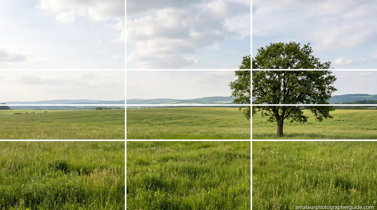
Caption: The rule of thirds grid divides your frame into nine equal parts — the four intersection points are where your subject will have the most visual impact.
Lines, Points, and the 3×3 Grid
The grid consists of two horizontal lines and two vertical lines, creating nine equal rectangles. The four points where those lines cross are your power points — the compositional sweet spots that tend to hold the viewer’s attention most effectively.
Here’s how to locate them mentally: divide your frame into three equal vertical strips and three equal horizontal strips. The power points sit at the corners of the center rectangle. In a standard landscape-orientation photo, that means:
- Upper-left — ideal for faces in portraits, the sun, a bird in flight
- Upper-right — works well for subjects facing left, or secondary focal points
- Lower-left — strong for foreground elements, subjects moving right
- Lower-right — effective for anchoring subjects, subjects moving left
The four lines themselves are also compositional tools. Horizons belong on a horizontal line. Tall vertical subjects — a tree, a building, a standing figure — belong on a vertical line. The power points are the priority placements; the lines are secondary but still powerful.
Enable the Grid on Your Device
Turning on the grid takes less than a minute on any modern device. Here are the exact steps:
- iPhone (iOS 16 and later):
- Open the Settings app
- Tap Camera
- Under the Composition section, toggle Grid to ON
The 3×3 overlay appears immediately in the Camera app and works across all shooting modes — Photo, Video, Portrait, and Panorama. The grid does not appear in your final image.
- Canon DSLR (most models):
- Press the Menu button
- Navigate to the Shooting Settings tab (camera icon, typically the 4th tab)
- Select Grid Display
- Choose 3×3 and press Set
- Nikon DSLR (most models):
- Press the Menu button
- Navigate to Custom Setting Menu (pencil icon)
- Select d Shooting/display
- Find Shooting display or Grid display and enable it
Consult your specific model’s manual if the menu path differs — Nikon menu structures vary more between generations than Canon’s. Most modern mirrorless cameras from Sony, Fujifilm, and Olympus follow a similar Display Settings path. In Adobe Lightroom, you can overlay a rule of thirds grid during cropping by pressing O after entering the Crop tool — a useful way to recompose existing shots.
Seeing the Grid Without Turning It On
Once you’ve shot with the grid for a few weeks, you’ll notice something: you start seeing the power points even when the overlay is off. This is the goal. Intermediate photographers who’ve internalized the grid describe it as a kind of spatial awareness — they raise the camera and immediately know where the subject should sit.
You can accelerate this by practicing a simple mental exercise: before you shoot, visually divide the frame into thirds horizontally and vertically. Pick the power point closest to where your subject naturally falls. Then adjust your position or framing to lock the subject onto that point. Do this consciously for 30 shots, and it begins to feel automatic. The grid is a training tool; the real skill is composition without it.
Why the Rule of Thirds Works
The rule of thirds isn’t arbitrary — it maps onto something real about how human eyes scan a visual field. Understanding the psychology of visual composition makes the technique far easier to apply consistently, because you’re no longer following a rule by rote; you’re working with your viewer’s natural perception.
How Your Eye Scans an Image
Research into visual attention patterns consistently shows that the human eye does not enter an image at the center. Instead, it tends to enter near one of the upper corners and scan in a loose Z or F pattern across the frame. This means a subject placed at the upper-left or upper-right power point is encountered early in the viewer’s natural scan — before their eye has had time to wander.
A centered subject, by contrast, requires the eye to travel to the center before the scan even begins. By that point, the viewer has already registered the composition as static. The Georgia O’Keeffe Museum’s educational resources describe this effect directly: “Applying the rule of thirds ensures that the main focal point is positioned to one side or at the top or bottom of the image, rather than being statically centered.”
This scanning behavior is why off-center composition feels more engaging — the subject intercepts the eye’s natural path rather than waiting passively at the center.
The Role of Negative Space
Negative space — the empty areas of a frame surrounding your subject — is not wasted space. It’s compositional space. When you place a subject on a power point, the remaining three-quarters of the frame becomes active negative space that gives the subject context, breathing room, and implied environment.
A portrait with the subject on the left vertical line and open space to the right creates a visual question: what is the subject looking at? The negative space becomes a kind of narrative suggestion. A bird perched on the lower-right power point with sky filling the upper two-thirds feels free and expansive. The same bird centered feels trapped.
Negative space also affects the perceived weight of an image. A heavy subject — a large building, a wide tree — placed on a power point with negative space on the opposite side creates visual balance through contrast rather than symmetry. The tension between the subject’s weight and the emptiness opposite it is what makes the composition feel resolved rather than awkward.
Visual Tension: Off-Center Subjects
Visual tension is the compositional energy created when elements in a frame feel like they’re in relationship with each other rather than simply coexisting. Off-center placement generates this tension naturally: the subject on a power point creates a pull toward the negative space, and the viewer’s eye moves between the two.
This is why photographers describe rule-of-thirds compositions as having a sense of movement or story — the viewer isn’t just looking at the subject, they’re experiencing a spatial relationship. According to Photography Life, the rule of thirds is intended as a guide for successful composition that suggests placing subjects along one of the four lines or, ideally, at one of the four intersection points — because those points concentrate the most visual energy.
A centered composition, by contrast, distributes tension equally in all directions, which effectively cancels it out. The result is the “passport photo” effect described earlier — technically correct, emotionally inert. Off-center placement is not a guarantee of a great photo; it’s a probability-raiser. That distinction matters, because it sets up the more nuanced skill of knowing when to break the rule entirely.
How to Use the Rule of Thirds in Photography
Knowing the theory is step one. Applying it in the field — with a moving subject, changing light, and a fraction of a second to decide — is where most intermediate photographers stall. These four steps turn the rule of thirds into a repeatable practice.
Step 1: Activate the Grid
Before you raise the camera, turn the grid on. It sounds obvious, but most photographers who “know” the rule of thirds still shoot with the grid off — which means they’re relying on habit rather than intention. On iPhone: Settings → Camera → Grid. On Canon: Menu → Shooting Settings → Grid Display → 3×3. This single step changes how you see the frame.
Step 2: Identify Your Primary Subject
Every frame has a hierarchy. Before you compose, ask: what is this photo about? Is it the person’s face? The mountain peak? The plate of food? Identify the single most important element — the one the viewer’s eye should find first. That element belongs on a power point.
Secondary subjects — a background figure, a foreground flower, a distant building — can be placed on secondary lines or left in the negative space. But the primary subject gets a power point. Trying to place two competing subjects on two different power points simultaneously is a common intermediate mistake; it divides the viewer’s attention rather than directing it.
Step 3: Choose the Right Power Point
Not all four power points are equal for every subject. Here’s a quick decision framework:
- Subject facing or moving right: Place on the left vertical line (upper-left or lower-left power point), leaving room in the direction of movement
- Subject facing or moving left: Place on the right vertical line
- Landscape with strong sky: Place horizon on the lower horizontal line (sky gets two-thirds)
- Landscape with strong foreground: Place horizon on the upper horizontal line (foreground gets two-thirds)
- Portrait: Place the near eye on the upper-left or upper-right power point
This concept — giving a subject space in the direction they’re facing or moving — is called leading room (sometimes “looking room”). It’s one of the most intuitive applications of the rule of thirds and one of the most commonly missed by beginners.
Step 4: Adjust Your Position
Amateur photographers tend to compose by zooming in or out. Intermediate photographers compose by moving. Once you’ve identified your subject and the power point you want it on, physically reposition yourself — step left, crouch down, raise your angle — until the subject sits on that point. This approach produces better background separation, more natural perspective, and stronger depth than zoom-only adjustments.
If you can’t move (street photography, wildlife), use the camera’s live view grid to shift your framing before the shot. Crop in post as a last resort — but recognize that cropping after the fact means you’ve lost resolution and the composition was reactive rather than intentional.
What Are Common Photography Mistakes?
The most common mistake is placing the subject dead center by default — a habit reinforced by cameras that focus at the center point. Across photography forums and beginner communities, another frequently reported mistake is placing the subject near a power point rather than precisely on it. A subject placed halfway between center and the power point gets neither the stability of center nor the dynamic energy of the thirds intersection. It just looks accidentally off-center. Use the grid overlay to be precise, especially while building the habit. For a comprehensive breakdown of other pitfalls, check out our 10 common photography mistakes to avoid guide.
Other frequent errors include:
- Tilting the horizon while trying to hit a power point — use the level feature alongside the grid.
- Cropping the subject awkwardly to force it onto a power point (especially cutting off limbs in portraits).
- Placing every element on a thirds line, which creates visual clutter rather than hierarchy.
- Ignoring the background while focusing on subject placement — a perfectly placed subject in front of a distracting background is still a weak photo.
Composition improves fastest when you identify your specific default error and address it directly. The rule of thirds improves your compositional foundation, but it doesn’t replace attention to light, background, and timing.
Rule of Thirds Examples: Before and After
Reading about composition is one thing. Seeing the difference is another. These three before/after scenarios describe the exact visual transformation that happens when you shift from centered framing to rule-of-thirds placement — each one targets a different genre and a different type of compositional problem.
Before and After: Portrait

Before: A subject is centered in the frame, face filling the middle third. Equal negative space on the left and right. The subject looks directly at the camera. The image is technically sharp and correctly exposed — but it feels like a yearbook photo. The viewer’s eye has nowhere to go after registering the face.
After: The subject is positioned on the left vertical line, with their near eye on the upper-left power point. They’re looking slightly right, into the open negative space. The background — blurred trees, an open doorway — is now visible in the right two-thirds of the frame. The viewer’s eye follows the subject’s gaze into that space, creating a sense of the subject existing within an environment rather than posing in front of one.
Caption: Shifting the subject from center to the left power point opens the frame and creates a natural visual journey for the viewer’s eye.
Before and After: Landscape
Before: A coastal scene with the horizon splitting the frame exactly in half — equal sky above, equal water below. Both halves compete for attention. The image feels indecisive: it can’t commit to being a sky photo or a water photo. The result is compositional ambiguity.
After: The horizon is placed on the lower horizontal thirds line. The sky now fills two-thirds of the frame — dramatic clouds dominate, the light on the water is visible but secondary. The image has a clear visual hierarchy: sky first, water second. Alternatively, with the horizon on the upper thirds line, the textured foreground water becomes the subject, and the sky becomes context. Both work. Neither requires centering.
Before and After: Street
Before: A street vendor is centered in the frame, equal space on both sides. The busy street behind them is equally visible left and right, and the vendor’s face is the only anchor point. The image feels like a snapshot — the viewer’s eye doesn’t know where to travel.
After: The vendor is placed on the right vertical line, facing slightly left into the open space that now dominates the left two-thirds of the frame. The street activity visible to the left becomes part of the story — the vendor exists within the bustle rather than isolated from it. The leading room in front of them creates implied movement and context.
Applying the Rule of Thirds by Photography Genre
How you use the rule of thirds shifts significantly depending on what you’re photographing. A horizon line that works beautifully in a coastal landscape is irrelevant in a macro food shot. Across our evaluation of genre-specific photography communities and instructional resources, the consistent finding is that most photographers learn the rule in the abstract and then struggle to translate it into the specific decisions their genre actually requires.
These five genre breakdowns address that gap directly.
Landscape: Placing the Horizon

In landscape photography, the most impactful single decision you make is where to place the horizon. The rule of thirds gives you two options: the lower horizontal line (sky gets two-thirds, emphasizing atmosphere, clouds, and light) or the upper horizontal line (foreground gets two-thirds, emphasizing terrain, water, or texture).
The choice depends on which element is more visually compelling. If the sky is dramatic — golden-hour light, storm clouds, a vivid sunset — give it two-thirds. If the foreground is the story — wildflowers, reflective water, interesting rock formations — flip it. What you almost never want is the horizon centered, because it forces the viewer to split their attention equally between two competing zones.
A secondary rule-of-thirds application in landscapes: vertical elements like trees, rock formations, or lighthouses belong on one of the vertical lines, not centered. Place a lone tree on the left vertical line with open sky to the right, and the image gains a sense of isolation and scale that a centered tree simply can’t achieve. For more advanced techniques, consult a dedicated landscape photo composition guide.
Caption: Moving the horizon from center to the lower third line immediately gives the sky room to become the dominant visual element.
Portraits: Where to Place the Eyes
In portrait photography, the power point rule is simple: the near eye goes on a power point. Specifically, the upper-left or upper-right power point, depending on which side of the frame your subject occupies. This placement ensures the most expressive and important part of the face — the eyes — sits at the compositional sweet spot.
A common intermediate error is placing the entire face on the power point rather than the eyes specifically. If you position the nose or the center of the face on the upper-left power point, the eyes end up above the line — and the image feels top-heavy. Adjust your framing so the eye line sits on the horizontal thirds line, with the face itself on the vertical thirds line.
For environmental portraits — subjects photographed in context rather than against a plain background — give the subject leading room in the direction they’re facing. A person looking right belongs on the left vertical line, with the right two-thirds of the frame showing their environment. This is what distinguishes an environmental portrait from a headshot: the negative space tells part of the story.
Food and Still Life Photography
Food photography is one of the most underserved niches when it comes to rule-of-thirds instruction — and one of the most rewarding to apply it in. The principles translate directly, but the execution is different because you control the entire scene.
For overhead (flat lay) food shots, place the hero element — the main dish, the tallest item, the most visually complex piece — at one of the four power points. Supporting elements (cutlery, garnishes, napkins) can occupy the surrounding thirds, but they should not compete with the hero for the power-point position.
For 45-degree angle shots (the most common in food photography), treat the near edge of the table or the “horizon” of the dish as you would a landscape horizon: place it on the upper or lower thirds line rather than centering it. The main subject — a bowl of soup, a stack of pancakes — then sits at the intersection of that line and one of the vertical thirds lines, landing naturally on a power point.
Negative space is especially powerful in food photography. A single plate of pasta placed on the lower-right power point with clean negative space filling the upper-left creates an elegant, editorial feel that centered food shots rarely achieve. According to food photography educators, this asymmetrical placement is what separates social-media snapshots from professional-looking food imagery.
Street Photography and Moving Subjects
Street photography is where the rule of thirds meets real-time decision-making — you have a fraction of a second, and there’s no repositioning the subject. The key skill is pre-composing: setting up your frame before the subject enters it, with a power point already designated for where they’ll be.
The most important application is leading room. A person walking right belongs on the left vertical line, with open space ahead of them. A cyclist moving left belongs on the right line. This placement does two things: it creates a sense of motion (the subject is moving toward something) and it invites the viewer’s eye to follow the implied trajectory into the negative space.
Without leading room, a moving subject feels cramped — like they’re about to exit the frame, or like the photographer was half a second late. With it, the image has narrative momentum.
For stationary street subjects — a vendor, a musician, a child at play — the same portrait rules apply. Place the near eye or the face on a power point, and give them space in the direction they’re facing or looking.
Nature and Wildlife Photography
Wildlife photography combines the unpredictability of street photography with the compositional goals of portraiture. You can’t reposition a bird in flight or ask a deer to look left. What you can do is pre-position yourself so that when the animal enters your frame, it naturally falls near a power point.
For birds in flight, the goal is always to place the bird on the leading power point with open sky ahead of it — never at the trailing edge of the frame. A bird flying right belongs on the left power point (upper-left if it’s in the upper portion of the sky, lower-left if it’s lower). The open sky in front of it creates the leading room that makes the image feel like a moment captured mid-journey rather than a subject about to exit.
For stationary wildlife — an owl on a branch, a fox in a field — treat the animal’s eye exactly as you would a portrait: place it on the upper power point closest to the subject’s position. The surrounding negative space (sky, foliage, open field) then becomes the environment that contextualizes the subject.
The rule of thirds is especially effective in wildlife photography because it prevents the instinct to zoom in tightly and center the animal — an approach that, while technically sharp, eliminates the habitat that makes wildlife photography compelling.
When to Break the Rule of Thirds
The rule of thirds is a powerful default. It is not a law. Across photography communities and instructional resources, the consensus is consistent: photographers who understand why the rule works are also the ones who know exactly when to set it aside. This is the core of Framing with Purpose — the ability to make a compositional decision consciously, whether that decision follows the rule or deliberately violates it.
Here are five specific scenarios where breaking the rule produces a stronger image.
Symmetry: When Center Works Better
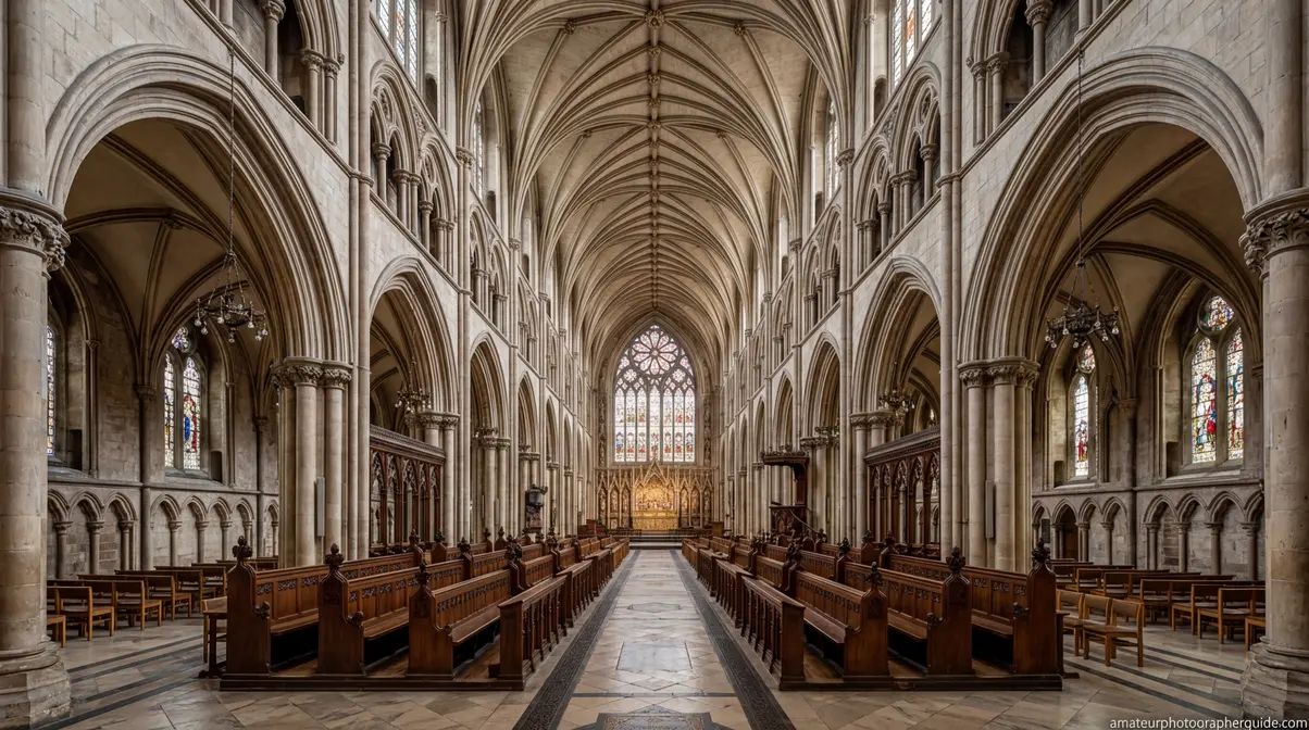
Centering is the right choice when your subject is the symmetry. Architectural photography is the clearest example: a cathedral facade, a long corridor with identical columns on both sides, a bridge reflected perfectly in still water. Centering these subjects doesn’t create a static image — it creates a powerful, intentional visual statement about balance and order.
The key distinction is whether the symmetry is the subject or an accident. A centered portrait of a person’s face is usually static because there’s nothing symmetrical about a human face at an angle. A centered shot of a perfectly mirrored mountain reflection in a still lake is static in the best possible way — the symmetry is the image.
Caption: When the symmetry is the subject, centering serves the image — breaking the rule here would undermine the visual logic.
Filling the Frame and Macro Shots
Macro photography — extreme close-ups of flowers, insects, textures, or food details — often works best when the subject fills the entire frame. At that scale, the concept of a “power point” becomes less relevant because there’s no negative space to work with and no background to separate from.
Similarly, environmental portraits where the subject intentionally fills the frame — a face pressed close to the lens, a texture shot of weathered wood — don’t benefit from thirds placement because the entire frame is the subject. Trying to force a power-point placement in these situations creates awkward cropping rather than better composition.
The test: if your subject fills more than 60-70% of the frame, the rule of thirds is probably not your primary compositional tool. Focus instead on where within the subject to place the sharpest focus — for a macro flower, that’s typically the stamens or the outermost petal edge.
Leading Lines and Dynamic Diagonals
Leading lines — roads, fences, rivers, stairways — are compositional elements that guide the viewer’s eye through the frame. When a strong leading line is present, the line itself becomes the primary compositional tool, and thirds placement becomes secondary.
A road that enters the frame from the lower-left corner and disappears toward the upper-right creates a diagonal that naturally draws the eye. Placing the vanishing point on a power point can reinforce this — but forcing a subject onto a thirds line when it disrupts the line’s natural trajectory is a mistake. Let the leading line dictate the composition; use the rule of thirds as a secondary check, not the primary framework.
Diagonal compositions in particular — what photographers sometimes call “dynamic diagonals” — generate their own visual tension. A horizon tilted 15 degrees creates energy that a rule-of-thirds horizon can’t match in certain action scenarios. This is an advanced technique, but the principle is the same: when another compositional tool is doing more work than the rule of thirds, follow the stronger tool.
The Golden Ratio: A Refined Alternative
The Golden Ratio (approximately 1:1.618, often visualized as the Fibonacci spiral) is an alternative compositional framework that predates the rule of thirds and produces similar but subtler results. Where the rule of thirds divides the frame into equal thirds, the Golden Ratio uses proportions derived from nature — the spiral of a nautilus shell, the branching of a tree — to identify compositional focal points.
In practice, the Golden Ratio’s focal point sits slightly closer to the center than the rule-of-thirds power point. This makes compositions feel a touch more organic and less geometrically rigid. According to SLR Lounge, the rule of thirds is a simplified approximation of the Golden Ratio — easier to apply in the field but slightly less precise. For a deeper dive into this mathematical approach, check out our golden ratio photography guide.
The practical recommendation: use the rule of thirds while shooting (it’s faster and maps to your camera’s built-in grid), and apply the Golden Ratio during post-production cropping when you want to refine a composition with more nuance. The photography golden ratio vs. rule of thirds debate is largely academic for field work; both are tools, not truths.
Framing with Purpose
Every scenario described above has one thing in common: the decision to break the rule was intentional. This is the essence of Framing with Purpose — the framework introduced at the beginning of this guide that distinguishes deliberate photographers from habit-driven ones.
Framing with Purpose means making every compositional decision — whether following or breaking the rule of thirds — with conscious intent rather than default behavior. A photographer who centers a subject because they forgot to think about composition has made a passive choice. A photographer who centers a subject because the symmetry demands it has made an active one. The images may look identical; the process that created them is completely different.
The goal of this guide is not to make you follow the rule of thirds every time you raise your camera. It’s to make you choose. The rule is your starting point — the most reliable default for most subjects in most situations. But the moment you understand why it works, you also understand exactly when it doesn’t. That understanding is what moves you from technically competent to visually intentional.
Common Pitfalls and Limitations
Common Pitfalls
Placing the subject “near” rather than “on” the power point. This is the most reported issue across beginner photography communities. A subject placed halfway between center and the intersection gets neither the stability of centering nor the dynamic energy of the power point. It simply looks slightly off. Use the grid overlay to be precise, especially while building the habit.
Ignoring the background while chasing the power point. The rule of thirds improves composition; it doesn’t fix a distracting background. A perfectly thirds-placed subject in front of a cluttered, busy background is still a weak photograph. Composition and background management are separate skills — both matter.
Using the rule as a substitute for thinking. Applying the rule of thirds to every shot without considering whether it’s the right tool is the same mistake as centering every shot by default. The rule is a starting point, not a destination. Across photography educator resources, the consistent warning is against mechanical rule-following that bypasses creative judgment.
Applying thirds to macro and fill-frame shots. When the subject fills the frame, thirds placement forces awkward cropping. Recognize when the rule doesn’t apply and adjust your approach accordingly.
Tilting the horizon while trying to hit a power point. Many beginners tilt the camera to shift the horizon toward a thirds line. Use your device’s level feature alongside the grid — most cameras and phones offer both simultaneously.
When to Choose Alternatives
If your subject is architecturally symmetrical — a building facade, a bridge, a tunnel — centering produces a stronger image than any thirds placement. The rule of thirds actively undermines symmetry-based compositions.
If you’re shooting macro or extreme close-up work, the fill-frame approach is more appropriate. Thirds placement requires negative space; macro photography eliminates it by design.
If a strong leading line or diagonal is the primary compositional element, follow the line rather than the grid. The two systems can coexist, but when they conflict, the stronger compositional element wins.
When to Seek Expert Help
If you’re consistently producing technically sharp images that still feel flat or unresolved, the issue is almost always compositional — and a one-on-one photography workshop or structured critique session will diagnose it faster than any tutorial. Photography communities on platforms like Flickr and 500px offer regular critique threads where experienced photographers provide specific, actionable feedback on composition. Seeking that kind of feedback accelerates improvement in ways that solo practice cannot.
Frequently Asked Questions
What is the rule of thirds in photography?
The rule of thirds is a compositional guideline that divides the camera frame into nine equal rectangles using two horizontal and two vertical lines. The four points where those lines intersect — called power points or crash points — are the strongest positions for your primary subject. Placing a face, a horizon, or a focal element on one of these points tends to produce more dynamic and visually engaging images than centering the subject. It’s one of the first techniques taught in photography courses because it reliably improves composition across nearly every genre. By mastering this foundational framework, you train your eye to see spatial relationships rather than just subjects.
How do I use the rule of thirds?
Start by enabling the grid on your camera or phone — on iPhone, go to Settings → Camera → Grid; on Canon DSLRs, navigate to Menu → Shooting Settings → Grid Display → 3×3. Once the grid is visible, identify your primary subject, then physically reposition yourself or adjust your framing until that subject sits on one of the four intersection points. Practice with the grid on until you can see the power points without it.
When should you not use the rule of thirds?
Skip the rule of thirds when symmetry is the subject. Architectural scenes, mirror reflections, and perfectly balanced compositions are weakened by off-center placement. You should also skip it for macro and fill-frame shots, where the subject occupies most of the frame and there’s no negative space to work with. Additionally, strong leading lines and dynamic diagonals sometimes override the thirds grid as the primary compositional tool. The core principle — Framing with Purpose — is that any compositional decision made intentionally is valid; the rule is a default, not a strict requirement.
The Deliberate Photographer’s Next Step
Rule of thirds photography is the most reliable compositional tool available to photographers at any level — because it works with how the human eye naturally scans a frame rather than against it. Off-center placement creates visual tension, gives negative space a purpose, and turns a snapshot into an image with a visual journey. The power points are not magic; they’re probability-raisers. Place your subject on one, and you’ve dramatically improved the odds that the image will hold a viewer’s attention.
The “Framing with Purpose” framework takes this further. Once you understand why the rule works, you understand when it doesn’t — and that’s where creative photography actually begins. Symmetry, macro work, leading lines, and the Golden Ratio all represent legitimate alternatives, each appropriate in specific contexts. The skill is not memorizing the rule; it’s developing the compositional judgment to choose the right tool for the image you’re trying to make.
Is the Rule of Thirds for Beginners?
The rule of thirds is an entry point, not a ceiling. Beginners benefit from it because it immediately breaks the centering habit and produces more dynamic images. But intermediate and advanced photographers use it constantly — just more selectively. The difference is that experienced photographers know when to apply it and when to break it deliberately. It’s taught first in photography courses because it’s the most broadly applicable compositional tool, not because it’s the simplest or least sophisticated one.
Your next step is simple: enable the grid on your camera or phone right now and shoot your next 30 frames with it on. Don’t overthink the power points — just notice where your subjects are landing relative to the grid. After 30 frames, you’ll have a clearer picture of your default habits and where the rule of thirds can make the biggest difference. That awareness is the foundation of every compositional decision you’ll make from here forward.