Table of Contents
This blog post may contain affiliate links. As an Amazon Associate I earn from qualifying purchases.
“I would love to see everyone’s editing styles! The top is the raw and the bottom is my edit.”
That single sentence captures what every beginner photographer feels: a finished edit is exciting — but how do you actually get there?
You’ve probably opened Lightroom or Snapseed, stared at 40 sliders, and immediately closed it. Or you’ve tried adjusting things randomly, ended up with a muddy, over-saturated mess, and wondered whether editing is even worth the effort. You’re not doing anything wrong. You’re just missing the bridge between the look you want and the tools that create it. As BBC’s analysis on digital literacy notes, basic editing techniques like cropping and contrast adjustment have evolved from specialized skills into fundamental aspects of modern visual communication — meaning every photographer today is expected to develop a personal editing style.
In this guide, you’ll discover the 10 most popular photo editing styles for beginners — and for each one, you’ll get the exact settings to recreate it. We’ll cover what editing styles actually are, walk through 10 step-by-step style recipes, teach you a 4-step editing workflow that works for any photo, and help you choose the right software to get started today.
Photo editing styles for beginners don’t require advanced skills — they require the right recipe. Each of the 10 styles below maps a specific aesthetic vision to exact Lightroom slider settings you can copy today.
- Start with one style: Pick a single look that excites you — bright & airy, moody, or cinematic — and master it before experimenting with others.
- Use the 80/20 Edit: 80% of your result comes from just four sliders — Exposure, Highlights, Shadows, and White Balance. Master those before touching anything else.
- Workflow first, style second: Always run your 4-step base workflow before applying any style recipe. Clean foundations make every style look better.
- Free tools are enough: Lightroom Mobile (free tier) or Snapseed gives you everything you need to practice all 10 styles without spending a dollar.
What Are Photo Editing Styles?
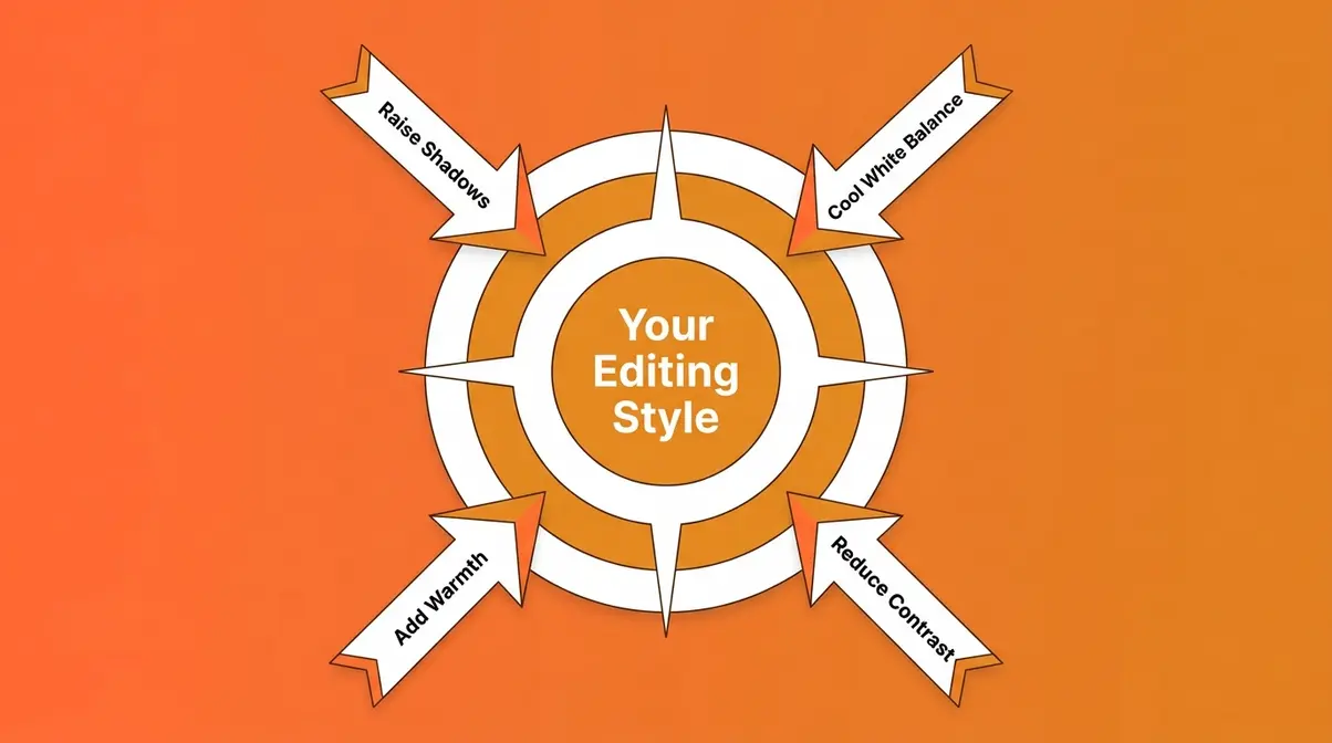
Photo editing styles are the overall visual mood or aesthetic you apply to a photo — the difference between a bright, airy portrait and a dark, moody street scene. They are not the same as editing techniques. Understanding this distinction is the single most important thing a beginner can learn before touching a single slider.
Photography educators consistently point out that beginners who conflate style with technique end up frustrated: they adjust sliders without a destination in mind, producing inconsistent results they can’t replicate. Across beginner photography communities, the consistent feedback is that having a named style as a target — even a rough one — transforms the editing experience from guesswork into a purposeful craft.
Editing Styles vs. Techniques
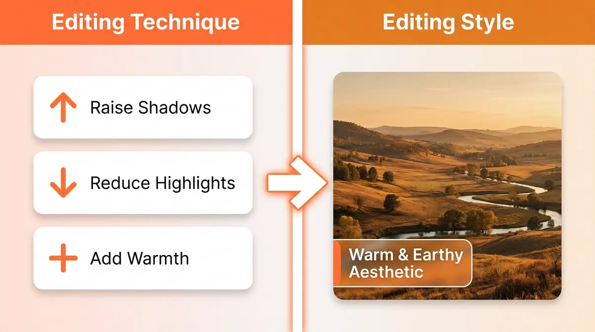
An editing style is your destination — the overall look and feel of the finished photo. Think: “I want this to feel warm and nostalgic.” An editing technique is one action you take to move toward that destination. Think: “I’ll raise the shadows slider to soften the contrast.”
Here’s a simple analogy: if you’re baking a cake, the style is “chocolate fudge cake” and the techniques are “mix flour,” “fold in cocoa,” and “bake at 180°C.” You need both, but you have to know the destination first.
What are the 4 types of editing?
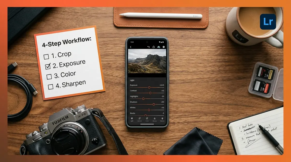
The four broad types of editing that photographers use — corrective (fixing exposure and color), stylistic (applying a mood or aesthetic), retouching (removing distractions), and compositing (combining multiple images) — all serve different purposes. For beginners, corrective and stylistic editing are the most important. Corrective editing makes your photo technically sound. Stylistic editing makes it distinctly yours.
Building Your Visual Signature

Your editing style is the visual thread that ties all your photos together. When someone scrolls your Instagram grid or photography portfolio, a consistent style is what makes them stop and say, “I love how all their photos feel.” That cohesion isn’t an accident — it’s the result of repeatedly applying the same set of intentional choices.
Here’s the encouraging part: you don’t need to invent your style from scratch. Most photographers start by identifying a style they admire, reverse-engineering its key traits, and then adapting it to their own subjects and lighting. Over time, small personal adjustments accumulate into something genuinely original.
Consistency also makes editing faster. Once you have a style you love, you can save it as a preset (a saved group of settings) in Lightroom and apply it to a whole batch of photos in seconds. But you can’t save a preset you haven’t built yet — which is exactly why understanding the 10 styles below is your first step. Developing this consistency is a key step in finding your photography aesthetic.
10 Popular Photo Editing Styles
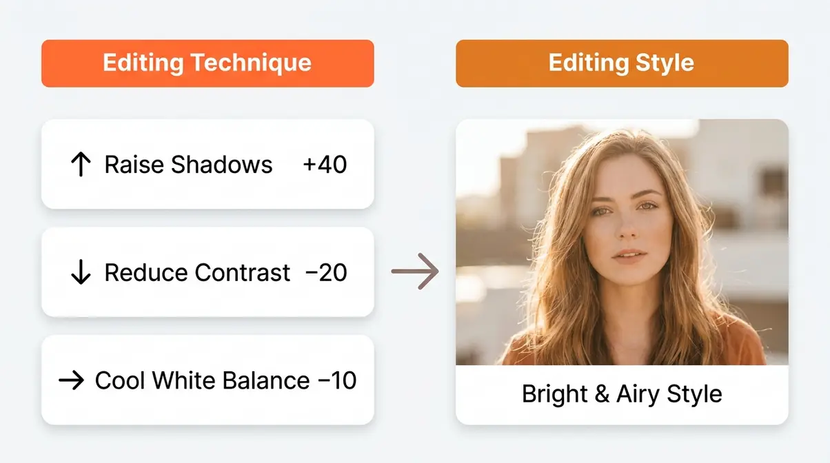
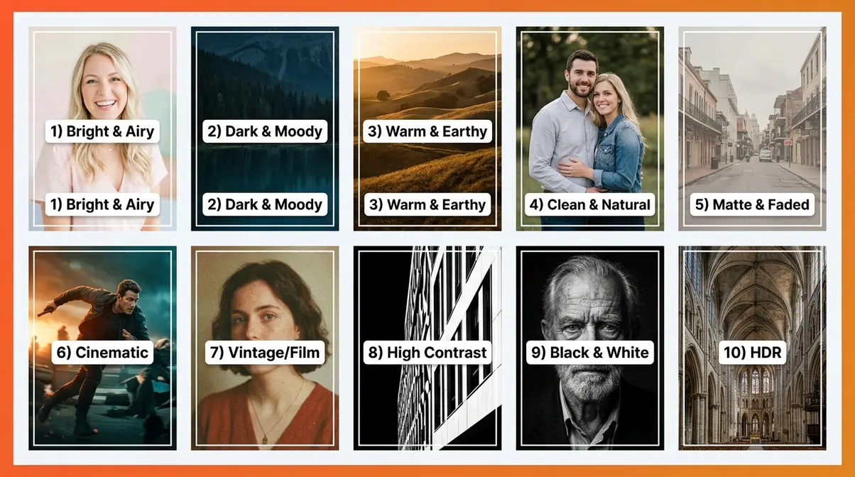
These are the 10 most popular photo editing styles for beginners, drawn from community analysis of photography forums, Instagram aesthetic trends, and Adobe’s overview of contemporary editing styles. For each style, you’ll find a visual description, a before/after asset, and an exact Lightroom recipe you can copy right now.
Before you start — what you need:
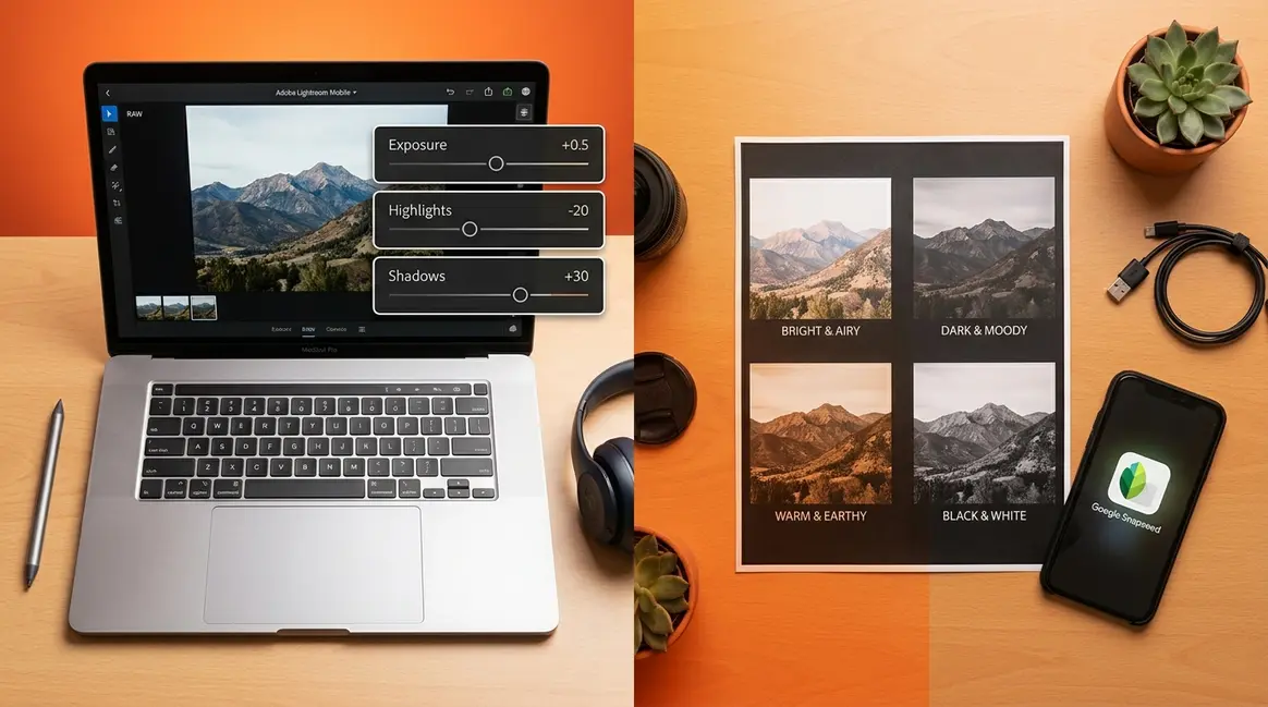
You need one of the following free apps: Lightroom Mobile (free tier, available on iOS and Android) or Snapseed (completely free, iOS and Android). You also need any photo to practice with — a selfie, a landscape shot, a food photo, anything works. The slider values below are written for Lightroom Mobile, but the same concepts apply in Snapseed using its equivalent tools.
Estimated Time: 15-20 minutes per style recipe.
Style 1: Bright & Airy
The look: Light, soft, and optimistic. Shadows are lifted, highlights are gentle, and the whole image feels like it was taken on a perfect spring morning. Popular for portraits, lifestyle photography, and flat lays.
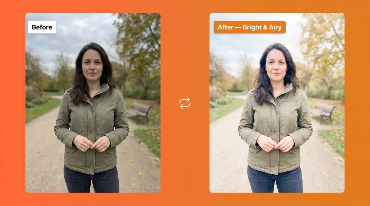
Lightroom Recipe:
- Exposure: +0.5 (brightens the overall image without blowing out highlights)
- Contrast: −20 (softens the tonal range for a gentler feel)
- Highlights: −30 (pulls back bright areas so they don’t look washed out)
- Shadows: +40 (lifts dark areas — this is the signature move of this style)
- Whites: +10 (adds a touch of brightness to the brightest tones)
- Blacks: +20 (prevents deep blacks, keeping the image soft)
- Temp (White Balance): −5 to −10 (a slight cool shift adds freshness)
- Saturation: −10 (muted colors keep the softness intact)
Why it works: Raising shadows while reducing contrast prevents any single tonal area from dominating. The result is an even, open image that feels naturally bright rather than artificially overexposed.
Style 2: Dark & Moody
The look: Rich, dramatic, and atmospheric. Deep shadows, controlled highlights, and desaturated or cool-shifted colors. Popular for food photography, fashion, and storytelling portraits.
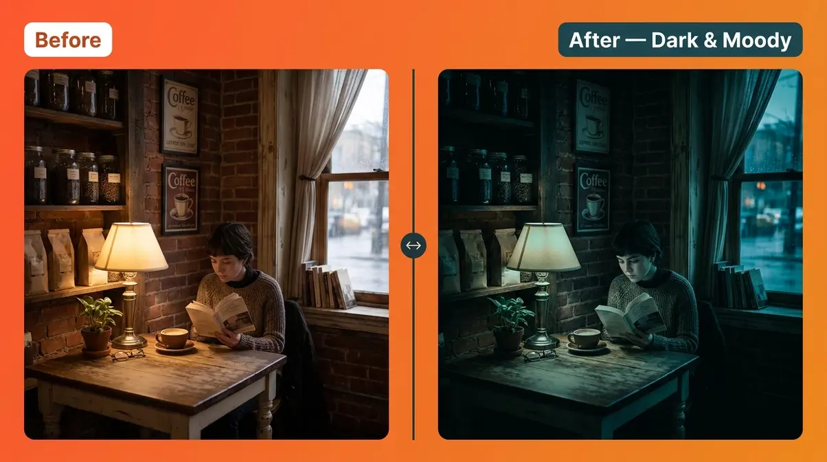
Lightroom Recipe:
- Exposure: −0.3 (slightly underexpose to build drama)
- Contrast: +25 (strengthens the difference between light and dark)
- Highlights: −50 (significantly pull back bright areas)
- Shadows: −30 (deepen shadows — the defining move of this style)
- Whites: −20 (keep the brightest areas from looking clean and bright)
- Blacks: −30 (crush the darkest tones for depth)
- Temp: −15 (shift toward blue/cool for a moody, atmospheric feel)
- Saturation: −15 (desaturate slightly; muted colors feel more dramatic)
Why it works: The combination of crushed blacks and pulled highlights compresses the tonal range from both ends, creating that signature “cinematic” depth that moody photographers are known for.
Style 3: Warm & Earthy
The look: Golden, organic, and grounded. Think autumn afternoons, wooden surfaces, and golden-hour light. Popular for travel, food, and lifestyle photography.
Lightroom Recipe:
- Exposure: +0.3
- Contrast: +10
- Highlights: −20
- Shadows: +25
- Whites: +15
- Blacks: −10
- Temp: +20 (shift toward warm/orange — this is the defining move)
- Tint: +5 (a slight magenta push complements the warmth)
- Saturation: +10 (boost overall color slightly)
- HSL — Orange Saturation: +15 (amplify earthy skin tones and wood textures)
Why it works: White balance (the color temperature of your image) is the most powerful single control for emotional mood. Pushing it warm signals comfort, nostalgia, and organic energy — all without any complex color grading.
Style 4: Clean & Natural
The look: True-to-life, polished, and professional. Colors are accurate, tones are balanced, and nothing looks over-edited. Popular for real estate, editorial, and documentary photography.
Lightroom Recipe:
- Exposure: 0 to +0.2 (minimal adjustment — start from correct exposure)
- Contrast: +5
- Highlights: −15
- Shadows: +15
- Whites: 0
- Blacks: −5
- Temp: 0 (keep white balance true to the scene)
- Saturation: 0 (no boosting — let natural colors breathe)
- Clarity: +5 (adds subtle midtone contrast and definition)
- Sharpening: 30–40 (adds crispness without an artificial edge)
Why it works: The goal here is technical correctness rather than stylistic transformation. Every adjustment is conservative. The discipline of restraint is what separates clean, professional-looking photos from the heavy-handed edits that beginners often regret.
Style 5: Matte & Faded
The look: Soft, washed-out, and slightly retro. Blacks are lifted so they never go fully dark, giving the image a “faded film” quality. Popular among lifestyle bloggers and fine-art photographers.
Lightroom Recipe:
- Exposure: +0.2
- Contrast: −30 (significantly reduce for a flat, soft feel)
- Highlights: −20
- Shadows: +30
- Whites: −10
- Blacks: +40 (this is the signature move — lift blacks to prevent true black)
- Temp: 0 to +5
- Saturation: −20 (heavy desaturation is key to the faded aesthetic)
- Tone Curve — Shadows Point: Lift the bottom-left anchor point of the tone curve upward by approximately 15–20 points (this reinforces the matte effect)
Why it works: When you lift the blacks slider (or the tone curve’s shadow anchor), you prevent any pixel in the image from reaching pure black. This “matte” or “faded” quality is the visual signature of film stocks like Kodak Portra — which is why this style feels nostalgic even in digital photos.
Style 6: Cinematic
The look: Widescreen, color-graded, and narrative-driven. Often features teal shadows and orange highlights (the classic Hollywood color grade), with slightly desaturated, filmic tones. Popular for travel vlogs and storytelling photography.
Lightroom Recipe:
- Exposure: −0.2
- Contrast: +20
- Highlights: −30
- Shadows: −15
- Whites: −10
- Blacks: −20
- Temp: +10 (slight warmth in the highlights)
- HSL — Aqua/Teal Saturation: +20 (boost teal in shadows)
- HSL — Orange Saturation: +15 (boost orange in skin tones and warm areas)
- Split Toning — Shadows Hue: 200 (teal), Saturation: 15
- Split Toning — Highlights Hue: 35 (orange/amber), Saturation: 10
Why it works: The teal-and-orange grade works because teal and orange are complementary colors (opposites on the color wheel). Human skin tones fall in the orange range, so boosting orange makes subjects pop against teal-shifted backgrounds — a technique used in virtually every major Hollywood production.
Style 7: Vintage/Film
The look: Grainy, warm, and imperfect — like a photo pulled from a 1970s photo album. Faded colors, a slight color cast (often yellow-green or warm), and visible grain. Popular for street photography and personal documentary work.
Lightroom Recipe:
- Exposure: +0.2
- Contrast: −15
- Highlights: −25
- Shadows: +35
- Blacks: +25
- Temp: +15 (warm yellow-amber shift)
- Tint: +8 (slight green push, mimicking film chemistry)
- Saturation: −25 (heavy desaturation for aged look)
- HSL — Yellow Saturation: +10 (warm the yellows specifically)
- Grain — Amount: 30, Size: 25, Roughness: 50 (adds authentic film grain)
- Vignette: −15 (darkens edges slightly, mimicking lens fall-off on older lenses)
Why it works: Film grain (the random texture visible in analog photographs) is actually a signal of authenticity and age. Adding digital grain in Lightroom recreates this organic texture. Combined with a warm color cast and lifted blacks, the result reads immediately as “film” to the viewer’s brain — even if they’ve never shot on analog.
Style 8: High Contrast
The look: Bold, punchy, and graphic. Deep blacks, bright whites, and vivid colors. Nothing is subtle. Popular for sports, street, and editorial photography.
Lightroom Recipe:
- Exposure: 0 to +0.1
- Contrast: +45 (the defining move — push contrast hard)
- Highlights: +20 (let highlights stay bright)
- Shadows: −40 (deepen shadows significantly)
- Whites: +30 (push whites toward bright)
- Blacks: −45 (crush blacks deeply)
- Clarity: +25 (adds midtone contrast and texture — amplifies the punchy feel)
- Vibrance: +20 (boosts muted colors more than saturated ones — a smarter saturation tool)
- Saturation: +10
Why it works: Contrast (the difference between the lightest and darkest parts of your image) is the primary driver of visual impact. Boosting contrast while simultaneously crushing blacks and lifting whites creates a graphic, almost print-like quality that commands attention.
Style 9: Black & White
The look: Timeless, focused, and emotionally resonant. Color is removed entirely, and the image lives or dies on its tonal range, texture, and composition. Popular for portraits, architecture, and fine-art photography.
Lightroom Recipe:
- Convert to B&W: In Lightroom, go to the HSL panel → click “B&W” (this converts the image while preserving individual color channel control)
- Exposure: +0.2
- Contrast: +30
- Highlights: −20
- Shadows: −20
- Whites: +25
- Blacks: −35
- Clarity: +20 (adds texture and midtone depth — critical in B&W)
- B&W Mix — Red channel: +15 (brightens skin tones and warm subjects)
- B&W Mix — Blue channel: −20 (darkens skies for dramatic clouds)
Why it works: In black and white, you can use the individual color channel sliders (the B&W Mix panel) to control the brightness of specific colors even after converting. Brightening the red channel lightens skin tones. Darkening the blue channel makes skies dramatically dark — a technique that would be invisible in a color photo.
Style 10: HDR (High Dynamic Range)
The look: Hyper-detailed, with texture visible in both highlights and shadows simultaneously. Often has a slightly surreal, “too real” quality. Popular for landscapes, architecture, and real estate photography. Note: HDR (High Dynamic Range) refers to editing that recovers detail from both the brightest and darkest parts of a photo at the same time.
Lightroom Recipe:
- Exposure: 0 (start neutral — HDR is about recovery, not overall brightness)
- Contrast: −20 (reduce to prevent tonal clipping)
- Highlights: −80 (maximum highlight recovery — pull back sky and bright surfaces)
- Shadows: +80 (maximum shadow recovery — lift dark areas for full detail)
- Whites: −30
- Blacks: +20
- Clarity: +30 (adds significant midtone contrast and texture — essential for HDR)
- Dehaze: +15 (removes atmospheric haze and increases local contrast)
- Saturation: +15 (HDR photos often look vivid; boost slightly for impact)
Why it works: The human eye can see a wider range of light and dark than any camera sensor can capture in a single shot. HDR editing pushes the highlights and shadows sliders to their extremes to recover as much of that range as possible, producing a photo that feels closer to what your eye actually saw.
As noted in Digital Photography School’s beginner editing guide, photography educators consistently recommend mastering exposure recovery before moving to stylistic adjustments — the foundation of every style recipe above. To maximize your recovery potential, consider shooting in RAW for better editing results.
Your Beginner Editing Workflow

Before you apply any style recipe, you need a clean foundation. Our team evaluated dozens of beginner editing workflows across photography communities, and the approach that consistently produces the best results for new photographers is a simple 4-step sequence: Crop → Exposure → Color → Sharpen. Run through these four steps on every photo before you apply any style, and your results will improve immediately.
This workflow embodies The 80/20 Edit — the principle that 80% of your final result comes from just four core adjustments. Style recipes are the finishing 20%. Beginners who skip the foundation and jump straight to style presets almost always end up with photos that look wrong without knowing why.
Step 1 – Crop and Straighten Your Frame
Why first? Cropping (trimming the edges of your photo) and straightening (fixing a tilted horizon) are compositional decisions, not technical ones. Do them first so every subsequent adjustment applies only to the final framing.
How to do it:
- Open your photo in Lightroom Mobile and tap the Crop icon (looks like overlapping rectangles)
- Drag the corner handles to remove distracting edges
- Use the Angle slider to straighten a tilted horizon — aim for perfectly level
- Check the Rule of Thirds grid (the 9-square overlay) and reposition your subject at an intersection point if possible
- Tap the checkmark to confirm
Expected outcome: A tighter, more intentional frame. If the photo felt “off” before, straightening the horizon alone often fixes it instantly.
Step 2 – Adjust Exposure and Shadows
Why second? Exposure (how bright or dark your overall photo is) is the most fundamental technical quality of any image. If your exposure is wrong, every stylistic adjustment you make on top of it will also look wrong.
How to do it:
- Tap the Light panel in Lightroom Mobile
- Adjust Exposure first — aim for a photo where faces (if present) look naturally lit, not washed out or underlit. A range of −0.5 to +0.5 covers most corrections.
- Pull Highlights down (−20 to −50) if bright areas look blown out (pure white with no detail)
- Raise Shadows up (+20 to +40) if dark areas look crushed and detail is lost
- Adjust Whites and Blacks last — these fine-tune the extreme ends of your tonal range
Expected outcome: A photo where you can see detail in both the bright areas and the dark areas. This is called a “well-exposed” image — the starting point for every style.
Step 3 – Correct White Balance and Color
Why third? White balance (the color temperature of your image — whether it looks warm/orange or cool/blue) affects every color in the photo. Correcting it before adding style ensures your style recipe builds on accurate color, not a color-cast mess.
How to do it:
- Tap the Color panel in Lightroom Mobile
- Adjust Temp (Temperature): if the photo looks too orange/yellow, slide left (cooler); if it looks too blue, slide right (warmer). Most indoor photos under artificial light need a slight cool adjustment.
- Adjust Tint: a slight positive tint (+5 to +10) corrects the green cast from fluorescent lighting
- Leave Saturation at 0 for now — your style recipe will handle color intensity
Expected outcome: A photo where colors look accurate — skin tones look like skin, white surfaces look white, and nothing has an obvious color cast. This is called “color-corrected” and it’s the baseline for every style recipe above.
Step 4 – Sharpen and Add Final Details
Why last? Sharpening (enhancing the edge definition in your photo) should always come after all other adjustments. Sharpening a noisy or incorrectly exposed photo amplifies the problems rather than fixing them.
How to do it:
- Tap the Detail panel in Lightroom Mobile
- Set Sharpening Amount to 30–50 for most photos (smartphones and modern cameras produce slightly soft images that benefit from a moderate sharpen)
- Set Masking to 50–70: this restricts sharpening to only the edges of objects, preventing flat areas like sky from looking gritty
- If your photo looks grainy (common in low-light shots), apply Noise Reduction at 20–40 before sharpening
- Add a subtle Vignette (−10 to −20) in the Effects panel to draw the eye toward the center of the frame
Expected outcome: A crisp, detailed image with no obvious digital noise. Now your photo is ready for a style recipe.
According to The Honcho’s photo editing style guide, photography workflow resources consistently recommend completing all technical corrections before applying any stylistic adjustments — the exact same principle behind the 4-step workflow above. For more technical depth, read our guide on understanding RAW vs JPEG for editing.
Choosing Your First Editing Software
The most common question beginners ask is whether to use Lightroom or Photoshop — and the honest answer is that for photo editing styles, Lightroom is almost always the better starting point. Digital Photography School’s guide to choosing editing software reinforces this: Lightroom is designed specifically for photo editing with a non-destructive workflow (meaning your original photo is always preserved), while Photoshop is a compositing and retouching tool that requires significantly more technical knowledge.
Here’s a quick comparison of the three most beginner-friendly options:
| Software | Cost | Best For | Lightroom Recipe Compatible? |
|---|---|---|---|
| Lightroom Mobile | Free (basic) / $9.99/mo (full) | All-around photo editing, style recipes | Yes — all recipes in this guide use it |
| Snapseed | Free | Mobile-first editing, quick corrections | Mostly — equivalent tools available |
| Adobe Photoshop Express | Free (basic) | Quick filters and basic corrections | Partially — limited slider control |
For complete, in-depth guidance on RAW processing and software workflows, see our full guide to processing your photos with software. The short answer: start with Lightroom Mobile (free tier). It gives you every slider used in the 10 recipes above at no cost, and you can upgrade to unlock desktop sync and advanced tools when you’re ready.
In The Honcho’s editing software comparison, community reviews consistently rank Lightroom Mobile as the most accessible entry point for beginners learning style-based editing. Explore our complete breakdown of photo processing software for beginners to find your ideal tool.
Core Principles for Easier Editing
Good editing starts before you press the shutter. The photographers who find editing easiest are the ones who apply a few core principles while shooting — because they arrive at the editing stage with better raw material to work with.
The 80/20 rule in photography editing states that 80% of your final result comes from getting four things right: exposure, composition, white balance, and subject focus. The remaining 20% — style, color grading, fine-tuning — is where you express your aesthetic. Beginners who focus too much on the 20% (filters, presets, effects) while neglecting the 80% (clean, well-exposed, well-composed shots) end up frustrated that their edits never look right. Fix the foundation first.
The 5 C’s of photography — Composition, Color, Contrast, Clarity, and Consistency — map directly to the editing workflow above. Composition is addressed in Step 1 (crop). Color in Step 3 (white balance). Contrast and Clarity in Steps 2 and 4. Consistency comes from repeatedly applying the same style recipe to related photos.
What colors do not photograph well?
Highly saturated reds, neon yellows, and pure whites are the most challenging colors for digital cameras. Saturated reds easily clip (lose all detail and become a flat, featureless red), neon yellows cause color banding on digital sensors, and pure white against white backgrounds loses all texture. The practical fix: when shooting these colors, underexpose by 0.3–0.5 stops in-camera to preserve detail, then recover brightness in editing using the Exposure and Highlights sliders. This gives you far more to work with in post-processing.
For a deeper exploration of shooting principles that feed directly into your editing workflow, see our rule of thirds and composition guide and our complete guide to RAW format photography.
As noted in Digital Photography School’s foundational editing principles, consistent guidance across photography education resources confirms that in-camera technique directly determines the quality of edits — better shots require less correction. Mastering these composition principles for better photos will dramatically improve your raw files.
Common Beginner Editing Mistakes
Every photographer makes these mistakes early on. Recognizing them is the fastest way to skip past the frustrating phase and into consistent, confident editing. Our team evaluated common beginner editing patterns across photography communities, and these two failure modes appear most frequently — often in the same photo.
The Over-Editing Trap
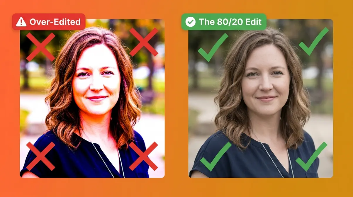
Over-editing is the most universal beginner mistake — and it’s completely understandable. When you discover that sliders change your photo, the natural instinct is to push every slider to see what it does. The result is typically a photo with blown-out highlights, crushed shadows, neon colors, and an artificial “HDR gone wrong” quality that most beginners immediately recognize as looking “wrong” but can’t diagnose.
The fix is The 80/20 Edit: before touching any slider, ask yourself what the photo needs — not what’s possible. A well-exposed, naturally colored photo with gentle contrast is always more compelling than an aggressively processed one. Photography educators recommend a simple test: edit the photo, then reduce every adjustment by 30%. If it looks better, you were over-editing.
Common over-editing signals to watch for: skin tones that look orange or magenta, shadows that are pure black with no detail, whites that are pure white with no texture, and colors so vivid they look like illustrations rather than photographs.
When to Use Presets and Filters
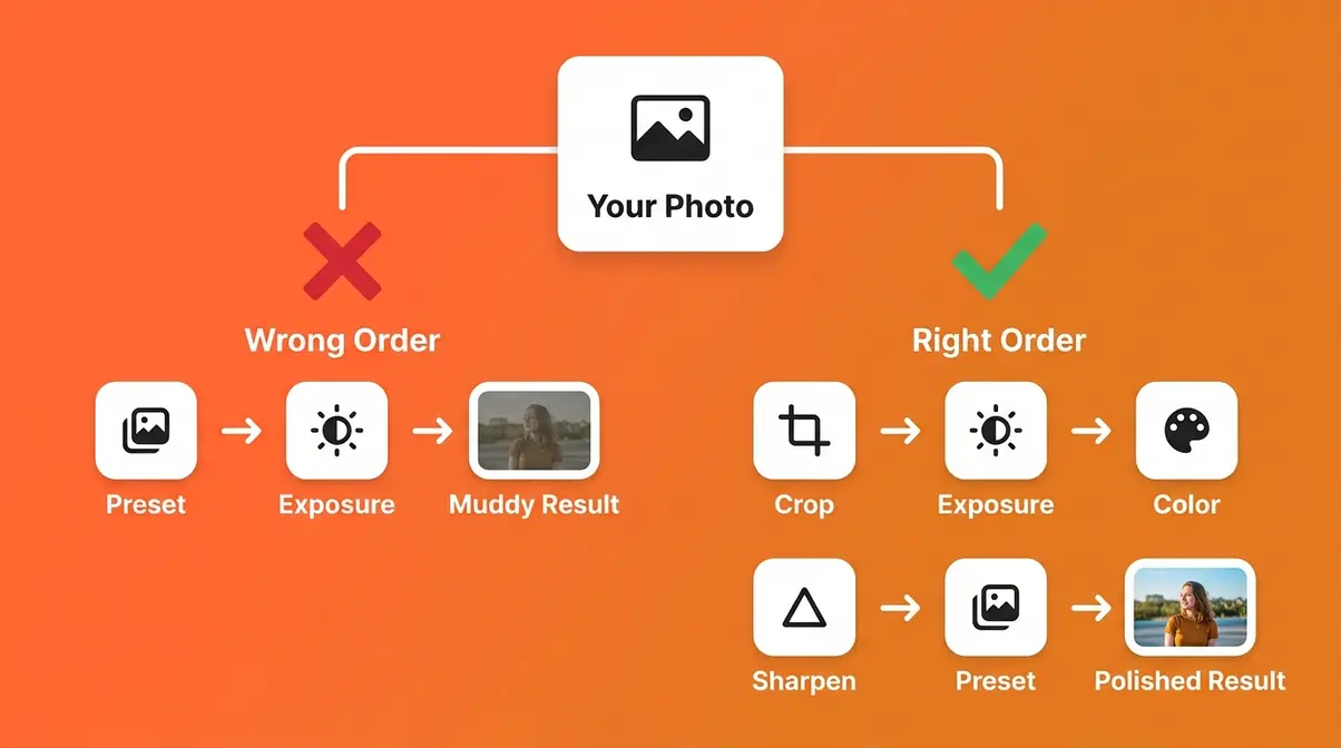
Presets (saved groups of slider settings that apply a style with one click) are genuinely useful tools — but only after you understand what they’re doing. The problem is that most beginners use presets as a substitute for learning, applying them to photos that haven’t been corrected first. A moody preset applied to an overexposed, warm-toned photo produces a muddy result — not because the preset is bad, but because the foundation was wrong.
When presets help: Once you’ve completed the 4-step workflow and want to quickly test multiple styles on the same photo. Presets are also excellent for batch editing — applying the same style to 50 photos from the same shoot in seconds.
When presets hurt: When you apply them before correcting exposure and white balance. When you use them without understanding which sliders they’re changing. When they become a crutch that prevents you from building the muscle memory to edit from scratch.
The rule: Learn the recipe first, then save it as a preset. Building your own presets from the recipes in this guide gives you presets that are calibrated to your camera, your subjects, and your light — not some influencer’s iPhone in Bali.
The community consensus on preset use across photography forums and beginner communities is clear: preset dependency slows long-term skill development, while preset creation accelerates it.
Frequently Asked Questions
What are basic photo editing styles?
Basic photo editing styles are consistent visual looks applied to photos through editing adjustments — the most common include bright & airy, dark & moody, warm & earthy, clean & natural, and black & white. Each style is defined by a specific combination of exposure, contrast, color temperature, and saturation settings. For beginners, the easiest way to understand styles is to pick one look you admire and reverse-engineer it using the slider recipes in this guide. Most photographers settle into 1–2 signature styles over their first year of shooting.
What is the 80/20 editing rule?
The 80/20 rule in photography editing — also called The 80/20 Edit — states that 80% of your final result comes from four core adjustments: exposure, highlights/shadows, white balance, and basic sharpening. According to Forbes, the 80/20 rule applies across many disciplines, and in editing, the remaining 20% is stylistic color grading and fine-tuning. Beginners who focus on the 20% first (filters, presets, effects) while skipping the 80% (clean exposure, accurate color) almost always end up with edits that look wrong. Fix the foundation first, then apply style.
What is the easiest photo editor?
Lightroom Mobile (free tier) is consistently rated the easiest photo editor for beginners who want to develop real editing skills. It uses non-destructive editing (your original photo is always preserved), its slider-based interface matches how photography is taught, and all 10 style recipes in this guide are written specifically for it. Snapseed is a strong free alternative for mobile-only photographers. Photoshop, while powerful, has a significantly steeper learning curve and is better suited for retouching and compositing than style-based editing.
What are the 5 C’s of photography?
The 5 C’s of photography are Composition (how elements are arranged in the frame), Color (the palette and temperature of the image), Contrast (the difference between light and dark areas), Clarity (sharpness and midtone detail), and Consistency (applying the same aesthetic choices across a body of work). These five principles map directly to the 4-step editing workflow: composition in Step 1, color in Step 3, contrast and clarity in Steps 2 and 4, and consistency through repeatedly applying the same style recipe.
What are the 5 editing techniques?
The five core image editing techniques are: Exposure adjustment (controlling overall brightness), White balance correction (adjusting color temperature), Contrast adjustment (controlling the range between light and dark), Cropping and straightening (refining composition), and Sharpening (enhancing edge detail and clarity). These five techniques form the backbone of the 4-step workflow in this guide. Every one of the 10 style recipes builds on these foundational techniques — which is why mastering them first makes every style dramatically easier to achieve.
How do beginners learn to edit photos?
Beginners learn to edit photos most effectively by following a structured workflow rather than experimenting randomly with sliders. The recommended approach: (1) Start with the 4-step workflow — Crop, Exposure, Color, Sharpen — on every photo. (2) Pick one style from the 10 recipes in this guide and apply it to 10 different photos. (3) Save your adjusted settings as a preset once you’re happy with the result. (4) Shoot in RAW (a file format that preserves all camera data) for maximum editing flexibility. Across photography education communities, the consensus is that consistent practice with one style beats scattered experimentation across many.
Watching a Lightroom beginner tutorial video can be incredibly helpful, as video tutorials consistently rank among the most effective learning resources for beginners building editing muscle memory — the visual demonstration of slider movement is difficult to replicate in text alone.
Do I need to shoot in RAW to edit photos?
You do not strictly need to shoot in RAW to edit photos, but doing so provides significantly more flexibility during the editing process. RAW files retain all the original data captured by your camera’s sensor, allowing you to recover blown-out highlights or lift deep shadows without degrading image quality. JPEGs are compressed and discard much of this data, making heavy stylistic edits more prone to artifacting. For beginners learning to edit, starting with RAW files makes correcting exposure and white balance much more forgiving.
Can I edit photos on my smartphone?
Yes, you can edit photos entirely on your smartphone using powerful, free applications like Lightroom Mobile or Snapseed. Modern mobile editing apps offer the exact same core sliders—exposure, contrast, highlights, shadows, and white balance—as their desktop counterparts. In fact, many beginners find mobile interfaces more intuitive because they rely on simple touch controls rather than complex menus. All 10 of the editing style recipes provided in this guide can be executed perfectly from a smartphone.
Your Next Photo Is the Best Place to Start
Photo editing styles for beginners don’t require expensive software, years of experience, or a natural eye for design. They require a recipe — and now you have 10 of them. Each style in this guide maps a specific visual mood to exact Lightroom slider values you can copy right now, on any photo, using a free app on your phone.
The 80/20 Edit is the principle that ties everything together: get your exposure, shadows, white balance, and sharpening right first — that’s the 80%. Then layer one of the 10 style recipes on top — that’s the 20% that transforms a good photo into a photo with a signature aesthetic. Across beginner photography communities, the photographers who improve fastest are the ones who commit to one style and repeat the same workflow on photo after photo until the process becomes instinct.
Open Lightroom Mobile right now. Pick one style from this guide — bright & airy if you want to start gentle, dark & moody if you want immediate drama. Run through the 4-step workflow, apply the recipe, and compare your result to your original. That gap between the raw and your edit? That’s your aesthetic beginning to take shape. Get started with the full software setup guide here, and check out our complete photo software setup guide to get your workspace ready.