Table of Contents
This blog post may contain affiliate links. As an Amazon Associate I earn from qualifying purchases.
You spend an hour perfecting the colors in Lightroom. Then you upload the photo to Instagram — and it looks flat, dull, and nothing like what you saw on your screen.
Without understanding color profiles in photography, every export is a gamble. That print you ordered? It might come back oversaturated and darker than anything you edited. The frustrating part is that the problem has nothing to do with your editing skills. It has everything to do with a system called color management — and most beginner guides never explain it clearly.
This guide changes that. You’ll learn exactly what color profiles are, which one to use for web versus print, and how to set up a workflow that keeps your colors consistent every single time. We’ll cover the three major color spaces, walk through a step-by-step workflow from camera to export, and troubleshoot the most common color problems beginners face.
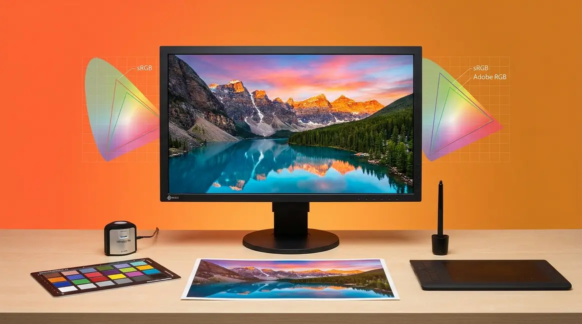
Color profiles in photography act as translators — ensuring the colors you see on your monitor match what appears online and in print. The Color Consistency Chain (Capture → Edit → Export) is the framework for getting this right every time.
- For web and social media: Always export in sRGB — it’s the universal standard supported by every browser and platform
- For professional printing: Adobe RGB captures roughly 35% more colors in the green-cyan range than sRGB — ideal for lab prints on wide-gamut printers
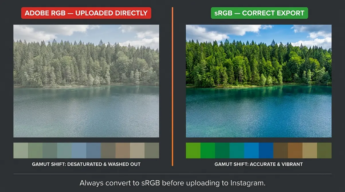
- The #1 mistake: Uploading an Adobe RGB file to Instagram causes colors to look flat and desaturated — always convert before uploading
- MacBook Pro users: Your P3 display shows approximately 25% more colors than a standard sRGB monitor — what looks vivid on your screen may appear duller on other displays
What Are Color Profiles in Photography?
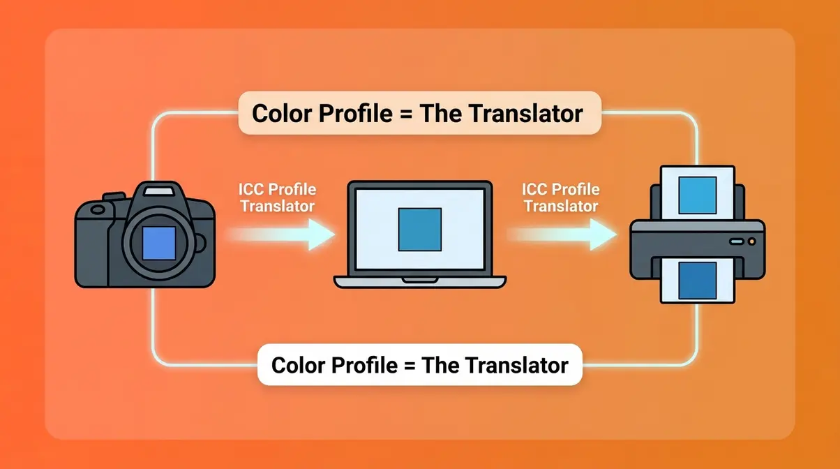
A color profile (also called an ICC profile) is a set of instructions that tells your camera, monitor, and printer how to interpret and display colors. Think of it as a translator dictionary: without it, your devices each speak a different color language, and the translation goes wrong. This is why a photo that looks perfect on your laptop can appear dull and washed out the moment you upload it online. Understanding color profile photography starts with understanding why this translation problem exists in the first place.
A color profile acts as a translator between your camera, monitor, and printer — without one, devices ‘guess’ at colors, producing unpredictable results (official ICC profile standards, International Color Consortium).
The Translator Dictionary Problem
Different devices don’t automatically agree on color. Your Canon camera captures a specific shade of blue. Your MacBook Pro interprets that blue one way. Instagram interprets it another way. Without a color profile connecting them, each device makes its own guess — and guesses are rarely consistent.
This inconsistency is the core problem. The same JPEG can look vibrant on one screen and flat on another. That’s not a “bad photo” problem. It’s a color profile mismatch. The colors themselves haven’t changed — but the translation has broken down at some point in the chain.
This is exactly the frustration behind a print coming back “oversaturated and darker” than expected. The photographer edited the image correctly, but somewhere between the screen and the printer, the translation failed. A missing or mismatched color profile is almost always the culprit.
Learn more about the fundamentals of color profiles to see how this affects every stage of your workflow.
How ICC Profiles Work
An ICC profile is a small data file — usually embedded directly inside your image file. It tells every color-managed application (Lightroom, Photoshop, your browser) exactly how to interpret the color values stored in that file.
When a color-managed application opens your photo, it reads the ICC profile and converts the colors to display correctly on the current device. Without a profile, the app guesses — using a default assumption that may be completely wrong for your image.
Most modern software is color-managed: Lightroom, Photoshop, Chrome, and Safari all handle ICC profiles correctly. However, many platforms — including some social media upload processors — strip or ignore embedded profiles. This is why the same image can look different in different places.
When you open a photo in Lightroom, it reads the embedded ICC profile and displays colors accurately. When you upload that same file to a non-color-managed platform without converting it first, the profile is ignored — and colors shift.
Understanding white balance is closely related — both affect how accurately your software interprets what the camera captured.
Color Gamut 101
Gamut (rhymes with “grammar”) is simply the range of colors a device can capture, display, or print. Think of it as a color bucket — a bigger bucket holds more colors.
No device can reproduce every color the human eye sees. A camera sensor captures a certain gamut. Your monitor displays a certain gamut. Your printer reproduces a certain gamut. When these three gamuts don’t match, colors shift. Color profiles are the system that maps one gamut onto another — preserving as much accuracy as possible during the translation.
sRGB vs. Adobe RGB vs. ProPhoto RGB
Choosing the right color space is one of the most practical decisions in your color profile photography workflow. Each space serves a different purpose — and using the wrong one for the wrong output is the most common source of color problems beginners experience.
sRGB: The Universal Web Standard
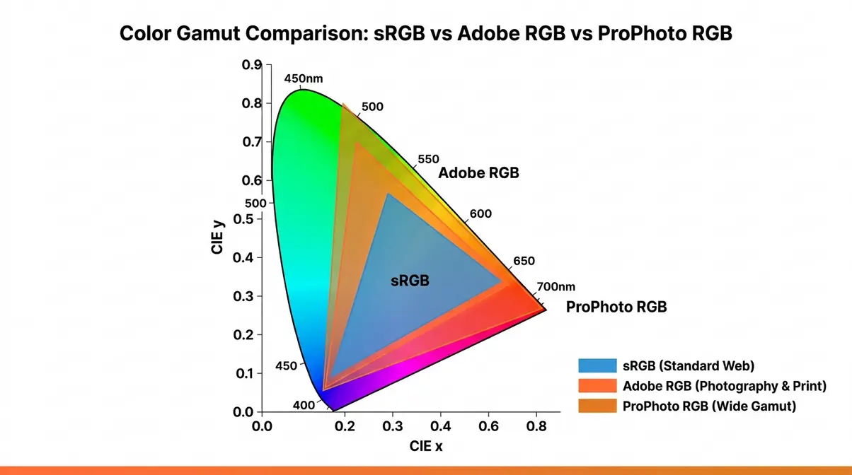
sRGB (Standard Red Green Blue) was developed by HP and Microsoft in 1996 specifically for digital screens. It covers approximately 35% of the visible color spectrum — a deliberately conservative range designed to work consistently across all monitors, browsers, and devices.
For web and social media use, sRGB is the correct choice every time. Every major browser, every social media platform, and virtually every consumer monitor is calibrated to display sRGB accurately. When you export a photo in sRGB, what you see on your screen is very close to what your audience sees on theirs.
The W3C color standards documentation confirms that sRGB remains the default assumption for all web color rendering. If a browser encounters an image with no embedded profile, it assumes sRGB. This makes sRGB the safest, most predictable choice for anything displayed on a screen.
Use sRGB for: Instagram, Facebook, your website portfolio, client proofing galleries, and any image viewed primarily on screens.
Adobe RGB: For Professional Printing
Adobe RGB was developed by Adobe in 1998 to cover a wider range of colors — particularly in the green-cyan range, where inkjet printers and professional lab printers can reproduce colors that sRGB simply cannot describe. Adobe RGB covers roughly 50% of the visible color spectrum, compared to sRGB’s 35%.
That difference matters most in landscape photos with deep greens, product photography with saturated colors, and portrait work where subtle skin tone gradations need to survive the print process. Professional photo labs and wide-gamut printers are designed to take advantage of Adobe RGB’s extended range.
However, Adobe RGB is a trap for the unwary. If you edit in Adobe RGB and then upload directly to Instagram without converting to sRGB first, the platform strips the profile and maps your colors to sRGB incorrectly — producing that characteristic flat, desaturated look that confuses so many beginners.
Use Adobe RGB for: Professional lab prints, fine art printing, and any workflow where the final output is a physical print on a wide-gamut printer.
ProPhoto RGB: The Archival Space
ProPhoto RGB covers approximately 90% of the visible color spectrum — far more than any current monitor can display. It was designed as an archival editing space, not a delivery format. When you edit in ProPhoto RGB, you’re working with the maximum possible color data from your RAW file, preserving every color the sensor captured.
Lightroom and Adobe Camera Raw process RAW files internally in a ProPhoto-like space. This is why editing in Lightroom preserves more color information than editing a JPEG directly. However, ProPhoto RGB files should never be delivered to a client or uploaded online without converting — most monitors cannot display the full range, and the colors will render incorrectly.
Use ProPhoto RGB for: Internal editing workflows only. Never export a ProPhoto RGB file for client delivery, web, or standard printing.
Display P3: The Modern Wild Card
This is the color space that 80% of photography guides completely ignore — and it’s increasingly relevant for anyone shooting for iPhone or MacBook viewers.
Display P3 is Apple’s wide-gamut color space, used in every iPhone since the iPhone 7, every MacBook Pro since 2016, and the iPad Pro. It covers approximately 25% more colors than sRGB, with particular richness in reds and greens. When you view a photo on an iPhone or MacBook Pro, the screen is actively showing you more colors than a standard sRGB monitor would.
This creates a new problem: photos you edit on a MacBook Pro may look vivid and rich to you — but appear flatter to viewers on standard sRGB monitors. The opposite is also true: an sRGB photo may look slightly muted on a P3 display compared to a P3-optimized image.
For most photographers in 2026, the practical guidance is: continue exporting in sRGB for maximum compatibility. Browsers like Safari and Chrome support P3 color on P3 displays, but the majority of viewing environments still default to sRGB. Unless you’re specifically optimizing for Apple ecosystem audiences, sRGB remains the safest export choice for web.
For more on Display P3 and Apple’s color management documentation, Apple’s developer color guidelines provide detailed technical specifications.
Quick-Reference Color Space Comparison
| Color Space | Gamut Coverage | Best For | Export For Web? | Export For Print? |
|---|---|---|---|---|
| sRGB | ~35% visible spectrum | Web, social media, screens | ✅ Yes — always | ✅ Yes (standard labs) |
| Adobe RGB | ~50% visible spectrum | Professional lab printing | ❌ Convert to sRGB first | ✅ Yes (wide-gamut printers) |
| ProPhoto RGB | ~90% visible spectrum | Internal editing only | ❌ Never | ❌ Convert first |
| Display P3 | ~45% visible spectrum | Apple device optimization | ⚠️ sRGB safer for now | ❌ Convert first |
Your Complete Color Profile Workflow

This is the practical heart of the guide — a step-by-step workflow for keeping colors consistent from the moment you press the shutter to the moment your photo appears on a screen or in a print. After reviewing professional color management workflows from Lightroom-certified educators and analyzing common pain points reported by photographers across multiple photography communities, this four-stage process covers every point where color can break down.
Think of it as protecting every link in the Color Consistency Chain: Capture → Edit → Export. Break any one link, and colors shift. Protect all three, and your colors stay consistent. If you need a broader overview of post-processing, check out our beginner photo editing workflow guide before diving into the color-specific steps below.
- What You’ll Need Before Starting:
- A camera capable of shooting RAW files (recommended) or JPEG
- Adobe Lightroom Classic or Lightroom CC (the steps below reference both)
- Adobe Photoshop (for the soft proofing steps in Stage 4)
- A calibrated monitor (strongly recommended — see H2 #5 for tools)
- 30–60 minutes to configure your settings once
Step 1 — In-Camera Settings
Your color profile workflow starts before you press the shutter. The settings you choose in-camera determine how much color information you have to work with in editing.
If you shoot RAW:
Good news — the in-camera color profile setting has almost no effect on your final image. RAW files store the raw sensor data before any profile is applied. Lightroom and Photoshop apply a rendering profile during import, giving you full control. However, your camera will still apply a profile to the embedded JPEG preview — this is the thumbnail you see on the camera’s LCD screen. If the preview looks different from your final edit, that’s why.
If you shoot JPEG:
The in-camera color profile is baked directly into the file at the moment of capture. You cannot change it later without degrading image quality. Here’s what to set:
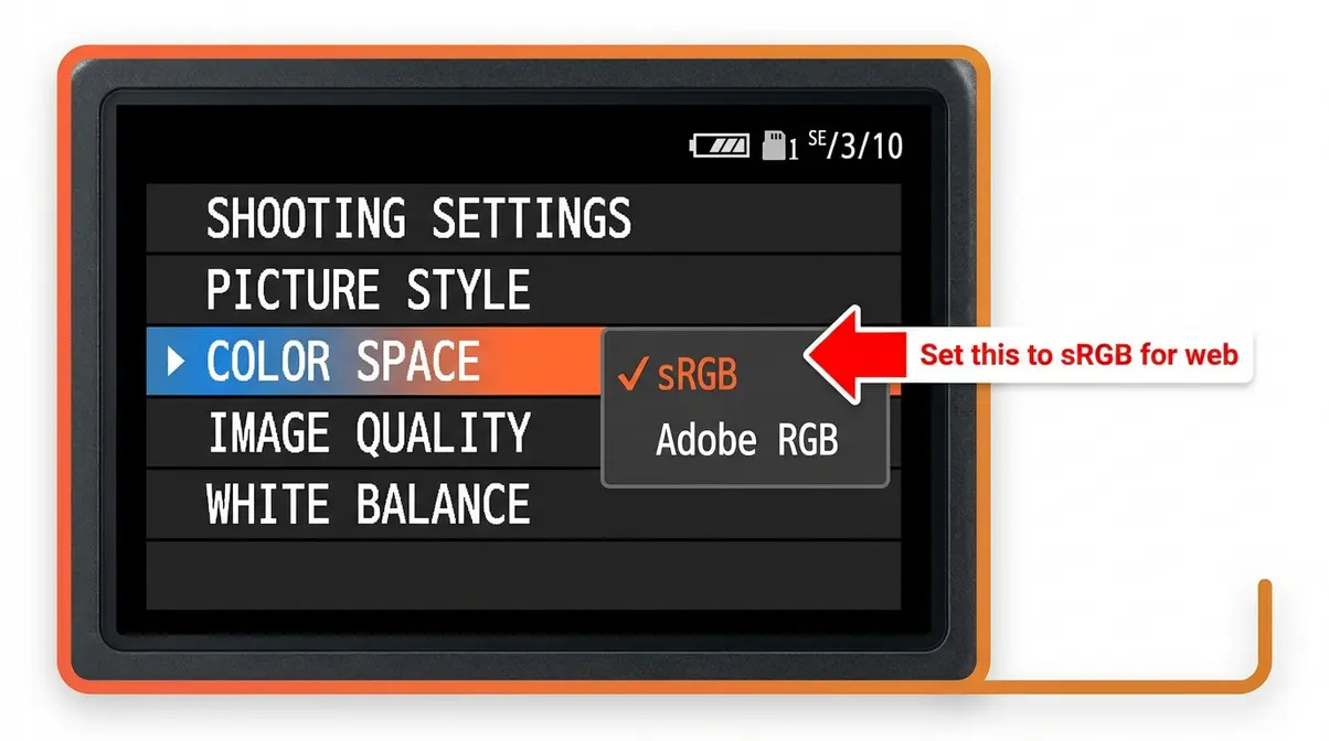
- Enter your camera’s menu system (typically under Shooting Settings or Picture Style/Control)
- Find the Color Space setting (Canon calls it “Color Space”; Nikon calls it “Color Space”; Sony calls it “Color Space” under Image Quality Settings)
- Set it to sRGB if you’re shooting for web delivery
- Set it to Adobe RGB only if you’re shooting specifically for professional print — and remember to convert before uploading online
Recommended setting for beginners: sRGB. It’s the safest starting point, and you can always move to Adobe RGB later as your workflow matures.
Step 2 — Editing Software
This is where most beginners make their first critical mistake. Lightroom’s internal editing environment, its color settings, and its import behavior all affect color — and the defaults aren’t always obvious. If you haven’t settled on an application yet, reviewing options for processing your photos using software is a great first step.
Setting Up Lightroom Classic:
- Open Lightroom Classic and go to Edit > Preferences (Windows) or Lightroom > Preferences (Mac)
- Click the Presets tab
- Confirm that “Make defaults specific to camera serial number” is checked — this ensures your import settings apply correctly per camera body
- Now go to Edit > Color Settings — Lightroom manages this automatically using its internal ProPhoto-based working space, so no changes are needed here
Applying Color Profiles in Lightroom:
- Select a photo in the Develop module
- In the Basic panel, look for the Profile field at the very top (it may show “Adobe Color” by default)
- Click Browse to see all available profiles for your camera
- For most editing, Adobe Color is an excellent starting point — it’s Lightroom’s modern default and renders colors more accurately than the older “Camera Standard” profiles
- For a look that matches your camera’s JPEG output exactly, choose the profile named after your camera’s picture style (e.g., “Camera Standard,” “Camera Portrait,” “Camera Landscape”)
Setting Up Photoshop Color Settings:
- Open Photoshop and go to Edit > Color Settings (Ctrl+Shift+K / Cmd+Shift+K)
- In the Working Spaces section, set RGB to sRGB IEC61966-2.1 for web work, or Adobe RGB (1998) for print work
- Under Color Management Policies, set all three dropdowns to “Convert to Working RGB” — this ensures any file you open is automatically converted to your working space
- Check “Ask When Opening” for profile mismatches — this way Photoshop alerts you when a file’s embedded profile doesn’t match your working space, giving you the choice to convert
Soft Proofing in Lightroom (Preview Before You Export):
Soft proofing lets you preview how your photo will look in a specific color space or on a specific printer profile — before you export. It’s one of the most underused features for beginners.
- In the Develop module, press S to toggle Soft Proofing on
- A white border appears around your image, and a Proof Setup panel appears in the toolbar below the image
- Click the Profile dropdown in the Proof Setup panel
- Select sRGB to preview how your image will look when exported for web
- Select your printer’s ICC profile (downloaded from your lab’s website) to preview how the print will look
- If the soft proof looks different from your edit, adjust until they match — then export
This step alone can eliminate the “oversaturated and darker” print problem before it happens. Learn more about Lightroom soft proofing from Digital Photography School’s in-depth guide.
Step 3 — Exporting for the Web
Exporting is where the Color Consistency Chain breaks most often for beginners. The good news: fixing it takes exactly two checkbox clicks in Lightroom.
In Lightroom Classic:
- Select your photo(s) and press Ctrl+Shift+E (Windows) or Cmd+Shift+E (Mac) to open the Export dialog
- Scroll down to the File Settings section
- Set Image Format to JPEG
- Set Color Space to sRGB — this is the critical step. If this is set to Adobe RGB or ProPhoto RGB, your colors will shift when uploaded online
- Set Quality to 80–90 for a balance of file size and quality
- Under Image Sizing, set your pixel dimensions for the target platform (Instagram recommends 1080px on the long edge; web portfolios typically use 2000–2500px)
- Click Export
In Photoshop (Save for Web):
- Go to File > Export > Export As (or File > Save for Web in older versions)
- In the Export As dialog, check Convert to sRGB in the bottom-left corner
- Also check Embed Color Profile — this ensures the sRGB tag travels with the file
- Set format to JPEG, quality 80–90, and export
Why this matters: When Instagram, Facebook, or any web platform receives an image, it checks for an embedded color profile. If it finds sRGB, it displays the colors as-is. If it finds Adobe RGB — or no profile at all — it either strips the profile or maps colors incorrectly, producing the characteristic flat, desaturated result.
Step 4 — Exporting for Print
Print export requires one extra layer of care — and it’s where soft proofing (from Step 2) becomes essential.
Getting Your Printer’s ICC Profile:
- Visit your print lab’s website and download the ICC profile for the specific paper you’re ordering (e.g., “Lustre,” “Metallic,” “Fine Art Matte”)
- Install the profile: on Mac, double-click the .icc file and click Install. On Windows, right-click the .icc file and select Install Profile
- The profile now appears in Lightroom’s Soft Proofing panel and Photoshop’s print dialog
Exporting from Lightroom for Print:
- Open the Export dialog (Ctrl+Shift+E / Cmd+Shift+E)
- Set Color Space to Adobe RGB (1998) if your lab specifies it — many professional labs prefer Adobe RGB because their printers can reproduce its wider gamut
- Set Quality to 100 for print — file size is less critical than image quality here
- Set Resolution to 300 PPI (pixels per inch) — the standard for high-quality prints
- Export and upload to your lab’s ordering system
Printing from Photoshop:
- Go to File > Print to open the Photoshop Print dialog
- Under Color Management, set Color Handling to “Photoshop Manages Colors”
- Set Printer Profile to the ICC profile you downloaded from your lab
- Set Rendering Intent to “Perceptual” (best for most photographic images with gradients and skin tones)
- Click Print
Learn more about professional print color management at Colby Brown Photography’s comprehensive guide.
Troubleshooting Common Color Profile Problems
Even with a solid workflow in place, color problems still appear. This section addresses the specific frustrations photographers report most often — with precise causes and fixes for each one.
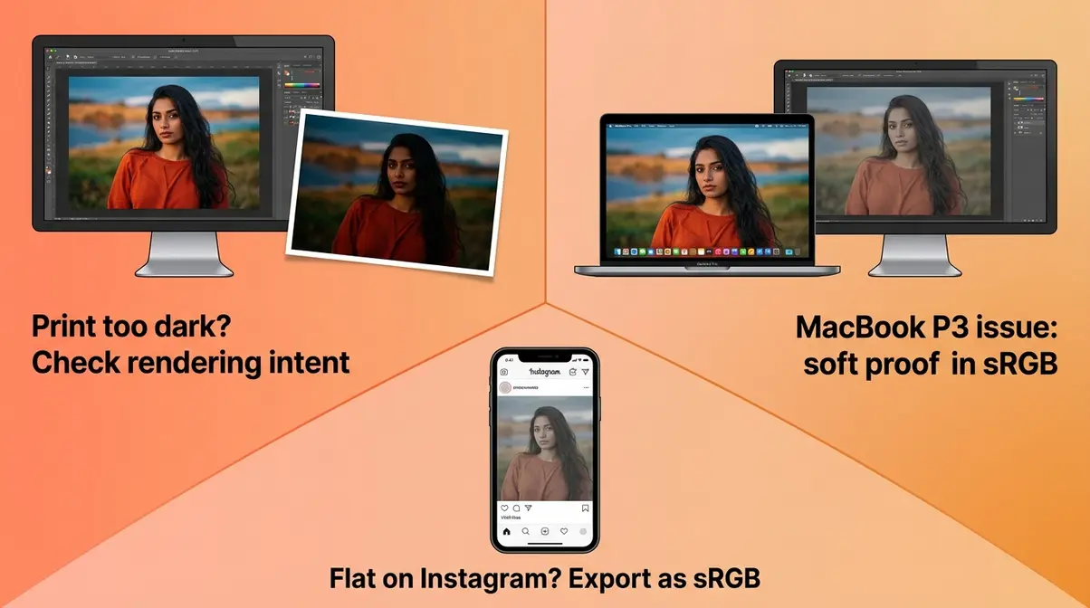
“Why is my sample print coming back as oversaturated and darker even though I used the correct ICC profile they gave me and edited my photo accordingly?”
This question captures one of the most confusing color problems in photography. You did everything right — you downloaded the lab’s ICC profile, you soft proofed, you exported correctly. And the print still came back wrong. Here’s what actually happened, and how to fix it.
Why Photos Look Oversaturated and Darker
The cause: The “oversaturated and darker” print problem almost always traces back to one of three issues — and they can stack on top of each other.
Issue 1: Your monitor isn’t calibrated. If your monitor displays colors brighter and more saturated than they actually are, your edits will compensate in the wrong direction. The print is accurate — your monitor was lying to you. A calibrated monitor (see H2 #5) is the single most effective fix for this problem.
Issue 2: You edited in the wrong color space. If you edited in Adobe RGB but exported the soft proof using an sRGB preview, the soft proof was showing you the wrong information. Always match your soft proof profile to your export profile.
Issue 3: The rendering intent is wrong. When Photoshop converts colors from your editing space to the printer’s ICC profile, it uses a “rendering intent” — a rule for how to handle colors that fall outside the printer’s gamut. Perceptual rendering compresses all colors proportionally to fit the printer’s range — this usually looks best for photographic images. Relative Colorimetric preserves in-gamut colors exactly but clips out-of-gamut colors, which can cause the oversaturated look in highlights and saturated areas.
Fix: Switch your rendering intent in Photoshop’s Print dialog from Relative Colorimetric to Perceptual, and re-run the soft proof before printing.
MacBook Pro P3 Display Issues
MacBook Pro users face a specific color challenge that stems from the laptop’s wide-gamut Display P3 screen. Here’s the core issue: your MacBook Pro shows you more colors than most of your viewers can see. When you edit a photo and it looks rich and vivid on your MacBook Pro, it may look slightly flat to a viewer on a standard sRGB monitor — because their screen genuinely cannot reproduce those colors.
The “too vivid on MacBook” fix:
- Open your photo in Lightroom and press S to enable Soft Proofing
- Set the Proof Profile to sRGB IEC61966-2.1
- Now you’re previewing how the image looks on a standard sRGB monitor
- If the soft proof looks noticeably flatter or duller, that’s what most of your audience sees
- Adjust your edit to look good in the sRGB soft proof — not just on your P3 screen
The “colors look wrong in Chrome vs. Safari” fix:
Safari on Mac is fully color-managed and renders P3 images in P3. Chrome is also color-managed on Mac but may handle edge cases differently. If an image looks different between browsers, check that the sRGB profile is properly embedded. In Photoshop, go to Edit > Assign Profile and confirm the profile reads “sRGB IEC61966-2.1.”
For more on color management across Apple devices, ViewSonic’s color management guide provides detailed coverage of display color spaces.
Getting Consistent Skin Tones
Skin tones are the most demanding test of your color profile photography workflow because the human eye is extraordinarily sensitive to skin color inaccuracies. A landscape can look slightly off and most viewers won’t notice. A portrait with slightly wrong skin tones looks immediately wrong.
Why skin tones shift across devices:
Skin tones are concentrated in a narrow band of the color space — warm reds, oranges, and yellows with specific saturation and luminance values. When a color profile mismatch occurs, these values shift in ways that are immediately visible. The classic symptoms are: skin looks too orange (over-saturated), too magenta (profile mismatch), or too gray (desaturation from Adobe RGB to sRGB conversion without proper handling).
The skin tone consistency workflow:
- Calibrate your monitor first (see H2 #5) — uncalibrated monitors are the #1 cause of skin tone editing errors
- In Lightroom, use the HSL/Color panel to check your skin tone hues — healthy skin tones typically fall in the Orange and Red hue ranges
- Enable Soft Proofing in sRGB before exporting — if skin tones shift noticeably, adjust the Orange and Red saturation sliders slightly before exporting
- Use custom JPEG color profiles (camera profiles) in Lightroom that match your camera’s skin tone rendering — the “Camera Portrait” profile is specifically tuned for skin tones on most Canon and Nikon bodies
Adjusting your portrait photography settings can help you connect color accuracy to your broader portrait workflow.
Hardware Calibration Tools for Perfect Color
Software settings can only take you so far. If your monitor displays colors inaccurately, every editing decision you make is based on false information — and no export setting will fix that. Hardware calibration tools measure your monitor’s actual color output and create a custom ICC profile that corrects for its specific inaccuracies.
After reviewing professional color management hardware across multiple photography workflows, the tools in this section represent the most practical options at each price point for photographers serious about color accuracy.
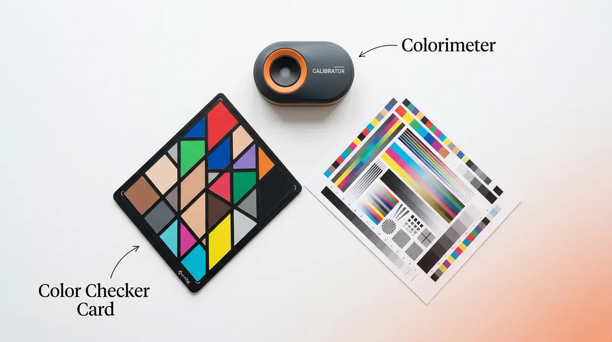
Monitor Colorimeters
A colorimeter (kuh-LOR-im-uh-ter) is a small sensor that attaches to your monitor screen and measures how your display renders specific test colors. The accompanying software compares those measurements to known-accurate values and builds a custom ICC profile that corrects the difference.
Why this matters: Even a brand-new, expensive monitor can be off by a significant margin from factory settings. Color temperature, brightness, and color accuracy all drift over time. A colorimeter catches these drifts and corrects them automatically.
How calibration works:
- Attach the colorimeter to your monitor screen (it hangs from the top with a counterweight)
- Launch the calibration software
- The software displays a sequence of color patches on your screen
- The colorimeter measures each patch and compares it to the target value
- The software builds a custom ICC profile based on the measured differences
- Your operating system loads this profile at startup, correcting your monitor’s display in real time
The process takes about 10–15 minutes and should be repeated every 4–6 weeks, or whenever you notice color drift. Fstoppers’ review of Datacolor’s color tools offers a detailed look at how these devices perform in real-world photography workflows.
Color Checker Cards
A color checker card (also called a color target or color passport) is a physical card printed with precisely known color patches. You photograph the card in your shooting environment, then use software to analyze the image and build a custom camera profile that corrects for your specific lighting conditions.
This is different from monitor calibration — it addresses color accuracy at the capture stage rather than the display stage. For portrait photographers, commercial photographers, and anyone shooting under mixed or unusual lighting, color checker cards are invaluable.
How to use a color checker card:
- Place the card in your scene under the same lighting as your subject
- Photograph the card in RAW format at your shooting exposure
- Import the RAW file into the color checker software (e.g., Datacolor SpyderCheckr software, X-Rite ColorChecker Camera Calibration)
- The software analyzes the captured patches against the known values and builds a custom DNG profile
- Install the profile — it appears in Lightroom’s Profile browser under your camera name
- Apply this custom profile to all images shot in that lighting condition
The result is dramatically more accurate color from the first image in a session — particularly for skin tones under studio or window light. UW Photography Guide’s color space overview provides additional context on how camera profiles interact with color spaces.
Top Calibration Tools
Two brands dominate the professional color calibration market, with options at every budget level:
- Datacolor Spyder Series:
- Spyder X Pro (~$150–$170 as of early 2026): The most popular mid-range colorimeter for photographers. Covers sRGB, Adobe RGB, and Display P3 calibration. Software is straightforward and beginner-friendly.
- SpyderCheckr 24 (~$70–$90): A 24-patch color checker card for camera calibration. Pairs with free SpyderCheckr software.
- Best for: Beginners to intermediate photographers who want reliable results without a steep learning curve.
- Calibrite/X-Rite:
- Calibrite ColorChecker Display (~$100–$130 as of early 2026): Formerly the X-Rite i1Display Studio. Excellent accuracy, supports wide-gamut displays including P3.
- ColorChecker Passport Photo 2 (~$90–$110): The industry-standard color checker card. Includes 24 color patches plus skin tones, and software for Lightroom and Capture One.
- Best for: Photographers who want professional-grade accuracy and plan to use color management across multiple monitors or in a studio environment.
| Tool | Type | Price Range | Best For |
|---|---|---|---|
| Datacolor Spyder X Pro | Monitor colorimeter | ~$150–$170 | Beginners, single monitor |
| Datacolor SpyderCheckr 24 | Color checker card | ~$70–$90 | Camera calibration, studio |
| Calibrite ColorChecker Display | Monitor colorimeter | ~$100–$130 | Wide-gamut P3 displays |
| ColorChecker Passport Photo 2 | Color checker card | ~$90–$110 | Pro accuracy, Lightroom/C1 |
Prices current as of early 2026 — verify at retailer before purchasing.
Common Color Profile Mistakes to Avoid
Even photographers with solid workflows make these mistakes repeatedly. Recognizing them is the first step to breaking the pattern.
The Most Common Pitfalls
Mistake 1: Exporting Adobe RGB files for Instagram. This is the single most common cause of flat, desaturated social media photos. Always convert to sRGB in your export settings — never upload Adobe RGB directly to any social platform.
Mistake 2: Editing on an uncalibrated monitor. Every edit you make on an uncalibrated screen is based on inaccurate information. You may be adding warmth to compensate for a monitor that runs cool — and your prints come back with a warm color cast as a result.
Mistake 3: Ignoring soft proofing before printing. Soft proofing takes three minutes and can save you from a $50 reprint. Enable it every time before sending a file to a lab.
Mistake 4: Using ProPhoto RGB for delivery. ProPhoto RGB is for internal editing only. Delivering a ProPhoto RGB file to a client or lab without converting it first produces severely shifted colors on most viewing devices.
Mistake 5: Not downloading your lab’s ICC profile. Every professional print lab publishes ICC profiles for each paper type. Using the wrong profile — or no profile at all — is the most direct cause of prints that look “oversaturated and darker” than your screen edit.
When Software Solutions Are Enough
For most beginner and intermediate photographers, software-only color management is sufficient. If you’re shooting for web delivery, social media, or sending files to a professional lab that handles color management on their end, the Lightroom workflow in H2 #3 covers everything you need. You don’t need a colorimeter to achieve consistent, predictable results — you need consistent software habits.
The key indicators that software is enough: your prints from reputable labs are consistently close to your screen edits, your social media photos look accurate on multiple devices, and you’re not doing color-critical commercial work.
When to Get Professional Calibration
Hardware calibration becomes necessary when: you’re doing commercial product photography where exact color reproduction is contractually required, you work with multiple monitors that need to match each other, you’re a fine art photographer printing on multiple paper types, or your prints consistently look different from your screen edits despite correct export settings.
If any of those situations apply, a colorimeter is not optional — it’s a professional tool as essential as a quality lens. Colby Brown’s color management guide provides professional-level guidance on when and how to integrate hardware calibration into a full studio workflow.
Frequently Asked Questions
Best color profile for photography?
sRGB is the best color profile for most photographers — particularly for web, social media, and standard photo printing. It’s the universal standard supported by every browser, platform, and consumer monitor. For professional printing with wide-gamut inkjet or lab printers, Adobe RGB captures roughly 35% more colors in the green-cyan range, making it the better choice specifically for high-quality physical prints. For internal editing in Lightroom, the software uses a ProPhoto-based space automatically — you don’t need to change this.
Which color profile for Lightroom?
In Lightroom’s Develop module, start with the “Adobe Color” profile — it’s the modern default and renders RAW files accurately for most cameras and subjects. For the export stage, set Color Space to sRGB for web and social media delivery. For print delivery to a professional lab, use Adobe RGB (1998) unless your lab specifies otherwise. You can find the profile selector at the top of the Basic panel in the Develop module, and the export color space in the Export dialog under File Settings.
Why photos look different on screens?
Photos look different on different screens primarily because monitors vary in their color accuracy and gamut coverage. A standard office monitor, a MacBook Pro, and a cheap laptop can all display the same sRGB file noticeably differently — because each has different brightness, color temperature, and gamut characteristics. An uncalibrated monitor is the most common cause of this problem. Calibrating your editing monitor with a colorimeter ensures your reference point is accurate, even if other screens vary. Embedding an sRGB profile in all exported files ensures that color-managed browsers and apps at least start from the correct color data.
Does color profile affect print quality?
Yes — using the wrong color profile is one of the most direct causes of poor print quality. Specifically, printing from an Adobe RGB file without converting it, or without using the printer’s ICC profile, commonly produces prints that appear oversaturated and darker than your screen edit. The fix is to download your print lab’s specific ICC profile for the paper type you’re ordering, enable soft proofing in Lightroom or Photoshop using that profile, and adjust your edit until the soft proof matches your intent. Then export at 300 PPI with the correct color space for your lab.
The Color Consistency Chain
Color profile photography doesn’t have to be complicated. Every problem in this guide traces back to the same root cause: a broken link somewhere in the Color Consistency Chain — the three-stage sequence of Capture, Edit, and Export.
When you set the correct color space in-camera, choose the right profile in Lightroom’s Develop module, soft proof before you print, and export in sRGB for web delivery, you’ve protected every link in the chain. The result isn’t just better-looking photos — it’s predictable, consistent color that matches your creative intent across every screen and every printer.
The Color Consistency Chain is your framework for diagnosing problems, too. Colors look wrong online? Check the Export link. Prints come back oversaturated and darker? Check the Edit link — specifically your soft proof and rendering intent settings. Colors shift between devices? Check the Capture link and your monitor calibration.
Start with the workflow in H2 #3. Apply the sRGB export setting today — it takes 30 seconds and immediately fixes the most common beginner color problem. Then work through monitor calibration and soft proofing as your workflow matures. Consistent color is a skill you build one link at a time.