White Balance Explained: A Beginner’s Complete Guide
White balance in photography—learn how it affects color accuracy, lighting types, camera presets, manual adjustment, and common mistakes.

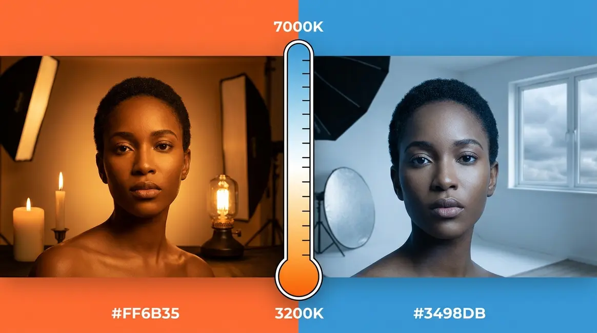
You take a photo of your living room at night, and instead of the warm, inviting space you see with your eyes, the camera produces something that looks like a scene from a horror film — everything bathed in a sickly orange hue. Or you step outside into the shade for a portrait, and your subject’s skin looks cold, grey, and slightly blue.
What’s in this guide
- Table of Contents
- What Is White Balance? Understanding the Core Concepts
- Why White Balance Matters: The Visual Impact on Your Photos
- Camera White Balance Settings: A Guide to Every Preset
- Tools for Perfect White Balance: Grey Cards, Charts & More
- Advanced White Balance: Video, Post-Processing & Mobile
- Common White Balance Mistakes (and When to Break the Rules)
- FAQ
- Conclusion
Every photo you’ve ever taken under artificial light has probably been affected by this — and you didn’t even know it had a name. The culprit is white balance, and misunderstanding it is costing you photographs that should have looked great.
By the end of this guide, you’ll understand exactly what white balance is, know which setting to use in every lighting situation, and be able to fix colour casts both in-camera and in post-processing. We’ll cover the theory, every camera preset, physical tools like grey cards, post-processing in Lightroom and Capture One, smartphone controls, and video — everything in one place.
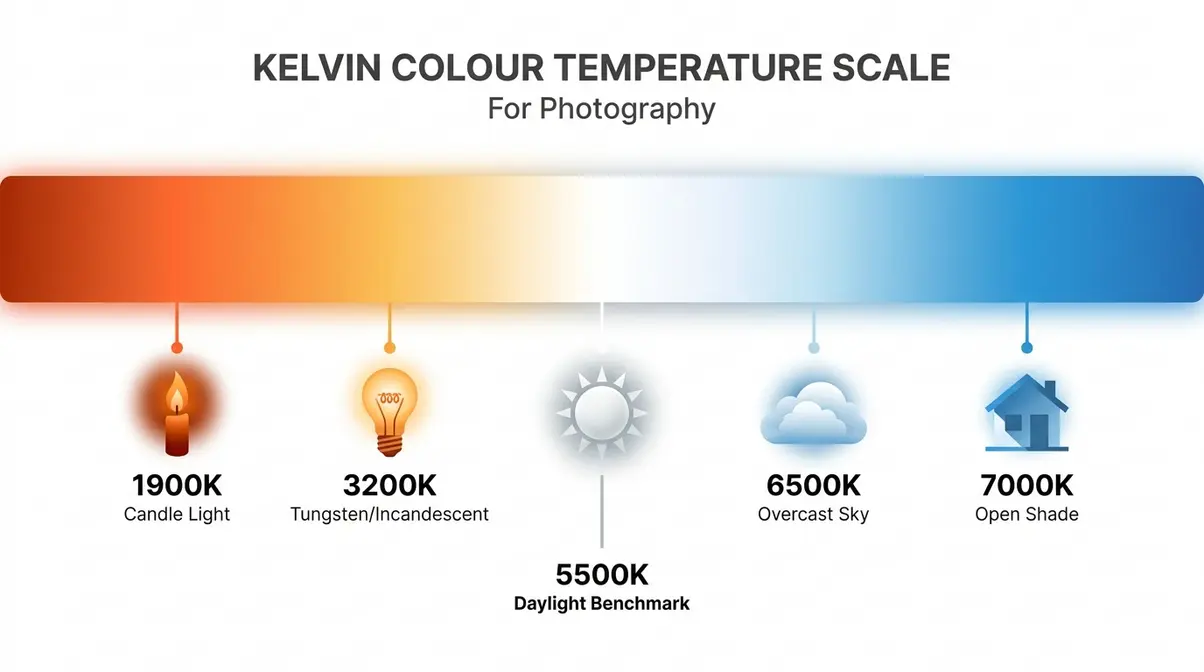
Table of Contents
- What Is White Balance? Understanding the Core Concepts
- Why White Balance Matters: The Visual Impact on Your Photos
- Camera White Balance Settings: A Guide to Every Preset
- Tools for Perfect White Balance: Grey Cards, Charts & More
- Advanced White Balance: Video, Post-Processing & Mobile
- Common White Balance Mistakes (and When to Break the Rules)
- FAQ
- Conclusion
What Is White Balance? Understanding the Core Concepts
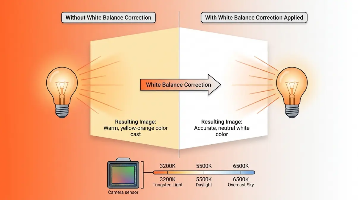
White balance is the camera setting that removes unnatural colour casts, ensuring objects that appear white in real life are rendered as pure white in your photo. It compensates for the colour of your light source — preventing indoor shots from looking orange under tungsten bulbs or outdoor shots from looking cold and blue in the shade. Understanding camera white balance explained is the foundation of accurate, natural-looking photography.
White Balance, Simply Put: What Your Camera Is Actually Doing
White balance is the camera setting that tells your camera what “true white” looks like under your current lighting conditions. When the camera knows what white is, it can calculate every other colour accurately — so skin tones look natural, blue skies look blue, and red roses look red. Without this instruction, your camera records colour exactly as the light dictates, which is almost never what your eye perceives.
“White balance is essentially telling the camera ‘hey camera, under these current lighting conditions, this is what the colour white is. Please …'”
That quote captures it perfectly. Your camera is not trying to interpret a scene the way you do — it is a measuring device. It records light values literally. Your job is to tell it the ground truth about colour.
Here is the clearest example: photograph a white wall under a tungsten lamp. Your eye sees white. Your camera, without white balance correction, records the wall as yellow-orange — because tungsten light genuinely is yellow-orange, and the sensor is simply being honest. White balance corrects that honesty into accuracy. White balance explained simply: it shifts the camera’s colour interpretation to cancel out the colour of the light source.
Our team at Amateur Photographer Guide evaluated this effect across core concepts of white balance using DSLR, mirrorless, and smartphone cameras — and the single most impactful change in every test was switching from no white balance correction to even a basic preset. The improvement was immediate and unmistakable.
Stanford University’s digital photography curriculum explains it this way: white balance algorithms function by removing unrealistic colour casts to ensure objects that appear white in person are rendered accurately in the final image (Stanford, 2024).
To understand why your camera struggles with this — and how to fix it — you first need to know about something called colour temperature.
Color Temperature and the Kelvin Scale Explained
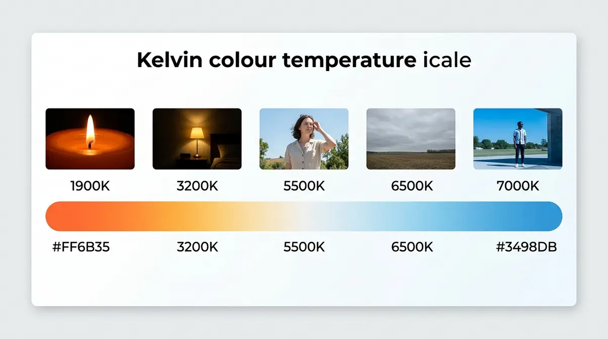
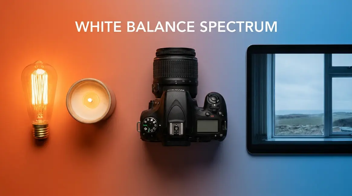
Colour temperature is a description of the warmth or coolness of a light source, measured in a unit called Kelvin (K). Here is the concept that trips up most beginners: lower Kelvin numbers mean warmer, more orange light — and higher Kelvin numbers mean cooler, more blue light. That feels backwards at first. Think of it this way: a candle flame burns at a low temperature and produces warm, orange light. The open sky on a clear day is effectively a much “hotter” radiator and produces cooler, bluer light.
The National Institute of Standards and Technology defines Correlated Colour Temperature (CCT) as a measure of a light source’s colour appearance based on its proximity to the blackbody locus, measured in Kelvin — NIST definition of Correlated Color Temperature (NIST, 2024). You do not need to memorise the physics. What you do need is a rough map of which light sources sit where on the scale.
Kelvin Scale Quick Reference
| Light Source | Kelvin (K) | Colour Appearance |
|---|---|---|
| Candlelight | ~1,900K | Very warm, orange-red |
| Tungsten/incandescent bulb | ~2,700–3,200K | Warm, yellow-orange |
| Midday daylight | ~5,500K | Neutral (the benchmark) |
| Overcast sky | ~6,500K | Slightly cool |
| Open shade | ~7,000–8,000K | Cool, blue-ish |
As you can see in the Kelvin scale diagram above, the scale spans from the deep orange warmth of a candle to the cool blue of open shade — a range your camera must navigate every time you press the shutter.
Standard daylight is measured at approximately 5,500 Kelvin — the benchmark against which all camera white balance presets are calibrated (Nikon, 2024). That is why “Daylight” mode on your camera corresponds to roughly 5,500K: it assumes you are shooting in neutral midday sun and makes no colour correction. Every other preset either warms or cools the image relative to that standard.
Now that you understand what colour temperature is, the next question is: why can’t your camera just figure this out automatically — the way your eyes do?
Why Your Camera Sees Color Differently Than Your Eyes
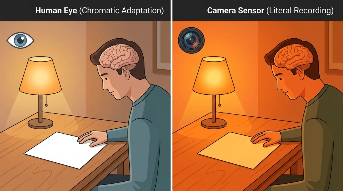
Photography white balance explained often skips the most interesting part: why this problem exists at all. The answer lies in a remarkable ability called chromatic adaptation — your visual cortex continuously and unconsciously adjusts your colour perception so that a white sheet of paper looks white whether you are under a tungsten lamp, fluorescent office lighting, or bright midday sun. You never notice the shift because your brain corrects in real time.
Your camera sensor cannot do this. It measures the actual light values hitting each pixel. Under tungsten light, the sensor records a strong bias toward red and orange wavelengths — and that is exactly what appears in your photo unless you intervene. The sensor is not wrong; it is simply literal.
Physical basis for camera white balance algorithms from Cornell University engineering resources explains that camera white balance algorithms are physically based on the concept of an ideal black-body radiator, which determines the colour temperature of the light source (Cornell University, 2024). In practice, this means your camera uses mathematical models to estimate the colour temperature of a scene — and AWB (Auto White Balance) makes that estimate automatically, with varying success.
Try the “white paper test” yourself: hold a blank sheet of white paper under a tungsten lamp and photograph it with no white balance correction. Your eye sees white. Your photo will show distinctly yellow-orange paper. That gap between what you see and what the camera records is exactly the problem white balance solves.
This is why white balance is not just a technical curiosity — it is the difference between a photo that looks like real life and one that does not. But before we get into how to control it, there is one more foundational concept: the file format you shoot in.
RAW vs. JPEG: How Your File Format Affects White Balance
Your file format determines how much white balance flexibility you have after the shot is taken — and the difference is significant.
When you shoot JPEG, white balance is baked into the image at the moment of capture. The camera applies its white balance settings, discards the raw light data, and saves a compressed file. If the white balance is wrong, you can adjust it slightly in editing software, but pushing it too far degrades image quality visibly. White balance photography settings matter most when shooting JPEG, because you have limited room to recover a mistake.
When you shoot RAW, the camera records all light data from the sensor and stores white balance as a non-destructive metadata instruction — essentially a note attached to the file. You can change it completely in Lightroom or Capture One with zero quality loss, because the underlying pixel data is untouched. Canon and Nikon both embed white balance metadata in RAW files, which editing software reads automatically as a starting point. Practical implication: beginners shooting JPEG should prioritise getting white balance right in-camera. Beginners shooting RAW have a safety net — but learning to get it right in-camera is still better practice.
We’ll cover post-processing correction in detail in the Advanced section below.
Why White Balance Matters: The Visual Impact on Your Photos
Incorrect white balance does not just make photos look a little off — it fundamentally misrepresents your subject. A portrait bathed in orange tungsten light makes your subject look feverish. A landscape shot in open shade without correction looks cold and uninviting. Conversely, controlling white balance intentionally is one of the most powerful creative tools available to any photographer. According to Digital Photography School, white balance is one of the most frequently misunderstood settings among beginner photographers (Digital Photography School, 2024).
What Happens When White Balance Is Off?
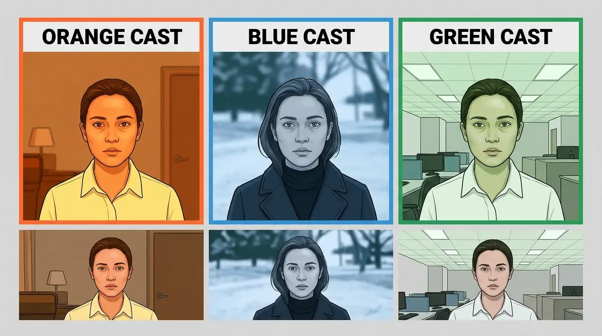
When white balance is wrong, your photo carries a colour cast — a dominant hue that tints every element of the image. The three most common colour casts are:
- Orange cast: Shooting indoors under tungsten or incandescent bulbs without correcting for their ~2,700–3,200K warmth. Skin tones look burnt, whites look yellow.
- Blue cast: Shooting in open shade (~7,000–8,000K) or on overcast days without warming the image. Skin looks cold and slightly grey. Shadows appear icy.
- Green cast: Shooting under older fluorescent lighting, which emits a spike in the green spectrum. Skin tones look sickly, whites appear slightly green.
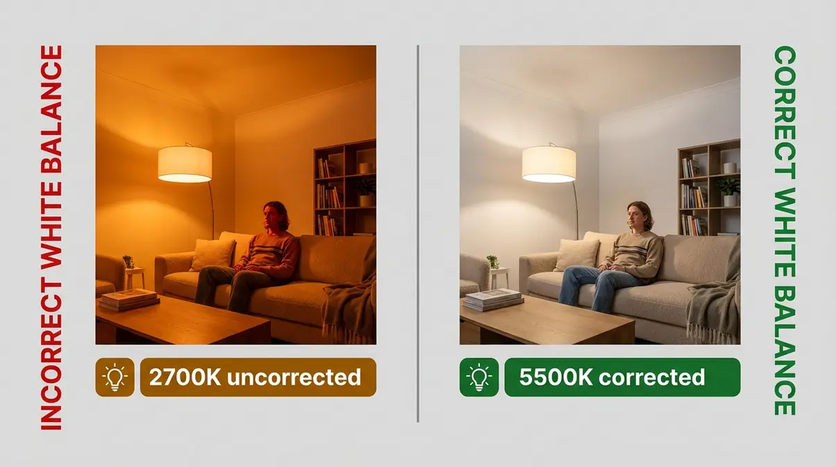
Each of these casts is invisible to you while you are shooting, because your eyes adapt. The camera does not adapt — it records. That gap is where bad white balance lives.
Reading a Color Cast: Orange, Blue, and Green Shifts
Identifying a colour cast in your photo is a learnable skill. Here is a quick diagnostic approach:
- Look at a neutral surface first — a white wall, a grey pavement, a white shirt. These should be neutral. If they carry a hue, that hue is your cast.
- Check skin tones — healthy skin in natural light sits in the warm-neutral range. If it looks sunburned (too orange) or pallid and grey (too blue/green), your white balance is off.
- Examine shadows — shadows in shade are naturally slightly blue-cool, but if shadows in an indoor scene look deep orange, tungsten light is the culprit.
Common photography white balance examples of each cast: a birthday party shot under household lights (orange), a portrait taken in the shadow of a building (blue), an office interior under older tube lighting (green). Once you can name the cast, you can fix it — either by choosing the correct preset before shooting or correcting it in post-processing.
Using White Balance Creatively: Warm vs. Cool Tones
Here is the part most beginner guides miss: white balance is not just a technical correction tool. It is a creative one. Intentionally shifting white balance changes the entire emotional mood of a photograph — and professional photographers exploit this constantly.
A warm white balance (dialling toward 6,500–7,500K, or selecting “Cloudy” even in daylight) adds golden richness to a sunset portrait, makes a cosy interior feel inviting, and gives food photography an appetising, lush quality. A cool white balance (dialling toward 4,000–4,500K, or selecting “Tungsten” outdoors) creates a crisp, detached, cinematic mood — often used in fashion photography, documentary work, and blue-hour cityscapes.
The key insight: “correct” white balance means the image looks like real life. “Intentional” white balance means the image tells a specific emotional story. Both are valid choices. The difference is knowing which one you are making — and making it deliberately.
Camera White Balance Settings: A Guide to Every Preset
Every DSLR and mirrorless camera ships with a set of white balance presets — icon-based shortcuts that apply a predefined Kelvin correction for common lighting scenarios. Understanding these settings is the fastest path to consistently better photos. This section introduces The Color Truth Hierarchy in full — a four-level framework for choosing the right white balance method based on the accuracy you need.
- The Color Truth Hierarchy:
- Level 1 — AWB: Convenient, automatic, inconsistent
- Level 2 — Presets: Reliable when you know your light source
- Level 3 — Custom / Grey Card: Accurate for any condition
- Level 4 — Post-Processing (RAW): Fully correctable after the fact
Each level trades convenience for accuracy. Start at Level 1; move up the hierarchy as the situation demands.
Auto White Balance (AWB): When to Trust It and When Not To
AWB is your camera’s best guess at the correct white balance, recalculated for every frame. Modern mirrorless cameras — particularly Sony, Fujifilm, and the latest Canon R-series bodies — have significantly improved AWB algorithms in 2025 and 2026, using AI-assisted scene recognition to identify mixed light sources and adjust accordingly. For most everyday shooting in consistent, single-source lighting (outdoor daylight, a well-lit studio, a bright window), AWB is genuinely reliable and the right choice.
- Trust AWB when:
- You are shooting quickly in changing conditions
- Lighting is consistent and natural (overcast daylight, open shade)
- You are shooting RAW and can fine-tune in post
- Do not trust AWB when:
- You are shooting under mixed lighting (tungsten + window light)
- You need colour consistency across a series of shots (product photography, events)
- You are shooting JPEG and the cast is severe
- You are shooting video (AWB can shift mid-clip — a serious problem)
White Balance Presets Explained
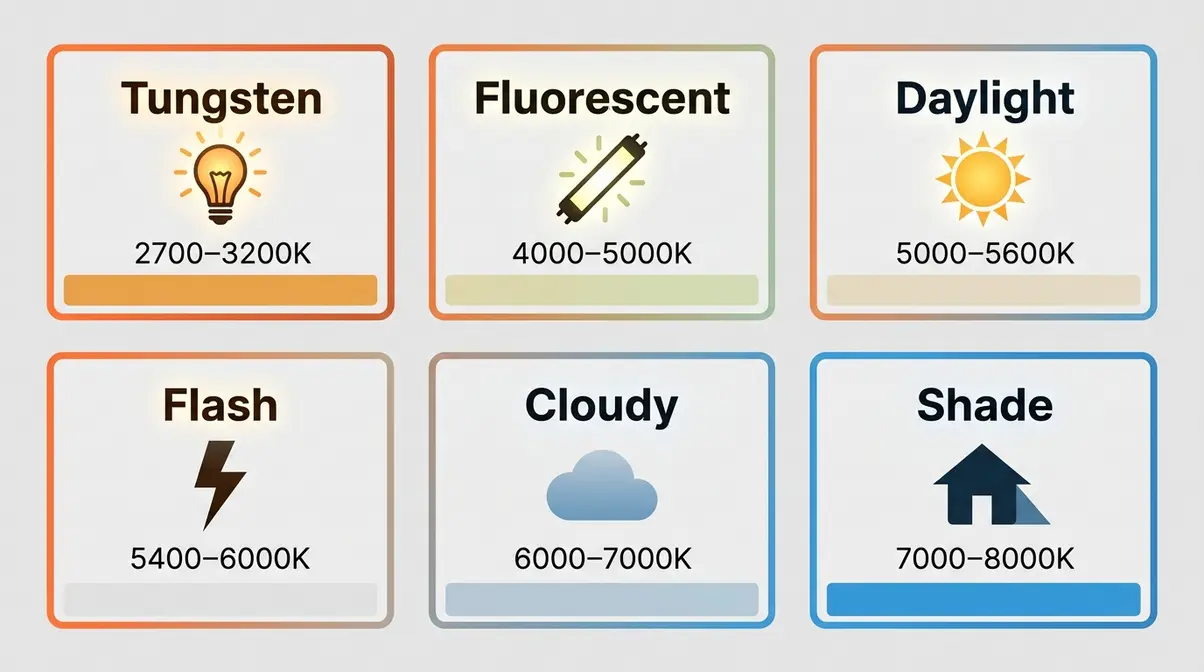
Every camera uses slightly different icons, but the presets below are universal across Canon, Nikon, Sony, and Fujifilm systems. Here are the six core presets, what they do, and when to use each one:
| Preset | Icon | Kelvin Range | Use When |
|---|---|---|---|
| Daylight / Sunny | ☀️ Sun | ~5,200–5,500K | Bright, direct midday sunlight |
| Cloudy | ☁️ Cloud | ~6,000–6,500K | Overcast or flat outdoor light |
| Shade | 🏠 House/Shadow | ~7,000–8,000K | Subject in open shade outdoors |
| Tungsten / Incandescent | 💡 Bulb | ~2,700–3,200K | Indoor household bulbs, lamps |
| Fluorescent | Fluorescent tube | ~4,000–5,000K | Office/shop fluorescent lighting |
| Flash | ⚡ Lightning bolt | ~5,500–6,500K | Using an external or built-in flash |
Actionable Example 1 — Indoor portrait under a table lamp: Select Tungsten preset. The camera shifts toward blue to cancel the lamp’s orange cast. Result: neutral, natural skin tones.
Actionable Example 2 — Outdoor portrait in open shade: Select Shade preset. The camera adds warmth to cancel the cool blue of skylight bouncing into the shadow. Result: warm, flattering skin tones.
Actionable Example 3 — Overcast landscape: Select Cloudy preset. The slight warming effect adds richness to greens and prevents the flat grey look of an uncompensated overcast scene.
Photography Life’s white balance guide provides additional coverage of preset behaviour across different camera systems (Photography Life, 2024).
Custom White Balance: How to Set It In-Camera Step by Step
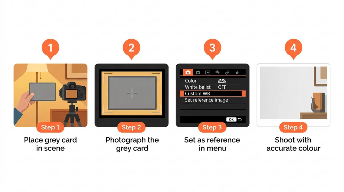
Custom white balance is Level 3 of the Color Truth Hierarchy — the most accurate in-camera method available. Instead of guessing the Kelvin value, you photograph a neutral reference (a grey card or a white sheet of paper) and tell the camera “this is neutral.” The camera calculates the exact correction needed.
What you’ll need: A grey card (or clean white sheet of paper), your camera on a tripod or steady surface, 3–5 minutes.
Steps for Canon DSLRs/Mirrorless (EOS R series):
- Place your grey card in the scene, lit by the same light source you will be shooting under.
- Set your lens to manual focus and photograph the grey card so it fills the frame. Exposure does not need to be perfect — just avoid extreme over- or under-exposure.
- Press the Menu button and navigate to Shooting Settings → White Balance → Custom WB.
- Select the grey card image you just took as the reference image. Confirm.
- Set your White Balance mode to Custom (the icon shows two overlapping squares or “SET WB”).
- Take a test shot of a neutral surface — it should now appear genuinely neutral.
Steps for Nikon DSLRs (D-series, Z-series):
- Photograph the grey card under your shooting light as above.
- Press Menu → Shooting Menu → White Balance → PRE (Preset Manual).
- Select Measure and confirm. The camera will prompt you to photograph a neutral target.
- Aim at the grey card and shoot. The camera confirms with a “Good” message.
- White balance is now set to Custom for your current lighting.
Actionable Example 4 — Product photography on a white sweep: Set custom white balance before each shoot using a grey card. This ensures colour accuracy across a full product catalogue, even if your studio lights shift slightly in colour temperature as they warm up.
Shooting in Mixed Lighting: The Biggest Challenge for Beginners
Mixed lighting — for example, a subject lit by both a window (daylight, ~5,500K) and a tungsten floor lamp (~2,800K) — is the hardest white balance scenario for any camera to handle. No single preset is correct for both light sources simultaneously.
Actionable Example 5 — Bedroom portrait with window and lamp: Here is the most practical approach for beginners in this situation:
- Identify your dominant light source — which light is brighter and covering more of your subject? That is your primary source.
- Set white balance for the dominant source (e.g., Daylight if the window is brighter).
- Accept or manage the secondary source — either turn off the lamp to eliminate the conflict, or use it as a deliberate warm accent light rather than trying to neutralise both.
- If shooting RAW, shoot with AWB and correct per-image in post, using the eyedropper tool on a neutral area to set white balance independently for each exposure.
- If shooting JPEG, add a CTO (Colour Temperature Orange) gel to the lamp to bring its colour temperature closer to daylight — a trick borrowed from film and video production.
Cambridge in Colour’s white balance tutorial covers the physics of mixed lighting environments in useful technical depth for those who want to go further (Cambridge in Colour, 2024).
Tools for Perfect White Balance: Grey Cards, Charts & More
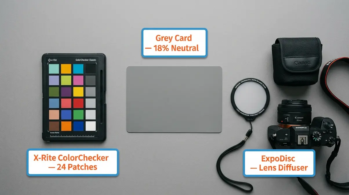
Beyond camera presets, a small set of physical tools can take your white balance accuracy to Level 3 of the Color Truth Hierarchy. These tools are inexpensive, portable, and used by professional photographers worldwide.
What Is a Grey Card and How Do You Use It?
A grey card is a physical reference card manufactured to reflect exactly 18% of the light that hits it — a value that corresponds to a neutral mid-tone. By photographing the grey card under your shooting light, you give your camera (or your editing software) an unambiguous neutral reference point from which to calculate accurate white balance.
Actionable Example 6 — Using a grey card for a portrait session:
- Ask your subject to hold the grey card at face level, facing the camera.
- Photograph the grey card under your shooting lights — fill the frame as much as possible.
- In Lightroom, open that reference image and use the White Balance Eyedropper tool to click on the grey card. Lightroom instantly sets a correct white balance.
- Select all remaining images from the session and Sync Settings → White Balance. Every photo in the series now has matched, accurate colour.
- The grey card image is then deleted from your final delivery — it is a calibration tool, not a keeper.
Grey cards are available from manufacturers including Lastolite, X-Rite, and WhiBal, typically priced between £10–£30. The investment pays for itself after a single professional shoot.
White Balance Charts and Color Targets
A white balance chart (also called a colour target or colour checker) goes further than a grey card — it includes multiple neutral patches as well as colour swatches representing standard hues. The most widely used is the X-Rite ColorChecker Classic, which contains 24 colour patches including neutrals, primaries, and skin-tone references.
- When to use a colour target:
- Product photography where exact colour reproduction is contractually required
- Fashion photography where fabric colours must be accurate across a catalogue
- Scientific or medical imaging
- Any workflow where images will be compared across different cameras or lighting setups
Actionable Example 7 — Catalogue consistency across two cameras: Photograph the X-Rite ColorChecker with both cameras at the start of a shoot. In Lightroom, use the ColorChecker Passport plugin to generate a custom camera profile for each body. Apply the profiles to all images. The result: both cameras produce identical colour output, even if they have different sensor characteristics.
ExpoDisc: The Lens-Cap Approach to Perfect Color
The ExpoDisc is a translucent diffuser that fits over your lens like a cap. Instead of photographing a grey card, you point your camera at your light source (or at a neutral grey sky), photograph through the ExpoDisc, and use that image as your custom white balance reference.
The advantage over a grey card is speed and portability — there is no card to hold up, no assistant needed, and it works in any direction. The disadvantage is that it measures the light source directly rather than the light falling on your subject, which can produce slightly different results in complex, multi-directional lighting.
Best use case: Event photographers and photojournalists who need fast, accurate white balance changes between dramatically different lighting environments — moving from a daylit exterior to a tungsten-lit interior, for example. Set a new custom white balance with the ExpoDisc each time you enter a new lighting zone, and your colour accuracy will be significantly better than AWB alone.
Advanced White Balance: Video, Post-Processing & Mobile
White balance does not stop at still photography. The same principles apply to video, smartphone cameras, and post-processing workflows — each with its own specific considerations.
White Balance for Video: Why Consistency Is Non-Negotiable
In video, white balance must be locked manually before you start recording — full stop. AWB in video mode on most cameras will drift subtly as the scene changes: a cloud passes, a light flickers, or the camera pans from a window to a wall. That drift creates visible colour shifts between cuts that are extremely difficult to fix in post and look deeply unprofessional.
- Video white balance checklist:
- Set a custom white balance or choose a fixed preset before rolling.
- Lock it — do not leave it on AWB.
- If lighting changes between setups, set a new white balance and note the change in your shot log.
- Shoot in a flat or LOG colour profile if your camera supports it — this gives maximum correction latitude in colour grading.
Standard video white balance values: indoor tungsten-lit sets typically use 3,200K; daylight exteriors use 5,600K. These are industry-standard values used across broadcast and cinema production.
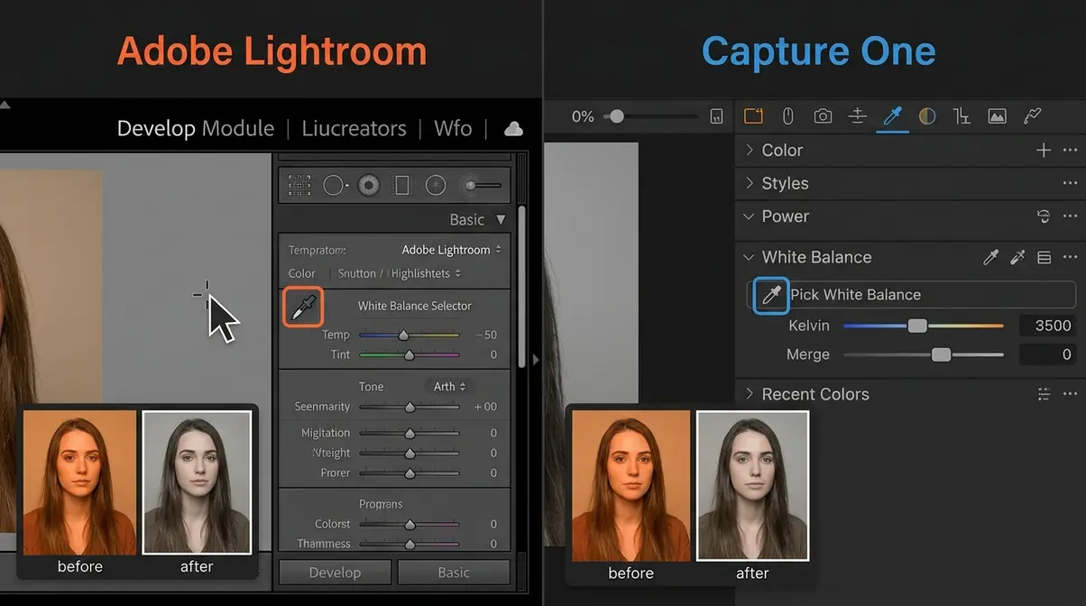
Fixing White Balance in Lightroom and Capture One
Post-processing white balance correction is the Level 4 safety net of the Color Truth Hierarchy — and when shooting RAW, it is lossless and fast.
In Adobe Lightroom (2026 UI):
- Open your image in the Develop module.
- Locate the White Balance panel at the top of the Basic panel (right column).
- Click the White Balance Selector (eyedropper icon). Your cursor becomes a sample tool.
- Click on any area in your image that should be neutral white or neutral grey — a white wall, a grey pavement, a white shirt.
- Lightroom instantly recalculates white balance. Use the Temp (temperature) and Tint sliders to fine-tune if needed.
- To apply to multiple images: select all images in the Filmstrip, click Sync, check White Balance, and click Synchronize.
In Capture One (2026 UI):
- In the Color tool tab, locate the White Balance tool.
- Click the Pick White Balance eyedropper.
- Click a neutral area in your image.
- Use the Kelvin slider or the Tint slider to refine.
- To copy to other images: right-click → Copy Adjustments → select White Balance → Apply to Selected.
Adobe’s white balance guide covers the Lightroom eyedropper workflow in additional detail (Adobe, 2024).
For JPEG files in both applications: The correction still works, but you will notice quality degradation if you push the sliders aggressively. Corrections of ±500K are usually acceptable; larger shifts introduce noise and colour banding.
White Balance on iPhone and Smartphones
iPhones and most Android flagships lock white balance automatically — AWB is the default and there is no native manual control in the standard Camera app. However, several approaches give you meaningful control.
- Option 1 — Lock exposure and white balance on iPhone:
- Open the Camera app.
- Tap and hold on your subject until you see the AE/AF Lock banner appear.
- This locks both exposure and white balance to the values at that moment. It will not drift.
- Limitation: you cannot specify a Kelvin value — you are locking whatever AWB calculated.
Option 2 — Use a third-party camera app:
Apps including Halide Mark III, ProCamera, and Camera+ 2 offer manual Kelvin control on iPhone. Set a specific Kelvin value (e.g., 5,500K for daylight, 3,200K for indoor) exactly as you would on a DSLR.
Option 3 — Shoot in RAW on iPhone:
iPhones from the 12 series onward support Apple ProRAW (and RAW in third-party apps). ProRAW files carry white balance metadata that Lightroom Mobile can correct non-destructively — the same Level 4 safety net as on a full camera.
Actionable Example 8 — Consistent white balance for social media flat lays: Shoot your flat lay in ProRAW using Halide, set white balance to 5,500K (neutral daylight), and batch-correct in Lightroom Mobile. Every image in your feed will have matched, consistent colour without any per-image guessing.
White Balance Cheat Sheet for Video
| Scenario | Recommended WB | Kelvin Value |
|---|---|---|
| Outdoor daylight | Daylight preset | 5,600K |
| Overcast exterior | Cloudy preset | 6,500K |
| Indoor tungsten/lamp | Tungsten preset | 3,200K |
| LED studio lights | Custom WB or manual | 5,500–6,000K |
| Mixed daylight + tungsten | Dominant source + gel secondary | 5,600K (with CTO gel on tungsten) |
| Blue-hour exterior | Manual | 4,500–5,000K |
Lock your white balance before every take. Never use AWB for video production.
Common White Balance Mistakes (and When to Break the Rules)
Common White Balance Mistakes Beginners Make
Even after reading a guide like this, a few predictable mistakes catch beginners off guard. Here is what to watch for:
Pitfall 1 — Leaving AWB on for video. AWB shifts mid-clip as the scene changes. Result: a visible colour flicker between cuts that is extremely hard to fix in editing. Fix: always set a manual white balance or locked preset before rolling video.
Pitfall 2 — Using the wrong preset “close enough.” Shooting in tungsten light and selecting Cloudy instead of Tungsten because “it looked better on the screen.” Camera screens are small, bright, and colour-inaccurate. What looks acceptable on the LCD will often look noticeably wrong on a calibrated monitor. Fix: choose the correct preset for your light source, then fine-tune in post.
Pitfall 3 — Correcting a JPEG too aggressively. Pushing the temperature slider more than ±500K on a JPEG introduces visible noise and colour banding. Fix: shoot RAW whenever accuracy matters, or get white balance right in-camera when shooting JPEG.
Pitfall 4 — Ignoring the background light source. You set white balance for the key light on your subject, but the background wall is lit by a different source. Result: a correctly exposed subject against a strangely coloured background. Fix: identify all light sources in the frame, not just the one hitting your subject.
Pitfall 5 — Not resetting custom white balance between locations. You set a perfect custom white balance in the studio, then move to a different room without resetting. Every shot in the new location inherits the wrong calibration. Fix: build the habit of setting custom white balance every time you change lighting environments.
When to Intentionally “Get It Wrong”
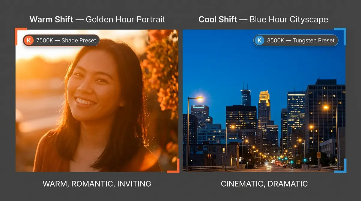
Breaking the “correct” white balance rule is a legitimate creative technique — but it should always be an intentional choice, not an accident.
Warm shift for golden-hour portraits: Set your white balance to 7,000–8,000K (Shade preset) even in direct sunlight. The image gains a rich, golden warmth that amplifies the mood of sunset light. Wedding and lifestyle photographers use this constantly.
Cool shift for moody cityscapes: Set white balance to 3,500–4,000K (Tungsten preset) when shooting a blue-hour cityscape. The artificial lights in the scene turn warm and golden, while the sky deepens to a rich, saturated blue — a colour contrast that reads as cinematic and dramatic.
Mixed-cast storytelling: Leave a deliberate orange cast in a photo of a campfire scene or a candlelit dinner. The warmth tells a story that a “corrected” neutral image would not. The rule of correct white balance exists to serve the image — not the other way around.
FAQ
What does white balance actually do?
White balance removes unnatural colour casts from your photos by compensating for the colour of your light source. Without white balance correction, indoor shots appear orange under tungsten bulbs and outdoor shots in shade appear blue — because light sources have different colour temperatures measured in Kelvin. For example, tungsten bulbs emit light at approximately 2,700–3,200K (warm orange), while open shade produces light at ~7,000–8,000K (cool blue). White balance tells the camera which colour is “true white” under those conditions, allowing it to render all other colours accurately. If you are shooting RAW, you can adjust white balance after the fact with no quality loss.
What should my white balance be set to?
For most everyday shooting, start with AWB (Auto White Balance) — modern cameras handle it well in consistent, single-source lighting. When you know your light source, a preset is more reliable: Daylight (~5,500K) for midday sun, Cloudy (~6,500K) for overcast skies, Tungsten (~3,200K) for household bulbs, and Shade (~7,500K) for open shade. For maximum accuracy in product, portrait, or commercial work, use a grey card to set Custom White Balance — the most precise in-camera option available. Shooting video? Always lock to a specific preset or Kelvin value; never leave it on AWB.
What happens if white balance is off?
When white balance is wrong, your photo carries a colour cast that tints every element of the image. An orange cast typically means you shot under tungsten or incandescent light without correction. A blue cast means you shot in shade or on an overcast day without warming the image. A green cast often indicates fluorescent lighting. Beyond looking inaccurate, incorrect white balance affects skin tones most visibly — making subjects look feverish (orange cast) or pallid and unwell (blue/green cast). The fix depends on your file format: RAW files can be corrected losslessly in Lightroom or Capture One; JPEG corrections are limited to roughly ±500K before quality degrades.
When should I use white balance?
You should actively manage white balance in every shooting situation, not just when something looks wrong. Use AWB for casual shooting in natural or consistent light. Switch to a preset (Tungsten, Cloudy, Shade) whenever you know your light source — it will outperform AWB in consistency. Set a custom white balance using a grey card when colour accuracy is critical: product photography, portraits where skin tone must be accurate, or any commercial assignment. For video, always lock white balance manually before recording. The Color Truth Hierarchy — AWB → Presets → Custom/Grey Card → Post-Processing — gives you a clear decision path for any situation.
Conclusion
For any photographer struggling with orange indoor shots or cold, blue portraits, white balance is the single setting that makes the most immediate visual difference. It is the camera setting that removes unnatural colour casts and ensures your images reflect the scene you actually saw. Standard daylight sits at approximately 5,500 Kelvin — every preset, custom setting, and post-processing correction is built around that benchmark (Nikon, 2024). The best approach combines understanding colour temperature, selecting the right preset for your light source, and reaching for a grey card when accuracy truly matters.
The Color Truth Hierarchy gives you a clear, tiered decision framework: start with AWB for convenience, move to presets when you know your light, step up to custom white balance or a grey card when accuracy is critical, and use post-processing as your safety net when shooting RAW. Each level trades a little convenience for a lot more accuracy. Knowing which level the situation calls for is the skill this guide has been building toward.
Your next step: pick one lighting scenario you shoot regularly — your home, your office, a favourite outdoor location — and deliberately test all four levels of the hierarchy in that environment. Shoot the same subject with AWB, the correct preset, a custom white balance from a grey card, and then correct one in Lightroom. The difference will be visible immediately, and that hands-on experience will make every concept in this guide permanent. Amateur Photographer Guide has additional resources to help you take the next step with colour accuracy and camera settings.

Dave King
Hi, I'm Dave, the founder of Amateur Photographer Guide. I created this site to help beginner and hobbyist photographers build their skills and grow their passion. Here, you’ll find easy-to-follow tutorials, gear recommendations, and honest advice to make photography more accessible, enjoyable, and rewarding.