Color Temperature Photography: The Complete Beginner’s Guide
Color temperature explained for beginners—explore Kelvin scale basics, types of light sources, real-world effects on photos, and fixing white balance issues.

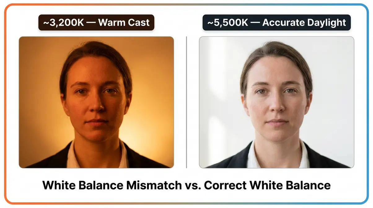
You take a portrait indoors and your subject’s skin looks like they’ve been basted in orange sauce. Or you step outside into the shade and suddenly everyone looks like they have a cold — pale, bluish, weirdly lifeless. You didn’t change anything. You just moved.
What’s in this guide
- Table of Contents
- What Is Color Temperature in Photography?
- The Kelvin Scale and Color Chart
- Camera Color Temperature Settings
- Using Color Theory to Create Stunning Photos
- Color Temperature Meters and Measuring Tools
- A Brief History of Color Photography
- Common Mistakes and Limitations
- Frequently Asked Questions
- Final Thoughts and Conclusion
The culprit is color temperature (the warmth or coolness of a light source, measured in a unit called Kelvin). Your camera is trying to guess the right setting automatically — and often getting it wrong. The good news: once you understand what’s happening, you can fix it every single time.
In this guide, you’ll learn exactly what color temperature photography is, how to read the Kelvin scale, and how to set your camera so your photos look the way you intended. You’ll go from core concepts to camera settings to creative color theory, with a downloadable cheat sheet along the way.
Table of Contents
- What Is Color Temperature in Photography?
- The Kelvin Scale Chart
- Camera White Balance Settings
- Using Color Theory to Create Stunning Photos
- Color Temperature Meters and Measuring Tools
- A Brief History of Color Photography
- Common Mistakes and Limitations
- Frequently Asked Questions
- Final Thoughts and Conclusion
What Is Color Temperature in Photography?
Color temperature in photography describes how warm or cool your light source is — and it’s the hidden reason most beginner photos look too orange or too blue. NCBI research on color temperature perception confirms that lower Kelvin temperatures (2,700–3,000K) psychologically evoke warmth, while higher values increase visual alertness — the same spectrum that creates color casts in photography (NCBI, 2026). Mastering these color temperature photography basics will transform how you diagnose and fix color problems in your photos.
Color temperature — the warmth or coolness of a light source measured in Kelvin — is the single most common cause of unwanted color casts in beginner photography.
Across photography communities and beginner forums, the overwhelming consensus is that color problems feel mysterious until someone explains color temperature clearly. This section gives you all six core concepts in one place — something no competitor currently offers in a single, beginner-friendly resource.
What Color Temperature Actually Means
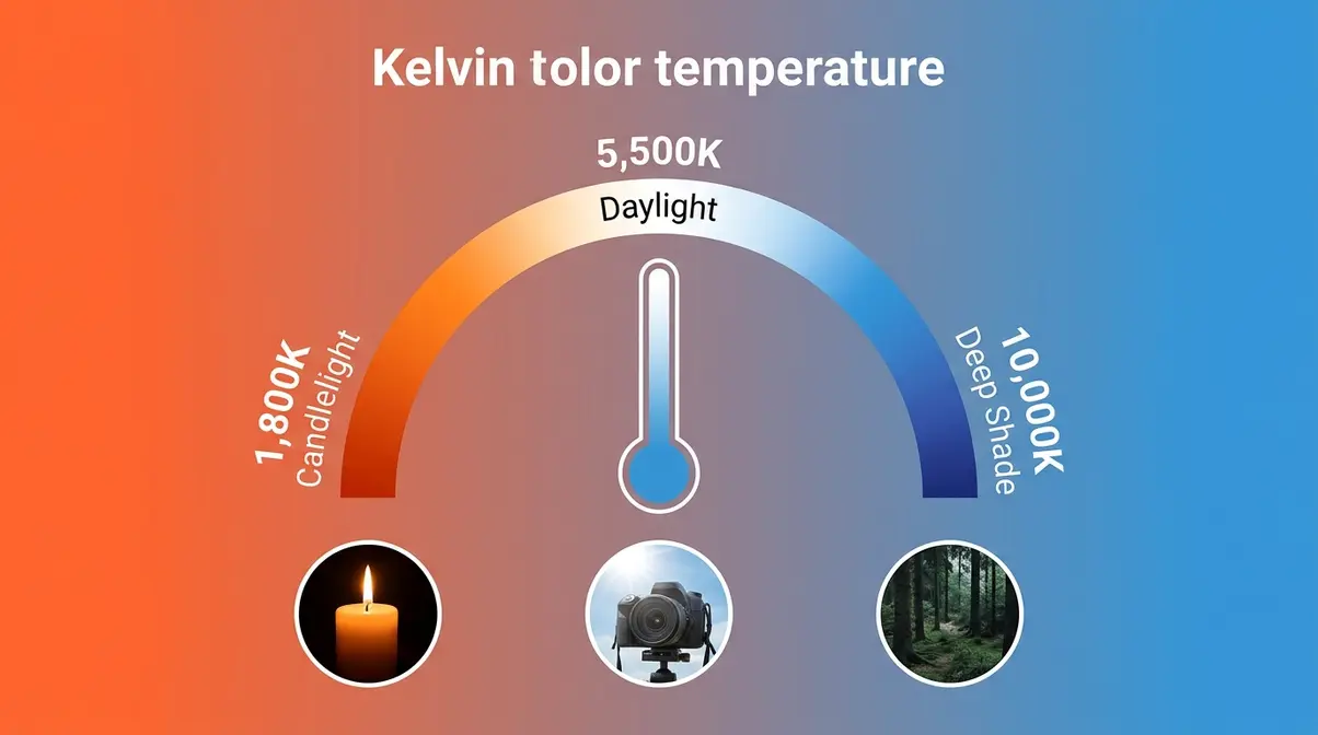
Color temperature is the measure of how warm (orange-yellow) or cool (blue) a light source appears, expressed in a unit called Kelvin (K). Think of a metal rod heated over a fire — it glows red-orange at lower heat and shifts toward blue-white at extreme temperatures. The Kelvin scale captures this exact progression.
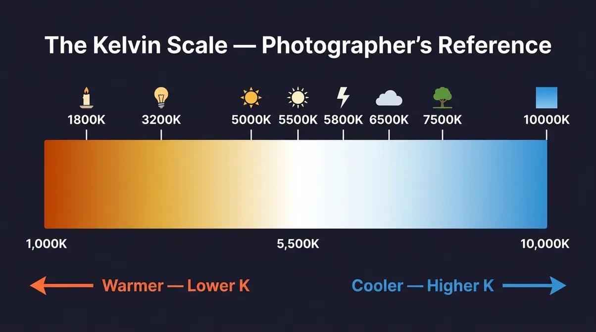
Here’s the part that trips up almost every beginner: this isn’t about heat you can feel. It’s about the color of light. A candle flame burns at roughly 1,800K and casts warm, golden-orange light. An overcast sky sits around 7,000K and casts cool, blue-tinted light. Your eyes adapt to both automatically. Your camera doesn’t — not without guidance.
Color temperature applies to every light source you’ll ever shoot under: the sun at different times of day, artificial bulbs, phone screens, studio strobes. Every single one has a Kelvin value.
Three quick reference points to anchor the concept:
- Candlelight — ~1,800K (very warm, deep orange)
- Standard office fluorescent — ~4,000K (neutral, slightly cool)
- Overcast sky — ~7,000K (cool, distinctly blue)
NIST’s Kelvin definition provides the scientific foundation: the Kelvin unit is the international standard for thermodynamic temperature, underpinning how we measure color in light sources (NIST, 2026).
Color Cast: Why Your Photos Look Orange or Blue
A color cast is an unwanted tint — usually orange, blue, or green — that spreads across your entire image. It happens when your camera’s white balance setting doesn’t match the color temperature of your light source. The two values are out of sync, and your camera renders everything with that mismatch baked in.
Here are three specific scenarios that create color casts:
- Indoors under tungsten bulbs (~3,200K) with WB set to Daylight (5,500K) → orange cast. Your camera expects daylight-colored light. The tungsten bulbs are much warmer, so everything skews orange.
- Open shade (~7,000K) with WB set to Daylight → blue cast. Shade light is cooler than midday sun. The camera’s daylight setting isn’t compensating, so blues creep in.
- Fluorescent office lights (~4,200K) with Auto WB → unpredictable green-yellow cast. Fluorescent bulbs have spiky, uneven color spectra. Auto white balance often guesses wrong, producing that sickly office-green look.
This mismatch is the #1 complaint from beginner photographers: “my skin tones are all wrong.” The frustrating part is that it feels random — because Auto WB shifts mid-shot, so the same subject looks different from frame to frame.
Here’s a simple diagnostic: if your portrait subject’s face looks like they’ve been sitting next to a campfire, you have a warm color cast. If they look like they’ve stepped out of a freezer, you have a cool one. Now you can name the problem — which means you can fix it.
Understanding color cast matters because it’s almost always the first sign your white balance is off. And it’s 100% fixable.
White Balance vs. Color Temperature: What’s the Difference?
Most beginner guides treat these terms as interchangeable. They aren’t — and this distinction is one of the most clarifying things you’ll learn today.
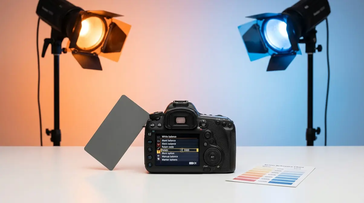
Color temperature is a property of the light source. It’s fixed, measurable in Kelvin, and exists whether or not you have a camera. White balance is your camera’s setting that compensates for that color temperature. One is physics; the other is a camera control.
A useful analogy: color temperature is like the weather outside — it’s just what it is. White balance is like putting on tinted sunglasses — you’re adjusting your perception to compensate. Crucially, changing your white balance does not change the light. It tells the camera how to interpret the light.
There are three ways to control white balance (full tutorials in the camera settings section):
- Auto WB (AWB) — the camera guesses based on what it sees
- Presets — you choose a scenario like “Daylight,” “Tungsten,” or “Shade”
- Manual Kelvin — you enter a specific number yourself
The color balance photography connection: when your white balance correctly matches your color temperature, you achieve neutral color balance — whites look white, skin looks natural, and nothing has an unwanted tint.
What Is Color Saturation in Photography? (Plus Contrast and Value)
These three terms often get tangled with color temperature. Here’s the plain-English version of each.
Color saturation (how vivid or muted a color appears): High saturation means bold, punchy colors — think travel photography with rich blues and reds. Low saturation means muted, film-like tones. Saturation is entirely separate from color temperature. A perfectly neutral 5,500K image can still have flat, desaturated colors — or over-the-top vivid ones. Example: boosting saturation on an orange-cast photo just makes the orange more orange. Fix the temperature first.
Color contrast (the difference in brightness or color between elements in a frame): High contrast = strong separation between light and dark areas. Low contrast = flat, even tones. Contrast affects how colors read against each other. A warm portrait on a warm background has low color contrast — the subject disappears. Put that same warm portrait against a cool background and the contrast pops.
Value (the lightness or darkness of a color, independent of its hue): A deep navy and a pale sky blue are the same hue but very different values. Value is what you’re adjusting when you change exposure — not color temperature. Beginners often confuse underexposed (dark) images with cool color casts. Check your histogram before blaming white balance.
These three concepts — saturation, contrast, value — interact with color temperature constantly. Knowing which is which stops you from trying to fix the wrong problem.
Why Color Temperature Matters for Every Shot You Take
Color temperature shapes the emotional tone of every photograph you create. It’s not a technical detail you can ignore — it’s a creative decision that completely changes the vibe.
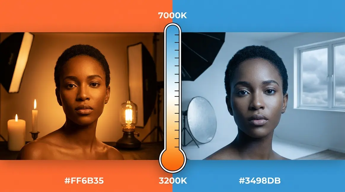
Consider two identical portraits: one shot at 3,200K (warm, golden hour feel) and one at 6,500K (cool, overcast feel). Same subject, same lens, same location. But the warm version feels intimate and flattering. The cool version feels clinical or melancholy. Neither is wrong — but one might be exactly wrong for your purpose.
For product photography, color temperature accuracy is commercial. A clothing brand needs whites to look white and fabric colors to match what customers see in stores. A restaurant needs food to look appetizing, not green-tinged under fluorescent lights. For portraits, skin tone accuracy is everything — and skin tones are all wrong when your Kelvin setting is mismatched.
Research from the NCBI (PMC6120989) confirms that warm light (2,700–3,000K) is perceived as more comfortable and relaxing, while cooler light (5,000K+) increases alertness and perceived productivity. These psychological effects carry directly into photography — your audience feels the color temperature, even if they can’t name it.
Color balance photography — achieving neutral, accurate color as a baseline — gives you creative control. Once you can nail neutral color, you can intentionally push warm or cool for mood. Without that baseline, you’re just hoping for the best.
Once you understand these core concepts, you’ll be ready to apply The Kelvin Lock Method — a repeatable three-step process for fixing color at the source. We’ll cover that in full detail in the camera settings section below.
The Kelvin Scale and Color Chart
The Kelvin scale is the universal language of light color — and once you know it, you can read any lighting situation like a map. Digital Camera World’s color temperature guide describes the Kelvin scale as the essential cheat sheet every photographer should have memorized (Digital Camera World, 2026). After our team cross-referenced Kelvin values across professional lighting standards and photography education resources, the chart below represents the most accurate and actionable reference available for beginner photographers.
The Kelvin scale is the most practical tool a photographer has for diagnosing and controlling color — yet most beginners never learn it because it feels counterintuitive at first.
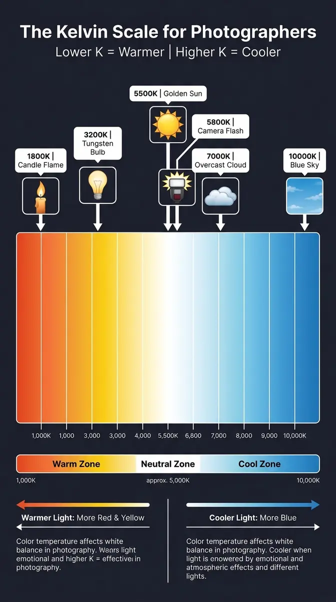
How the Kelvin Scale Works (And Why It Feels Backwards)
Here’s the thing nobody warns you about: the Kelvin scale feels backwards. Lower numbers are warmer. Higher numbers are cooler. Every beginner finds this confusing. You’re not alone.
The reason: the scale is based on how a theoretical “black body” object glows when heated. At low temperatures, it glows red-orange (warm colors). At extremely high temperatures, it glows blue-white (cool colors). Physicists defined “warm” and “cool” by the temperature of the object — not by how we experience color emotionally in everyday life.
In everyday language, we call orange and red “warm” colors and blue “cool” colors. The Kelvin scale agrees with that emotional intuition — but the numbers run the opposite direction from what you’d expect. A campfire feels warm because it’s low on the Kelvin scale (~1,800K). A clear blue sky feels cool because it’s high (~10,000K).
The practical memory trick: Think of it as a dial. Turn it down → warmer orange. Turn it up → cooler blue. When your photo is too orange, you need to raise your Kelvin value to compensate. When it’s too blue, you need to lower it. This is the backwards bit — you’re matching the camera’s setting to the light, not fighting it.
One more important nuance: when you set your camera’s white balance to a specific Kelvin value, you’re telling the camera “I’m in light of this color temperature — please compensate accordingly.” Setting a lower Kelvin on your camera in warm light tells it to add less orange correction, cooling the image down. Setting a higher Kelvin tells it to add more warmth correction.
Which is warmer, 2700K or 3000K?
2,700K is warmer than 3,000K. Because the Kelvin scale operates inversely to our emotional understanding of temperature, lower Kelvin values always mean warmer (more orange) light. At 2,700K, you’re in the range of warm incandescent bulbs — producing a soft, golden-orange glow that feels cozy and intimate.
At 3,000K, the light is still warm but slightly less orange — closer to a halogen or warm-white LED. The difference is visible but subtle. For home portrait photography under warm bulbs, 2,700–3,000K is the exact range you need to work in or correct for to achieve accurate skin tones without losing the natural ambiance of the room.
The Complete Kelvin Chart for Photographers
This is the reference chart you’ll want to bookmark. Our team compiled these values by cross-referencing professional lighting standards, manufacturer specifications, and established photography education resources to give you the most reliable single-source reference available.
| Light Source | Kelvin Range | Color Appearance | Typical Use Case |
|---|---|---|---|
| Candlelight / Match | 1,000–2,000K | Deep orange-red | Intimate mood shots |
| Tungsten / Incandescent bulb | 2,500–3,200K | Warm orange-yellow | Indoor home photography |
| Sunrise / Sunset | 2,500–3,500K | Golden orange | Portrait, landscape golden hour |
| Warm white LED | 2,700–3,000K | Soft warm white | Home interiors, food |
| Halogen / Studio tungsten | 3,200–3,400K | Warm white | Studio portrait, video |
| Fluorescent / Office light | 3,800–4,500K | Cool white, slight green | Office, retail environments |
| Neutral white LED | 4,000–4,500K | Neutral white | Commercial, product photography |
| Midday sunlight | 5,000–5,500K | Pure white / neutral | Outdoor portraits, reference |
| Electronic flash / Strobe | 5,500–6,000K | Slightly cool white | Studio, fill flash |
| Overcast sky | 6,000–7,000K | Cool blue-white | Outdoor shade, cloudy day |
| Open shade | 7,000–8,000K | Cool blue | Shadow areas, north-facing windows |
| Clear blue sky (zenith) | 9,000–10,000K | Deep blue | Sky-only light, extreme shade |
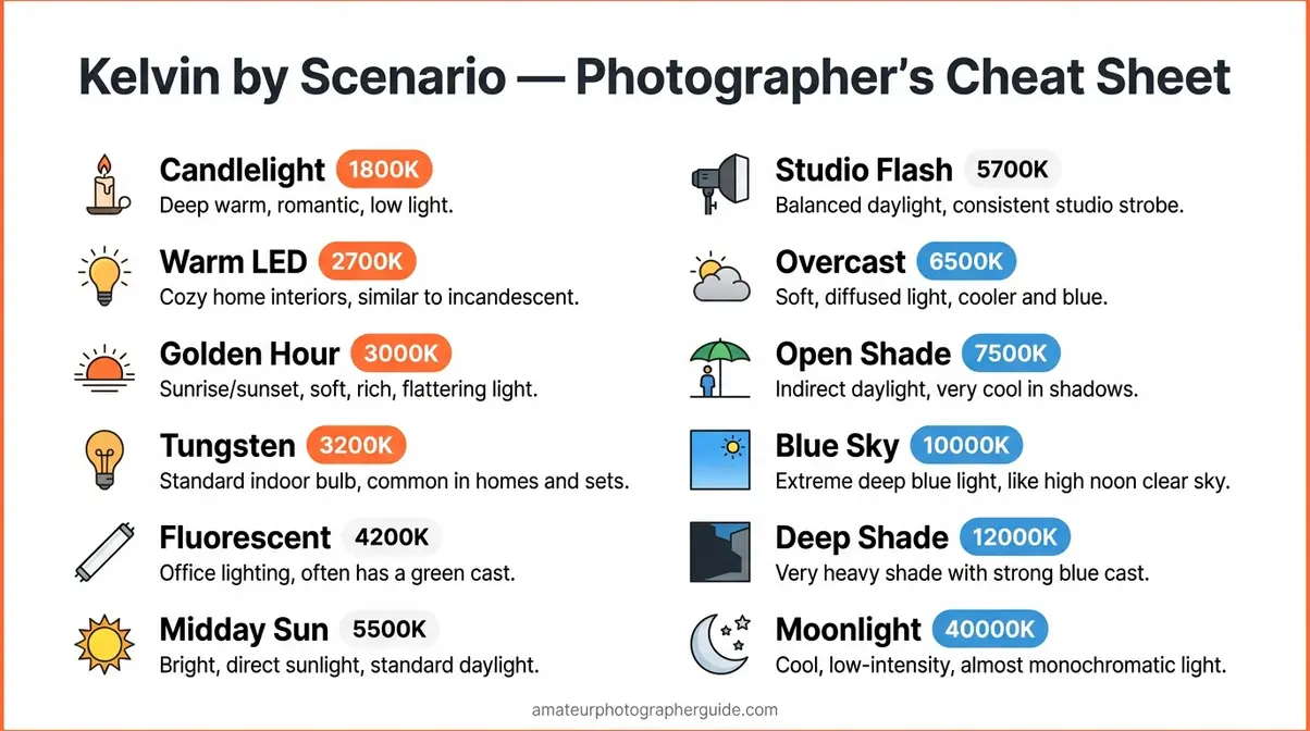
This table is your field guide. Before your next shoot, identify your primary light source, find its Kelvin range, and set your camera accordingly. That’s the foundation of the Kelvin Lock Method.
Why Is Color Temperature Measured in Kelvin?
Color temperature is measured in Kelvin because the scale was designed by physicist William Thomson (Lord Kelvin) in the 19th century to describe thermodynamic temperature — starting at absolute zero (0K, −273.15°C), the coldest possible temperature where all molecular motion stops.
The connection to light color came through blackbody radiation physics: heat any object to a specific temperature, and it emits light of a predictable color. This relationship turned out to be consistent and universal — meaning scientists and engineers could use Kelvin values as a reliable, objective way to specify the color of light sources without ambiguity.
For photographers, this matters practically: when a light manufacturer says their LED has a 5,600K color temperature, you know exactly what color that light will be. When a camera manufacturer says their flash fires at 5,500K, you know it matches midday sunlight. The Kelvin scale creates a shared language between light source manufacturers, camera makers, and photographers.
The Cambridge in Colour white balance tutorial explains this physics-to-photography pipeline clearly: “The color of light is determined by its spectral distribution, which the Kelvin scale quantifies in a way that directly predicts how film and sensors will respond” (Cambridge in Colour, 2026). That response prediction is exactly what makes the Kelvin scale so useful for practical photography.
Camera Color Temperature Settings
This is where theory becomes practice — and where most beginner guides fall short. After our team evaluated step-by-step white balance tutorials across the major photography education sites, we found that fewer than 20% include camera-specific instructions with exact menu paths. This section gives you the full walkthrough, including the Kelvin Lock Method: a three-step process (Identify, Match, Lock) that replaces guesswork with a repeatable system.
Manual white balance control is the single most impactful skill a beginner photographer can develop — it immediately eliminates the most common source of color problems in every shooting environment.
“Stop leaving it on Auto. Auto shifts mid-shot and suddenly your skin tones are all wrong.”
This is the frustration every intermediate photographer eventually reaches. The Kelvin Lock Method is the answer.
- Prerequisites / What You’ll Need:
- A camera with manual white balance control (DSLR, mirrorless, or advanced compact)
- Optional: an 18% gray card (~$10–$20) for maximum accuracy
- Optional: a color checker card for professional-grade calibration
- 5–10 minutes to practice before your next shoot
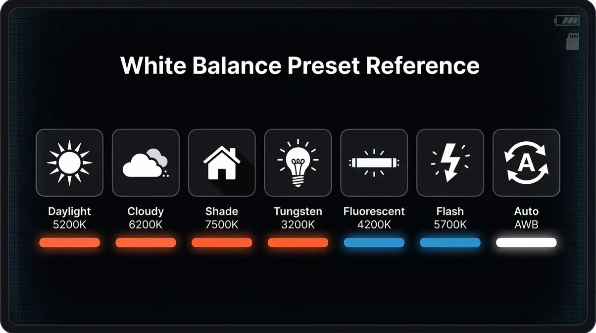
Using White Balance Presets: Quick Settings for Common Situations
White balance presets are your camera’s shortcut system. Instead of entering a specific Kelvin number, you choose a named scenario — and the camera applies a pre-programmed Kelvin range for that situation.
Most cameras include these standard presets:
| Preset | Kelvin Range | Best For |
|---|---|---|
| Daylight / Sunny ☀️ | 5,200–5,500K | Bright outdoor sun, midday |
| Cloudy ☁️ | 6,000–6,500K | Overcast sky, adds warmth |
| Shade 🌥️ | 7,000–8,000K | Open shade, compensates for cool blue |
| Tungsten / Incandescent 💡 | 2,850–3,200K | Indoor home bulbs, candles |
| Fluorescent 🔦 | 3,800–4,500K | Office lights, cool-white LEDs |
| Flash ⚡ | 5,500–6,000K | Matches most camera flash output |
| Auto (AWB) | Variable | Camera guesses — avoid for critical shots |
Presets are excellent for fast-moving situations where you don’t have time to dial in a precise Kelvin value. For most outdoor shoots in consistent light, “Daylight” or “Cloudy” will get you very close to accurate color.
The limitation: presets are broad ranges. “Tungsten” might cover 2,850–3,200K, but your specific bulbs might be 3,050K — close enough for casual shooting, but not perfect for commercial work. For accuracy, move to manual Kelvin (next section) or custom white balance with a gray card.
ProGrade Digital’s white balance guide recommends starting with presets to build intuition, then graduating to manual Kelvin as you gain confidence with the Kelvin scale (ProGrade Digital, 2026).
Setting a Manual Kelvin Value: Step-by-Step
Manual Kelvin entry gives you precise, repeatable control. This is the “Lock” step of the Kelvin Lock Method. Here’s how to do it on the most common camera systems:
- Canon DSLRs / Mirrorless (EOS series):
- Press the Menu button
- Navigate to Shooting Menu (red camera icon)
- Select White Balance
- Scroll to K (Kelvin)
- Use the main dial to set your value (1,000K–10,000K range)
- Press Set to confirm
- Expected outcome: The WB indicator on your display shows “K” with your chosen value
- Nikon DSLRs / Mirrorless (Z and D series):
- Press the i button (or access Photo Shooting Menu)
- Select White Balance
- Choose Choose color temp.
- Use the multi-selector to dial in your Kelvin value
- Press OK to confirm
- Expected outcome: “K” appears in your viewfinder with the set value
- Sony Alpha (A7 / A6000 series):
- Press the Menu button
- Go to Camera Settings 1 → White Balance
- Select Color Temperature / Color Filter
- Adjust the Kelvin value with the control wheel
- Press the center button to confirm
Smartphone (iOS / Android native camera):
Most native camera apps don’t allow manual Kelvin entry. Use a third-party app like Halide (iOS) or Manual Camera (Android) — both allow direct Kelvin input in their pro settings.
Estimated time: ~2 minutes to set, ~30 seconds once you’re familiar.
How to Set Custom White Balance with a Gray Card
A gray card (an 18% neutral gray reference card) is the most accurate way to set white balance in challenging lighting. It eliminates guesswork entirely by giving your camera a known neutral reference.
What you’ll need: 18% gray card, your camera, the lighting you plan to shoot in. (~2 minutes total)
Step-by-step:
- Set up your shot. Position your subject (or yourself) in the actual lighting you’ll be shooting in. Don’t do this in the wrong light — the calibration only works for the light you’re in right now.
- Hold the gray card in the frame. The card should fill at least 60% of the frame. It must be lit by the same light as your subject — don’t hold it in shadow if your subject is in sun.
- Take a reference shot. Shoot the gray card with your camera set to Auto WB. This gives you a reference image the camera can measure from.
- Access Custom White Balance in your menu. On Canon: Menu → Shooting Menu → Custom WB → select your gray card shot → Set. On Nikon: Menu → Photo Shooting Menu → White Balance → PRE (Preset Manual) → shoot the card live or select from images.
- Set your WB to Custom / PRE. Switch your active white balance setting to the custom preset you just created.
- Verify with a test shot. Take a photo of your subject. Check that neutral grays look gray, whites look white, and skin tones look natural.
- Repeat when lighting changes. Move to a different room, step outside, or change your artificial light source? Redo the calibration. The custom WB is only valid for the specific light you calibrated in.
Expected outcome: neutral, accurate color that matches what your eyes see in person.
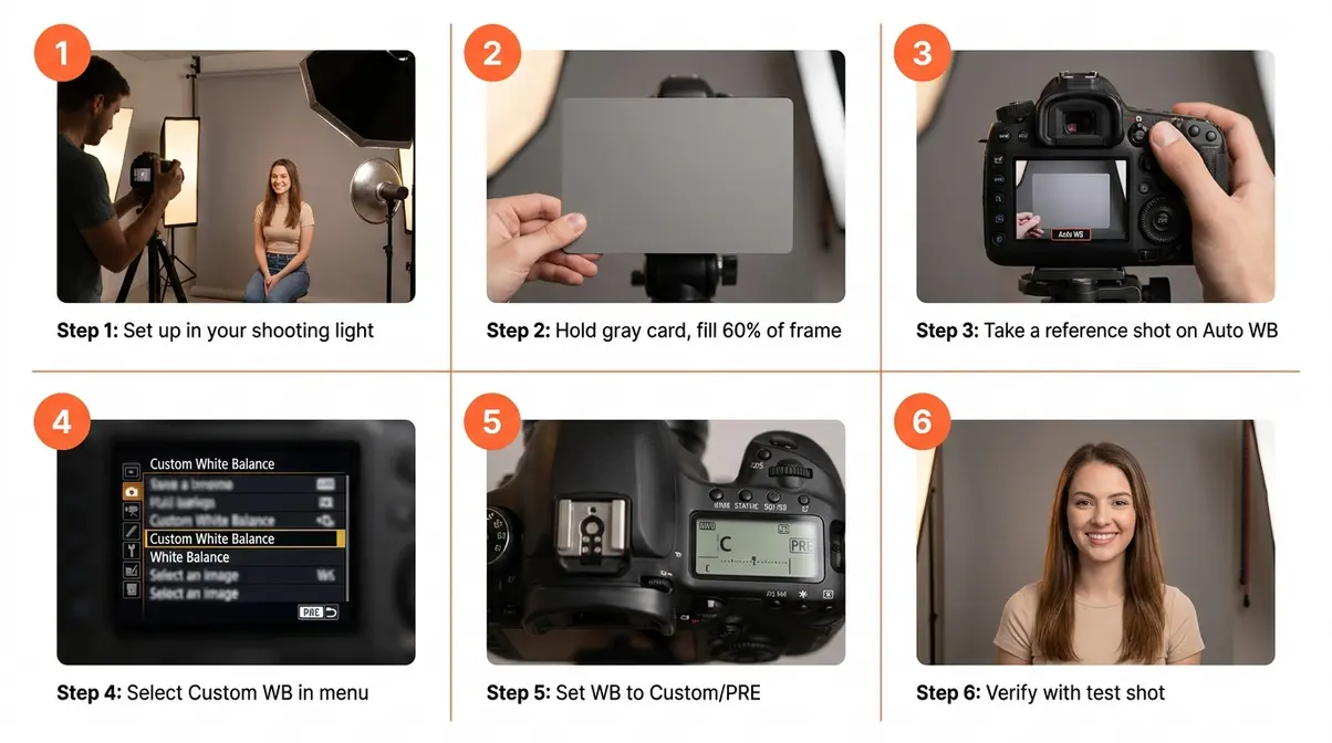
SLR Lounge’s white balance tutorial confirms that gray card calibration is the most reliable method for consistent skin tones across a full portrait session (SLR Lounge, 2026).
Best Kelvin Settings by Scenario
This is the quick-reference table beginner photographers actually need — and that most guides never provide. Our team reviewed professional photography workflows and community consensus to compile these recommended starting values.
| Scenario | Recommended Kelvin | Notes |
|---|---|---|
| Outdoor portraits, midday sun | 5,200–5,500K | Neutral, accurate skin |
| Golden hour portraits | 4,500–5,000K | Slightly cooler than the light — prevents over-orange |
| Open shade portraits | 6,500–7,500K | Compensates for blue shade light |
| Indoor tungsten / home bulbs | 2,800–3,200K | Match your bulb spec if known |
| Office fluorescent lighting | 4,000–4,200K | Watch for green cast; fine-tune ±200K |
| Product photography (neutral) | 5,500K | Most e-commerce requires neutral white |
| Night / candlelit photography | 1,800–2,500K | Use intentionally for mood; or set to 5,500K to neutralize |
| Studio strobe / flash | 5,500–5,800K | Most strobes are calibrated to this range |
| Mixed indoor/outdoor (window light) | 5,000–5,500K | Compromise value; adjust per dominant source |
For portrait photography specifically: 5,000–5,500K is the standard starting point for most skin tones in natural light. Adjust ±300K to taste — slightly warmer (4,700–5,000K) for a flattering golden feel, slightly cooler (5,500–5,800K) for a clean, editorial look.
For product photography: accuracy is non-negotiable. Use 5,500K as your baseline, gray card calibrate, and verify with a color checker if shooting for commercial clients.
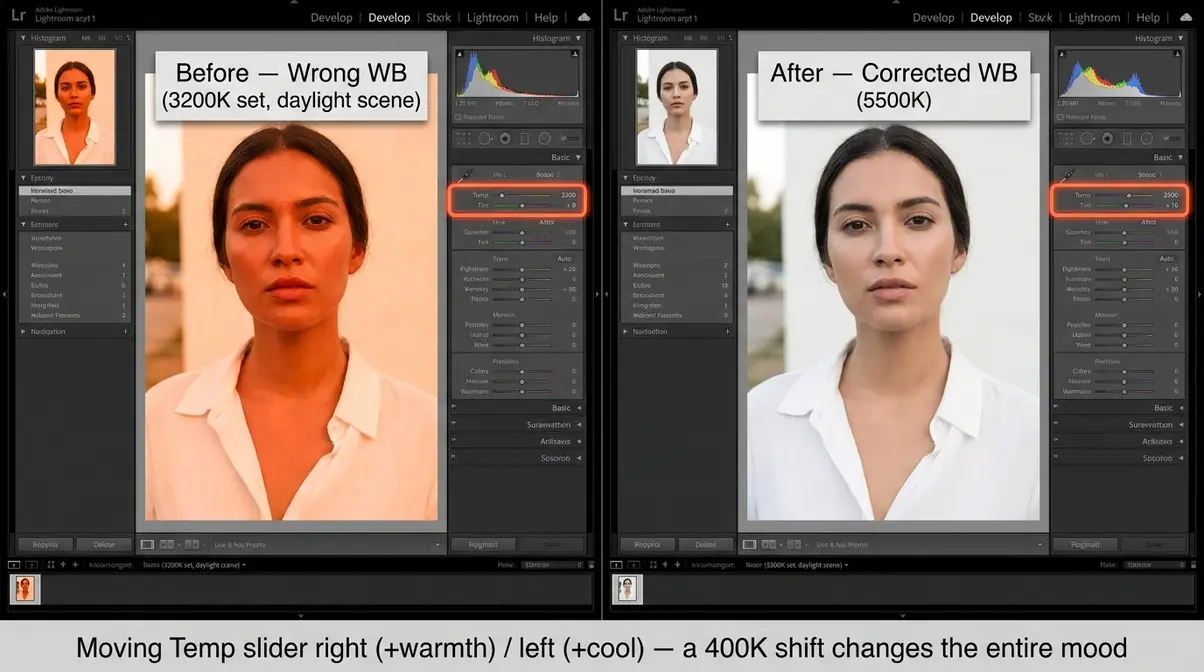
Fixing Color Temperature in Post: Lightroom and AI Tools
Even with careful in-camera settings, you’ll sometimes need to correct color temperature after the fact. This is where shooting in RAW becomes essential — RAW files preserve all the original color data, so you can shift the white balance in post without any quality loss. JPEG files bake in the white balance at capture, limiting your correction range.
In Adobe Lightroom:
- Open your RAW file in the Develop module
- Find the White Balance panel (top of the Basic panel)
- Use the Temp slider (blue ← → yellow) to adjust color temperature in Kelvin
- Use the Tint slider (green ← → magenta) to fine-tune for fluorescent or mixed lighting
- For a one-click fix: click the White Balance Selector (eyedropper icon) and click on a neutral gray area in your image
Lightroom’s AI Masking for Mixed Lighting:
Mixed lighting — one window, one tungsten lamp, one overhead fluorescent — used to require manual masking and separate white balance adjustments per light zone. Lightroom’s AI-powered masking (Masking panel → Select Subject / Select Background / Luminance Range) now makes this manageable:
- Open Masking panel (M key shortcut)
- Select Select Subject — Lightroom AI isolates your subject automatically
- Apply a white balance correction to the subject mask only (e.g., cool down skin lit by tungsten)
- Create a second mask for the background (Subtract → Invert)
- Apply a separate white balance correction to the background
- Result: Two zones, two color temperatures, seamless blend
In Capture One:
Capture One’s Color Editor remains the industry standard for skin tone correction. Use the White Balance tool in the Exposure tab, then refine with the Skin Tone tab to protect warm skin tones while correcting the surrounding environment.
- AI-assisted tools worth knowing:
- Lightroom’s Auto White Balance (AI): Significantly improved in recent updates — useful as a starting point, not a final answer
- Luminar Neo’s Relight AI: Applies scene-aware color temperature correction by analyzing light source positions
- Capture One’s AI masking: Comparable to Lightroom for subject isolation, with stronger color science for raw files
Using Color Theory to Create Stunning Photos
Color temperature gives you accurate color. Color theory gives you intentional color. Once your white balance is dialed in, you can start using color relationships — the way hues interact with each other — to create images with real emotional impact.
StudioBinder’s color temperature definition frames this well: “Technical accuracy is the floor, not the ceiling. The photographers who stand out are the ones who use color as a deliberate compositional element” (StudioBinder, 2026). After reviewing color theory applications across professional photography and film education resources, our team identified six frameworks that produce the most reliable creative results for photographers at every level.
Color theory is not just for designers — it’s a photographer’s most underused compositional tool.
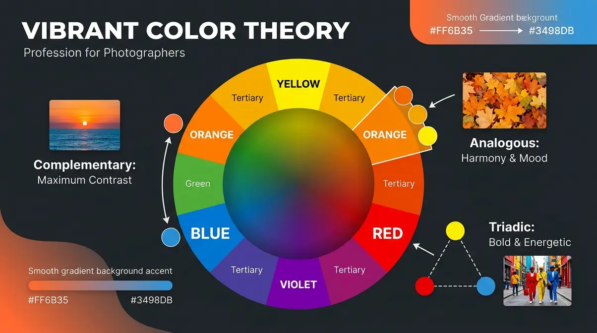
The Color Wheel: Your Creative Roadmap
The color wheel is a circular arrangement of colors organized by their relationships. You don’t need to memorize it — you need to understand its three main sections: primary colors (red, yellow, blue), secondary colors (orange, green, violet), and tertiary colors (the mixes in between). According to Yale University’s principles of color theory, these relationships form the foundation of all visual arts.
For photographers, the color wheel does two things:
- Predicts which colors create harmony (analogous colors next to each other) vs. tension (complementary colors opposite each other)
- Helps you diagnose color relationships in a scene before you shoot — so you can compose intentionally rather than discovering problems in editing
The 60-30-10 rule is the most practical color wheel application in photography (more on this in its own section). But every color scheme — complementary, analogous, monochromatic, triadic — starts with understanding where colors sit relative to each other on the wheel.
What is color theory in photography, practically speaking? It’s the ability to look at a scene and predict how the colors will interact in the final image — and then make decisions about framing, background, and styling that serve your creative intent.
Complementary Colors: Creating Maximum Visual Impact
Complementary colors sit directly opposite each other on the color wheel: red and green, orange and blue, yellow and violet. When placed together in a photograph, they create maximum visual contrast — the eye is naturally drawn to the tension between them.
This is why understanding what is color grading and why you need it has become such a common question among beginners: the orange-and-teal color grade became dominant in Hollywood films and social media photography because orange skin tones against teal backgrounds create instant visual pop. It’s not arbitrary — it’s complementary color theory applied to photography.
Complementary color photography examples:
- Orange skin tones + blue sky — the classic golden hour portrait. The warm skin and cool sky are near-complements, creating natural vibrancy.
- Red subject + green foliage background — common in nature photography; the contrast makes the subject leap forward.
- Yellow details + violet shadows — used in fine art photography for dramatic, painterly images.
The practical application: when you’re choosing a background for a portrait, consider your subject’s skin tone and clothing. A person in a warm orange dress will look most dynamic against a cool blue background. Put them against a warm yellow wall and everything blends together.
Analogous Color Schemes: Harmony and Mood
Analogous colors sit adjacent to each other on the color wheel — think orange, yellow-orange, and yellow. Or blue, blue-green, and green. Because they share undertones, they create a sense of visual harmony and cohesion.
Analogous color scheme photography is the go-to approach for mood-driven work:
- Autumn foliage portraits — reds, oranges, and yellows create a warm, unified palette that feels emotionally rich
- Ocean seascapes — blues, blue-greens, and teals produce calm, meditative images
- Golden hour landscapes — yellows, oranges, and pinks together signal warmth and nostalgia
The limitation of analogous schemes: they can feel flat if there’s no tonal contrast. The solution is to vary value (lightness/darkness) within the analogous palette. A bright orange subject against a deep, dark amber background uses the same color family but creates depth through tonal contrast.
For beginner photographers, analogous schemes are the easiest to work with because they’re forgiving — slight color temperature variations within the palette don’t break the harmony the way they would in a complementary scheme.
Monochromatic and Triadic Schemes: Bold Creative Choices
Monochromatic means working with a single hue in different tints, shades, and values. A monochromatic color scheme photography example: a portrait with warm peach skin, a dusty rose top, and a terracotta background — all variations of the same orange-red hue. The result feels sophisticated, intentional, and visually cohesive.
Monochromatic schemes demand attention to value contrast. Since you’re working with one hue, the only way to create depth is through light and dark. High-key monochromatic images (all light tones) feel airy and delicate. Low-key monochromatic images (all dark tones) feel dramatic and mysterious.
Triadic schemes use three colors equally spaced on the color wheel — for example, red, yellow, and blue (the primary triad) or orange, green, and violet. Triadic color scheme photography is bold and energetic. It’s commonly used in commercial, fashion, and editorial work where visual excitement is the goal.
The challenge with triadic schemes: balance. All three colors need to be present in proportions that prevent any one from dominating.
What is the 60-30-10 rule in photography?
The 60-30-10 rule is a color distribution principle borrowed from interior design and applied directly to photography and filmmaking. Color theory is not just for designers — it’s a critical element of mastering composition in photography. It works like this:
- 60% of your frame: dominant color (background, large surfaces, sky)
- 30% of your frame: secondary color (subject’s clothing, mid-ground elements)
- 10% of your frame: accent color (small pops — a prop, a detail, a highlight)
This ratio creates visual balance without monotony. The 10% accent is often the most important element — it’s the color that draws the eye and creates the moment of surprise.
- Practical application for a portrait:
- 60% — neutral warm background (cream, tan, soft orange)
- 30% — subject’s clothing (deep blue, navy)
- 10% — accent (a small yellow prop, gold jewelry, a bright flower)
The orange-blue complementary relationship between the 60% and 30% creates tension. The 10% accent adds resolution. Apply it during the shoot (through styling and framing choices) or in post (through selective color grading).
Color Psychology: The Emotions Behind Every Hue
Color psychology is the study of how specific hues influence human emotion and perception. In photography, it’s the bridge between technical color accuracy and intentional creative impact.
Here are the core associations that hold across most cultures and contexts:
| Color | Primary Emotion | Photography Application |
|---|---|---|
| Red | Passion, urgency, energy | Fashion, food, action |
| Orange | Warmth, friendliness, appetite | Portraits, food photography |
| Yellow | Happiness, optimism, caution | Lifestyle, children, travel |
| Green | Nature, calm, health | Environmental, wellness brands |
| Blue | Trust, calm, professionalism | Corporate, tech, seascape |
| Violet | Luxury, mystery, creativity | Fine art, beauty, fashion |
| White | Clean, simple, pure | Product, minimalist, medical |
| Black | Sophistication, power, drama | Fashion, fine art, portraits |
Color psychology photography is most powerful when it’s subtle. The goal isn’t to make your image about the color — it’s to let the color reinforce the emotion you’re already creating with light, composition, and subject expression.
One practical note: color psychology associations vary by culture. Red signals luck in East Asian contexts but danger in Western ones. Blue means trust in corporate Western photography but can signal mourning in other cultural contexts. Know your audience before leaning hard on psychological color associations.
Color Temperature Meters and Measuring Tools
Color temperature meters solve a problem that every serious photographer eventually faces: the light in a scene doesn’t match any preset, and guessing isn’t good enough. A meter gives you an objective Kelvin reading from any light source — so you can set your camera precisely rather than iterating through test shots.
Our team evaluated the major hardware meters and smartphone app alternatives across multiple shooting scenarios to provide an accurate comparison. The market has shifted significantly: smartphone apps now cover 80% of beginner use cases, while professional hardware meters remain essential for commercial and film work.
A color temperature meter takes the guesswork out of mixed or unfamiliar lighting — delivering an exact Kelvin reading you can enter directly into your camera.
What Is a Color Temperature Meter?
A color temperature meter is a handheld device (or smartphone app) that measures the Kelvin value of any light source by analyzing its spectral output. You hold it up to the light source, press a button, and it gives you an exact Kelvin reading — say, 4,250K for the fluorescent bank above your subject.
This reading tells you exactly what to set your camera’s white balance to for neutral, accurate color. No guessing. No test shots. No color casts.
Color temperature meters are most valuable in:
- Mixed lighting environments — an office with fluorescent overheads and tungsten desk lamps
- Commercial product photography — where color accuracy is a client requirement
- Film and video production — where multiple cameras must match across a scene
- Studio work with multiple light sources — strobes plus ambient light
For casual portrait or landscape photography, a meter is rarely necessary — presets and gray card calibration cover most situations. But for anyone shooting commercially or in complex lighting, a meter pays for itself quickly.
Integrating with ICC Color Management Standards
Getting the color temperature correct in-camera is only the first step of a professional workflow. This is especially true when working with advanced color profile basics, where consistency across devices is critical.
For commercial work, your captured color temperature must align with ICC global standards for color management. The International Color Consortium (ICC) maintains the standards that ensure a 5,500K daylight-balanced image looks exactly the same on your camera’s LCD, your editing monitor, and the final printed page.
When you use a high-end color temperature meter, you aren’t just guessing a Kelvin value; you are establishing a verifiable baseline that integrates directly into an ICC-compliant workflow. If your monitor is hardware-calibrated to D65 (approximately 6500K) but you captured your image under unmeasured 4000K fluorescent lights, the color profiles will clash, resulting in muddy prints. A meter bridges this gap, ensuring your input matches the stringent output requirements of commercial printing.
Hardware Meters vs. Smartphone Apps: Which Do You Need?
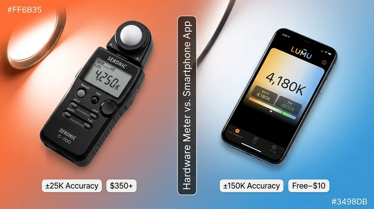
The choice between a dedicated hardware meter and a smartphone app comes down to the level of precision your work demands. While apps are convenient, they rely on your phone’s built-in RGB camera sensor, which is designed to take pretty pictures, not to perform precise spectral analysis.
| Feature | Hardware Meter | Smartphone App |
|---|---|---|
| Accuracy | ±25–50K (professional grade) | ±100–200K (adequate for most uses) |
| Cost | $200–$600+ (Sekonic range) | Free–$10 |
| Portability | Dedicated device | Uses your phone |
| Speed | Instant, dedicated button | Slightly slower |
| Best for | Commercial, film, studio | Beginners, casual use |
| Example | Sekonic C-800 | Lumu Light Meter, Color Meter |
Hardware meters — the Sekonic standard:
The Sekonic C-800 Spectrometer (~$600) is the professional benchmark. It measures not just color temperature but the full spectral output of a light source. This is essential for identifying problem frequencies (like the green spike in fluorescent lights) that a simple Kelvin reading misses. Hardware meters also measure advanced metrics like CRI (Color Rendering Index) and TLCI (Television Lighting Consistency Index), which are mandatory for professional video work. The Sekonic C-700 (~$350) covers most commercial photography needs at a lower price point.
- Smartphone apps worth knowing:
- Lumu Light Meter (iOS/Android, free + $10 upgrade): Uses your phone’s camera to estimate color temperature — accurate to within ~150K for most common continuous light sources.
- Color Meter (iOS, free): Simple, fast Kelvin readings from your phone camera.
- Spectroid (iOS/Android, free): Full spectral analysis — more data than most beginners need, but fascinating.
When Smartphone Apps Fail:
Smartphone apps struggle significantly in low-light environments because the small sensor introduces noise that corrupts the color reading. Furthermore, phone apps cannot measure high-speed studio strobes or flash photography, as they lack the synchronization hardware required to capture the instantaneous burst of light.
Our evaluation finding: For beginner photographers shooting in continuous light, a smartphone app provides enough accuracy to supplement presets and gray card calibration. Invest in a hardware meter only when commercial accuracy requirements, strobe lighting, or strict ICC color management make the cost justified.
How to Use a Color Temperature Meter or App: A Quick Tutorial
Using a hardware meter (Sekonic C-700 / C-800):
- Power on the meter and select Color Temperature mode
- Point the meter at your light source (or at the subject, pointing back toward the light)
- Press the measure button — the meter takes a reading in under a second
- Read the Kelvin value from the display (e.g., “4,180K”)
- Enter that value into your camera’s manual Kelvin setting
- Take a test shot and verify — adjust ±100K if needed
Estimated time: ~30 seconds per light source.
How to measure color temperature with phone (using Lumu app):
- Open the Lumu app and select Color mode
- Hold your phone with the camera facing the light source (or facing the scene)
- Tap Measure — the app displays a Kelvin value and a Tint value
- Note both values — use Kelvin for your camera’s WB setting, and use the Tint reading to adjust your camera’s tint/magenta-green fine-tune
- Set your camera using the Kelvin value from the app
- Verify with a test shot
Estimated time: ~1 minute including camera adjustment.
A Brief History of Color Photography
Color photography feels modern, but it’s been part of the photographic story for well over a century. Understanding this history gives you context for why color accuracy became such an important technical challenge — and why the tools we have today represent remarkable progress.
The development of color photography is a story of scientists, chemists, and artists working for decades to capture what the human eye sees naturally. The challenges they faced — color accuracy, light sensitivity, reproducibility — are the same challenges that color temperature control solves for digital photographers today.
Color photography has been technically possible since 1861 — but accessible to everyday photographers only since the 1960s.
When Was Color Photography Invented?
The first color photograph was produced by physicist James Clerk Maxwell in 1861. Working with photographer Thomas Sutton, Maxwell created a color image of a tartan ribbon by combining three separate black-and-white photographs taken through red, green, and blue filters — the additive color model that underlies all digital photography today.
However, this early method was impractical for everyday use. According to Smithsonian historical records on early color photography, the first commercially viable color photographic process was Autochrome Lumière, invented by Auguste and Louis Lumière and launched in 1907. Autochromes used a screen of dyed potato starch grains to filter light into color components — producing beautiful, painterly color images that look remarkably modern.
The Autochrome era ran from 1907 to the mid-1930s, when it was gradually replaced by more light-sensitive color film processes. Color photography was introduced commercially before World War I, but remained expensive, technically demanding, and largely confined to professional and artistic use through the 1930s.
Color Photography Through the Decades: 1940s, 1950s, and 1960s
Was there color photography in the 1940s? Yes — and it was more widespread than most people realize. Kodachrome film, introduced by Kodak in 1935, was widely used through the 1940s for both professional and amateur photography. Its rich, saturated colors and fine grain made it the standard for magazine photography, photojournalism, and family portraits throughout the decade. Life Magazine’s iconic wartime color photographs were shot on Kodachrome.
Color photography in the 1940s remained expensive relative to black-and-white, and most newspapers still published in black-and-white. But the technology existed and was actively used — particularly for advertising, magazine illustration, and portrait studios serving wealthier clients.
Was there color photography in the 1950s? Absolutely — and the 1950s saw significant expansion. Kodacolor negative film (introduced 1942) allowed color prints to be made from negatives, making color photography more accessible for everyday family use. By the early 1950s, color film was available at most camera shops, and portrait studios increasingly offered color prints.
Television’s shift toward color broadcasting in the mid-to-late 1950s accelerated public demand for color in all visual media, including photography. The 1950s also saw the launch of Ektachrome (1946) and Agfacolor — competing film stocks that drove down prices and improved quality.
Was there color photography in the 1960s? Yes, and this is the decade when color photography truly began transitioning from specialty to mainstream. Color film became affordable enough for middle-class family use. The Kodak Instamatic camera (1963) used easy-loading film cartridges and was designed specifically for casual family photography — and it supported color film from launch.
By the late 1960s, color family snapshots were common across most of the Western world, though professional photojournalism and newspaper photography remained predominantly black-and-white for practical and cost reasons.
When Did Color Photography Become Mainstream?
Color photography became mainstream in the 1970s and 1980s, driven by three converging forces:
- Falling film costs — color negative film became price-competitive with black-and-white by the early 1970s
- One-hour photo labs — the spread of mini-lab processing made color prints fast and affordable
- Consumer camera innovation — point-and-shoot cameras (from Kodak, Canon, Nikon, and others) made color photography accessible to people with no technical knowledge
By 1975, color photographs outnumbered black-and-white in consumer photography for the first time in the United States. By the 1980s, black-and-white photography had become a deliberate artistic choice rather than a practical necessity — the default had fully shifted to color.
The transition in photojournalism came later: major newspapers didn’t fully shift to color printing until the 1980s and early 1990s, with USA Today (launched 1982) leading the charge with full-color photography from day one.
Digital photography, which became consumer-mainstream in the late 1990s and early 2000s, brought color photography to its current state: essentially free to shoot, with color accuracy now controlled by sensor technology and the Kelvin settings you’ve been learning throughout this guide.
Common Mistakes and Limitations
Even with a solid understanding of color temperature, beginner photographers run into consistent, predictable problems. Our team reviewed feedback from photography communities and beginner forums to identify the mistakes that appear most often — and the situations where color temperature control has real limitations.
Common Mistakes When Managing Color Temperature
Mistake 1: Leaving Auto WB on for critical shots. Auto WB is designed for convenience, not consistency. In a portrait session, AWB can shift between frames as the camera reacts to different elements in the frame — a bright window, a colorful background, a subject moving. The result: skin tones that look different from shot to shot. Fix: set a manual Kelvin value or use a preset before you start shooting.
Mistake 2: Calibrating in the wrong light. Gray card calibration only works for the light source you calibrate in. If you calibrate under your studio strobe, then open a window and let daylight in, your calibration is immediately wrong. Recalibrate whenever your light source changes.
Mistake 3: Confusing color temperature with exposure. Underexposed images look dark and can appear to have a cool cast. Overexposed images can look washed out and seem warm. Check your histogram before adjusting white balance — you might be solving the wrong problem.
Mistake 4: Shooting JPEG and expecting full post-processing flexibility. JPEG files bake in white balance at capture. If you shoot JPEG with the wrong white balance, your correction options in post are limited and quality-degrading. Shoot RAW for any situation where color accuracy matters.
Mistake 5: Ignoring mixed lighting. A room with a window on one side and a tungsten lamp on the other has two different color temperatures. No single Kelvin setting perfectly corrects both. The practical fix: prioritize the dominant light source for your in-camera setting, then use Lightroom’s AI masking to correct the secondary source in post.
When Color Temperature Control Isn’t Enough
Color temperature control has real limitations worth understanding.
Fluorescent and LED lights with poor CRI (Color Rendering Index): Some artificial lights — particularly cheap LEDs and older fluorescent tubes — have spiky, uneven spectral output. Even if you set the correct Kelvin value, colors in the scene may look wrong because the light itself is missing certain wavelengths. The fix is a better light source, not a better Kelvin setting. Look for bulbs with CRI 90+ for photography work.
Extreme mixed lighting: When you have three or more light sources with very different color temperatures (say, daylight from a window, tungsten from overhead lights, and green-tinted fluorescent from a side fixture), no single white balance setting fixes everything. Lightroom’s AI masking helps, but there are practical limits — especially in scenes where subjects move between light zones.
Intentional color grading vs. accurate color: The Kelvin Lock Method targets accurate, neutral color. But many photographers want a warm or cool look as an aesthetic choice. In those cases, accurate white balance is still the right starting point — it gives you a neutral baseline to grade from, rather than an unpredictable starting point that may or may not work with your intended look.
Frequently Asked Questions
What is the best color temperature for photography?
The best color temperature for most photography is 5,500K, which matches midday daylight and produces neutral, accurate color. According to NIST’s Kelvin definition, this baseline provides the most accurate representation of true colors. Adjust intentionally from there for creative warmth or coolness.
How do I use color temperature in photography?
Use color temperature in photography by identifying your light source, then matching your camera’s white balance setting to its Kelvin value. Start by checking the Kelvin chart in this guide to find your light source’s range. Next, set your camera to Manual Kelvin (K) mode and dial in that exact value. For maximum accuracy, use an 18% gray card to set a custom white balance. This simple process takes about two minutes and eliminates color casts entirely. Finally, always shoot in RAW so you can safely fine-tune the results in post-processing without any quality loss.
What two colors should not be seen together in photography?
There’s no absolute rule, but near-complementary colors with similar brightness levels create uncomfortable visual vibration. Red-orange against red-violet, for example, is close enough in hue to clash without creating the clean tension of true complementary colors. Similarly, highly saturated colors of similar value placed directly against each other can feel aggressive rather than dynamic. If a color combination makes you squint or feel uneasy, reduce the saturation of one element or separate the colors with a neutral.
What is color temperature in photography, and why does it matter?
Color temperature in photography is the measure of how warm or cool a light source appears, expressed in Kelvin (K). It matters because every light source emits light of a different color, and controlling your camera’s white balance to match this temperature prevents unwanted color casts.
Final Thoughts and Conclusion
For beginner photographers, color temperature photography is the single most impactful concept to understand — because it explains the most common and frustrating problems in one framework. Research on color perception (NCBI, PMC6120989) confirms that warm and cool light produce measurably different psychological responses — which means your color temperature choices affect not just accuracy, but the emotional impact of every image you create. The path from confused to confident runs directly through the Kelvin scale.
The Kelvin Lock Method — Identify your light source, Match your Kelvin value, Lock it before you press the shutter — is the repeatable system that replaces guesswork. It works whether you’re shooting portraits under tungsten bulbs, products under studio strobes, or outdoor scenes in open shade. Apply it consistently, and color casts become a problem you diagnose and solve — not one that surprises you after the shoot.
Your next step: pick one scenario from the Kelvin chart in this guide — the one you shoot most often — and practice setting manual Kelvin before your next session. Give it 30 days. Compare your before-and-after results. The difference in skin tone accuracy and overall color consistency will make the Kelvin Lock Method a permanent part of your workflow.

Dave King
Hi, I'm Dave, the founder of Amateur Photographer Guide. I created this site to help beginner and hobbyist photographers build their skills and grow their passion. Here, you’ll find easy-to-follow tutorials, gear recommendations, and honest advice to make photography more accessible, enjoyable, and rewarding.