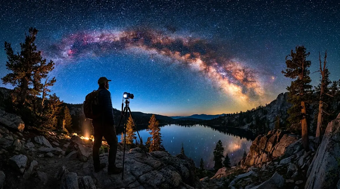
What Is a Histogram in Photography? Beginner’s Guide
What is histogram? Learn how histograms enhance exposure control, compare RGB and luminance types, and avoid common mistakes in photography editing.
You took a photo that looked perfectly exposed on your camera’s LCD screen. The colors were rich, the brightness felt right, and you moved on to the next shot. Then you got home, opened the image on your computer — and it was washed out, pale, and completely overexposed. The screen lied to you.
What’s in this guide
- What Is a Histogram in Photography?
- How to Read a Photography Histogram Step by Step
- Understanding Exposure Clipping
- When Should You NOT Use a Histogram?
- RGB vs. Luminance Histograms
- Related Photography Concepts to Explore Next
- Common Histogram Mistakes Beginners Make
- Frequently Asked Questions
- Stop Guessing Exposure — Start Reading the Data
This happens to almost every beginner. And it keeps happening until you discover a small graph built into your camera that tells the truth every single time. Understanding what is histogram photography is the single most reliable step you can take toward consistent, correctly exposed shots — no guesswork required.
Once highlights are blown out (permanently overexposed), that detail is gone forever. No editing software can recover it. Every time you trust the LCD over the histogram data, you risk losing the shot entirely.
What You’ll Need: All you need is any DSLR or mirrorless camera — every modern model has a histogram built in. No editing software is required to follow this guide.
In this guide, you’ll learn exactly what a photography histogram is, how to read it in under five minutes, and how to use it to nail exposure every time. We’ll move from the basic definition → reading the graph → understanding clipping → knowing when to ignore it → RGB vs. luminance types.
What Is a Histogram in Photography?
Most beginners spend months adjusting exposure by eye — checking the LCD, second-guessing themselves, and ending up with shots that look different on a computer than they did in the field. The histogram ends that cycle. As Photography Life puts it: “The histogram is a useful tool for photographers. It can help you identify if your photograph is correctly exposed, and it can alert you if you are clipping.” This section explains exactly what that graph is and why it matters more than your screen.
What is the main purpose of a histogram?
The main purpose of a histogram in photography is to show the tonal distribution of your image — how many pixels exist at each brightness level from pure black to pure white. It serves as an objective exposure check that is unaffected by ambient light, LCD brightness settings, or your own visual perception. According to Photography Life, it alerts you to clipping (permanent loss of detail) before you leave the scene and can no longer reshoot.
What Does a Histogram Actually Show?
If you are wondering what is histogram photography at a technical level, it is a graph — specifically, a bar chart that counts how many pixels in your photo exist at each brightness level. The scale runs from pure black (value 0) on the far left to pure white (value 255) on the far right. Every pixel in your image lands somewhere on that scale, and the histogram stacks them up to show you the distribution at a glance.
Think of it like a bar chart you made in school. Instead of counting students by height, you’re counting pixels by brightness. A tall spike on the left means many dark pixels. A tall spike on the right means many bright pixels. A spread across the middle means a balanced mix of tones.
One important clarification: the histogram is not measuring color. It is measuring luminosity (brightness). Every pixel — regardless of whether it’s red, blue, or green — has a brightness value, and the histogram counts them all.
Concrete example: photograph a white wall, and almost every pixel will be bright. The graph will show a tall spike crammed against the right side. Photograph a dark room at night, and the spike shifts to the left.
Without this graph, you are guessing whether your photo is correctly exposed based on how it looks on a small screen — in sunlight, in shade, at varying brightness settings.
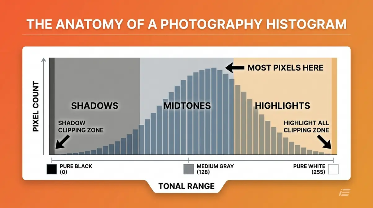
Tonal Range and Pixel Count
The histogram has two axes, and understanding both makes reading it intuitive.
The horizontal axis (X-axis) represents the tonal range — the full spectrum of brightness from pure black on the left to pure white on the right. The middle of the axis represents medium gray (value 128). Every point on this axis corresponds to a specific brightness level.
The vertical axis (Y-axis) represents pixel count — how many pixels in your photo exist at that brightness level. A taller bar means more pixels at that tone. A short bar means fewer. The Y-axis has no fixed numerical scale on most cameras; what matters is the shape and distribution, not the exact height.
Here’s why this matters to you: if you shoot a portrait in soft, even light, you’d expect most of the pixels to cluster in the midtones — and the histogram should show a hill shape in the center. If that hill is crammed against the right wall instead, your subject’s skin is probably overexposed and blown out.
The two axes work together. The X-axis tells you where the tones are; the Y-axis tells you how many pixels are there. Together, they give you a complete picture of your image’s tonal structure — objectively, without the ambiguity of eyeballing a small screen.
Why Your Camera’s LCD Screen Can’t Be Trusted
Here is the core problem that beginners don’t realize until it’s too late: your camera’s LCD screen cannot objectively measure exposure — only the histogram provides a mathematical count of every pixel’s brightness value. This is what we call “The Exposure Truth Gap” — the measurable difference between what your LCD appears to show and what the histogram’s pixel data actually confirms.
Three factors make the LCD unreliable:
- Ambient light changes your perception. In bright sunlight, your LCD looks much darker than it actually is — so you compensate by brightening the image, which leads to overexposure. Shoot in a dim room, and the opposite happens.
- LCD brightness settings vary. Many cameras ship with the LCD brightness set high to look impressive in stores. A vivid, bright LCD makes even an overexposed photo look acceptable.
- Your eyes adapt. After shooting in shade for an hour, your eyes adjust to low light and start reading your LCD as brighter than it is.
According to B&H Photo, experienced photographers rely on the histogram precisely because it removes the subjective element entirely. The histogram does not care about ambient light. It does not adjust to your screen’s brightness setting. It simply counts pixels and reports back — every single time.
This is the Exposure Truth Gap in action. The LCD shows you an interpretation. The histogram shows you the data.
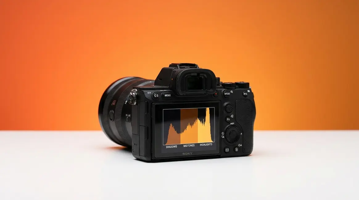
How to Read a Photography Histogram Step by Step
Learning why use a histogram and how to read it is a skill you can master in a single session. Our team evaluated histogram displays across a range of camera models — including the Canon EOS R series, Sony Alpha 7 series, and Nikon Z series — and found that while menu placement differs by brand, the histogram itself follows the same universal logic across all of them. Once you understand the three zones and five common shapes, you can read any histogram on any camera.
What does a histogram look like?
A histogram looks like a mountain range made of bars, plotted from left (dark) to right (bright). In a normally exposed photo, it resembles a hill or bell curve peaking somewhere in the middle. An underexposed photo shows the mountain shifted left; an overexposed photo shows it shifted right. A high-contrast scene shows two peaks — one on each side — with a valley in the middle. A low-contrast, flat scene shows a narrow, compressed mound in the center with empty space on both sides.
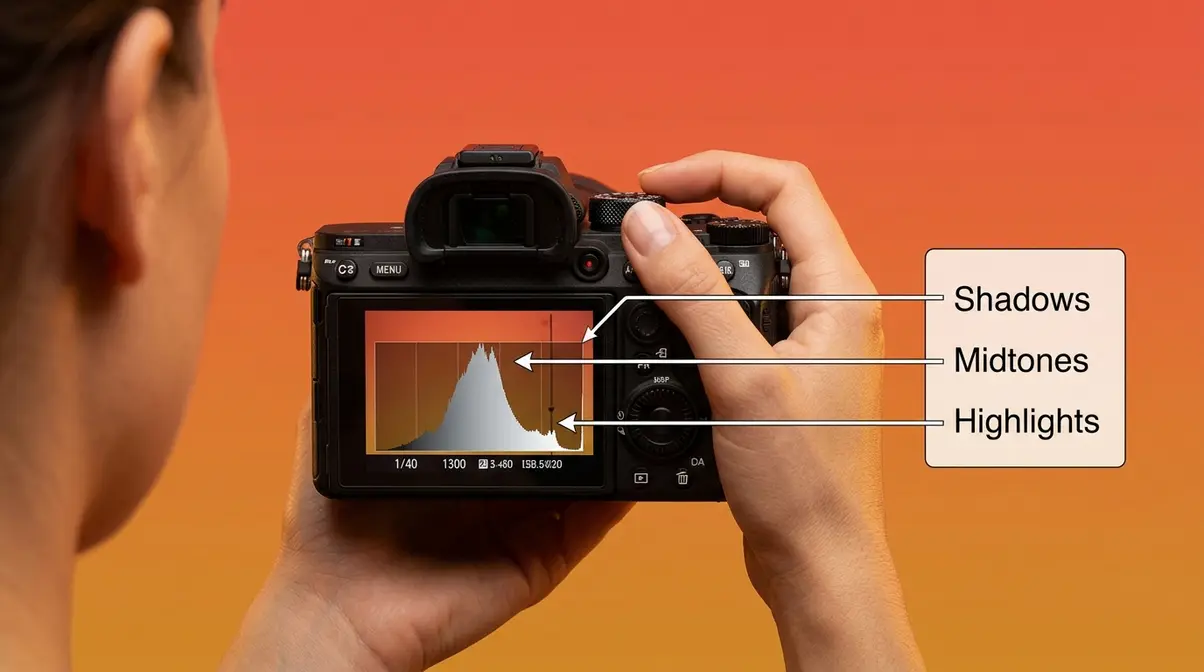
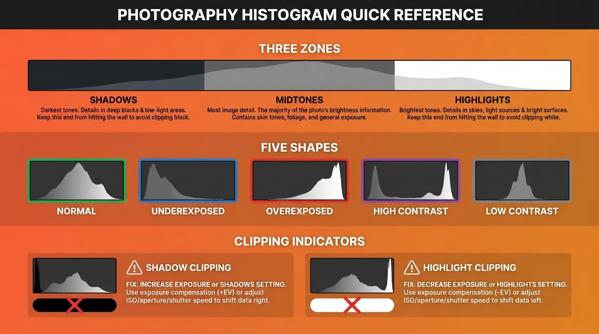
The Three Zones: Shadows, Midtones, and Highlights
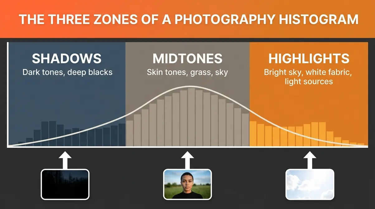
Divide the histogram into three regions from left to right. Each zone tells you something specific about your image.
Shadows (left third): This zone represents the darkest tones in your photo — deep blacks, dark shadows, and underlit areas. A large spike here means a significant portion of your image is very dark.
Midtones (center third): This is the “sweet spot” for most natural scenes. Skin tones, grass, blue sky, and most subjects in normal lighting fall here. A healthy, well-exposed portrait typically shows a prominent peak in the midtones.
Highlights (right third): This zone holds the brightest tones — bright sky, specular reflections, white fabric, and light sources. A spike here is not automatically bad; it depends entirely on what you’re photographing.
Why this matters to you: by glancing at which zone holds the most data, you instantly know whether your image skews dark, bright, or balanced — before you’ve even looked at the photo itself. This is especially valuable when shooting in harsh sunlight where your LCD is hard to read accurately.
What Does a “Good” Histogram Look Like?
Here’s the honest answer that most beginner guides skip: there is no single “correct” histogram shape. A good histogram is one that matches your creative intent for the scene.
That said, for a typical outdoor portrait or landscape in normal daylight, a well-exposed histogram generally shows a smooth, hill-like curve peaking in the midtones with the data tapering off before it reaches either edge. No data is crammed against the left or right wall. The tones are spread across most of the scale.
According to Cambridge in Colour, the most important rule is avoiding “clipping” — the condition where data is pushed completely off either edge of the histogram. As long as your data stays within the graph’s borders, you have captured usable tonal information that you can adjust in editing.
For beginners, a practical starting point: aim for a histogram where most of the data lives between 20% and 80% of the scale, with no hard spike against either wall. That gives you the maximum flexibility when you edit.
5 Common Histogram Shapes and What They Mean
Most images produce one of five recognizable histogram patterns. Learning to identify them quickly is the core practical skill this guide builds.
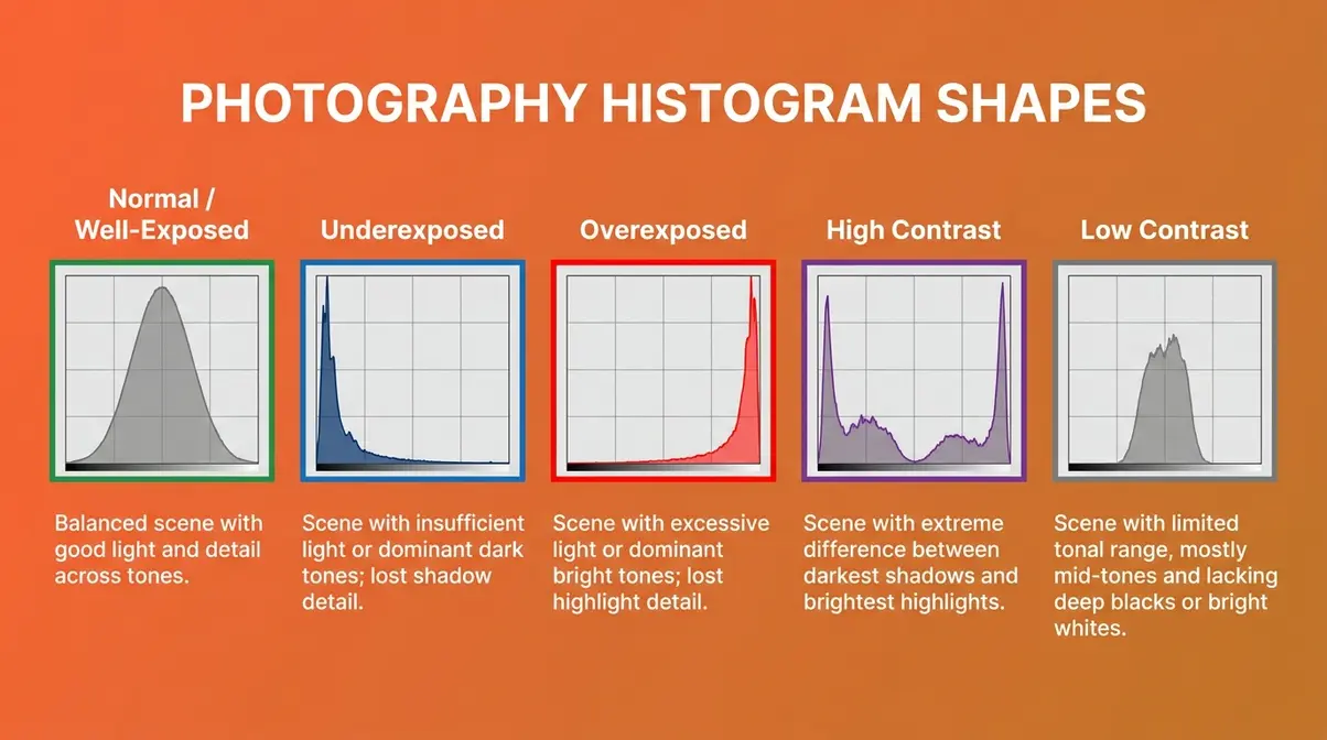
Shape 1: Normal / Well-Exposed
A smooth, bell-curve-like distribution peaking in the midtones, tapering before the edges. The data does not touch either wall. This is what a correctly exposed scene in average light typically produces. It does not guarantee a great photo, but it confirms you have full tonal information to work with.
Shape 2: Underexposed (Spike on the Left)
The bulk of data is crammed to the left, often with a spike touching the left wall. Your image is too dark — shadows are murky, and mid-tone detail is lost in darkness. Solution: increase your exposure (open the aperture, slow the shutter speed, or raise ISO) until the histogram shifts right.
Shape 3: Overexposed (Spike on the Right)
The bulk of data is crammed to the right, often touching the right wall. Your image is too bright — highlights are blown out (permanently overexposed), and bright areas have lost all detail. This is the most common mistake beginners make when trusting the LCD. Solution: reduce exposure until the right edge clears.
Shape 4: High Contrast (Two Spikes at Both Ends)
Data clusters at both the far left and far right, with a valley in the middle. This scene has extreme contrast — think a backlit subject against a bright sky. The camera cannot capture the full tonal range in a single shot. You may need to expose for one end and accept clipping at the other, or use HDR techniques.
Shape 5: Low Contrast (Narrow Mound in the Center)
All data is bunched in a narrow range in the middle — no deep blacks, no bright whites. The image will look flat and gray. This often happens in overcast fog, or in studio setups with very even lighting. It is not necessarily wrong; some scenes genuinely are low contrast. But if you expected a vivid scene, this signals underexposure or flat lighting.
Understanding Exposure Clipping
Clipping is the single most important concept to grasp after learning what a histogram is. It is also the most costly mistake a beginner can make — because unlike most exposure errors, clipping cannot be fixed in post-processing. Once pixel data is gone, it is gone. DPReview describes clipping as the point at which digital information is permanently lost — areas of pure white or pure black with zero recoverable detail.
Shadow Clipping: When Your Blacks Are Too Dark
Shadow clipping happens when the histogram’s data pile-up touches the left wall. On your photo, it shows up as areas of pure, featureless black — fabric folds that disappear into darkness, a face in shadow with no visible skin detail, a background that becomes a flat void.
To check for shadow clipping on most cameras, look for a “blinkies” or highlight/shadow alert in playback mode. Shadow-clipped areas are often shown flashing blue or black. On the histogram, the telltale sign is a spike that runs directly into the left edge with no taper.
Shadow clipping is generally more forgivable than highlight clipping. In RAW format, you can often recover 1–2 stops of shadow detail in software. But push it too far, and you get noisy, color-shifted muddy tones that no editing can fully fix.
Why this matters to you: If you’re shooting a dark-haired subject against a dark background and the left edge of your histogram is a solid wall, bump your exposure up slightly and reshoot. You’ll be surprised how much detail was hiding in those shadows.
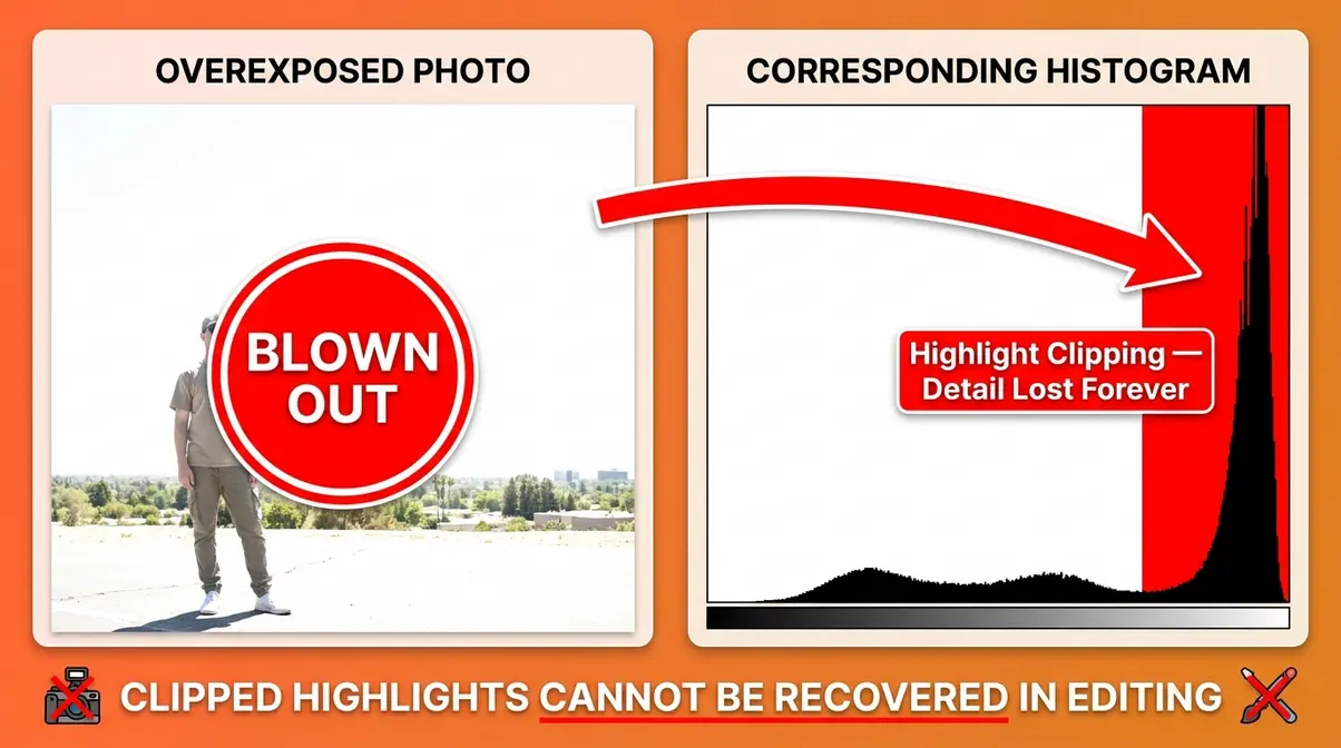
Highlight Clipping: The Exposure Mistake You Cannot Fix
Highlight clipping is the more dangerous of the two. When data touches or spikes against the right wall of the histogram, your brightest areas have been recorded as pure white — value 255 — with zero tonal variation. A white wedding dress becomes a flat, featureless blob. A bright sky becomes a blank sheet. The camera’s sensor simply ran out of range to record that information.
Unlike shadow clipping, highlight clipping in RAW files offers very limited recovery. You might claw back half a stop at best. If the right wall is hit hard, those highlights are gone forever — blowing out your highlights is an exposure mistake you cannot fix, no matter how sophisticated your editing software is.
The histogram spike against the right wall is your early warning system. See it, and immediately reduce your exposure — even by a third of a stop — and reshoot. Your future self, sitting at the editing desk, will thank you.
Expose to the Right (ETTR): A Pro Technique for Cleaner Photos
Once you understand clipping, you can use a technique called ETTR — Expose to the Right — to extract maximum quality from your camera’s sensor.
The concept: deliberately expose your image as brightly as possible without touching the right wall of the histogram. You push the data as far right as you can while keeping the highlights just inside the boundary.
Why does this produce cleaner photos? Digital sensors capture more tonal information in the brighter half of the exposure range. When you expose to the right, you’re filling that information-rich zone with data — which means less noise in your shadows and more smooth gradients across your midtones. You then bring the exposure back down in editing, and the result is cleaner than if you’d exposed more conservatively.
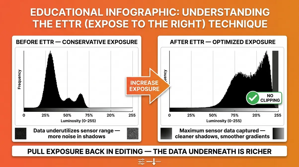
- How to apply ETTR in the field:
- Set your camera to display the histogram in playback or on your live view screen.
- Take a test shot and check the histogram.
- Increase exposure (open aperture, slow shutter speed, or raise ISO) until the data approaches the right wall.
- Stop before the data touches the wall — you want it close, not over.
- In editing, pull the exposure slider back down. The image will look dark at first, but the tonal data underneath is richer and cleaner than a more conservative exposure would have produced.
ETTR works best in controlled lighting and when shooting RAW files. For JPEG shooters, the in-camera processing reduces the benefit. According to Photography Life, ETTR is particularly effective for landscape and studio photography where you have time to evaluate the histogram between shots.
When Should You NOT Use a Histogram?
The histogram is a powerful tool — but it is not an infallible rule. Understanding when to intentionally “break” the histogram’s apparent rules is what separates a photographer who uses the tool mechanically from one who uses it intelligently. The Exposure Truth Gap works both ways: sometimes the histogram shows data that looks “wrong” but is exactly right for the creative vision.
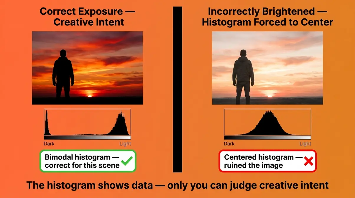
High-Key Photography: When a Bright Histogram Is Correct
High-key photography is a style where the image is intentionally bright — think newborn portraits on white blankets, product shots against bright white backgrounds, or fashion photography with an airy, light-filled aesthetic. In high-key images, shadows are deliberately minimized and the overall tone is light and soft.
The histogram for a high-key image will look “wrong” by standard rules. The data will be skewed heavily to the right, with very little information in the shadow zone. If you tried to “correct” this histogram to a centered bell curve, you would ruin the image — you’d be adding darkness that was never supposed to be there.
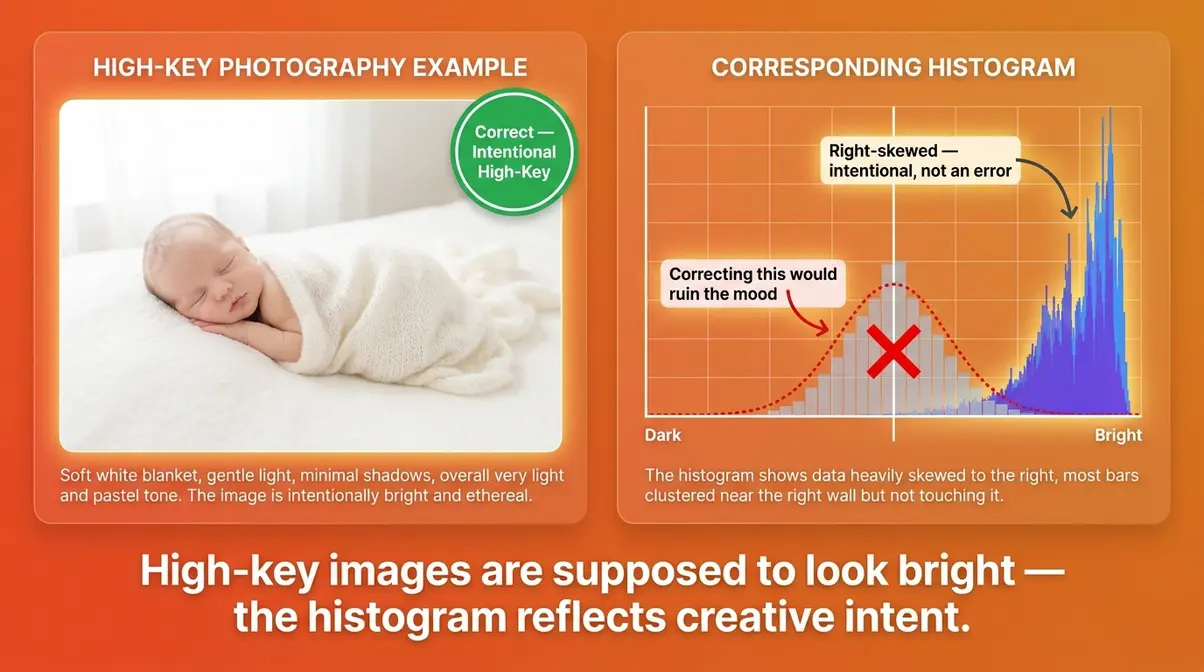
The rule: when shooting high-key intentionally, allow the histogram to skew right — as long as you are not clipping the highlights. The data can be close to the right wall, but it should not pile up against it. That distinction is everything.
Low-Key Photography: When Dark Shadows Are Intentional
Low-key photography is the opposite approach — a style built on deep shadows, dramatic contrast, and selective lighting. Think moody noir portraits, dramatic still-life images, or a single lit candle against near-total darkness. The aesthetic depends on dark, rich blacks.
The histogram for a low-key image will show data heavily weighted toward the left. Shadow clipping may even be intentional — those pure-black areas are part of the composition, not an error. Trying to “fix” the histogram by brightening the image would wash out the mood entirely.
According to Adobe, the key distinction is intentionality. Shadow clipping in a low-key portrait is a creative decision. Shadow clipping in a standard portrait of your child’s birthday party is a mistake. The histogram cannot make that distinction for you — only you can.
When a histogram is not appropriate: any time your creative intent requires tones that push against the edges of the scale. The histogram is a diagnostic tool, not a creative constraint.
Mirrorless Live Histograms vs. DSLR Chimping
This is one of the most significant practical differences between modern mirrorless cameras and traditional DSLRs — and it’s a workflow shift that most older guides completely ignore.
With a DSLR, you shoot a frame, then review it in playback (“chimping” — checking the LCD after every shot). You evaluate the histogram in playback, then adjust settings and shoot again. This back-and-forth works, but it costs time and means you’re always reacting to the last shot rather than preparing for the next one.
With a mirrorless camera — like the Sony Alpha 7 series, Canon EOS R series, or Nikon Z series — the live histogram is displayed in your electronic viewfinder (EVF) or on the rear screen before you take the shot. As you adjust aperture, shutter speed, or ISO, the histogram updates in real time. You can see the exposure data shift as you turn the dial.
This is a genuine workflow advantage. Instead of shooting and checking, you dial in your exposure while looking at the histogram live, then shoot when the data looks correct. Our evaluation of mirrorless workflows across Sony, Canon, and Nikon systems found that this live histogram eliminates the most common beginner mistake — trusting the LCD impression over actual pixel data — because the histogram IS the live preview.
Practical tip for mirrorless shooters: Enable the histogram overlay in your EVF settings. On Sony Alpha bodies, go to Menu → Camera Settings → Display → Histogram. On Canon EOS R bodies, press the INFO button while in viewfinder mode to cycle through display options including the histogram overlay. On Nikon Z cameras, find the histogram under the display information settings in the i-menu.
The Exposure Truth Gap still applies with mirrorless cameras — but live histograms close it before the shutter fires, not after.
RGB vs. Luminance Histograms
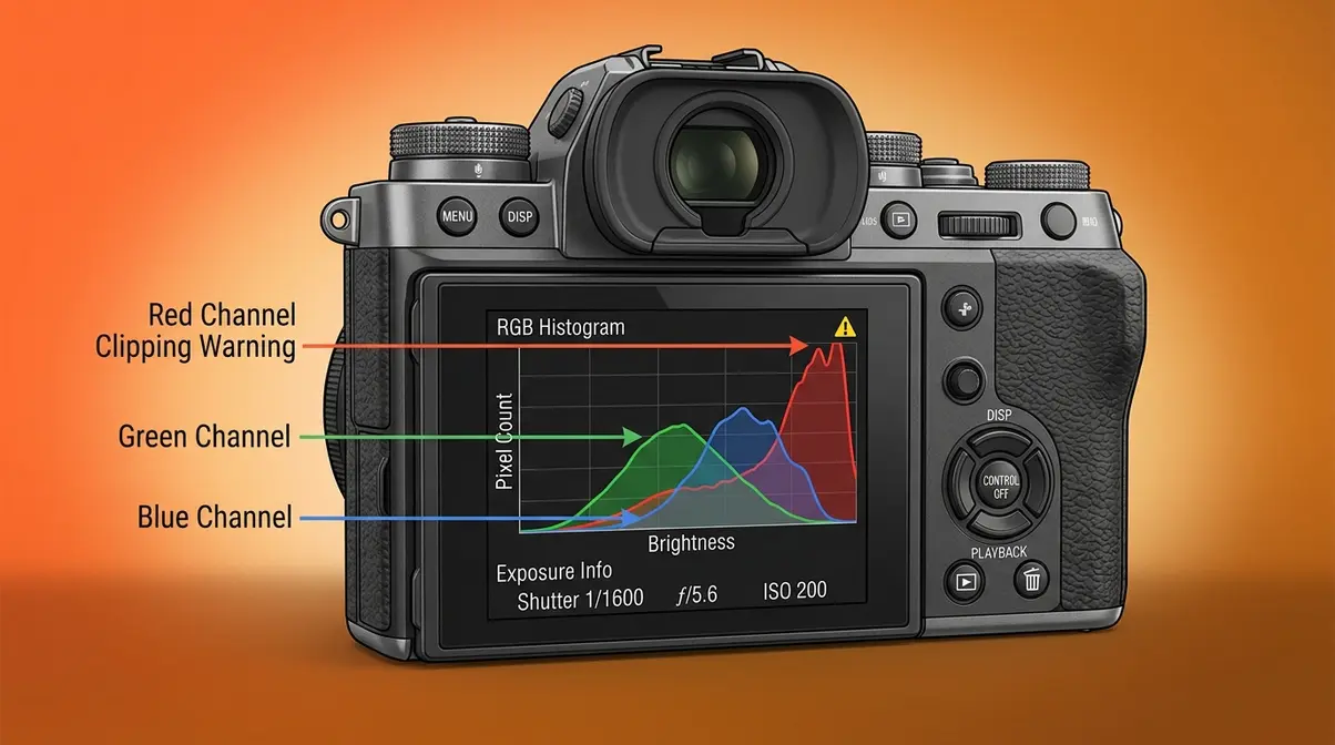
Most cameras display a single luminance histogram by default — but many also offer an RGB histogram, which shows separate graphs for red, green, and blue channels. For beginners, the luminance histogram is the right starting point. As your skills develop, the RGB version offers a level of precision that the luminance histogram cannot match.
What Is a Luminance Histogram?
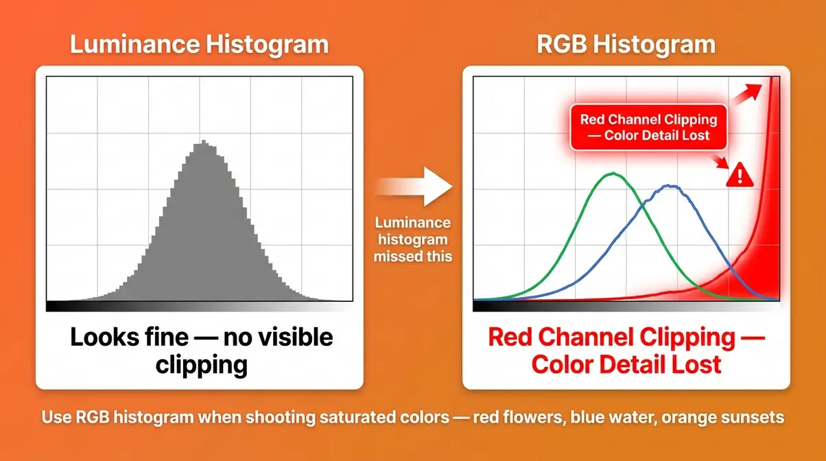
A luminance histogram (also called a brightness histogram) combines all three color channels into a single graph. It shows the overall brightness distribution of the entire image — a quick, clean read of whether your exposure is balanced. For most shooting situations, this is all you need.
The luminance histogram is calculated by blending the red, green, and blue channel data into a single weighted average. Because it combines all channels, it can sometimes mask a problem: one color channel might be clipping while the combined luminance graph still looks clean. This is the primary limitation of the luminance histogram.
Why this matters to you: if you’re shooting a scene with a very bright red or blue element — a red sports car in sunlight, or a vivid blue sky — the luminance histogram might show no right-edge clipping, while the red or blue channel is actually blown out. You’d lose color detail without knowing it.
When the RGB Histogram Is More Accurate
The RGB histogram displays three separate graphs — one for each color channel. Each graph follows the same left-to-right tonal scale as the luminance histogram, but shows only the pixel data for that specific color.
As noted by DPReview, the RGB histogram is often more accurate than a standard luminosity histogram for detecting color-channel clipping — particularly in scenes with saturated primary colors. A vivid red sunset, for example, may show a perfectly centered luminance histogram while the red channel is clipping aggressively.
- When to switch to RGB:
- Shooting vivid, saturated colors (red flowers, blue water, orange sunsets)
- Product photography where color accuracy is critical
- Any scene where you suspect one color might be clipping while others are not
For most everyday shooting, the luminance histogram is fast and reliable. Switch to RGB when color accuracy is a priority or when you suspect the luminance graph might be hiding a channel problem.
Related Photography Concepts to Explore Next
Understanding the histogram gives you a solid foundation in exposure. The following concepts build naturally on that foundation, each adding a new layer of creative control to your photography.
What Is Macro Photography?
Macro photography is the practice of photographing small subjects at very close range, producing images where the subject appears life-size or larger than life-size in the final image. A 1:1 magnification ratio — where a 1cm subject fills the entire sensor — is the standard definition of true macro photography.
Common subjects include insects, flowers, water droplets, coins, and jewelry. The histogram is particularly useful in macro work because depth of field (the range of sharp focus) is extremely shallow at close distances, and exposure can be tricky — especially when using a ring flash or diffused macro light. Because macro lighting often creates harsh specular highlights on reflective surfaces like insect eyes or metallic objects, a well-read histogram prevents these areas from blowing out. Photographers who use focus stacking also rely on consistent histogram readings across dozens of frames to ensure seamless blending later.
If you’re drawn to the detail and intimacy of close-up subjects, macro photography is one of the most rewarding specializations a beginner can explore. Check out our macro photography guide to learn more.
What Is Digital Photography?
Digital photography is the practice of capturing images using a digital sensor rather than photographic film. Instead of chemical reactions on film, a digital sensor converts light into electrical signals that are processed and stored as digital image files (JPEG, RAW, TIFF).
The histogram exists because of digital photography — it’s a direct visualization of the digital data your sensor captures. Film photographers judged exposure through experience, external light meters, and the Zone System; digital photographers have the histogram as an objective, real-time feedback tool built right into the camera. Understanding the digital workflow — how your sensor captures light, how RAW files store significantly more tonal data than JPEGs, and how editing software processes that data — helps you use the histogram more intelligently.
By mastering this tool, you effectively bridge the gap between what your eyes see and what the digital sensor records. Read our digital photography guide to dive deeper into these foundational concepts.
Common Histogram Mistakes Beginners Make
Even after learning to read the histogram, beginners often fall into two predictable traps. Recognizing them now saves you from repeating the same mistakes across hundreds of shots. The Exposure Truth Gap doesn’t only exist between the LCD and the histogram — it can also exist between the histogram and your understanding of it.
Trusting the LCD Over the Histogram
This is the original mistake — the one this entire guide was written to fix. Even after learning what the histogram shows, many beginners continue to check the LCD first and only glance at the histogram as an afterthought. The LCD is visual and intuitive; the histogram requires a moment of interpretation.
The fix is a simple habit shift: check the histogram first, the LCD second. When you review a shot in playback, press the display button to cycle to the histogram view before evaluating the image visually. After a few weeks, this becomes automatic — and your keeper rate will improve noticeably.
Across photography communities, the consistent advice from experienced shooters is the same: the LCD is for composition review, the histogram is for exposure review. Use each tool for what it does best.
Treating the Histogram as a Rigid Rule
The opposite mistake is over-reliance — treating the histogram as an infallible authority and trying to force every image into a “perfect” bell curve regardless of the scene.
As covered in the section on high-key and low-key photography, many intentional creative styles produce histograms that look technically “wrong.” A silhouette of a person against a bright sunset will produce a bimodal histogram with spikes at both ends — and that is correct for the shot. Forcing a centered histogram would destroy the image.
The histogram’s disadvantage, as Cambridge in Colour notes, is that it shows you what the data looks like, but not whether that data matches your creative intent. That judgment always belongs to you.
The healthy relationship with the histogram: use it to confirm you have not clipped critical detail, then let your creative vision guide everything else. The histogram is a safety net, not a straitjacket.
Frequently Asked Questions
When should you not use a histogram?
You should not rely on a histogram when your creative intent intentionally pushes tones to the extremes. High-key photography (bright, airy images), low-key photography (dark, moody images), and silhouette shots all produce histograms that look “wrong” by standard exposure rules — but are exactly right for the creative goal. The histogram is a diagnostic tool, not a creative rulebook. Use it to check for unwanted clipping, then let your artistic vision take over. If the “incorrect” histogram matches your intended mood, it is correct.
What should a photography histogram look like?
There is no single “correct” histogram shape — it depends entirely on the scene and your creative intent. For a standard, naturally lit scene, a well-exposed histogram shows a smooth distribution peaking in the midtones, with data tapering before it reaches either edge. The critical requirement is that data does not pile up hard against the left or right wall (clipping). A portrait, a landscape, and a product shot will all produce different histogram shapes — and all can be correctly exposed.
What is a histogram in simple terms?
A histogram is a bar chart that shows how bright or dark your photo is — pixel by pixel. The left side of the chart represents the darkest tones (pure black), the right side represents the brightest tones (pure white), and the height of each bar shows how many pixels exist at that brightness level. If the bars pile up on the left, your photo is too dark. If they pile up on the right, it’s too bright. It’s your camera’s built-in exposure truth-teller.
What is the disadvantage of a histogram?
The main disadvantage of a histogram is that it shows you data, not intent — it cannot tell you whether a “wrong-looking” histogram is a mistake or a creative choice. A silhouette scene and an overexposed accident can produce similar right-skewed histograms; only you know which one was intentional. Additionally, the standard luminance histogram can miss individual color-channel clipping — a red or blue channel may be blown out while the combined graph looks clean. For color-critical work, the RGB histogram is more reliable.
Why is a histogram not appropriate?
A histogram is not appropriate as a strict rule when shooting creative styles that intentionally use extreme tonal ranges — such as high-key portraiture, low-key dramatic lighting, intentional silhouettes, or night sky photography. In these cases, the histogram will show data against the edges of the scale, which looks like an exposure error but is actually correct. Forcing the histogram toward a “normal” shape in these scenarios would ruin the image. The histogram is most appropriate as a clipping detector, not as an absolute exposure target.
What is the #1 rule of photography?
The #1 rule of photography is: get the exposure right in-camera, not in post. No editing software can recover blown-out highlights or deeply clipped shadows. Every other creative decision — composition, lighting, timing — builds on a correctly exposed foundation. The histogram is the most reliable tool for following this rule consistently. As Adobe notes, understanding tonal distribution before you leave a scene gives you maximum flexibility and the best possible starting point for any editing workflow.
Stop Guessing Exposure — Start Reading the Data
For beginner photographers, the histogram is the single most underused tool built into your camera. Every modern DSLR and mirrorless body has one. Most photographers ignore it for months or years — and spend that time frustrated by inconsistent exposures they cannot explain.
The Exposure Truth Gap is real: your LCD screen shows you an impression of your image, shaped by ambient light, screen brightness, and your own visual adaptation. The histogram shows you the data — an objective count of every pixel’s brightness value that does not change based on where you’re standing or how bright the sun is. Once you start reading the histogram instead of trusting the screen, ruining your exposure becomes far less likely.
Now that you know what is histogram photography, you can stop guessing and start reading the data. Start with the basics: enable histogram display in your camera’s playback settings right now. Take a few test shots and practice identifying the three zones — shadows on the left, midtones in the center, highlights on the right. Watch for data touching either edge. Over the next week of shooting, make it a habit to check the histogram before reviewing the image visually. That single habit change will do more for your exposure consistency than any other technique in this guide.
If you want to go deeper, explore our exposure triangle guide and our RAW vs. JPEG guide — both build directly on what you’ve learned here and will help you take full control of your camera’s capabilities.
Dave King
Hi, I'm Dave, the founder of Amateur Photographer Guide. I created this site to help beginner and hobbyist photographers build their skills and grow their passion. Here, you’ll find easy-to-follow tutorials, gear recommendations, and honest advice to make photography more accessible, enjoyable, and rewarding.