Table of Contents
This blog post may contain affiliate links. As an Amazon Associate I earn from qualifying purchases.
You pressed the shutter at the perfect moment — golden light, a great expression, everything lined up. Then you opened the file on your computer and felt that familiar deflation: the photo looks flat, dull, and nothing like what you saw.
That gap between the scene you witnessed and the image your camera recorded is not a failure of your photography skills. It is a technical limitation built into every camera ever made — and it has a name: The Sensor Gap. Your eyes can perceive roughly 20 stops of dynamic range (the full spectrum from the deepest shadow to the brightest highlight). Most camera sensors capture only 10–14 stops (DPReview, 2026). Everything outside that range is simply lost — unless you edit it back in.
In this guide, you will learn exactly why edit photographs matters, what your camera physically cannot do on its own, and how a simple five-step editing workflow transforms flat files into images that finally match your memory. We’ll cover the core reasons editing is essential, walk through a beginner-friendly workflow, show you the most common mistakes to avoid, and answer the photography questions beginners ask most.
Editing photographs is not optional — it is how you close The Sensor Gap, the difference between what your camera recorded and what your eyes actually saw. RAW files store unprocessed sensor data that requires editing to reveal hidden detail (Adobe, 2026).
- Editing corrects technical flaws your camera cannot fix automatically — exposure, color, and contrast
- Editing expresses your artistic vision and gives images your personal stamp
- RAW files demand editing — they are intentionally unfinished by design
- The Sensor Gap framework helps beginners understand why every great photo you admire has been edited
- 5 editing steps cover 80% of the visual improvements most beginners need
Why Editing Is an Essential Part of Photography
Editing photographs is essential because every camera sensor, regardless of price, records a compressed and imperfect version of reality. The human eye continuously adjusts to changing light, perceives a vast tonal range, and fills in color nuance that no sensor can replicate. Editing is the technical and creative bridge that closes The Sensor Gap — restoring the detail, color, and mood that your camera physically could not capture in a single exposure.
“The editing process is only another step in fulfilling the artistic vision of the artist.”
That quote resonates across photography communities because it names something many beginners feel but can’t quite articulate. You are not “fixing” a mistake when you open an image in Adobe Lightroom (the industry-standard photo editing application). You are completing the photograph.
Cameras Can’t See What Your Eyes See
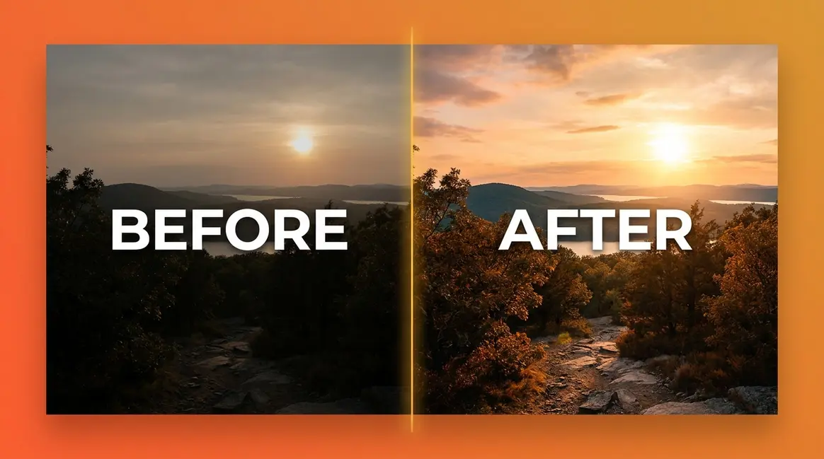
A camera sensor — the electronic chip inside your camera that converts light into digital data — is an impressive piece of technology, but it has hard physical limits. The human visual system perceives approximately 20 stops of dynamic range, meaning it can simultaneously register deep shadow and brilliant highlight in the same scene. A modern camera sensor captures roughly 10–14 stops (DPReview, 2026). That is a significant gap.
Camera sensors capture a narrower tonal range than the human eye, which perceives approximately 20 stops of dynamic range compared to a camera’s 10–14 stops — a difference that explains why your photos consistently look flatter than the scene you witnessed (DPReview, 2026).
Why does this matter to you? When you photograph a sunset, your eyes see rich orange clouds AND dark foreground trees at the same time. Your camera must choose one or the other. Editing lets you recover the detail in both — brightening the shadows without blowing out the sky — which is exactly what your memory of that moment contains.
Photographers consistently report that straight-from-camera JPEGs appear flatter than the scene they witnessed. This is not a perception error. It is The Sensor Gap at work, every single time.
Check out our guide on camera sensor limits to understand more about how your equipment processes light.
Correcting Technical Imperfections
Even experienced photographers shoot images with minor technical imperfections — a slightly underexposed (too dark) frame, a color cast from indoor lighting, or a horizon that tilts a degree or two. Editing is the stage where these are corrected cleanly and quickly.
The most common technical corrections beginners make include:
- Exposure (how bright or dark the image is) — lifting a dark image or pulling back an overexposed one
- White balance (the color temperature of the light source) — removing the orange glow from tungsten bulbs or the blue cast of shade
- Horizon straightening — rotating the frame to level a tilted horizon
- Cropping — removing distracting edges or repositioning the subject within the frame
These are not artistic judgments — they are technical repairs. Skipping them does not preserve the “authenticity” of the image; it simply leaves the image with errors your eye automatically corrected in the moment. According to photography educators at the Digital Photography School, correcting basic technical flaws is the minimum standard for a finished image, regardless of genre.
You can learn how to apply these fixes in our tutorial on basic Lightroom adjustments.
Expressing Your Artistic Vision
Technical correction is only the beginning. The deeper reason why photographers edit their photos is creative expression. Two photographers can stand in the same location, shoot the same scene, and produce images that look completely different — because editing is where your personal stamp gets applied.
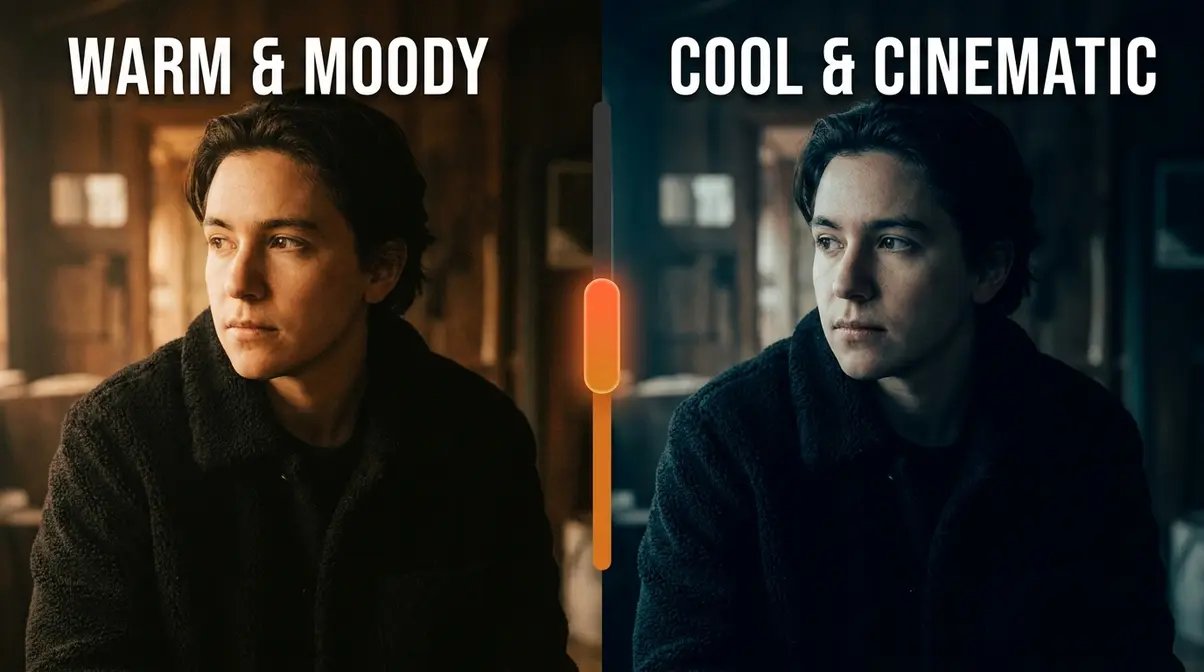
Do you love warm, golden tones? A cool, cinematic (film-inspired, high-contrast) look? Soft, airy pastels? None of those aesthetics come directly from a camera. They come from deliberate editing choices: the way you shift color hues, the amount of contrast you apply, the specific curve you draw in your tone panel.
Across photography communities on Reddit and forums like r/photography, the consistent experience is that beginners who start editing develop a recognizable visual style within months — while those who avoid editing often plateau, because the creative half of photography never gets practiced (Reddit r/photography, 2017).
Editing is where photography becomes personal. The camera records the raw unedited data; editing is where you decide what that data means and how it should feel.
Why RAW Files Require Editing
Here is something that surprises many beginners: if you shoot in RAW (a file format that stores uncompressed, unprocessed sensor data), your images are intentionally unfinished. This is not a flaw. It is a design decision by camera manufacturers.
A RAW file is closer to a film negative than a finished photograph. The camera records all the sensor data and hands it to you — it makes no decisions about color rendering, sharpening, or contrast. Those decisions are yours to make in editing software. A JPEG (the compressed file format most cameras produce by default), by contrast, has those decisions baked in automatically by the camera’s internal processor. You get a finished-looking image immediately, but you lose the flexibility to change it later.
The difference in recoverable detail is significant. According to Adobe’s documentation on RAW processing, a 14-bit RAW file contains billions of possible tonal values, while an 8-bit JPEG retains only 16.7 million — meaning a RAW file gives you roughly 64 times more tonal information to work with when editing (Adobe, 2026).
| File Type | Bit Depth | Tonal Values | Editing Flexibility |
|---|---|---|---|
| RAW | 14-bit | ~4.4 billion | Maximum — full adjustment range |
| JPEG | 8-bit | ~16.7 million | Limited — adjustments degrade quality quickly |
Shooting RAW without editing is like recording a studio album and never mixing it. The data is there. Editing is how you hear it.
For a deeper dive, read our breakdown on RAW vs JPEG differences.
Is Editing Cheating? A History
The idea that “real” photography means no editing is a myth — and a surprisingly modern one. Photographers have manipulated images since the 1840s. The Metropolitan Museum of Art’s 2012 exhibition Faking It: Manipulated Photography Before Photoshop documented over 200 years of pre-digital image manipulation, including combination printing, retouching, and darkroom compositing (Metropolitan Museum of Art, 2012).
Ansel Adams — the legendary landscape photographer known for his meticulous darkroom techniques — spent as much time in the darkroom as he did in the field. His iconic black-and-white prints were the product of extensive dodging (selectively lightening areas of a print) and burning (selectively darkening areas), contrast adjustments, and careful paper selection. Adams viewed the darkroom as the second half of photography, not a shortcut.
The only context where strict editing limits apply is photojournalism. The National Press Photographers Association (NPPA) code of ethics prohibits manipulations that alter the meaning of a news image — adding or removing subjects, changing context. But for portrait, landscape, and art photography, no such rule exists or has ever existed (NPPA Code of Ethics, 2026).
Editing is not cheating. It is the completion of the photographic process — consistent with how every other visual art form works. Painters add layers. Filmmakers grade color. Sculptors sand and polish. Photography has always had its own finishing stage.
A Beginner’s 5-Step Photo Editing Workflow
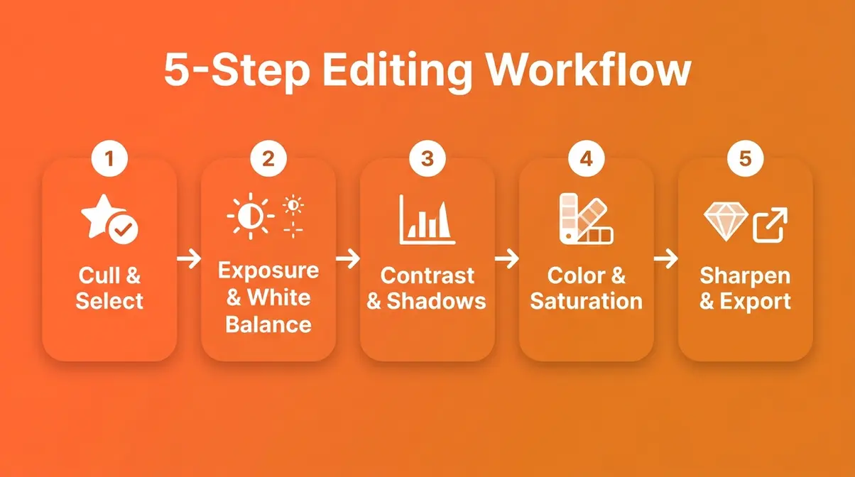
Understanding why edit photographs is one thing — knowing how to start is another. This workflow covers the five core adjustments that produce 80% of the visual improvement most beginners need. You do not need to master every tool in your software. These five steps, applied consistently, will transform your results.
- What You’ll Need Before You Start:
- A photo editing application (Adobe Lightroom, Lightroom Mobile , or free alternatives like RawTherapee or Darktable)
- Your images imported into the software library
- 15–30 minutes for your first session (it gets faster with practice)
- Ideally, RAW files — though JPEGs work for steps 1–4
Step 1 — Cull and Select Your Best Shots
Before you touch a single slider, decide which images are worth editing. Culling (reviewing and rating your images to select the keepers) is the first and most underrated step in any editing workflow.
Most photographers shoot multiple frames of the same scene. Culling means picking the sharpest, best-composed, best-exposed frame from each sequence — then deleting or archiving the rest. In Lightroom, press P to flag a keeper and X to reject. This prevents you from wasting time editing images that should never be edited.
A useful rule: if an image has a fundamental problem — motion blur on the subject, eyes closed in a portrait, a badly clipped highlight — no amount of editing will rescue it. Cull ruthlessly, then edit confidently.
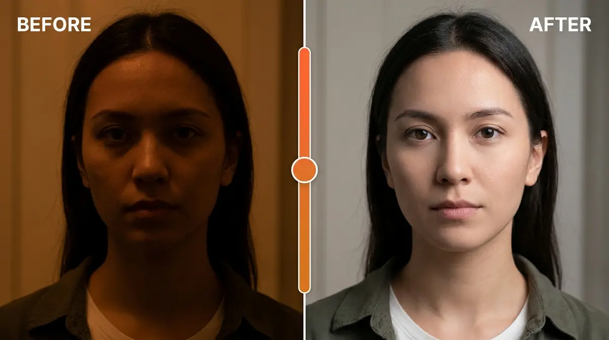
Step 2 — Exposure & White Balance
With your best shots selected, start with the two adjustments that affect everything else: exposure (brightness) and white balance (color temperature).
In Lightroom’s Develop module or Basic panel:
- Move the Exposure slider until the image looks naturally bright — not too dark, not washed out
- Check the Histogram (the graph in the top-right corner) — you want data spread across the graph without spikes at either edge
- Adjust White Balance using the Temp slider: move left (cooler/bluer) for daylight, move right (warmer/more orange) for indoor scenes
- Use the White Balance Eyedropper tool on any neutral gray or white surface in the frame for an automatic correction
| Setting | Starting Point | Why |
|---|---|---|
| Exposure | 0 (adjust ±1 stop based on histogram) | Sets overall brightness |
| White Balance | “As Shot” → adjust to taste | Removes unwanted color casts |
| Highlights | -20 to -40 | Recovers bright sky/window detail |
| Shadows | +20 to +40 | Opens up dark foreground detail |
Getting exposure and white balance right first makes every subsequent step easier and more accurate.
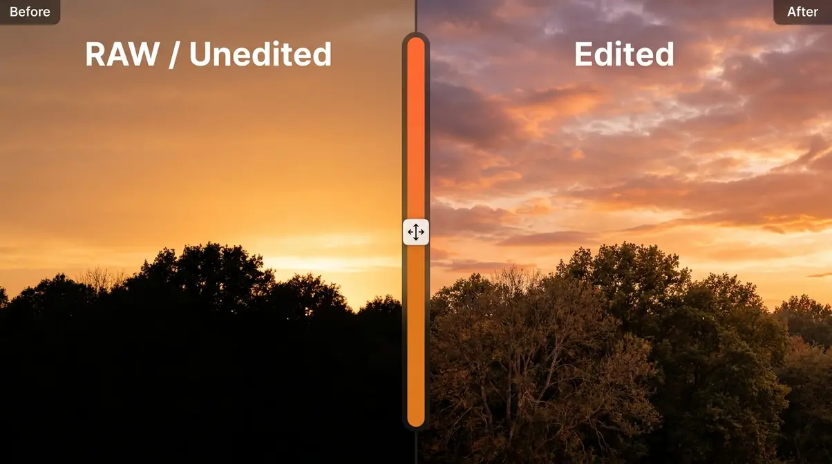
Step 3 — Contrast and Shadows
Once exposure is correct, refine the tonal range — the relationship between the darkest and lightest parts of your image. This is where The Sensor Gap starts to close visibly.
In Lightroom’s Basic panel:
- Pull Highlights down (-20 to -60) to recover detail in bright areas like skies and windows
- Push Shadows up (+20 to +60) to reveal detail in dark areas like foregrounds and faces
- Adjust Whites and Blacks to set the endpoints — a small S-curve in your histogram indicates healthy contrast
- Use the Tone Curve panel for finer control if needed
The goal is not to make the image look dramatic — it is to make it look like what you actually saw. That is the core purpose of tonal editing.
Step 4 — Enhance Color and Saturation
Color is where editing becomes genuinely creative. After fixing the tonals, you can shift the mood of an image entirely through color choices.
In Lightroom’s Basic panel and HSL (Hue, Saturation, Luminance) panel:
- Adjust Vibrance (a gentle, intelligent saturation boost that protects skin tones) before touching Saturation
- Use the HSL panel to target individual colors — make skies bluer, grass greener, or skin tones warmer without affecting the whole image
- Apply a Color Grade (split toning) to add a cinematic feel — warm shadows and cool highlights is a popular starting point
A common beginner mistake is pushing Saturation too high. Aim for colors that look vivid but believable — the test is whether the image still looks like a photograph, not a painting.
Step 5 — Sharpen, Denoise, and Export
The final step prepares your image for output. Sharpening (increasing edge definition) and noise reduction (smoothing grainy texture caused by high ISO settings) are the last adjustments before export.
In Lightroom’s Detail panel:
- Apply Sharpening — start at Amount: 40, Radius: 1.0, Detail: 25
- Hold Alt/Option and drag the Masking slider until sharpening applies only to edges, not flat areas like sky
- Use Noise Reduction (Luminance: 20–40) to smooth grain from high-ISO shots
- For AI-powered results, try Lightroom’s AI Denoise (available in Lightroom 12+, 2026) — it removes noise while preserving sharp edges significantly better than the manual slider
Once your adjustments are complete, go to File → Export and choose your output settings:
| Export Setting | Recommended Value | Why |
|---|---|---|
| File Format | JPEG | Universal compatibility |
| Quality | 85–90 | High quality, manageable file size |
| Color Space | sRGB | Correct for web and most screens |
| Long Edge | 2048–3000px | Web-ready without excessive file size |
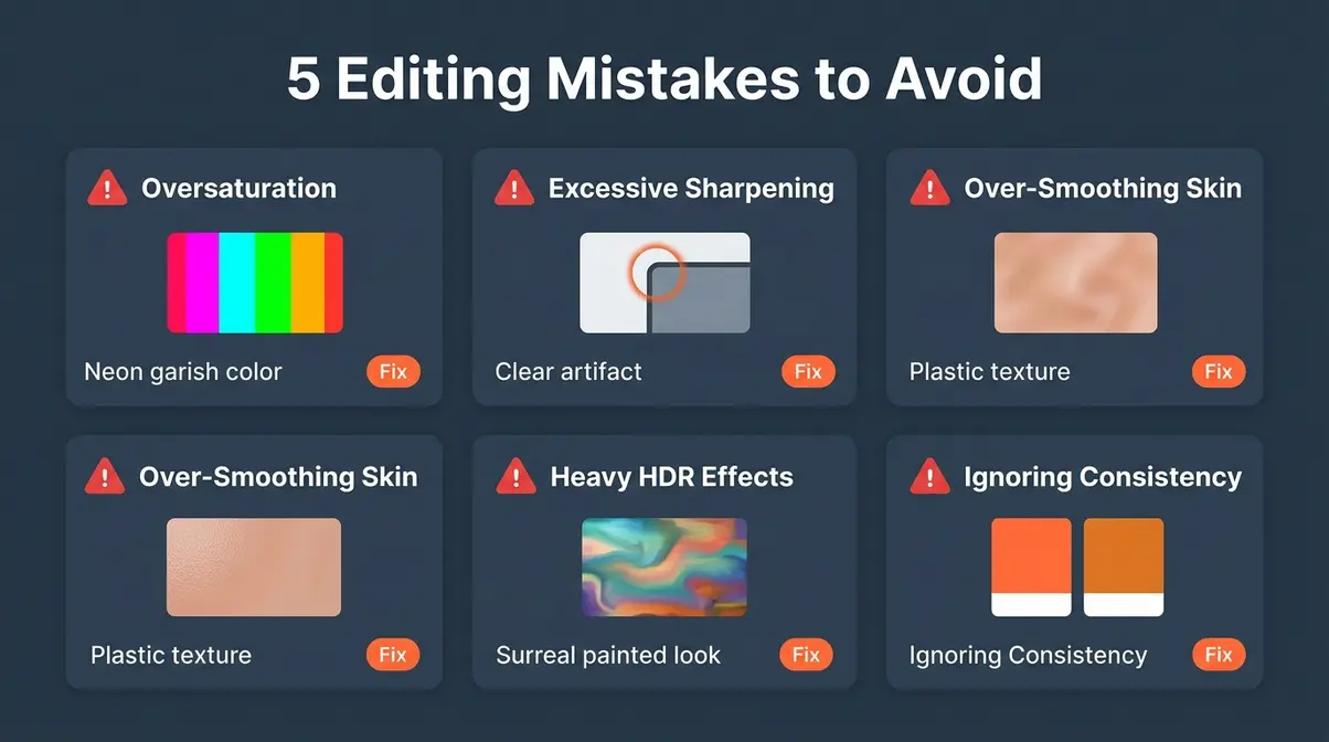
5 Common Photo Editing Mistakes Beginners Make
Knowing the workflow is half the battle. The other half is knowing what to avoid. Across photography communities and tutorials, these five mistakes appear most consistently in beginner edits — and each one has a straightforward fix.
Mistake 1 — Oversaturation
Oversaturation is the most common beginner editing mistake. It is easy to understand why: boosting the Saturation slider makes images feel more vibrant immediately, and the temptation to keep pushing is strong.
The problem is that over-saturated images quickly look artificial. Skin tones turn orange, grass goes neon green, and the image loses the sense of realism that makes photographs compelling. According to Digital Photography School, oversaturation is the single most cited sign of amateur editing in photography critique communities.
The fix: Use the Vibrance slider instead of Saturation for most adjustments. Vibrance boosts muted colors while protecting already-saturated tones (like skin). Keep Saturation adjustments between -10 and +20 for realistic results.
Mistake 2 — Excessive Sharpening
Over-sharpening creates a harsh, gritty look — edges develop bright halos, textures look crunchy, and the image feels digitally processed rather than photographed. At the other extreme, excessive noise reduction smears fine detail into a waxy, plastic appearance.
Both mistakes share the same root cause: applying global adjustments without masking. When you sharpen everything — including smooth skies and blurred backgrounds — the result looks unnatural.
The fix: Use the Masking slider in Lightroom’s Detail panel (hold Alt/Option while dragging to preview the mask). This restricts sharpening to edges only. For noise reduction, apply it to shadows specifically using the HSL Luminance panel rather than globally.
Mistake 3 — Over-Smoothing Skin
Portrait retouching tools are powerful — and easy to overuse. Heavy-handed skin smoothing removes pores, fine lines, and texture until subjects look more like CGI characters than real people. Photographers commonly report that clients actually prefer natural-looking skin over heavily smoothed results, once they see a side-by-side comparison.
The fix: In Lightroom, use the Soften Skin preset as a starting point, then reduce its strength to 30–50%. Aim to reduce blemishes rather than eliminate all texture. Real skin has pores — keeping some visible is what makes portraits look authentic.
Mistake 4 — Heavy-Handed HDR Effects
HDR (High Dynamic Range) processing — when overdone — produces the telltale “painted” look: halos around objects, over-saturated colors, and a flat, almost surreal tonal quality. This style was popular around 2010–2014 and now reads as heavily dated.
The irony is that the goal of HDR (recovering shadow and highlight detail simultaneously) is a legitimate and valuable editing technique. The execution, not the intention, is where beginners go wrong.
The fix: Use the Highlights/Shadows recovery sliders in Lightroom’s Basic panel rather than dedicated HDR processing for most scenes. If you need true HDR merging (multiple exposures combined), keep the Deghost setting at Medium and reduce overall saturation after merging.
Mistake 5 — Ignoring Consistency
A single beautifully edited image is satisfying. A portfolio of images with wildly inconsistent color grading, contrast levels, and brightness looks unprofessional — even if each individual image is technically correct.
Consistency is what separates a photographer with a recognizable style from someone who is still experimenting. Your personal stamp should be visible across your work, not just in individual images.
The fix: In Lightroom, create a Preset (a saved set of your preferred adjustments) and apply it as a starting point for every image in a session. Sync adjustments across similar shots using the Sync Settings button. This is the single most time-saving habit a beginner can develop.
Photography Principles That Elevate Your Editing
Editing works best when the original photograph is composed and shot well. Two foundational principles — composition and color theory — directly affect how much editing can do for your images.
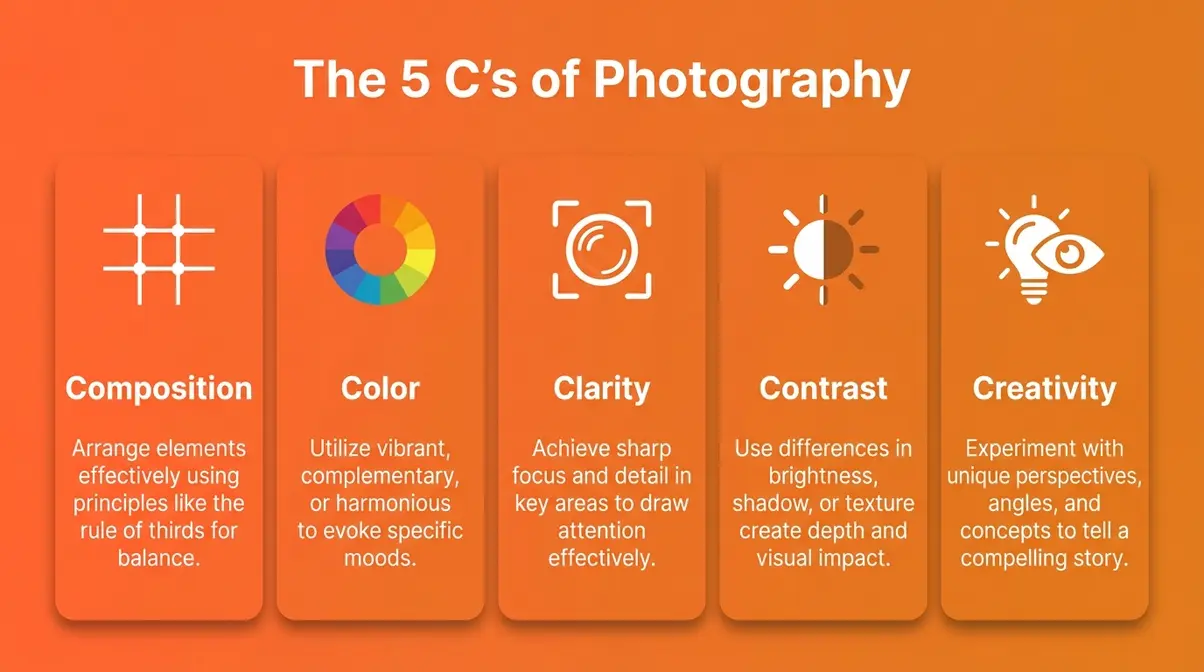
What Are the 5 C’s of Photography?
Strong composition (the arrangement of elements within your frame) is the foundation every edit builds on. A poorly composed shot rarely improves with editing — you cannot crop your way out of a fundamentally weak frame.
Photography educators often teach the 5 C’s of photography as a framework for composition decisions:
| C | Principle | What It Means |
|---|---|---|
| Composition | Rule of thirds, leading lines | How elements are arranged in the frame |
| Color | Harmony, contrast, temperature | The palette of the scene |
| Clarity | Sharpness, focus point | What the eye is drawn to first |
| Contrast | Tonal range, light vs. shadow | The drama and depth of the image |
| Creativity | Unique perspective, storytelling | Your personal vision beyond the rules |
Shots that follow these principles edit more cleanly because the underlying structure is already strong. Cropping, color grading, and contrast adjustments then refine the image rather than rescue it.
Read our full photography composition guide to master these framing techniques before you shoot.
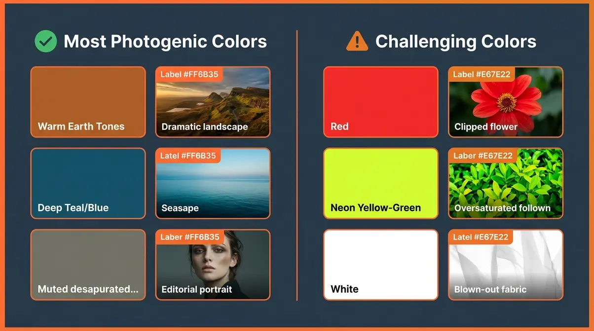
What Colors Are the Most Photogenic?
Not all colors behave equally in front of a camera sensor or under editing. Understanding which colors photograph well — and which ones cause problems — helps you both shoot and edit more effectively.
Colors that photograph well:
- Earth tones (rust, ochre, warm brown) — hold detail across a wide exposure range and respond beautifully to warm color grades
- Deep blues and teals — separate well from skin tones, making portraits and seascapes pop in editing
- Muted, desaturated tones — respond well to stylized editing without becoming garish
Colors that can be difficult to photograph:
- Bright red — tends to clip (lose detail) in highlights quickly, especially on flowers and clothing; requires careful exposure
- Neon yellow and lime green — can appear oversaturated straight from camera and look artificial after any saturation boost
- Pure white and pure black — both clip easily; require careful exposure and post-processing to retain texture
The most photogenic color combinations tend to involve complementary contrast (colors opposite each other on the color wheel, such as orange and teal) — which is exactly why the orange-and-teal color grade became a staple of cinematic editing. It leverages natural visual contrast between warm skin tones and cool environments.
Dive into our beginner color grading tips to learn how to manipulate these palettes.
When Editing Less Is More
Understanding why edit photographs also means understanding when to hold back. Not every image benefits from heavy processing — and recognizing that is itself a mark of developing skill.
Signs You Are Over-Editing
Over-editing is easier to spot in someone else’s work than in your own. After staring at an image for 30 minutes, your perception adjusts and what looked natural when you started can drift far from realistic without you noticing.
Common signs you have pushed too far:
- Colors look neon — especially greens, reds, and skin tones
- Shadows have a visible color cast — green or magenta shadows indicate over-aggressive color grading
- Skin looks plastic — no visible pores or texture
- Halos appear around edges — a sign of over-sharpening or heavy local contrast adjustments
- The image looks like a painting — a sign of extreme HDR or texture processing
The simplest fix is the “fresh eyes” technique: close the image, wait at least an hour, then reopen it. What looked subtle often reveals itself as extreme after a break. Photography educators also recommend reducing all your sliders by 15–20% as a calibration step before finalizing any edit.
When Minimal Editing is Best
Some genres and contexts genuinely call for minimal intervention. Documentary photography, street photography, and photojournalism all carry an implicit commitment to representing reality as it was witnessed. The NPPA Code of Ethics (2026) explicitly prohibits alterations that change the meaning of a news image — and this standard reflects a genuine ethical principle, not arbitrary restriction.
Even in art photography, some styles are built on restraint. Film simulation presets that mimic the look of analog film stock involve editing — but the aesthetic goal is naturalism and grain, not heavy processing. Choosing minimal editing is a creative decision, not an avoidance of skill.
The key distinction: minimal editing chosen deliberately is craft; avoiding editing out of fear or uncertainty is a missed opportunity. Know why you are making the choice either way.
Frequently Asked Questions About Photo Editing
What’s the point of editing photos?
The point of editing photos is to close The Sensor Gap — the difference between what your camera recorded and what your eyes actually saw. Camera sensors capture only 10–14 stops of dynamic range, while human vision perceives roughly 20 stops (DPReview, 2026). Editing recovers the shadow and highlight detail your camera compressed, corrects color casts from artificial light, and gives you control over the mood and tone of the final image. Without editing, you are accepting your camera’s automatic decisions rather than making your own creative choices.
Why do people edit their photos so much?
People edit their photos because editing is where creative vision gets expressed. The camera records a literal version of a scene; editing transforms it into the version the photographer intended. Across photography communities, photographers consistently report that editing is the stage where their personal style becomes visible — through color choices, tonal adjustments, and stylistic decisions like cinematic grades or film simulations. For those shooting RAW files, editing is not optional: RAW images are intentionally unfinished and require processing to produce a viewable result (Adobe, 2026).
What is the 80/20 rule in photography?
The 80/20 rule in photography suggests that 80% of your best results come from 20% of your techniques. Applied to editing, it means that five core adjustments—exposure, white balance, highlights/shadows, color, and sharpening—produce the vast majority of visual improvement. Beginners who master these five steps consistently outperform those who try to learn every tool simultaneously.
What colors do not photograph well?
Bright reds, neon yellows, and pure whites are the most challenging colors to photograph well. Bright red tends to clip in highlights quickly, losing all detail in petals, clothing, and lips — requiring careful underexposure and highlight recovery in editing. Neon yellow and lime green can appear oversaturated straight from camera. Pure white and pure black both clip easily at either end of the histogram. The practical solution is to slightly underexpose scenes with dominant red or white elements, then recover brightness in editing where detail is preserved.
Can someone be beautiful but not photogenic?
Yes — being photogenic is a separate skill from being physically attractive, and it is largely learnable. Photogenicity depends on how facial structure, skin tone, and expression interact with two-dimensional light and shadow — factors that differ significantly from how the human eye perceives a face in three dimensions. Lighting direction, lens focal length (the distance-compressing effect of the lens), and editing choices like skin tone warmth and contrast all affect how photogenic someone appears in a final image. Portrait photographers use editing specifically to bridge this gap — warming skin tones, softening harsh shadows, and enhancing eyes.
Is photo editing considered cheating?
Photo editing is not cheating — it is the completion of the photographic process, and it always has been. Photographers have manipulated images since the 1840s, as documented in the Metropolitan Museum of Art’s Faking It exhibition (2012), which showcased over 200 years of pre-digital manipulation. Ansel Adams spent as much time in the darkroom dodging and burning his prints as he did shooting in the field. The only context where strict editing limits apply is photojournalism, where the NPPA (2026) prohibits changes that alter the meaning of a news image. For portrait, art, and personal photography, no such rule exists or has ever existed.
Every Great Photo You’ve Seen Has Been Edited
For beginner photographers, editing photographs is the essential final step that closes The Sensor Gap — the physical difference between your camera’s 10–14 stops of dynamic range and the 20 stops your eyes perceive (DPReview, 2026). The five-step workflow in this guide — cull, correct exposure and white balance, refine tonal range, enhance color, and sharpen for export — covers 80% of the visual improvements most beginners need. Every image you admire, from smartphone portraits to gallery prints, reflects deliberate editing decisions made after the shutter was pressed.
The Sensor Gap is not a problem to be embarrassed by — it is simply the reality of how cameras work. Understanding it transforms editing from something that feels like cheating into something that feels like craft. The photographers who develop a recognizable personal stamp are not the ones who skip editing; they are the ones who learned to use it deliberately and consistently.
Start with one image today. Apply the five steps. Compare your before and after. That moment of recognition — when the image finally matches your memory of the scene — is exactly what editing is for. When you are ready to go deeper, our complete guide to photo editing walks through every adjustment in detail.