
Table of Contents
- Quick Summary
- 1. Classic Black and White Conversion
- 2. Vibrant Color Pop Enhancement
- 3. Soft and Dreamy Pastel Look
- 4. High Contrast Dramatic Effect
- 5. Moody Matte Finish
- 6. Retro Film Style Editing
- 7. Minimalist Clean Edit
- Discover Your Perfect Photo Editing Style and Elevate Your Photography Skills
- Frequently Asked Questions
- Recommended
This blog post may contain affiliate links. As an Amazon Associate I earn from qualifying purchases.
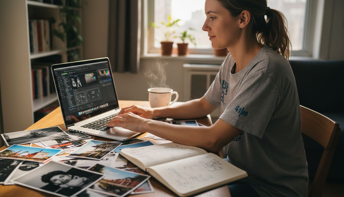
Choosing the right photo editing style can overwhelm even experienced photographers. Every image deserves a unique touch, and picking a method that truly matches your vision is not always straightforward. Without a clear roadmap, your edits can quickly feel random or uninspired instead of purposeful and creative.
This guide brings together a range of editing techniques—from classic black and white to dreamy pastels and bold high contrast effects—each with proven approaches drawn from trusted sources. You will learn exactly what makes each style effective and how to apply these methods for results that feel both intentional and visually compelling.
Get ready to discover practical editing ideas that breathe new life into your images. Each insight offers fresh inspiration and actionable steps to help you find the perfect style for every photo you take.
Quick Summary
| Key Message | Explanation |
|---|---|
| 1. Control Color Tones in Black and White | Use channel mixing to enhance contrast and maintain details in converted images, avoiding flat looks. |
| 2. Selectively Enhance Colors for Impact | Isolate and boost specific colors while muting others to create visual hierarchy and engagement in your composition. |
| 3. Maintain Intentional Softness in Pastels | Lower clarity and reduce vibrancy to achieve dreamy images, ensuring proper exposure and emotional resonance. |
| 4. Achieve Striking Contrast in Images | Use curves adjustments to enhance separation between highlights and shadows without losing detail for impactful visuals. |
| 5. Emulate Vintage Film Characteristics | Add grain and warm color casts to mimic authentic retro aesthetics, maintaining a balance for a sophisticated appearance. |
1. Classic Black and White Conversion
Classic black and white conversion transforms your color photos into timeless monochrome images that feel intentional and refined. This editing style strips away the distraction of color, allowing viewers to focus entirely on composition, contrast, and the emotional impact of light and shadow.
What makes a classic conversion different from simply desaturating your image is the control you maintain over how different colors translate into grayscale tones. When you desaturate a photo, all the color information disappears equally, often resulting in flat, lifeless images. A proper classic conversion, however, uses techniques like channel mixing and luminosity-based adjustments to give you precise control over tonal values. This means you can brighten or darken specific colors before they convert to gray, creating richer, more dimensional results.
The reason this matters for your photography is straightforward. Your camera captures color data across three channels: red, green, and blue. When converting to black and white, you need to decide how much each channel contributes to the final gray tone. A sky that appears bright blue in your original photo might become too dark in your conversion if you don’t adjust it properly. By understanding channel mixing, you can ensure that blue skies become appropriately light gray while maintaining detail in the clouds.
When implementing a classic black and white conversion, start by choosing your conversion method. Luminosity-based conversion typically produces the most natural-looking results because it mimics how human eyes actually perceive brightness. This method converts colors to grayscale based on their perceived luminance value, meaning colors that appear naturally bright stay bright in the converted image. If you want something more dramatic and striking, you could experiment with high contrast noir approaches that emphasize shadows and highlights for bold, theatrical effects.
Consider this practical example. You’re editing a landscape photograph with green trees and a blue sky. Using a standard desaturation, both the trees and sky might end up nearly identical shades of gray. With a classic conversion using channel mixing, you’d increase the blue channel’s contribution to brighten the sky while decreasing the green channel to deepen the tree tones. Suddenly your image has dimension, separation between elements, and visual interest.
Another reason to master this style is the timeless quality it creates. Black and white photography has existed for over a century, and when done properly, your converted images will feel as if they could have been taken decades ago. Some beginners worry that black and white is boring or outdated, but when you see a well converted classic black and white image, you understand why photographers still choose this style today. The absence of color forces stronger composition, more dramatic lighting choices, and cleaner visual storytelling.
You can also explore vintage film emulation within your black and white conversions. Emulating classic black and white film stocks like Kodak Tri-X or Ilford HP5 adds character that pure digital conversion sometimes lacks. These emulations introduce subtle grain patterns and specific tonal characteristics that reference the analog photography era. The grain isn’t random noise but rather a deliberate texture that enhances the nostalgic, authentic feeling of your images.
Understanding how to take better black and white photos from the capture stage will dramatically improve your conversion results, since composition and lighting choices matter even more when color isn’t available to carry your image.
Pro tip: Before converting any image to black and white, zoom in and examine whether you have strong contrast between your main subject and background; if tones blend together too much, your conversion will look flat regardless of technique, so consider brightening or darkening specific areas slightly before conversion to create better tonal separation.
2. Vibrant Color Pop Enhancement
Vibrant color pop enhancement makes specific colors in your image leap off the screen while keeping everything else neutral or muted. This editing style creates immediate visual impact by drawing the viewer’s eye directly to the most colorful elements of your composition.
The reason this technique works so effectively is rooted in human perception. Our eyes naturally gravitate toward saturated, vivid colors. When you selectively enhance certain colors while desaturating or muting others, you’re essentially creating a visual hierarchy that guides viewers exactly where you want them to look. It’s not subtle, and that’s the whole point. Color pop editing makes your photos feel more intentional and dramatically more engaging than standard color work.
To understand how color pop works, think about it as selective saturation control. Rather than boosting saturation across your entire image (which often looks garish and unnatural), you’re isolating specific color ranges and enhancing just those tones. A common approach involves desaturating your overall image and then selectively restoring or enhancing the saturation of one or two key colors. Another method uses color masking tools to target precise hues without affecting anything else in the frame.
Implementing color pop requires you to decide which colors deserve emphasis. The best candidates are colors that already stand out in your composition and colors that define your subject. For instance, if you’re photographing a portrait of someone wearing a red jacket against a neutral background, making that red pop while keeping the background desaturated immediately emphasizes the jacket and draws focus to your subject. If you’re shooting autumn foliage, you might enhance only the orange and yellow tones while cooling down the greens, creating a warmer, more dramatic landscape image.
The practical process is straightforward in most editing software. Start by creating a layer or duplicate of your image, then apply overall desaturation to reduce color intensity globally. Next, use your editing tool’s color range selection or masking features to isolate the specific colors you want to enhance. Boost the saturation, vibrance, or luminance of just those selected colors, then adjust the intensity until the effect feels right to your eye. The key is restraint. One or two popping colors look intentional. Three or four usually looks overdone.
Color pop works exceptionally well for specific photography genres. Portrait photographers love this technique for making colored clothing or accessories pop while keeping skin tones natural. Product photographers use it to make merchandise stand out from plain backgrounds. Street photographers enhance specific colored elements to create visual stories within busy urban scenes. Nature photographers selectively enhance wildflowers or sunset colors to amplify the drama nature already provides.
One common mistake beginners make is enhancing colors that were already muted or less visible in the original shot. This creates an unnatural look because viewers subconsciously know that color wasn’t prominent in the scene. Instead, identify colors that were already somewhat visible and vibrant in your original image, then amplify what’s already there. This maintains a sense of realism even though you’re clearly enhancing the image.
Another consideration is the contrast between your popped colors and the rest of the image. The more desaturated your background becomes, the more dramatic your color pop effect appears. However, completely draining all color from the background can sometimes look artificial. Many photographers find the sweet spot is keeping the background colors relatively muted rather than completely gray, which creates a more balanced, sophisticated final result.
Pro tip: Use the vibrance adjustment instead of saturation when possible, because vibrance intelligently protects skin tones and prevents overly saturated colors from looking artificial, making your color pop edits look more professional and refined.
3. Soft and Dreamy Pastel Look
The soft and dreamy pastel look transforms your photos into ethereal, whimsical images that feel like they belong in a fantasy or fairytale. This editing style uses muted color palettes with gentle tones to create an atmospheric, almost hazy quality that’s become increasingly popular for portrait and lifestyle photography.
What makes this style special is how it fundamentally changes the mood of an image. A portrait edited with the soft and dreamy pastel look feels intimate and romantic rather than sharp and defined. Landscapes become peaceful and meditative instead of punchy and realistic. The technique works by intentionally softening details, reducing clarity, and shifting colors toward pastel tones. This creates images that feel less like documentation of reality and more like a memory or a dream.
The technical approach involves several specific adjustments working together. You’ll reduce clarity and texture in your image to create that soft, almost slightly out of focus quality. You’ll decrease vibrancy to tone down color intensity, making colors feel muted and gentle rather than saturated and bold. You’ll also apply subtle color grading adjustments that shift your overall color palette toward cooler or warmer pastels depending on your preference. The combination of these techniques creates the signature dreamy aesthetic.
Understanding why each adjustment matters helps you execute this style effectively. Lowered clarity removes micro contrasts that make images feel sharp and defined. When you reduce clarity, fine details become less pronounced, and the image takes on a softer, more forgiving appearance. Decreased vibrancy keeps colors from feeling too bold or saturated. Pastel colors by definition are less intense than fully saturated colors, so toning down vibrancy across your image creates that muted, gentle palette. Subtle midtone adjustments further enhance the dreamy feeling by controlling how light and shadow transitions appear.
To implement this look, start with your overall exposure and contrast. You’ll typically keep contrast relatively neutral or slightly increased to avoid the image looking flat, but you’re not going for high contrast drama. Next, reduce clarity by about 30 to 60 percent depending on how dreamy you want the final result. Decrease vibrancy by 20 to 40 percent. Then apply color grading by adding a slight color cast, often cooler tones like soft cyan or blue for dreamy coolness, or warmer tones like subtle pink or peach for romantic warmth. Fine tune these adjustments until the image feels ethereal without looking washed out or poorly edited.
This style works beautifully for specific photography types. Portrait photographers use the soft and dreamy pastel look to make subjects appear more approachable and emotional. Fashion photographers apply it to create aspirational, lifestyle imagery that feels aspirational rather than commercial. Wedding photographers use it to add romance and nostalgia to their work. Even nature photographers apply this style to create peaceful, contemplative landscape images that feel more about mood than technical perfection.
One important consideration is maintaining proper exposure while creating softness. Beginners sometimes think soft and dreamy means underexposed or overly blown out, but that’s not the case. Your image should still have proper exposure with good detail in highlights and shadows. The softness comes from reduced clarity and the pastel color treatment, not from poor exposure. A well exposed image with soft editing looks intentional and professional, while an underexposed image with soft editing just looks underexposed.
Another key point is avoiding the trap of making your image look washed out or faded. Pastel tones are subtle and soft, but they’re not the same as desaturated or faded colors. You want colors to still have presence and character, just in a gentler, more muted form. This means being careful not to reduce saturation too aggressively. Many photographers find that reducing vibrancy rather than saturation gives better results because vibrancy is more intelligent about how it handles colors across your image.
Pro tip: When reducing clarity to achieve the soft, dreamy effect, do it in layers or with masking so you can protect the eyes in portraits from becoming too soft, keeping them sharp and expressive while the rest of the face remains dreamy and ethereal.
4. High Contrast Dramatic Effect
High contrast dramatic effect creates bold, striking images by maximizing the difference between your brightest highlights and deepest shadows. This editing style makes your photos feel powerful and emotionally charged by pushing tonal extremes to their limits.
What makes high contrast work so effectively is that human eyes are drawn to areas of strong contrast. When you create dramatic separation between light and dark areas, you immediately command viewer attention. Your subject becomes more prominent, details become sharper in perception, and the overall image feels more impactful and less forgiving of compositional mistakes. This is why high contrast works particularly well for portraits, dramatic landscapes, and subjects where you want to eliminate ambiguity.
The technical foundation of high contrast editing involves several interconnected adjustments. You’re increasing the difference between your shadows and highlights by making shadows deeper and highlights brighter. You’re enhancing clarity to make edges feel sharper and more defined. You’re often adjusting color saturation to create color contrast where complementary hues intensify each other. You’re using curves and exposure adjustments to maintain detail in both shadow and highlight areas while still achieving that dramatic separation.
Understanding the relationship between exposure, contrast, and clarity helps you achieve high contrast without losing important image detail. If you simply increase contrast without adjusting exposure, you’ll crush your shadows into pure black and blow out your highlights into pure white, losing all the subtle tones that make an image look professional. Instead, you’ll maintain exposure while using curves adjustments to selectively darken midtone shadows and brighten midtone highlights. This creates dramatic contrast while preserving detail. The clarity adjustment then sharpens edge definition, making the contrast feel even more pronounced.
Color contrast plays an equally important role in dramatic high contrast images. When you have complementary colors positioned near each other, they intensify each other optically. A red subject against a blue background appears more vibrant and dramatic than either color alone. If your image contains complementary hues, slightly increasing saturation specifically in those color ranges amplifies the dramatic effect. However, this requires restraint. Over saturation looks artificial. The goal is making colors feel richer and more present, not cartoonish.
To implement this style, start by assessing your image’s existing tonal range. Does it have true blacks and true whites, or are the shadows and highlights compressed in the middle tones? If compressed, you’ll need curves adjustments to redistribute the tones across a fuller range. Open your curves panel and create an S curve by pulling the shadows darker and the highlights brighter. This is the foundation of high contrast editing. Next, increase clarity by about 40 to 60 percent depending on how dramatic you want the effect. Increase contrast by 15 to 30 percent. Finally, assess color saturation. If your image has strong colors, increase vibrance or saturation slightly. If colors are muted, you might increase saturation more aggressively.
This style works exceptionally well for specific subjects and genres. Portrait photographers use high contrast to make skin tones pop and create dramatic, magazine worthy headshots. Product photographers rely on high contrast to make merchandise stand out from backgrounds. Black and white photographers naturally gravitate toward high contrast because the lack of color makes tonal separation even more critical. Street photographers use high contrast to cut through busy backgrounds and make their subjects unmistakably clear.
One critical consideration is avoiding the loss of detail when pursuing high contrast. Beginners often push contrast too far and end up with featureless black shadows and blown out highlights. The trick is using adjustment masks strategically. If your shadows are getting too dark and losing detail, mask your contrast adjustment to affect only the midtones and highlights. If your highlights are getting blown out, protect them with selective adjustments. This sophisticated approach maintains the dramatic contrast feel while preserving the detail that separates professional images from amateur ones.
Another key point is ensuring that high contrast serves your image rather than overwhelming it. Not every photo benefits from maximum drama. A high contrast edit works best when your composition, lighting, and subject matter already support that dramatic treatment. If you’re forcing high contrast onto a naturally soft subject or weak composition, the edit will feel disconnected and artificial.
Understanding how to manage dynamic range in your images directly supports your ability to create high contrast edits that maintain detail across the entire tonal range instead of losing information in pure black and pure white areas.
Pro tip: Use the highlights and shadows sliders before adjusting overall contrast, since these tools give you more precise control over specific tonal ranges and allow you to maintain detail in bright areas while darkening shadows independently.
5. Moody Matte Finish
The moody matte finish creates atmospheric, cinematic images with subdued tones, deep shadows, and a soft, almost film like quality. This editing style strips away the glossy, polished look and instead creates something that feels introspective and emotionally resonant.
What makes the moody matte finish distinct is its intentional restraint. While other editing styles might boost saturation or push contrast to dramatic extremes, the matte finish deliberately softens and mutes. This creates a visual language that feels contemplative and serious rather than vibrant and celebratory. The matte texture, which reduces the reflective quality of your image, combined with lowered contrast and saturation, results in photographs that feel timeless and story focused rather than attention grabbing.
The technical approach involves several specific adjustments that work together. You’re lowering overall contrast to reduce the punchy separation between light and dark, creating a softer, more compressed tonal range. You’re reducing saturation or vibrance to create muted, subdued colors that feel less vibrant than real life. You’re often adjusting color balance toward either cool or warm tones to set an emotional mood. You’re keeping shadows deep without completely crushing them into pure black, maintaining atmospheric depth. The combination creates that signature cinematic, moody aesthetic.
Understanding why you reduce contrast in matte finishing helps you avoid the mistake of making your image look underexposed or poorly edited. Reduced contrast doesn’t mean bad exposure. It means the gap between your brightest and darkest areas is compressed. Your image might still have proper exposure with good visibility in shadow and highlight areas, but the visual separation feels less dramatic. This compression is what creates the soft, unified mood. When colors are less saturated and contrast is lower, everything feels like it belongs to the same emotional world rather than having disparate visual elements competing for attention.
To implement the moody matte finish, start by lowering your overall contrast by about 20 to 35 percent. This immediately softens the image and creates that matte texture. Next, reduce saturation or vibrance by 15 to 30 percent depending on how muted you want the final result. Then assess your color balance. Cool tones like blues and teals create a melancholic, introspective mood. Warm tones like browns and oranges create a nostalgic, intimate mood. Shift your color balance slightly toward your chosen direction. Finally, adjust your shadows carefully. You want them deep and present, but not crushed completely black. A touch of lift in the shadows maintains detail while preserving the moody atmosphere.
This style works exceptionally well for specific photography genres and subjects. Portrait photographers use moody matte finishes for emotional, introspective headshots and fashion editorials. Documentary photographers apply it to create narrative depth and emotional authenticity. Fine art photographers embrace it for its cinematic, gallery worthy quality. Even lifestyle photographers use matte finishes to create aspirational yet grounded imagery that feels real and relatable rather than overly polished.
One crucial consideration is avoiding over processing. The moody matte look should feel intentional and artistic, not like your image is underexposed or poorly edited. The key is understated enhancement. You’re subtly shifting the mood and aesthetic, not dramatically changing how the image looks. If viewers are thinking about your editing rather than feeling the mood and emotion, you’ve likely pushed too far. The best matte finishes feel like they were simply how the photograph was captured rather than an obvious edit.
Another important point is recognizing that the moody matte finish serves certain subjects better than others. A bright, cheerful moment at a beach probably doesn’t benefit from a moody matte treatment. A candid portrait of someone in quiet reflection does. A wedding ceremony in soft, ambient lighting works beautifully with matte finishing. A bright, sunny outdoor product shot doesn’t. Match your editing style to your subject matter and the story you’re trying to tell.
Color balance plays a significant role in setting the specific mood within your matte finish. A cool toned matte finish with blue and teal color casts feels introspective and melancholic. The same matte compression with warm orange and brown tones feels nostalgic and intimate. A neutral matte finish feels objective and documentary. Consider what emotional story your image should tell, then use color balance to reinforce that mood. This sophisticated approach to color grading within a matte framework separates professional results from amateur attempts.
Pro tip: When reducing saturation for a matte finish, use the vibrance slider instead of saturation because vibrance protects skin tones from becoming too dull and desaturated, keeping portraits looking natural and healthy while still achieving the muted, moody aesthetic.
6. Retro Film Style Editing
Retro film style editing transforms your digital photos into images that look like they were shot on vintage film stock from the 1960s through 1990s. This editing approach combines warm color tones, visible grain texture, and analog imperfections to create nostalgia and emotional depth that feels authentically aged.
What makes retro film style so appealing is that it taps into genuine nostalgia while also creating a sense of intentionality and craft. Digital photos can sometimes feel cold and sterile, while film has natural characteristics that make images feel warmer and more human. When you edit digitally to mimic film, you’re borrowing those desirable qualities. The grain structure adds texture that feels organic. The warm color casts create intimacy. The slight color shifts and imperfections suggest a story and history behind the image. Your viewers respond to these cues emotionally, even if they can’t articulate exactly why the image feels special.
The technical components of retro film style editing work together to create authenticity. You’re adding visible grain to replicate the film stock texture, typically stronger grain than modern digital photography would produce naturally. You’re applying warm color shifts that push your image toward yellows, oranges, or slightly faded tones. You’re often desaturating colors slightly to create a muted palette reminiscent of aged film stock. You might introduce specific color casts like slight blue tints in shadows or warm orange tints in highlights to mimic how different film stocks rendered color. The combination creates images that feel genuinely vintage rather than obviously edited.
Implementing retro film style begins with assessing your image’s existing color and tone. Add grain by about 8 to 15 percent depending on the film stock you’re emulating and your personal preference. Stronger grain feels more authentically vintage but can reduce perceived sharpness. Next, apply a warm color cast, typically by shifting your temperature slider warmer or adding a slight yellow or orange color grade. Desaturate slightly by reducing vibrance by 5 to 15 percent. If you want to emulate a specific film stock like Kodak Tri-X or Fujifilm Velvia, research how that stock rendered skin tones, shadows, and highlights, then match those characteristics in your edits. Finally, consider adding subtle vignetting around the edges, which was common in vintage lenses and adds to the authenticity.
Retro film aesthetics are experiencing genuine renewed interest in 2025. Creators across all platforms are deliberately choosing retro styles as a creative statement, not just because they lack access to modern cameras. This trend demonstrates that people crave the warmth and character that vintage film provides, even when shooting digitally. The limitation and intentionality implied by film photography also appeal to modern audiences fatigued by endless digital perfection. When you apply retro film styling, you’re participating in a legitimate creative movement that values authenticity and story over technical polish.
Different film stocks produced distinctly different aesthetic results. Kodachrome produced warm, saturated colors with excellent color rendering. Fujifilm stocks produced slightly cooler tones with excellent greens and blues. Kodak Portra produced warm, flattering skin tones beloved by portrait photographers. Ilford black and white stock produced specific grain patterns and tonal characteristics. If you research the specific film stock you’re trying to emulate, you can match those characteristics more authentically. This research transforms your editing from generic retro treatment into deliberate homage to a specific film era.
One important distinction in retro film editing is authenticity versus cliché. A well executed retro edit feels like it could have actually been shot on film from that era. An over processed, heavy handed retro edit looks like you applied a preset and called it a day. The difference lies in restraint and understanding. Vintage film wasn’t always heavily grain textured or dramatically colored. Some film stocks were quite refined. Some images from the 1970s look surprisingly clean and color accurate. When you understand the variety within vintage film aesthetics rather than defaulting to stereotypical heavy grain and warm cast, your edits feel more sophisticated and authentic.
Your editing software likely offers film emulation presets designed to replicate specific film stocks. These serve as excellent starting points. However, treating them as fixed presets rather than starting places often yields mediocre results. Instead, apply a film preset, then customize it to your specific image. Adjust the grain amount, color temperature, and saturation to match your image’s unique characteristics rather than forcing every photo into the same preset look. This flexibility ensures that your retro editing enhances each image’s individual qualities rather than homogenizing them.
Understanding how vintage cameras and film stocks created their distinctive looks gives you deeper insight into why certain color casts and grain patterns matter, allowing you to edit with more authenticity and intentionality rather than relying purely on presets.
Pro tip: When adding grain to mimic film, vary the grain amount based on ISO sensitivity that would have been used in the original film stock; high ISO films had coarser grain, while low ISO films had finer grain, so matching grain texture to an appropriate ISO level makes your retro edit feel genuinely authentic rather than obviously stylized.
7. Minimalist Clean Edit
Minimalist clean editing strips away unnecessary visual elements and excessive adjustments, leaving you with images that feel refined, intentional, and focused. This editing approach prioritizes simplicity and clarity, allowing your composition and subject to speak for themselves without heavy handed effects or overdone processing.
What makes minimalist editing so powerful is its restraint. In a world of over processed, heavily filtered images, clean minimalist edits feel refreshingly authentic and sophisticated. This style requires you to think carefully about every adjustment you make. Each change should serve a specific purpose and enhance the image without transforming it fundamentally. Unlike high contrast or vibrant color pop edits that announce themselves loudly, minimalist editing is subtle and often goes unnoticed by casual viewers, yet it elevates the entire feel of your photograph.
The technical foundation of minimalist clean editing involves several interconnected principles. You’re making subtle adjustments to exposure, contrast, and white balance to optimize what’s already there rather than dramatically changing it. You’re enhancing negative space and simplifying compositions by removing visual distractions. You’re using selective clarity boosts to highlight your main subject without affecting the entire image. You’re maintaining color authenticity rather than applying trendy color grading. You’re removing technical imperfections like dust spots and sensor artifacts that detract from cleanliness. The goal is enhancement rather than transformation.
Implementing minimalist editing starts with understanding your image’s existing strengths. Before making any adjustments, examine your composition. Is your subject clear and the background appropriately simple? If not, consider cropping to eliminate distractions and strengthen the composition. Next, make subtle adjustments to exposure and white balance to optimize the image’s technical qualities without dramatically altering it. Usually you’re looking at adjustments in the range of plus or minus 5 to 15 percent rather than major exposure corrections. Increase contrast slightly if needed, typically just 5 to 10 percent, to add visual pop without creating harshness. Apply a subtle clarity boost to your subject, using masking to keep the background unaffected. Finally, check your colors. Is the white balance neutral and accurate? Are colors authentic to what you observed? If so, leave them alone. If colors need adjustment, use balanced changes to the entire color palette rather than boosting specific colors dramatically.
The approach is about enhancement rather than transformation, producing clean, elegant visuals that amplify composition and light.
Minimalist editing works exceptionally well for specific subject matter. Architectural photography benefits enormously from minimalist editing that emphasizes clean lines and negative space. Portrait photographers using minimalist editing create professional headshots that focus attention on the subject rather than distracting effects. Product photography relies heavily on minimalist aesthetics to let merchandise speak for itself. Fine art photography often employs minimalist editing to emphasize conceptual strength over visual spectacle. Even landscape photography can benefit from minimalist treatment that emphasizes composition and light rather than artificial enhancement.
One critical skill in minimalist editing is recognizing when to stop. Beginners sometimes add adjustments continuously, thinking more editing equals better results. In minimalist work, more often means worse. You’re done when every visible element serves a purpose and removing anything would diminish the image. This requires developing an eye for restraint and learning to appreciate simplicity. Many photographers find that after mastering bold, obvious editing styles like high contrast or vibrant color pop, minimalist editing requires an actual shift in philosophy and patience.
Another key consideration is the difference between minimal and minimal looking. An image that looks underexposed or underedited isn’t minimalist, it’s just poorly edited. True minimalist editing involves intentional, strategic adjustments that create a polished, professional result. Your image should look like you made deliberate choices, not like you forgot to edit. Proper exposure, accurate white balance, clean colors, and refined composition all contribute to the impression of thoughtful minimalism rather than neglect.
Selective desaturation is a useful technique in minimalist editing. Rather than desaturating your entire image equally, you might reduce saturation in specific color ranges to create a more unified color palette. This creates visual harmony without the flat, washed out appearance of global desaturation. For instance, you might slightly reduce saturation in the background while keeping your subject’s colors accurate. This creates subtle emphasis without the obvious visual separation of color pop editing.
Understanding minimalist composition principles from the shooting stage makes minimalist editing far more effective, because clean, intentional compositions require less heavy handed editing to achieve professional results.
Pro tip: Before finalizing any minimalist edit, zoom out to view your full image at actual size rather than zoomed in, because adjustments that look appropriate when zoomed in often appear excessive when viewing the complete frame, helping you maintain the restraint that defines quality minimalist editing.
Below is a comprehensive table summarizing the key editing styles and strategies for digital photography enhancement discussed in the article.
| Editing Style | Description | Key Techniques | Applications |
|---|---|---|---|
| Classic Black and White Conversion | Creates timeless, detailed monochrome images by controlling grayscale tones. | Use luminosity adjustments and channel mixing for tonal control. | Portraits, landscapes, dramatic scenes. |
| Vibrant Color Pop Enhancement | Emphasizes specific colors for immediate visual impact. | Selectively enhance target colors while muting the background tones. | Portraits, product shots, natural scenes. |
| Soft and Dreamy Pastel Look | Produces ethereal, whimsical images using muted tones. | Reduce vibrancy, apply soft focus, and adjust colors toward pastel hues. | Lifestyle, portraits, dreamlike landscapes. |
| High Contrast Dramatic Effect | Highlights differences between light and dark for striking images. | Use curves adjustments to maintain tonal detail and increase contrast. | Portraits, urban photography, bold landscapes. |
| Moody Matte Finish | Creates atmospheric images with reduced contrast and muted colors. | Lower saturation and contrast; slightly lift shadow tones. | Fine art, introspective portraits. |
| Retro Film Style Editing | Mimics vintage film stock for a nostalgic aesthetic. | Add grain, adjust color casts, and tone down vibrancy. | Stylized editorials, personal projects. |
| Minimalist Clean Edit | Provides simplicity and clarity by refining existing elements. | Enhance exposure, adjust white balance, and remove distractions. | Product photography, professional portraits. |
Discover Your Perfect Photo Editing Style and Elevate Your Photography Skills
Mastering different photo editing styles can feel overwhelming when you are just starting out. The challenge often lies in understanding key concepts like “channel mixing” for classic black and white conversions or “vibrance” adjustments for vibrant color pop enhancements. You might worry about making your images look natural while still showing your creative vision. Whether you want to create moody matte finishes or achieve the nostalgic charm of retro film style editing, finding clear and practical guidance is essential to overcoming these hurdles.

Unlock your creative potential and make every edit intentional by exploring detailed tutorials, tips, and expert advice at Amateur Photographer Guide. Start with our 7 Examples of Photo Editing Styles for Beginners to gain confidence in techniques like soft dreamy pastel looks and high contrast dramatic effects. Visit Amateur Photographer Guide now and take your editing from confusing to captivating in just a few simple steps.
Frequently Asked Questions
What is classic black and white conversion in photo editing?
Classic black and white conversion is a method that transforms color photos into monochrome images, enhancing composition and tonal contrast. To try this, start by adjusting the luminosity of specific colors before converting to grayscale, creating richer and more dimensional results.
How can I enhance colors using color pop editing?
Color pop editing emphasizes specific vibrant colors while keeping the rest of the image muted. Begin by desaturating the overall image and then selectively boosting the saturation of one or two colors to guide the viewer’s eye effectively.
What adjustments are needed for a soft and dreamy pastel look?
To achieve a soft and dreamy pastel look, reduce clarity and vibrance while shifting colors towards gentler pastel tones. For best results, lower clarity by about 30 to 60 percent and decrease vibrance by 20 to 40 percent, ensuring the image remains softly focused and ethereal.
How can I create a high contrast dramatic effect in my photos?
Creating a high contrast dramatic effect involves maximizing the difference between highlights and shadows to make images feel more powerful. Start by adjusting curves to enhance shadow depth and highlight brightness, and consider increasing clarity by 40 to 60 percent to sharpen your image.
What makes the moody matte finish appealing in photo editing?
The moody matte finish produces atmospheric images with subdued tones and deep shadows, offering a soft, cinematic quality. To achieve this, lower overall contrast by 20 to 35 percent and reduce saturation by 15 to 30 percent, ensuring to keep adequate detail in shadow areas while maintaining a cohesive mood.
How can I replicate a retro film style in my digital photos?
Replicating a retro film style involves adding grain, warm color tones, and slight desaturation to mimic the characteristics of vintage film. Begin by adding grain at about 8 to 15 percent and apply a warm color cast to create an authentic aged look, reminiscent of film photography from past decades.
Recommended
- 7 Essential Editing Techniques for Beginners to Try Now
- 7 Essential Editing Techniques for Beginners to Try Now
- How to Edit Photos for Social Media Like a Pro – Amateur Photographer Guide
- 7 Essential Photo Editing Tips for Amateur Photographers – Amateur Photographer Guide
- Qu’est-ce que la post-production ? Guide complet vidéo